The brief is to create a price of work that is inspired by our visit to the Royal Fort Gardens. Literally have two days to create and finish. This is good for me as I spend a lot of time overthinking ideas and discarding them quickly due to my imposter syndrome.
I have three photographs that I keep being drawn back to from the morning in the gardens.
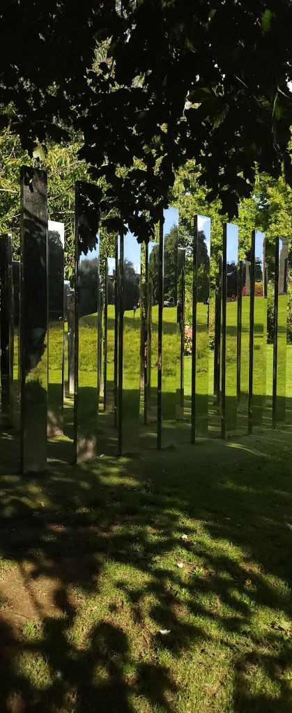
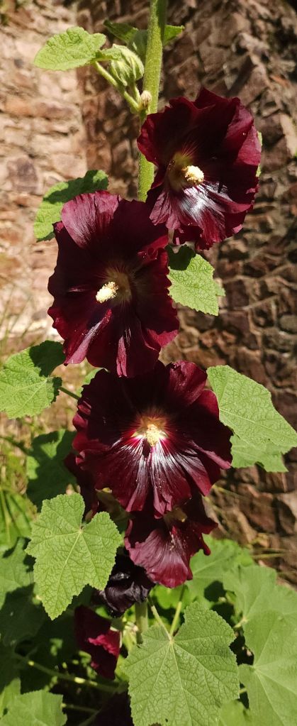
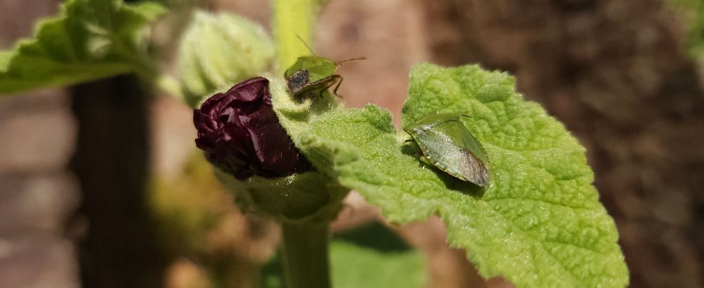
Using photoshop I layered the images and cropped to a square, adjusted the opacity of the two upper layers to finalise the colour balance I wanted.
I have a small 10 x10 inch square canvas board and some handmade Khadi paper of different thicknesses, using water based oil paints and water colours I plan to recreate a form of my image as a collage. The paper should add to the texture and depth to replicate the illusion from the mirror maze.
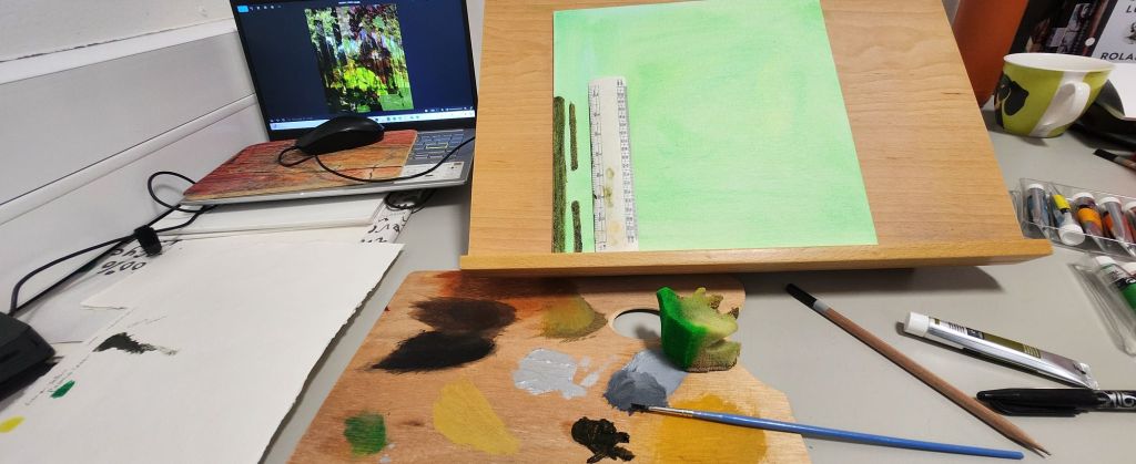

Discussions with my tutor had to take it further – use different textures print photograph on acetate and handmade paper, the Print on Khadi paper has worked really well
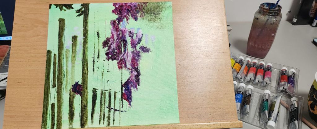
Use watercolours – I need to use them wetter so they kind of bleed into each other and I need to block more and I need to follow the fact that I have a darker pattern across the paper with the acetate’s cut and stuck so I need to make them blend into the flowers and block with more burgundy and dark green, follow the pattern lines. give the watercolour image a better composition.
David Whittaker and Emil Nolde are two artists I need to research in more detail.
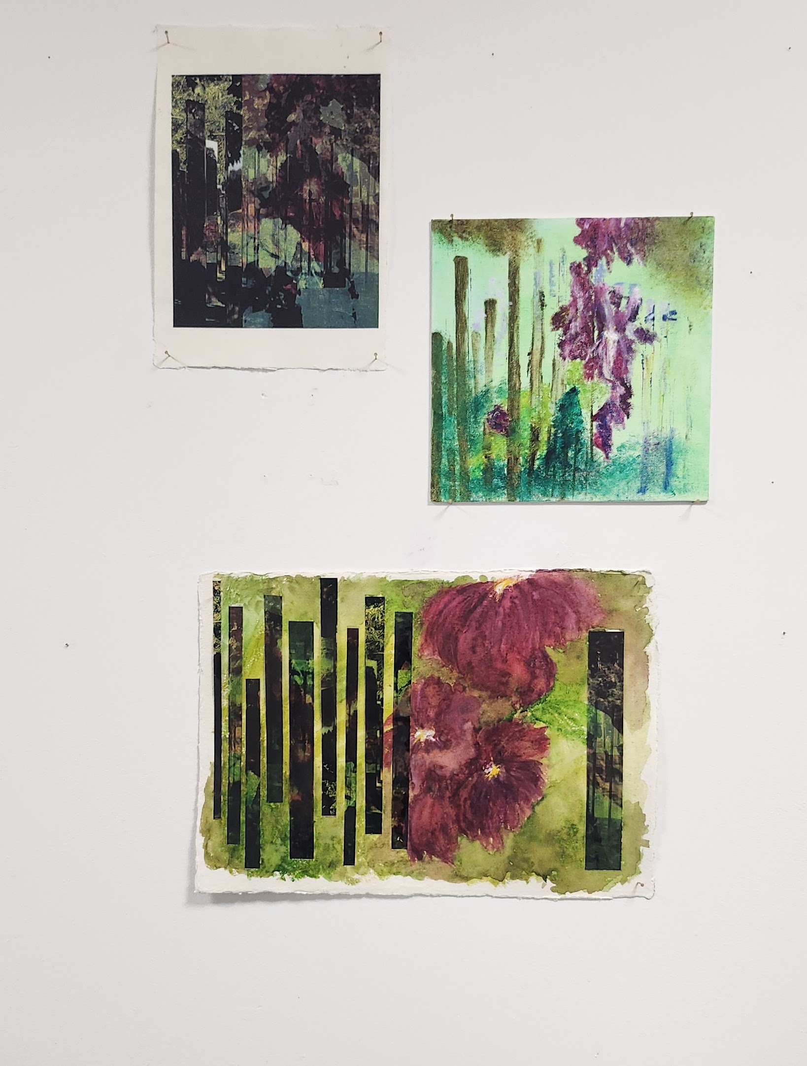
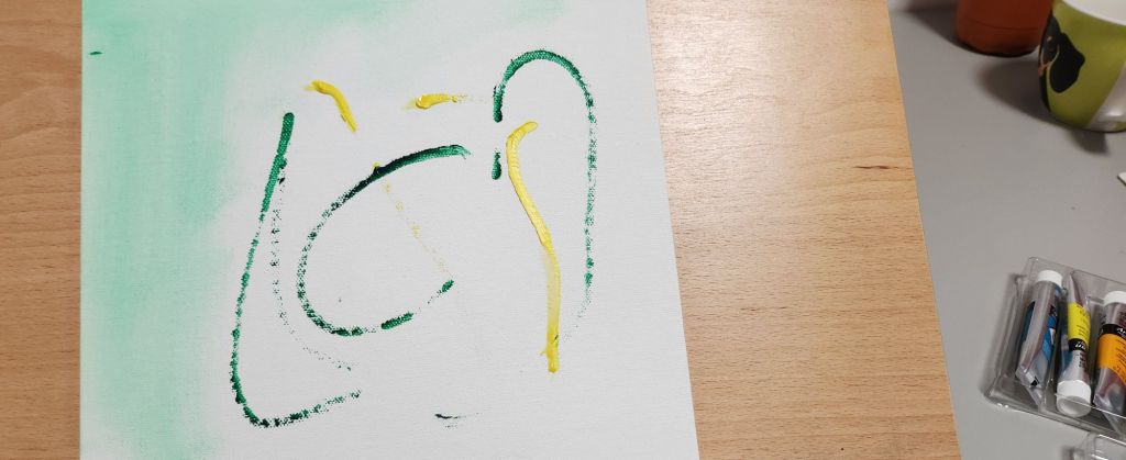
I printed the final photocollage from photoshop on hand made cotton rag paper, the paper added depth and texture to the colours. The top right image is using water based oil paints, I like the way the flowers hang in the air, a bit of a dreamy japanese feel to them. The bottom image is watercolour on handmade cotton rag paper 140gsm, heavier than the paper used for the photograph. I also printed the image on acetate and cut it into oblong strips to represent the mirror maze. I the arranged them on the paper to contrast with the water colour. It was pointed out to me that the flowers needed to be darker and blend more together. I found this really hard, water colour is one of my weaker mediums to use.
I think each piece holds it’s own and all have a totally different feel to them. Something to consider for future, what am I trying to convey? what would that look like in the medium I’m using? could a different medium or composition work better?
Questions to always ask myself.
