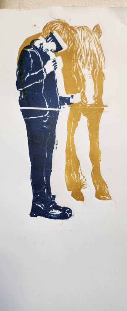
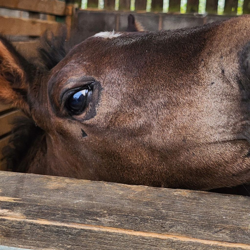
20th May 2025
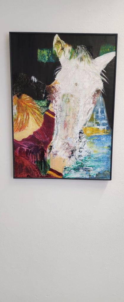
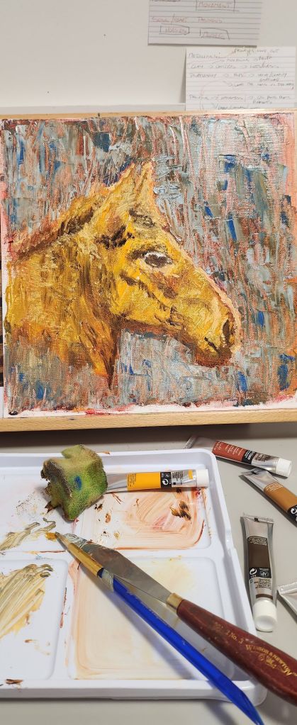
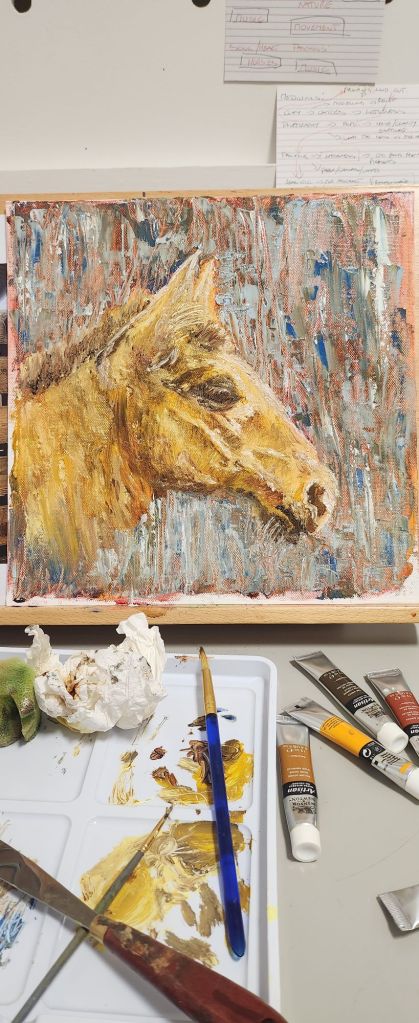
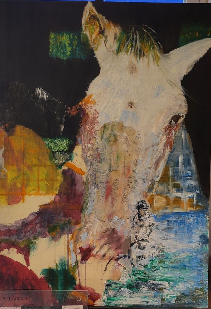
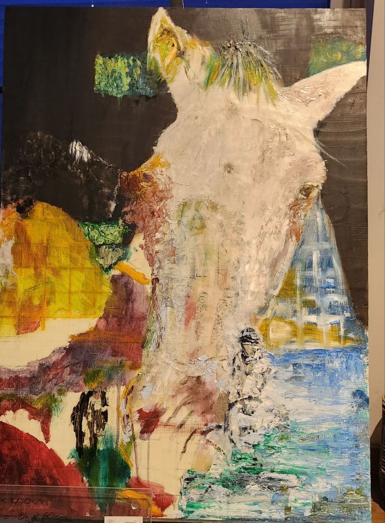
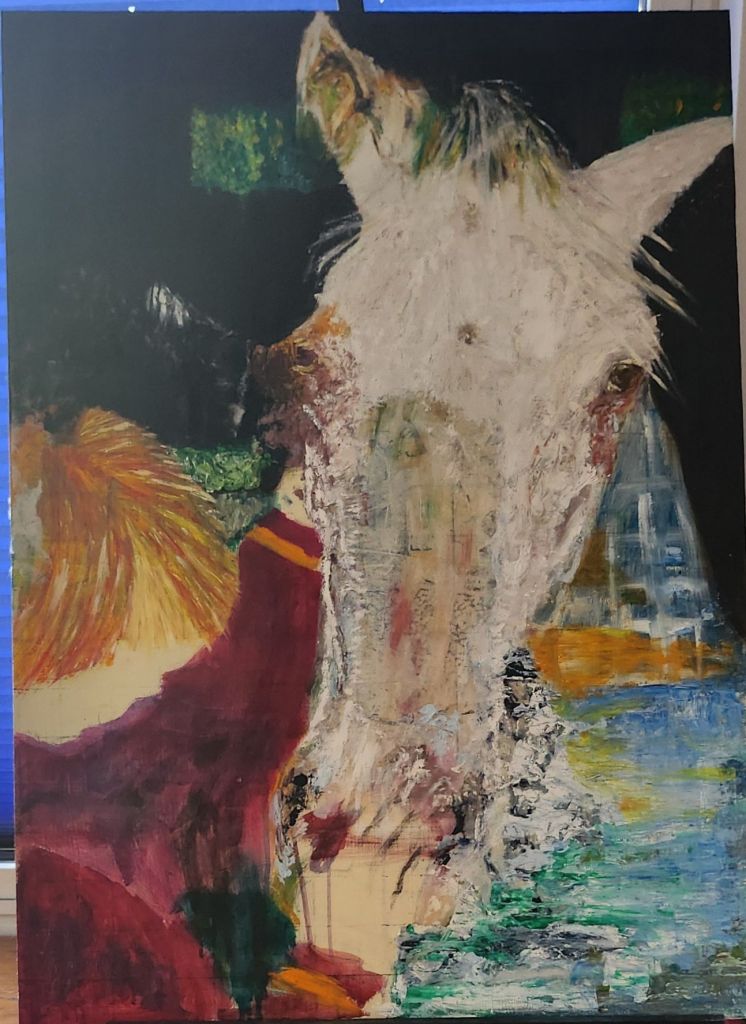
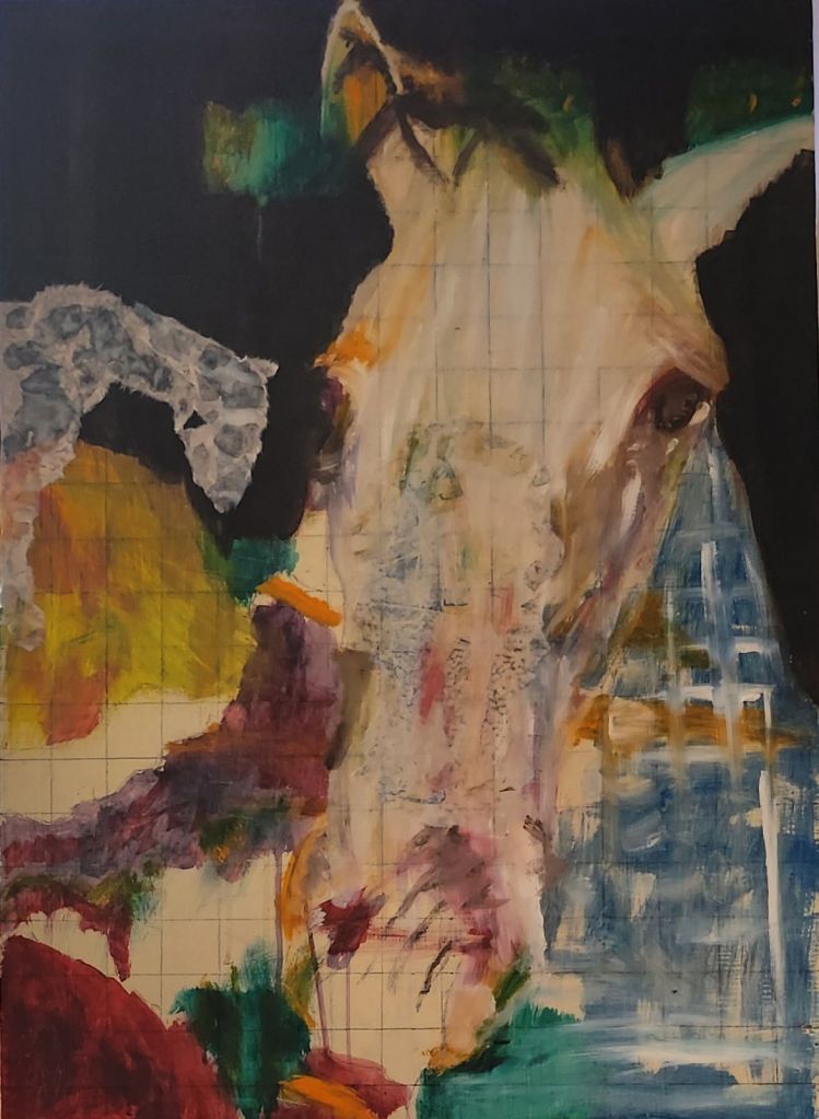
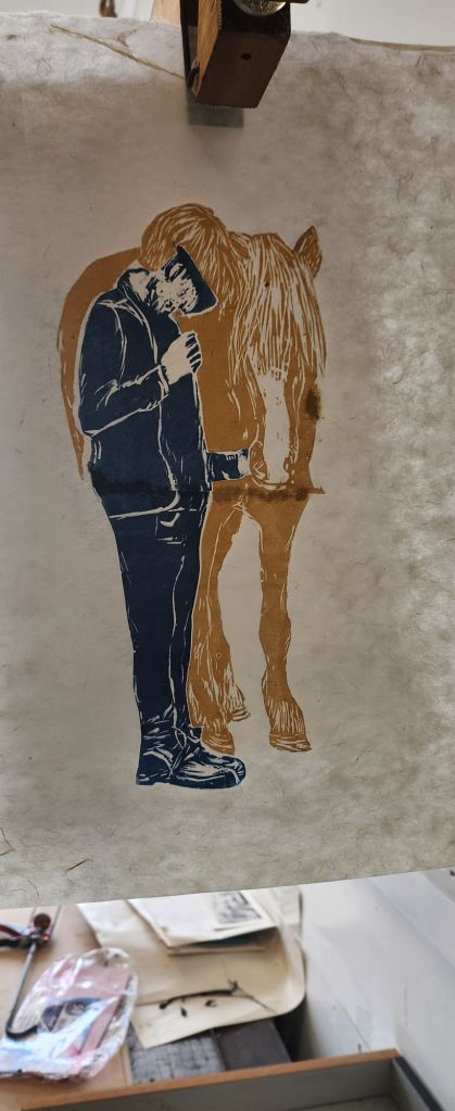
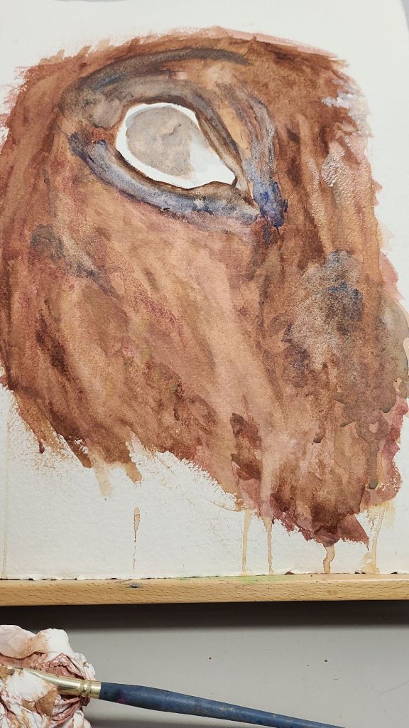
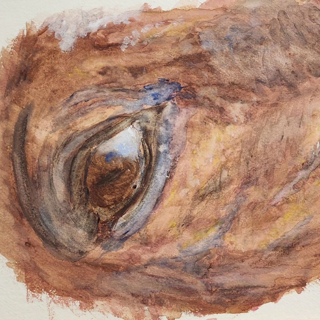
I am really pleased with how it’s looks. I can see all the imperfections.
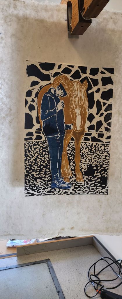
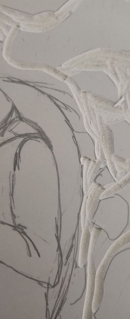
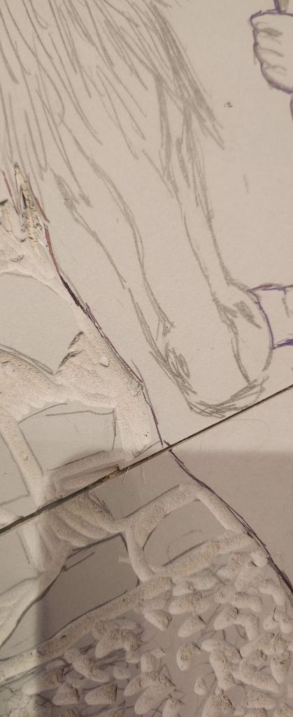
There are a lot of things I would do differently, working in oils I should have afforded myself more time. Time wasn’t my friend this year, more so than other years.
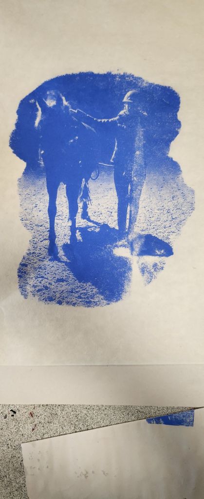
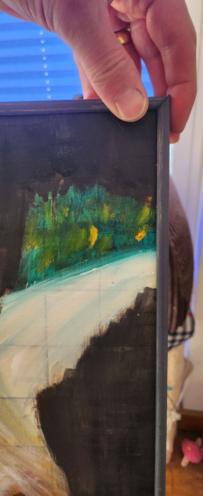
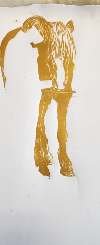
I hadn’t anticipated how hard it would be to get the mixed media of paper, hardboard, oils and ink to blend together.
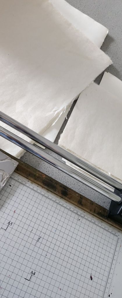
I was as sustainable as I could be using water based oils, home made oil pigments and hand made sustainable papers. All the wood used were offcuts we had at home.
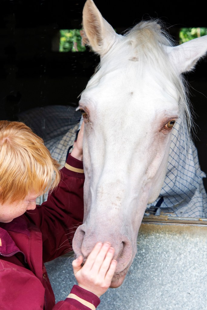
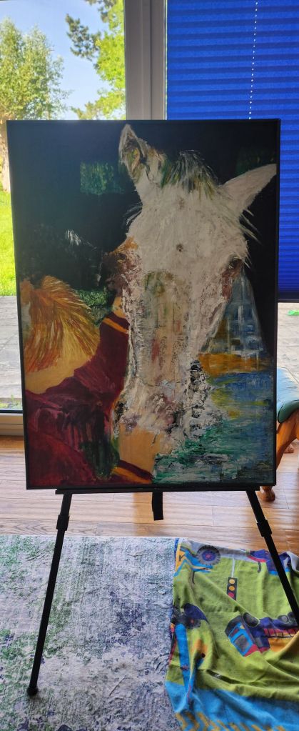
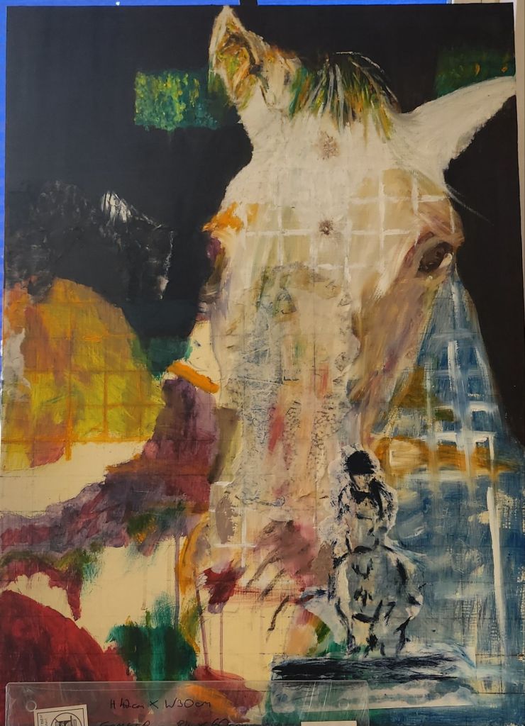
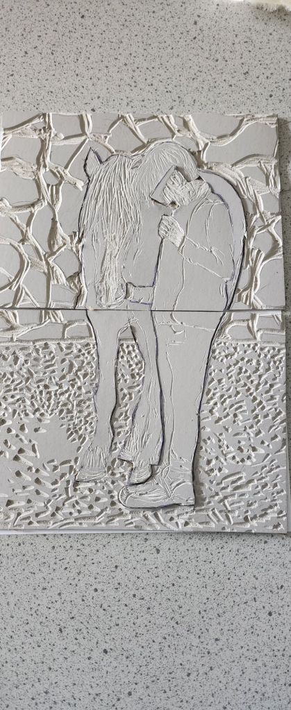
It was a personal subject matter, but I needed to do that, and this is one painting that will go up on the wall at home.
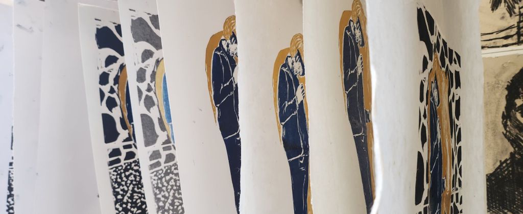
I am glad it’s all finished, I have acheived the start of a style of creating that suits my creative thought process.