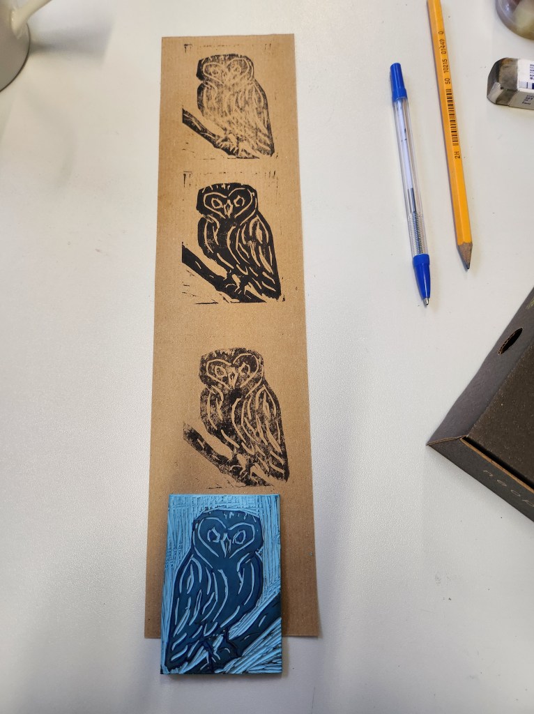
I loved lino cutting! I need more practice, I don’t do enough of it even though I have a small set at home. I get annoyed at too much noise – the lines in the areas I don’t want printed. This is just because I’ve not really done much and am a bit heavy handed in places.
As part of this session we also cut into foam rollers to make repeat patterns. Again this is something I just to enough experimenting with. Great for those long rolls of brown paper for personalised gift wrap.
I found Michal really inspiring and I loved the reason and ideas behind his projects.
I especially liked that most of what you see is captured in camera with few edits and using a 50mm 1.4 prime lens.
One of the challenges I have decided to set myself is to only use my 2.8 prime lens 50mm and keep a record. This is such a good way to improve my photography technique and refine my knowledge of using the different manual settings on my camera. I love natural light and often struggle getting what I see reproduced in camera.
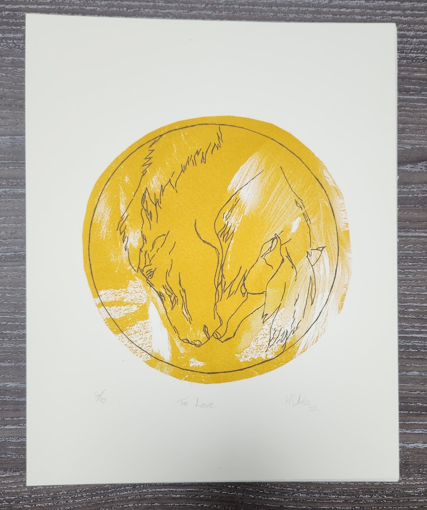
As part of our course we have the opportunity to display and sell a limited edition of screen prints in a pop up shop space in Weston Super Mare. The theme was a visual verb. I chose “to love” and the image I decided to use was the one I had worked on in our photoshop and screenprinting sessions.
I chose the colours gold for the bitmap photo image and moss green for the trace outline. The image had to fit a 10″x8″ frame. I am pleased to say I sold one mounted print and that small gesture has improved my confidence so much, people do like my work enough to put it on their wall.
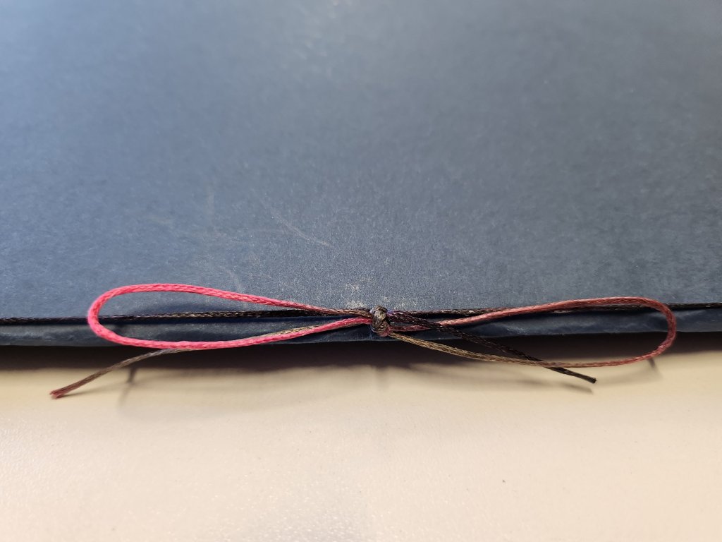
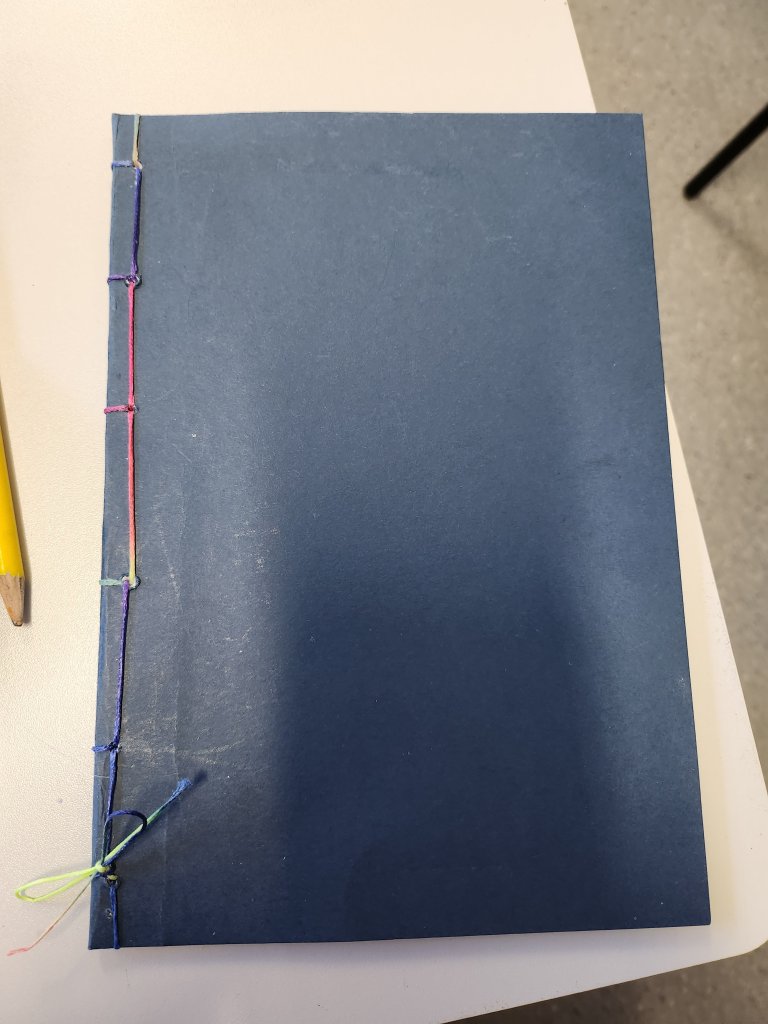
I loved this! I have so many sketchbooks with maybe a handful of unused pages in, and what a great way to collate them all together and make new ones to be used.
As ever, I’m just a little uncoordinated with the sewing. I always seem to start things off back to front. Anyway, I made a simple stitch pamphlet and a Japanese stitch booklet.
The whole idea of making my own sketchbooks, really ties in with my decision to find a more sustainable way of working and producing art.
I missed this lecture due to a hospital appointment. This links to the assemble project in the Creation and Production module.
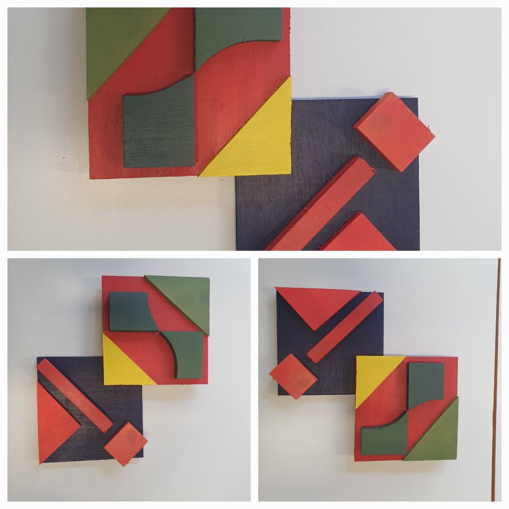
It’s about understanding the colour wheel and how our decisions as artists will affect the final composition. The rule we use or disregard in a piece of work have a bearing on how we would like our work to be viewed. Its important to understand where you wish the observers eye to be drawn, and does the composition encourage it to follow a certain path or not. What colour’s you use can help highlight certain areas of the image, or set the mood because of the choice of warm or cool colours, or a blend of both.
I decided to use a simple complimentary pallette and tried several way of fitting the shapes together. For me it works best with the yellow triangle in the centre.
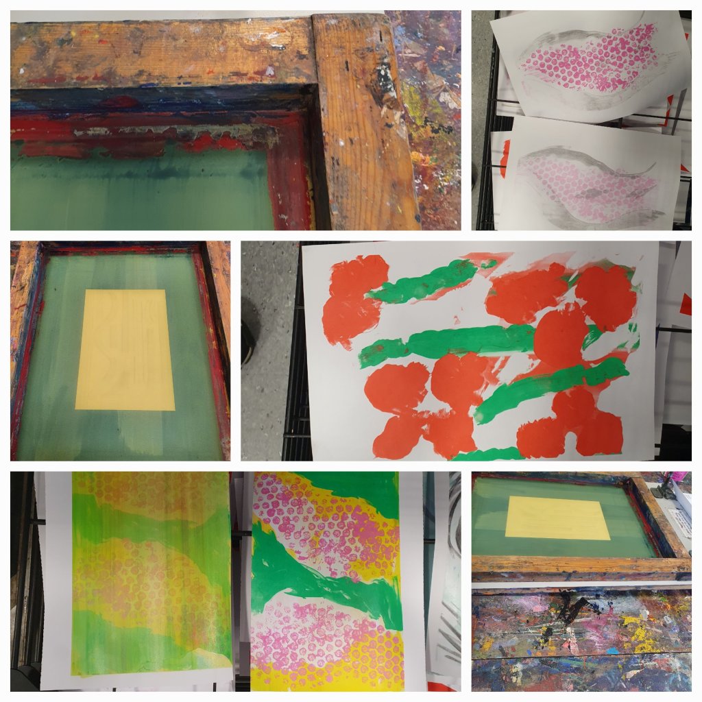
This was a good refresher back into the screen printing process.
I didn’t have any grand ideas or pictures in my mind, I enjoyed using the ink purely as a mark making process. I concentrated on the technique of drawing the ink down the screen.
The simple things of remembering to keep the screen flat, the correct angle of the scraper, getting a good ghost print. How to clean the screen off, using bubble wrap to create texture.
Taking our image from last week, dissecting and folding to create a 3D form.
What did I picture this as? What was my final piece going to look like? Was it functional? Did it have a purpose or is it just an ornament? A piece of art to look at?
In my mind I pictured this as an abstract sculpture, the shapes I’d chosen in the image resembled elements of a horse and that is what I envisioned. As I folded and tore and stuck the paper together, I was picturing what it could like and the possibilities. It was definitely made out of metal, possibly steel, and the mane would dissect parts of the muzzle and fold back on itself. The you would be able to see through the nostrils and there would be refracted light, the effect of the mane would be through a cascade of water running down the curved metal into the pool below.
On a grand scale it’s a water feature I could see outside a stately home such as Gatcombe House, Burghley or Badminton. Yet I could also see it on a smaller scale in a local park or as a water feature in an inner city courtyard.
The paper maquette is currently hanging with others as part of the wall display at Uni, perhaps one day I will find a way of making the prototype water feature, with the right kind of metal that is shiny yet dull, and able to be textured, and have natural light causing an array of rainbow colours reflecting its surroundings.
So I shall leave you with the sound of water flowing, the warmth of the sun on your face and the sights, sound and smells you would find on a summers day in an English garden whatever it’s size.
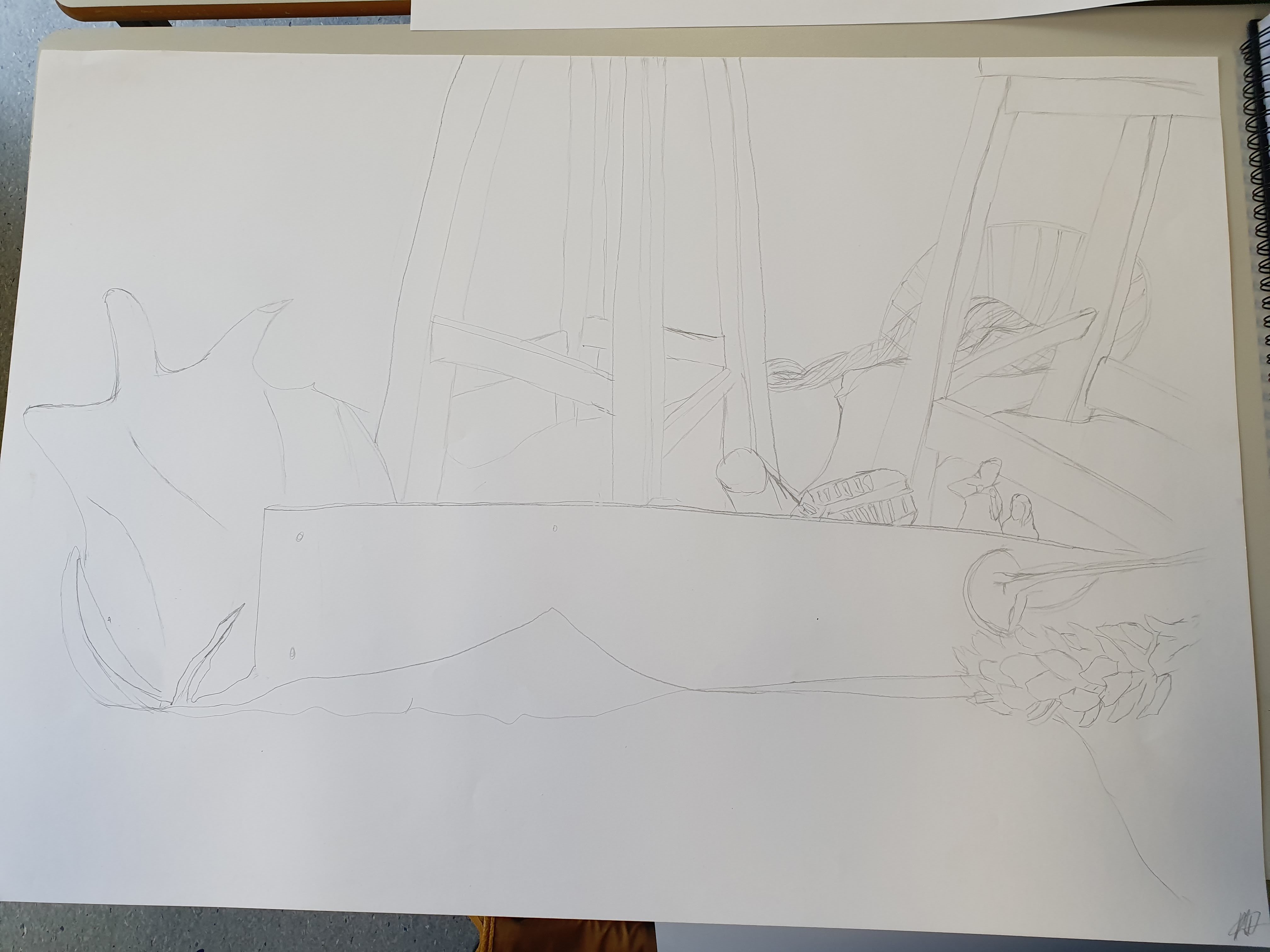
Creating a still life line drawing using pencil. Sounds easy, yet it isn’t, I found myself struggling to pick an area of the array of still life objects and recreating.
What I have learnt is that instead of letting other people just move pieces I was considering drawing, in fact had even started drawing I should really have said something. However, on the other hand if I was painting a plen air scene on a busy bustling city street, I would have to adapt to changes and focus initially on the more static elements of the scene in front of me first. So maybe it was a good thing, that I chose to hide in my shell and not create a fuss.
This was my first choice and the weird looking shape on the left is what was moved, and I had to draw from memory it’s original state as part of my composition as I’d already started drawing elements of it. Needless to say the perspective is wrong, it doesn’t even represent what it was. However, you wouldn’t have known if I wasn’t honest and told you, but I think all of this is because I am not comfortable drawing still life, I’m not comfortable drawing what I see with other people around me and able to look over my shoulder and immediately comment. After the summer break, I found it hard settling into the whole learning and my art is on display enviroment again. There were some stools, a piece of wood, a fir cone, figurines, a wire fruit tray to name a few of the items in my image. My perspective is off, it usually is when I’m doing these kind of pieces.
I didn’t really add any shadows or highlights, or consider tonal values. The exercise was to recreate the shapes and forms and the result is a flat image.
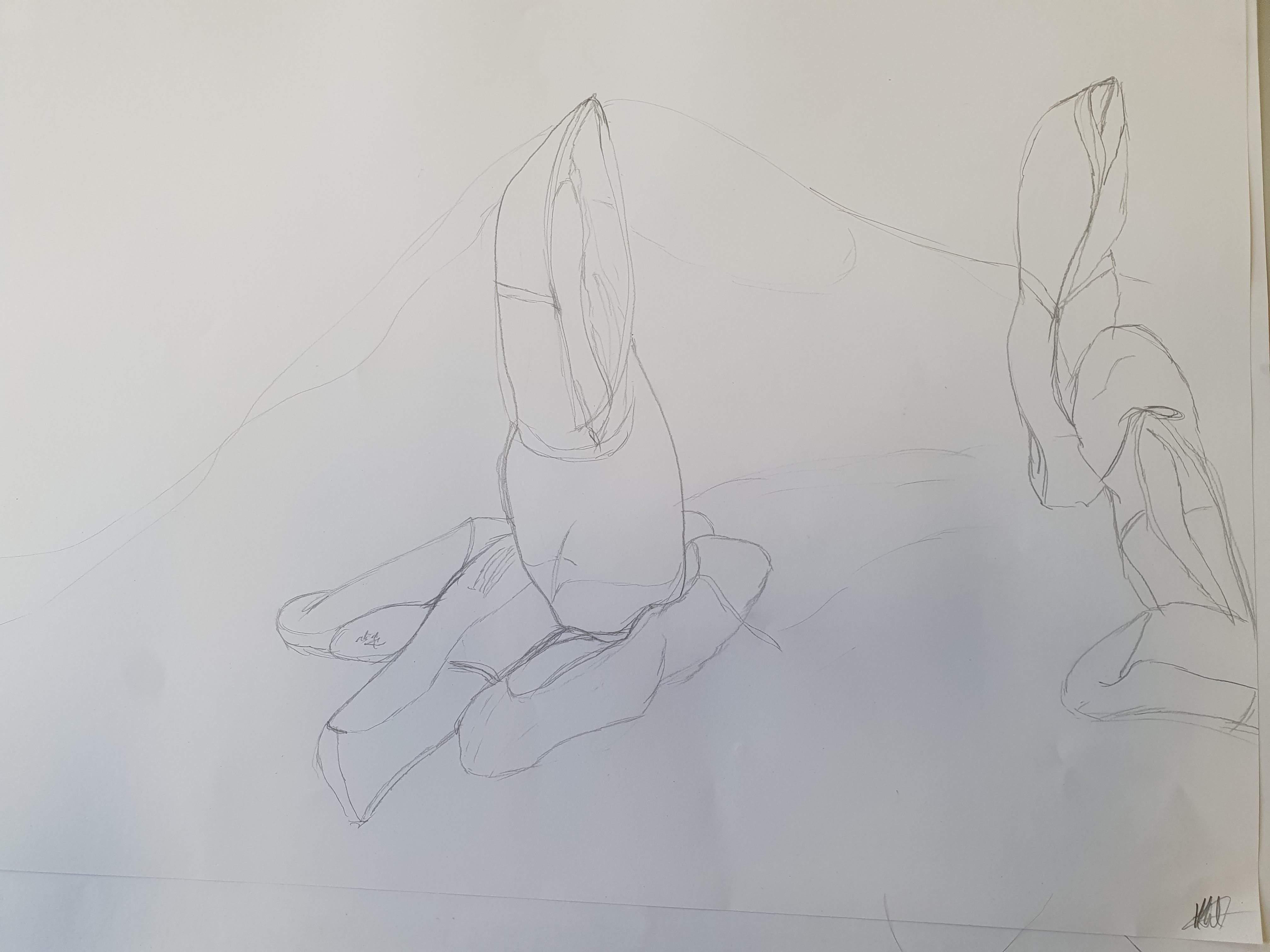
I created another image, this time I concentrated on the array of ballet shoes propped against a board on tin foil. I felt more at ease drawing these, I used simple lines to create the sense of folding and creases where the shoes had worn and held their shape. Many reasons why this image is less flat, I have more interest in the subject matter, I connected with the shoes as I used to dance. Or maybe, I just let myself tune out the fact that there were other people around, so I was less self-conscious and less distracted.
I think as well as having more of an understanding of art practices I need to do more of, this exercise has also highlighted other things I should work on, on a more self esteem, personal level. There isn’t really a wrong or right interpretation, unless you are being photo realistic, art is just a reflection of what the artist sees and feels, and the story they want to tell. Also, the more I create and do, the more relaxed and confident in my outcomes I’ll be.
This is small project that ran across two modules Realisation and Creation and Production.
I missed the presentation on this due to being absent, I had to catch up on the second day and finish assembling my piece at home.
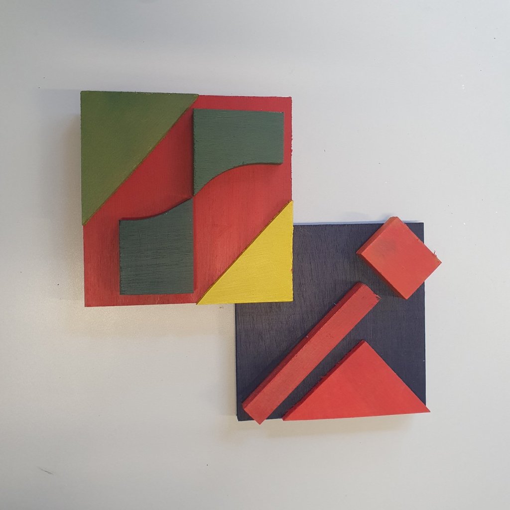
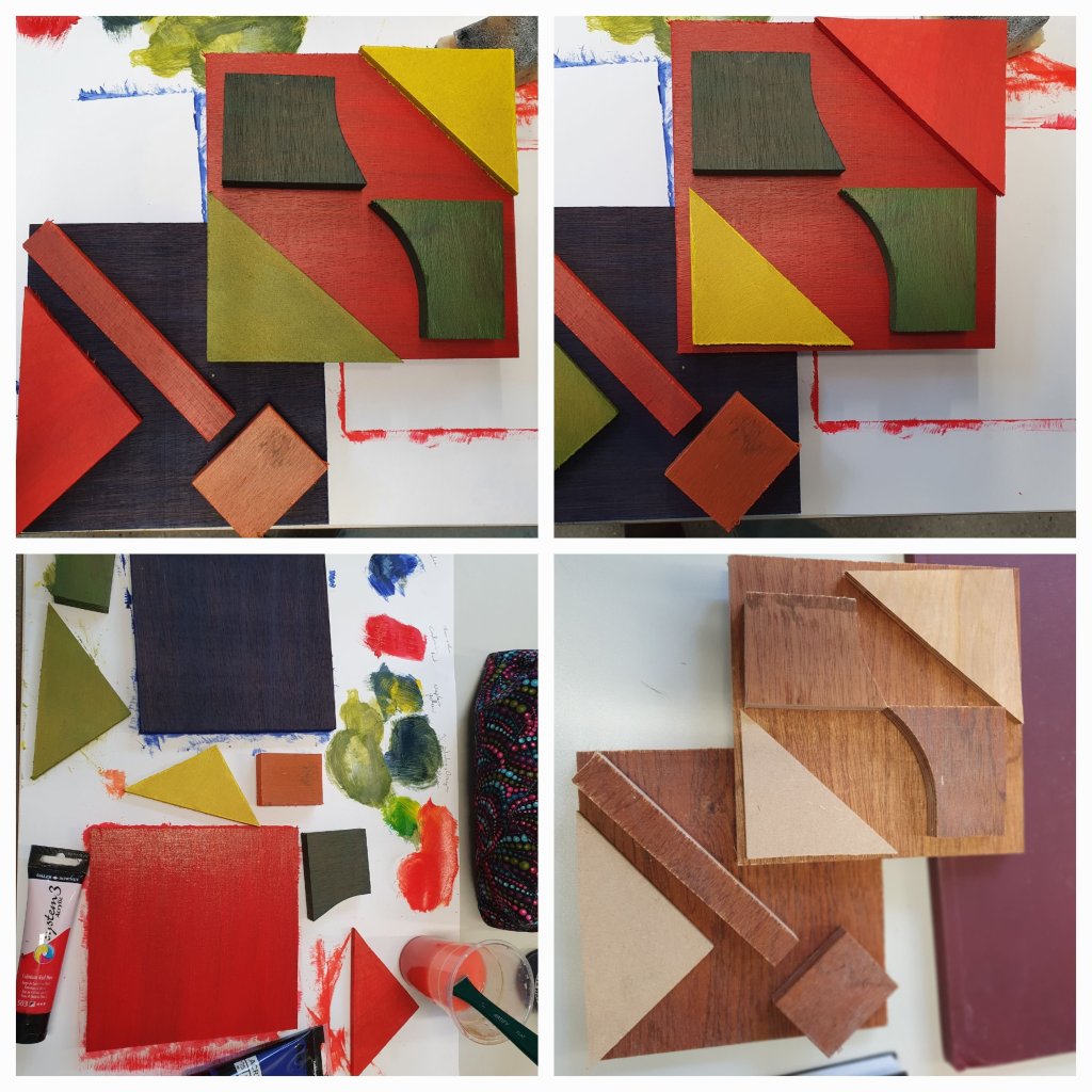
Quickly refreshing my knowledge on colour theory, the rule of thirds, the chaos theory and the golden ration. The first task which falls under the Realision Module, was to cut out 3D shapes and arrange them in several compositions, considering how they blend together and the various rules of composition. The different colours of the wood I used certainly helped with my final composition as I used the tones of the wood to help consider what a 3 or 4 colour complimentary palette would look like.
The second task was to paint the pieces of wood and then check the composition again, make any changes that would work with the application of colours if needed and then attach the pieces together in the final piece.
I moved the triangles around quite a lot, for me the piece looked more balanced with the red pieces on the blue square and the other pieces on the red square. I was originally going to put the green triangle in the middle. The benefits of phone cameras is that you can take a snapshot, look at it, change things around, take another photo, compare the two and it certainly helps with decision making in situations like this if undecided. After a few trials I decided that that the yellow triangle in the intersection of the two squares was definitely a better balance and composition.
This was a fun little exercise to do, certainly refreshed my memory on things to be considered when creating pieces of work, whether I wish to follow the rules or not.