Reading Weeks

25th October 2022

Reading weeks coincided with half term, this is where I admit defeat a little and that I am a ludite with technology and embracing this whole blog process. I’m a mature student juggling the part time job, with a full time course and a family. I missed the memo that said read the books and write just a little about them in your blog.

I read the chapters from Practices of Looking by Sturken and Cartwright, and re-read John Berger’s Ways of Seeing. I just didn’t log my opinion or interpretation of what I’ve read.

I would like to think that some of the views in John Berger’s Ways of Seeing are outdated, especially the ones about the onlooker being male and the male perspective of the viewer for advertisers etc. However, it hasn’t. Yes we have adverts directed at women as the voyeur and basically that’s what it is. I’m wondering if people think that to market certain products they have to objectify the person in the picture be it male or female? Do they think that if they objectify men to gain more female customers, it’s ok? It balances out objectifying women over the years? I know that’s a bit of an extreme point of view, but we are bringing up the next generations in a crazy social media society that is used to instant gratification. You want a new drill? a new hoover? a new car? with online, next day delivery its there. We are very much a throw away society of almost everything, trends change so quickly what’s in one week is out the next.

The general idealogy of what is the “perfect (woman/man/car/dog/body/hairstyle etc etc)” is still being manipulated by those with power. The big corporations, the politicians, religious leaders, the media, the wealthy and unfortunately a lot of them are men or controlled by men. We don’t accept change in society very well, and some parts of the world have undone 20yrs of progress with regards to equal rights and acceptance of all areas of society. This is clear in the images they are broadcasting to the world. Even in western culture we have a fear of change, a fear of moving away from some of this false idealism.

Reading these two books, I strongly feel that until we change the way we deliver the messages, we won’t change the way we see the world.

There are a few strong, individuals who are brave enough to try
Modernism – Bauhaus

11th October 2022

This was a good one for me, I think because although I have heard of Bauhaus in passing, it’s influence and legacy has never really been something that I have considered in depth. Although I’ve always loved art, I am late to to learning about it and evaluating it and understanding the importance of art as the world changed between the two world wars.

It is interesting to understand the roles assigned to the women of the Bauhaus, in the main they were very traditional. It’s also interesting when the school had to close, how they went on and influenced other schools like the Black Mountain College. I never knew that Kadinsky was involved in teaching colour studies to Bauhaus students. I researched his art last year when I did a small project on synesthesia, music in art. He is a name that keeps coming up in my studies. Another is Joseph Albers, whose wife Annie was also a colour theory teacher.

What the Bauhaus school did was unify art and craft using technology, wanting and promoting change for the better. For the first time art and design were being taught together and it brought out lots of new representation. It incorporated modernism and optimism and had international appeal.

Joseph and Annie Albers taught at the Black Mountain College of Art, in North Caroline. The students there also had a strong commitment to study design and art. Jackson Pollock, Rochenberg, Lloyd Cunningham all had links to the summer school at Black Mountain. American Modernism, Abstract Expressionists all tie back to ideas and lessons that originated from the Bauhaus School and its teachers and students.

Semiotics

4th October 2022

What did I take from our last session?

To See – is a process of observing and recognizing

To Look – is to actively make meaning of the world

Semiotics are a representation – a scientific study of production and use of signs

The interpretation of signs and language – visual literacy

We are meaning makers – Homosignificant.

Well thats a lot to think about in those simple statements. As artists we need to be aware of what we create and how a simple change in an image, like a colour or adding a badge, change a word in a slogan can seem very simple, but have huge connotations in the meaning.

Rolant Barthes Term “Death of the Author” – nothing counts more than what the reader understands and does with the sign. (Baldwin J Roberts, 2014) Adding text to an image fixes it’s meaning to the one most likely.

Understanding semiotics and how an observer is likely to interpret your image and give it meaning, is useful for political advertising and propaganda.

The advances in technology over the past 60 years and how production processes can be blended changes expectations in how we interpret work. Also looking back at some of the examples with hindsight and modern perspective, there are many adverts or images that portray a different and sometimes uncomfortable representation of the world. That back in the 1940’s and 1950’s portrayed society as it was in the rules then, like the segregation of black passengers on public transport in America, which would be frowned upon today, unless it was being used in the correct historical context.

For most of us Semiotics are seen every single day in Road Signs. We know the caution signs for Children Crossing, Elderly People, Horse Riders and the instructional signs, for giving way, one way, priority to oncoming traffic etc.

Images and Meaning

27th September 2022

What do images mean to us? How do we analyse them? Do we actually see what we are looking at? What are the images trying to tell us? Are they are storyline? Part of a visual language?

As an artist and a photographer, there are ways to help you draw the observers attention to what you wish them to notice. These can be subtle or more direct. In general we can use the rule of thirds, leading lines, and perspective to help create a storyboard and direct the eye. We can use a warm or cold colour pallette to enhance a generalised feeling or indicate a season.

With the onset of the digital age we can edit and manipulate the original image, and create composites. There was a time when people used to say the camera never lies, but in today’s society with so many people being concerned about how they look on social media platforms, it often does. Commercial advertising is airbrushed, we can add filters to our own selfies with our phone cameras. We can get apps for our phones that will remove blemishes, change the lighting etc. We can change the background to be somewhere else entirely.

We do all of these things because we want to convey a story, we wish the world to see us in a certain way, or we are unhappy with how we look.

There are times when I struggle to actually see what the photographer or the artist are trying to convey, and that isn’t always a bad thing. Sometimes, having a different perspective to the original intention of the image can lead to conversation and enlightenment.

The Visual Verb

21 September 2022

We looked at the work of Richard Serra and his idea of creating artwork from verbs. TO DRAW is a verb.

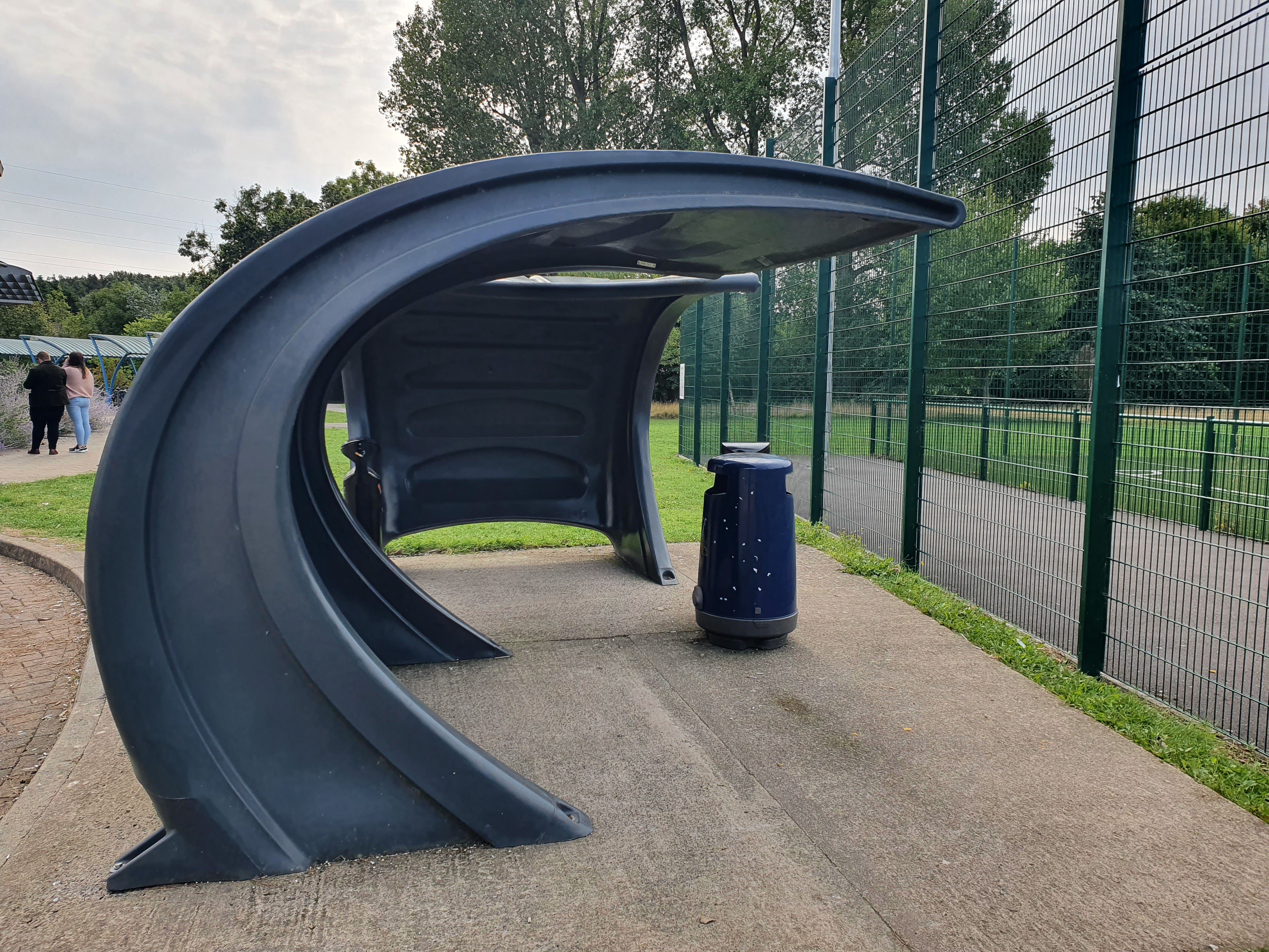
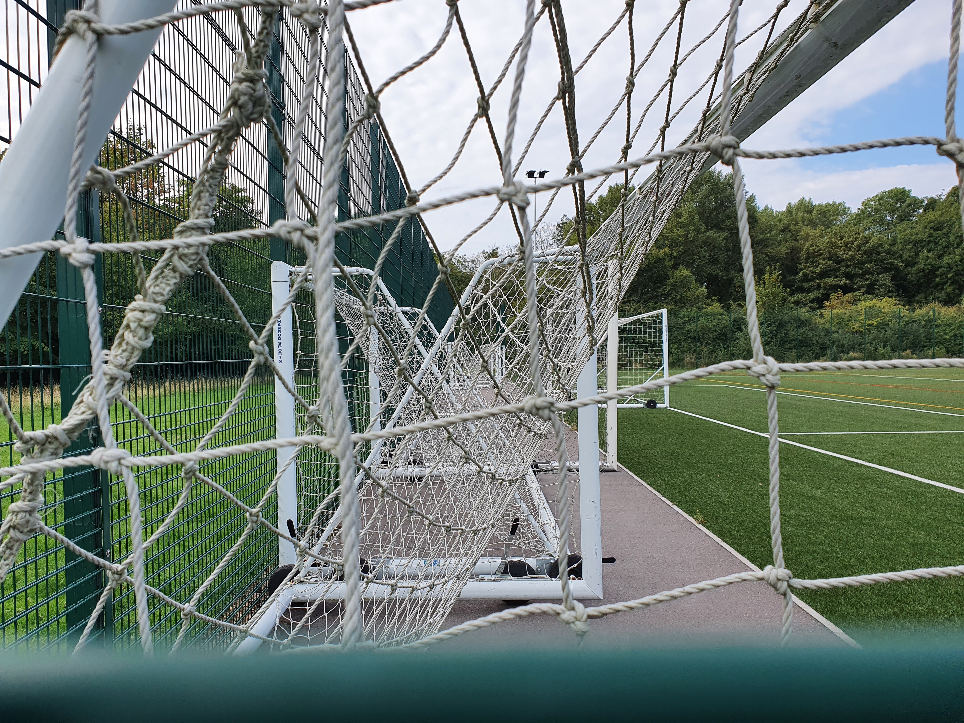
As a group we had a class exercise to find examples of the twelve verbs we had chosen from Richard Serra’s list of verbs and photograph them. The limitation on the task was that they needed to be from somewhere in the college building and grounds. My choices are below:

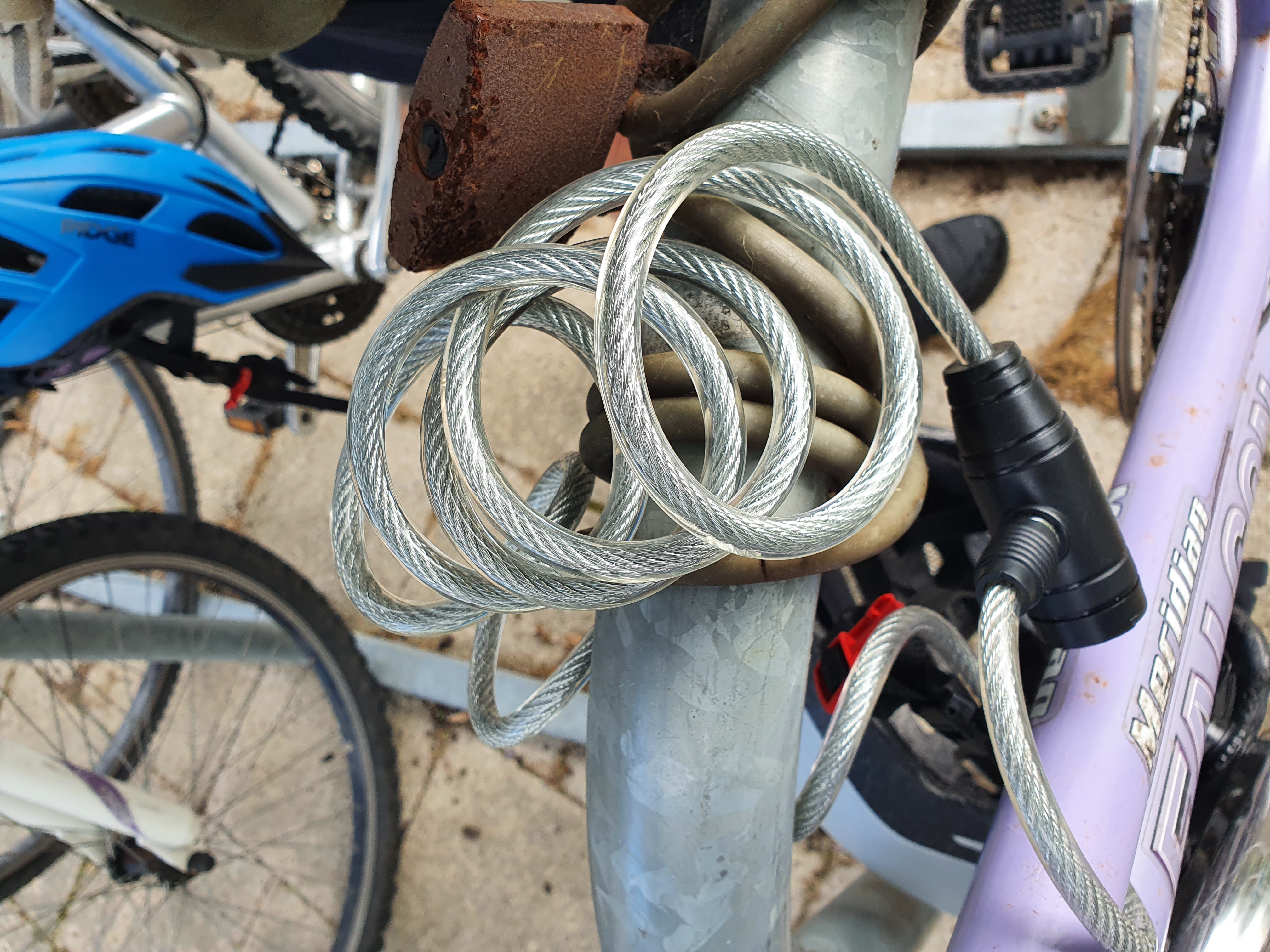
To Twist

To Simplify

To Splash

To Suspend

To Gather

To Surround

To Weave

To Match

To Light

Of Nature

Of Reflection

Of Symmetry

As an exercise it was quite interesting as even though we were to work individually, as a class we used similar images, if not the same for some of the verbs. Our lecturer asked us to upload them all so that she could display them as a postcard wall.

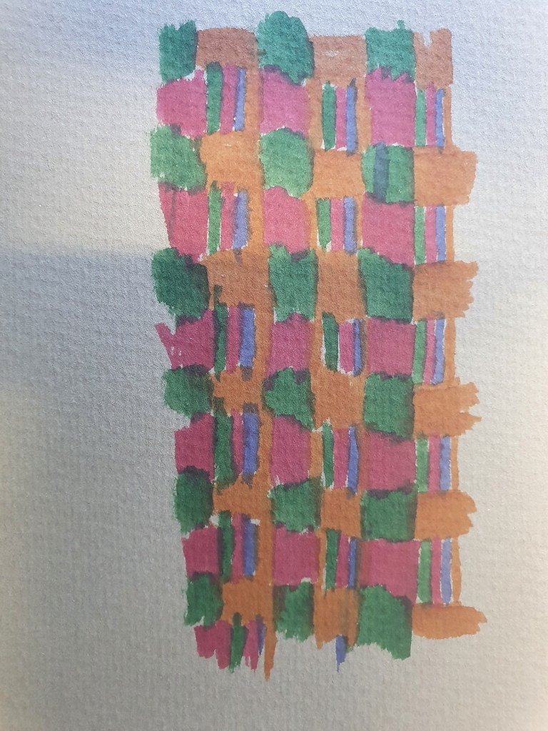
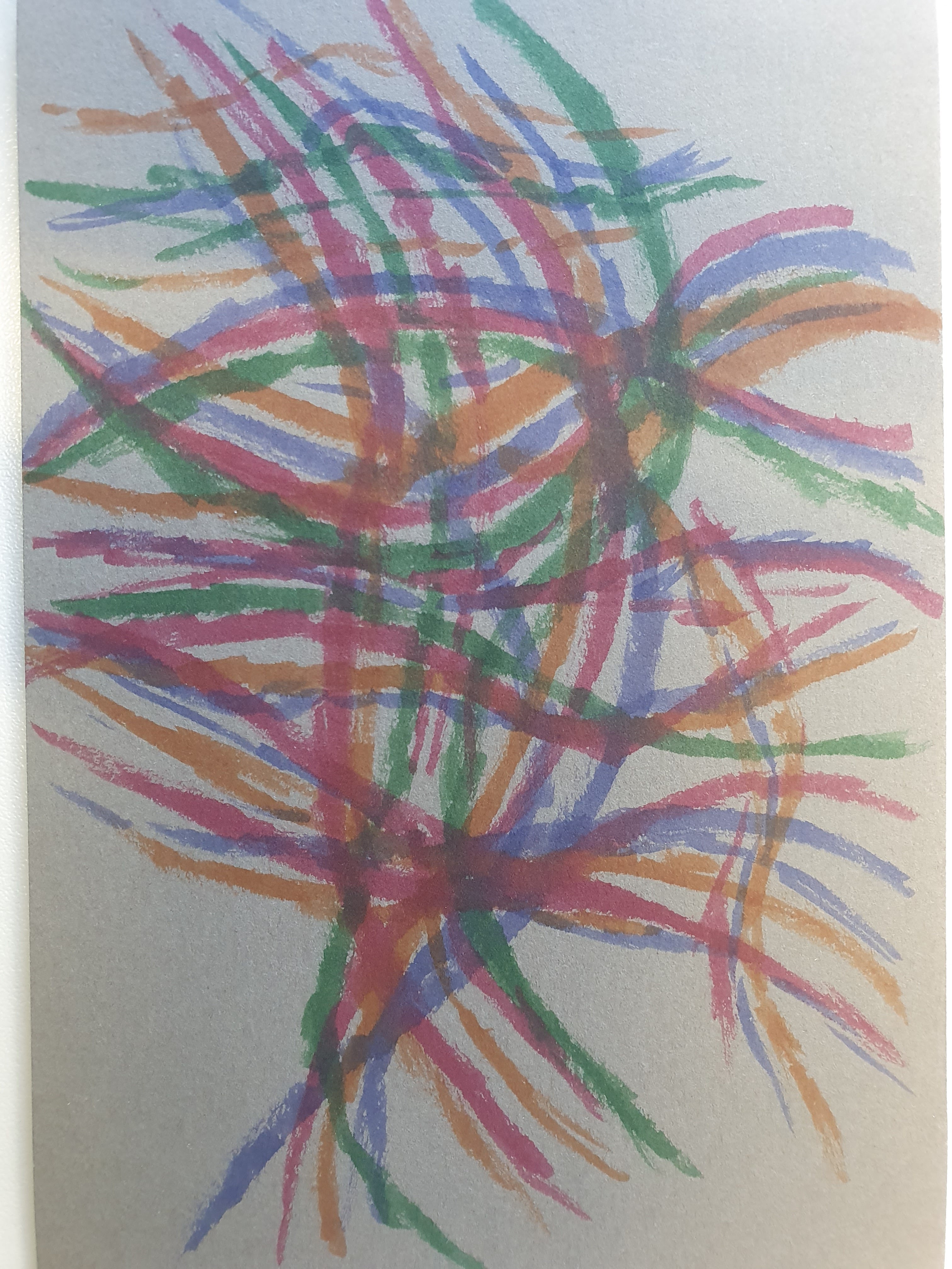
The next task was to create an art response to one of the verbs, the stipulation was that it had to be 4″x6″ postcard size. I did one response but wasn’t too sure about it, so on the reverse did another response. I used felt tip pens to create the image, can you guess which verb I chose?