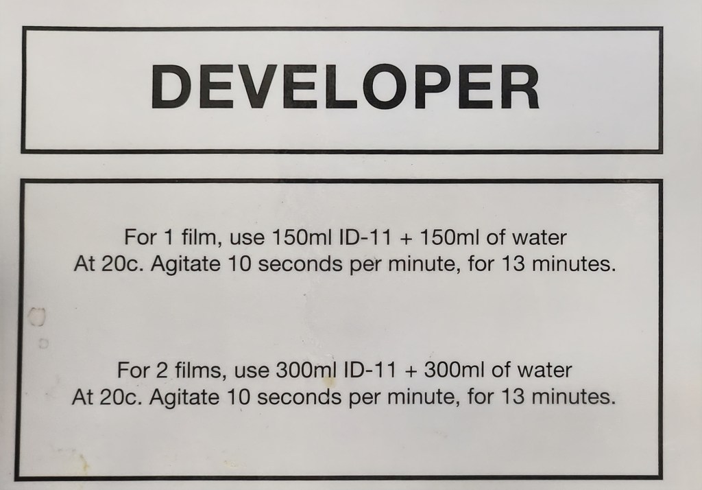
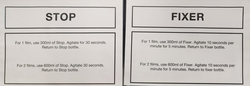
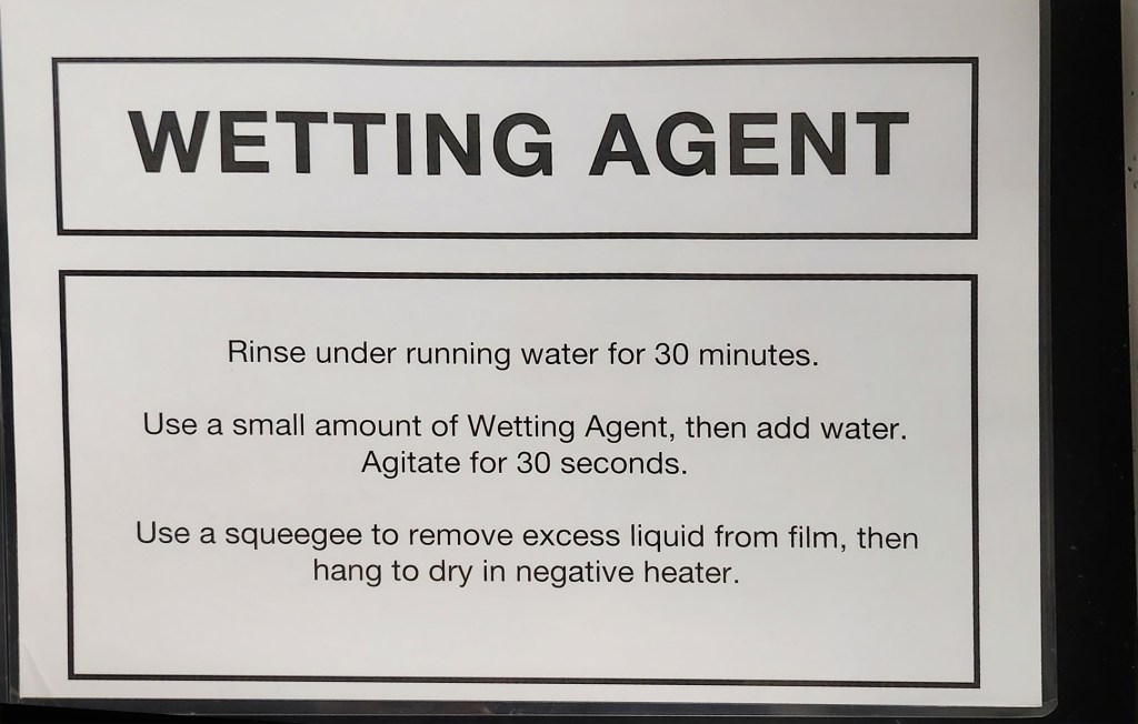
Where am I going from here?

June 2024


I have honestly been out of my comfort zone a lot during studio development and I feel this had
inhibited my style and creative process. Ceramics has always been more of a hobby, my time, my little bit of
therapy.  Putting the pressure on myself by wanting to use clay as a canvas for my artwork has been quite challenging because I don’t feel I have enough knowledge to do each element confidently.   I still don’t.  Am I glad I did it? Yes.


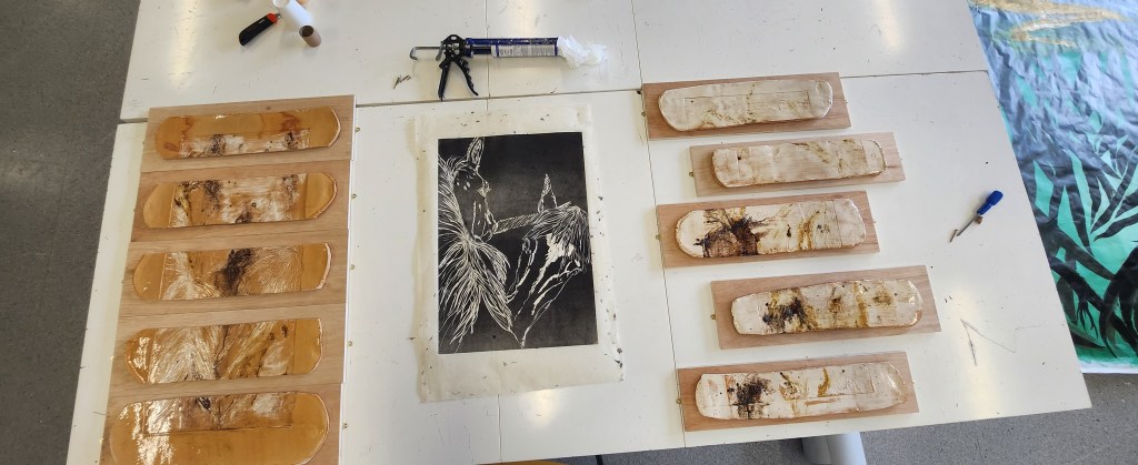
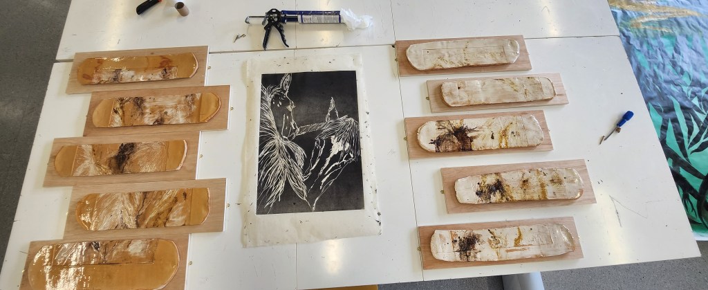
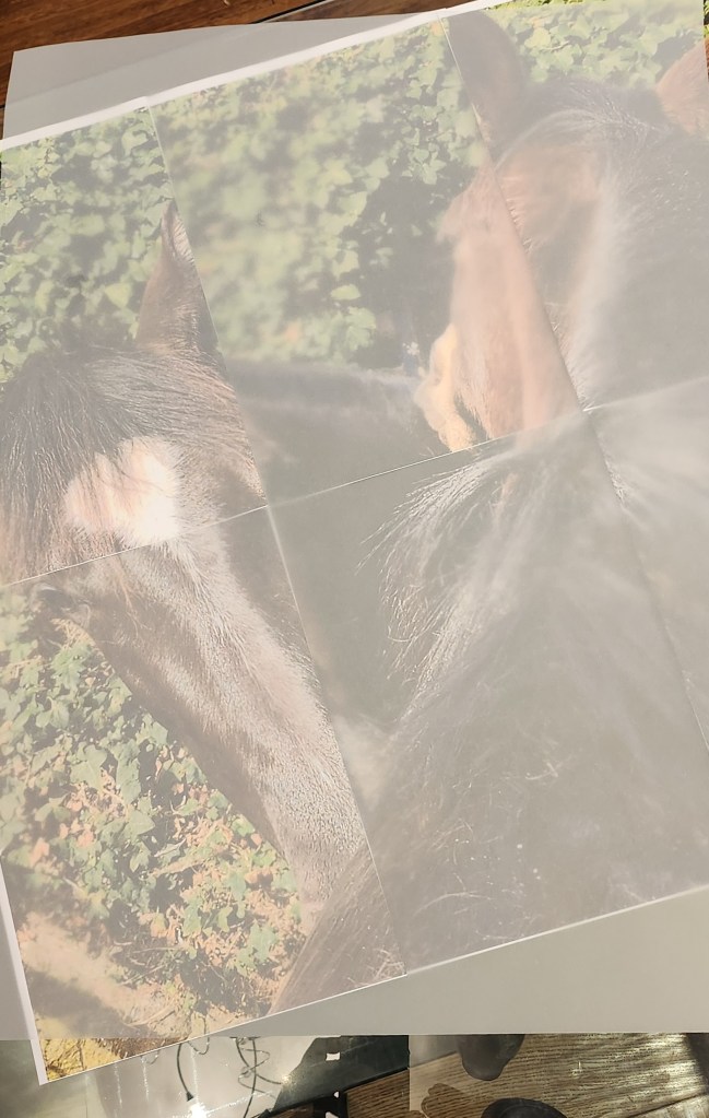
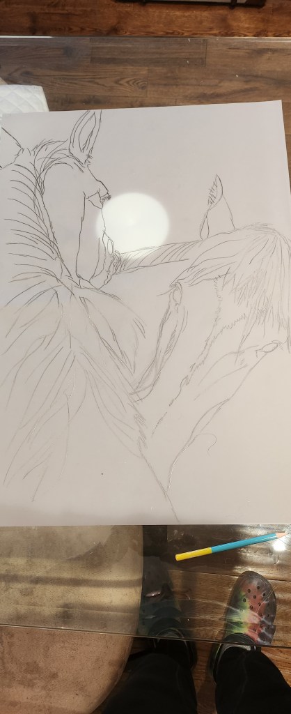
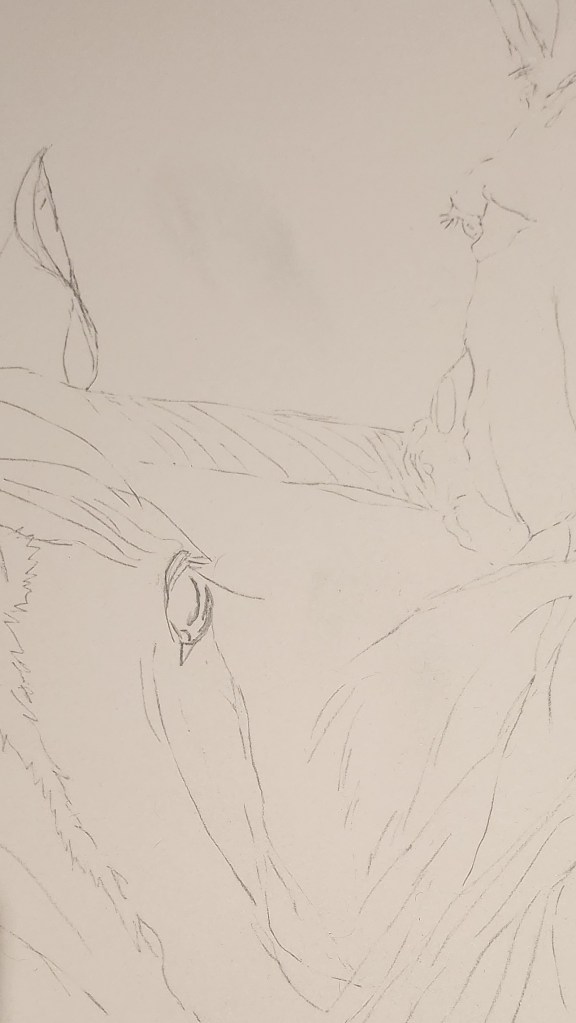
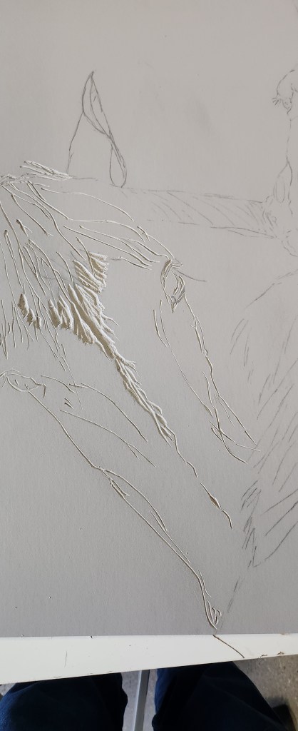
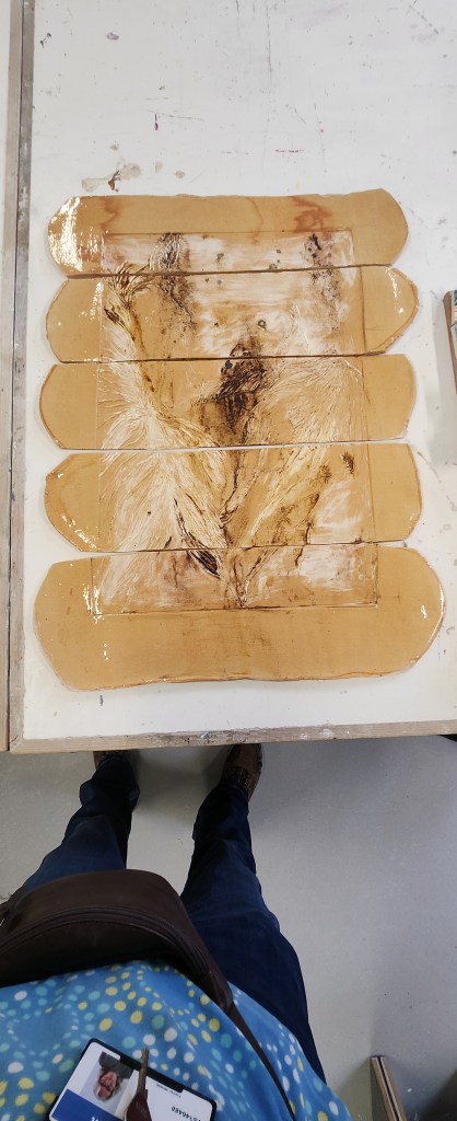
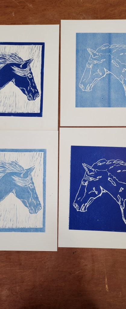
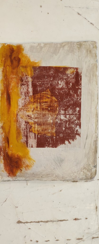
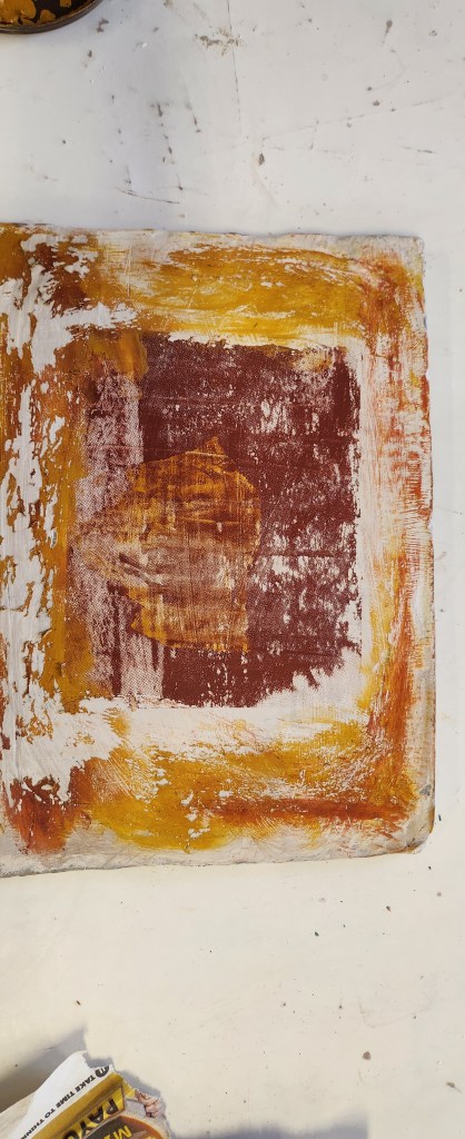
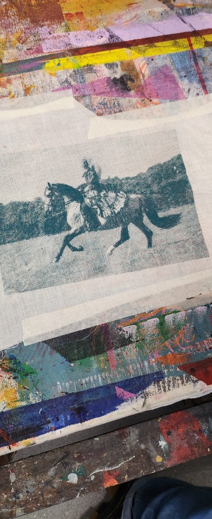
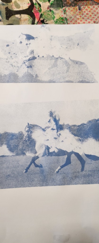
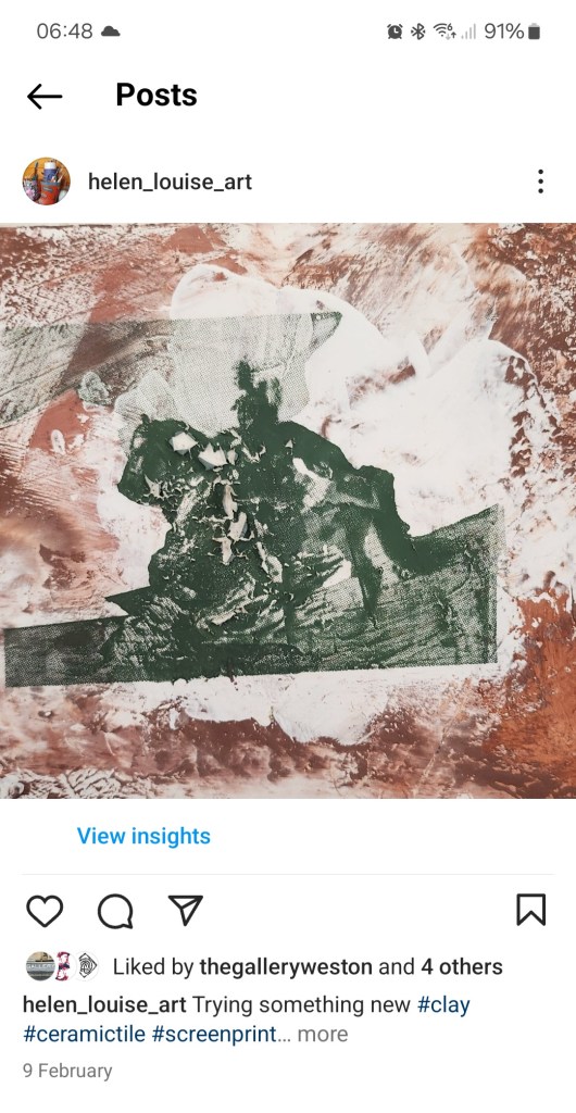
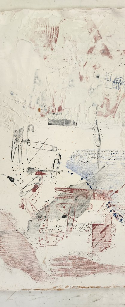
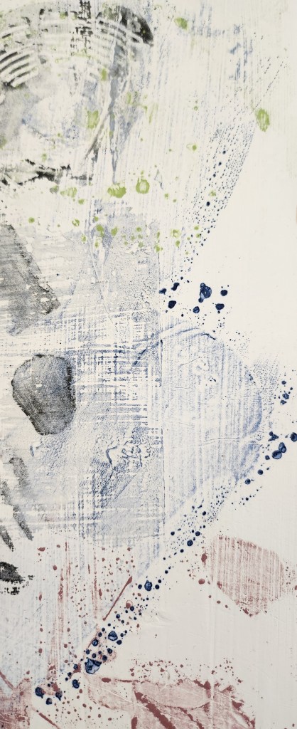
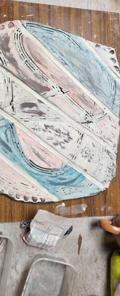
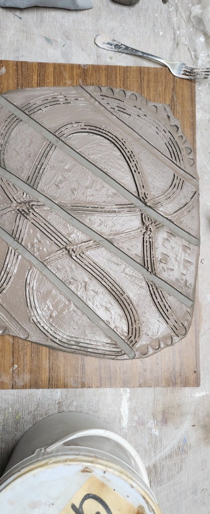
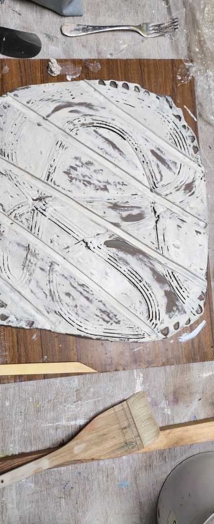
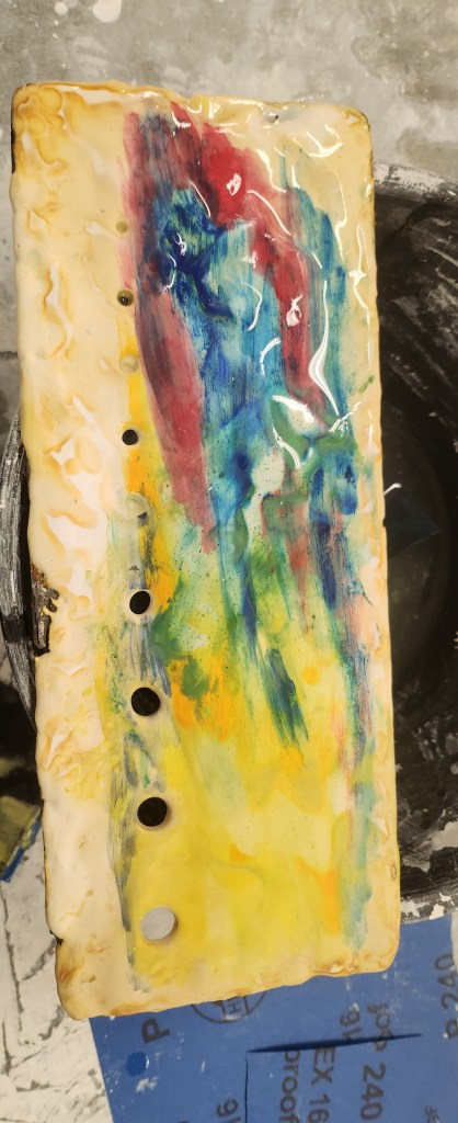
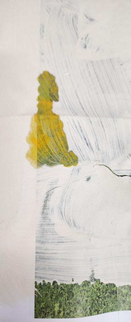
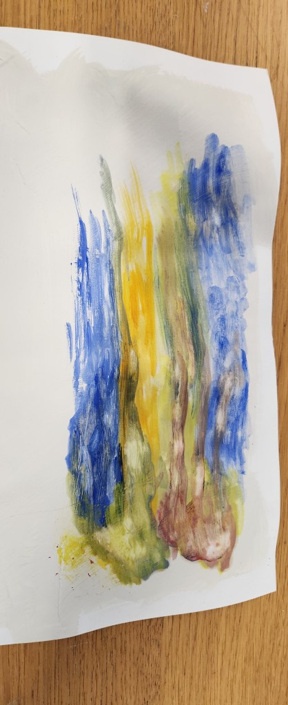
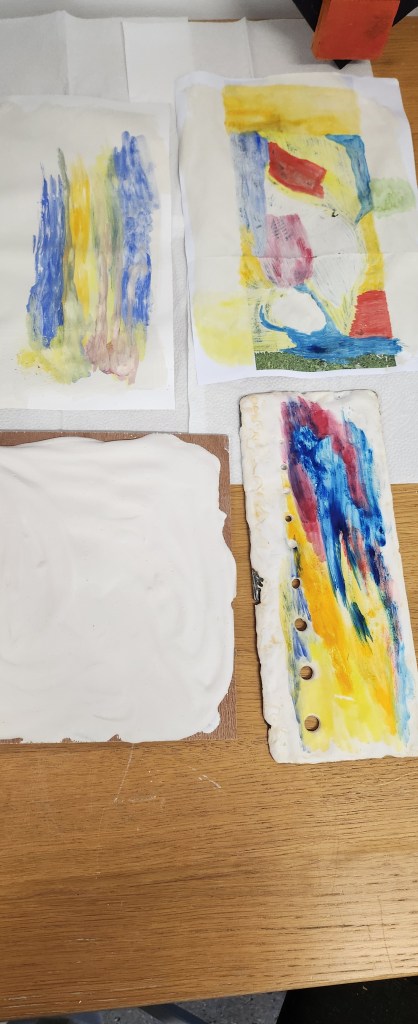
What I take from this whole year is that from one photograph I have created several pieces of artwork, using a number of different mediums.  I can decide to either follow these skills and create more refined ceramic pieces as either unique pieces or limited editions.


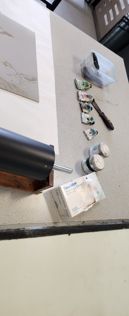
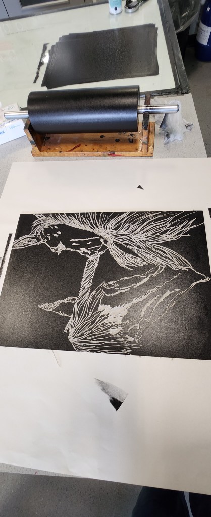
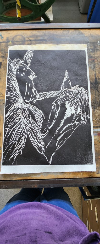
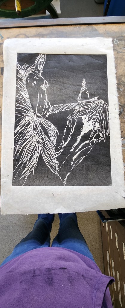
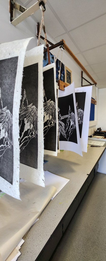
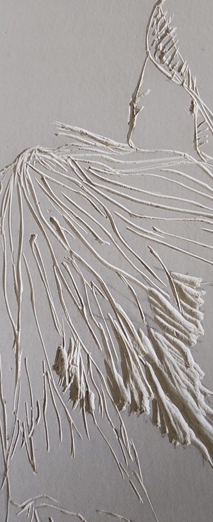
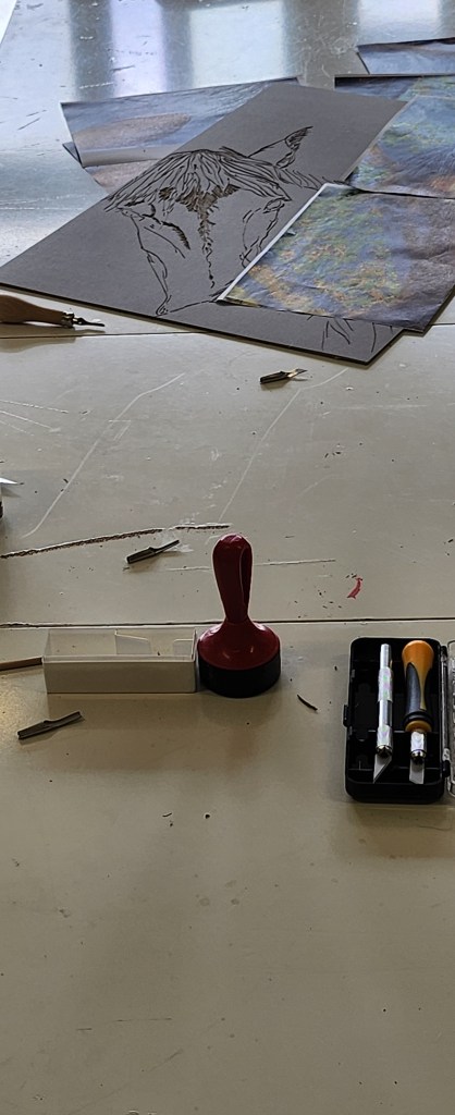
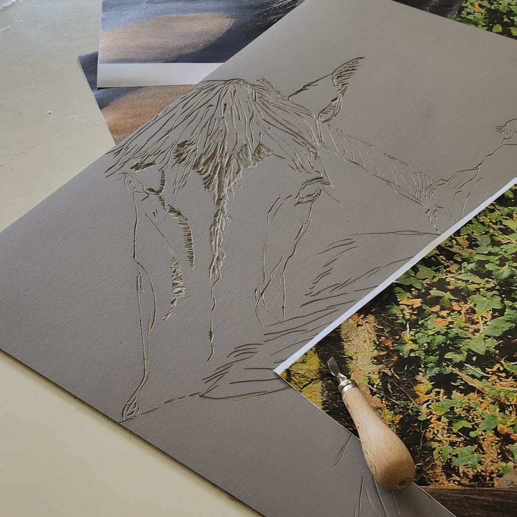
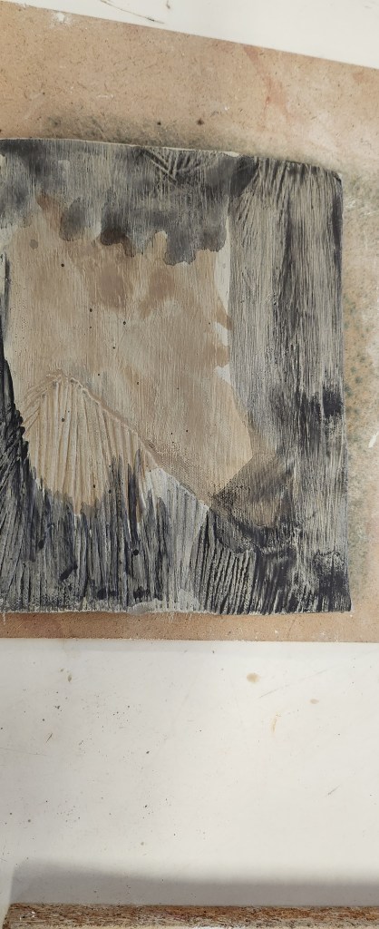
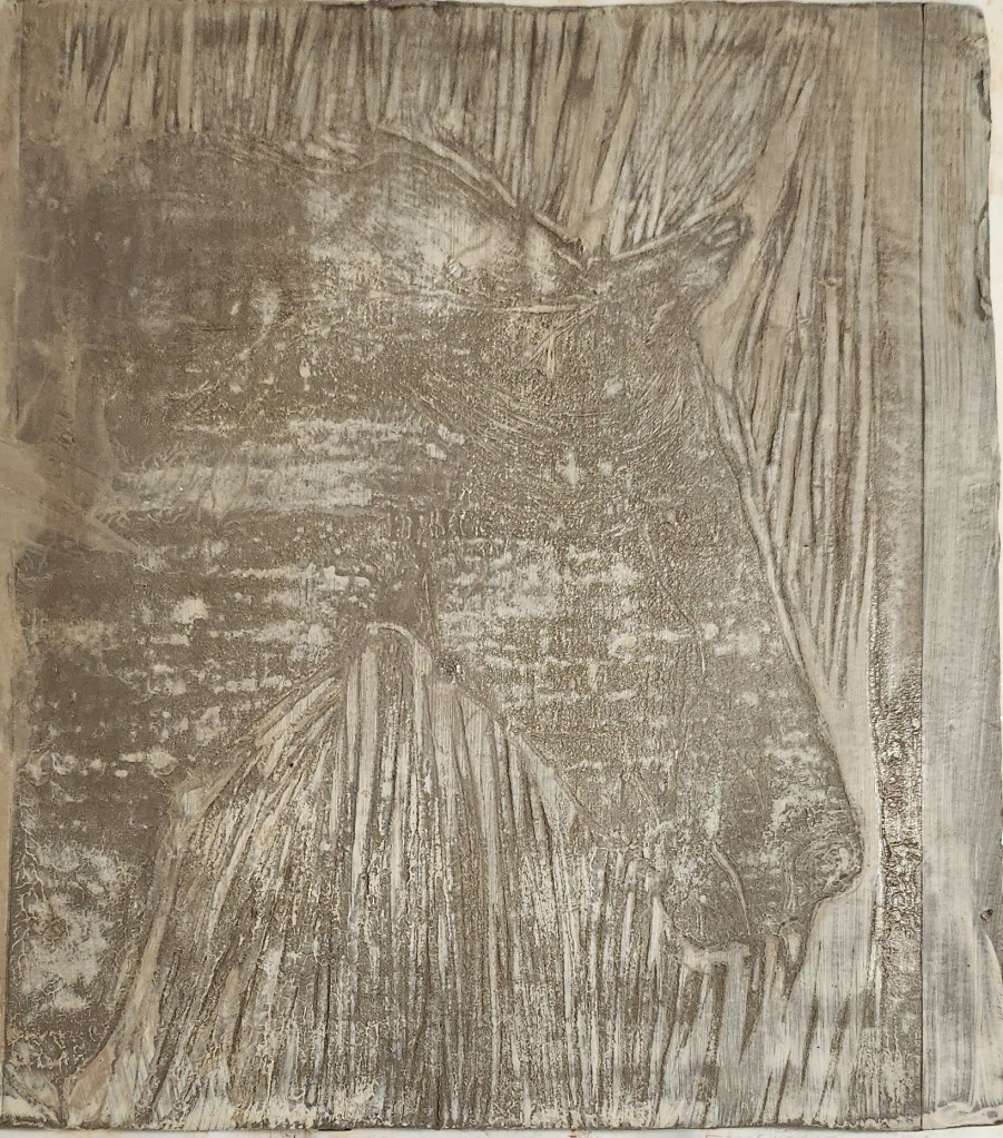
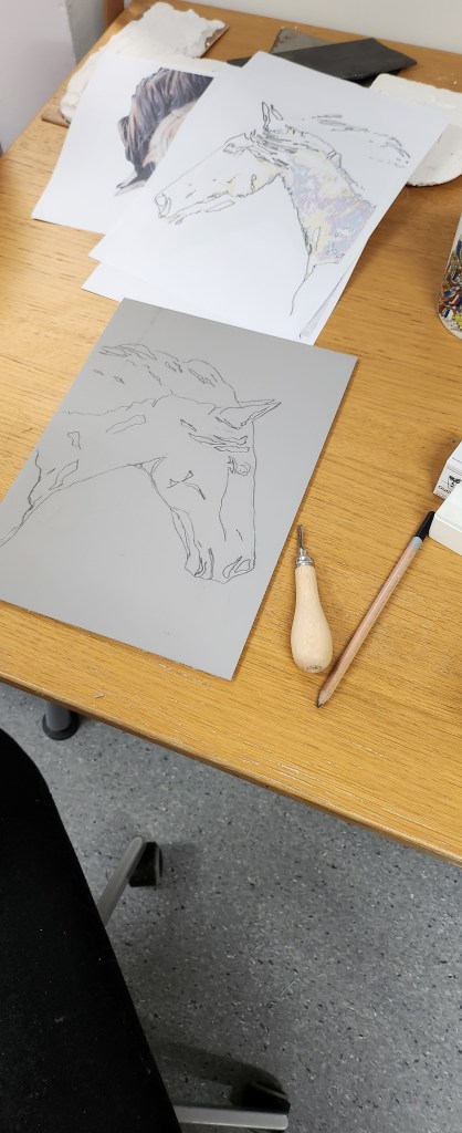
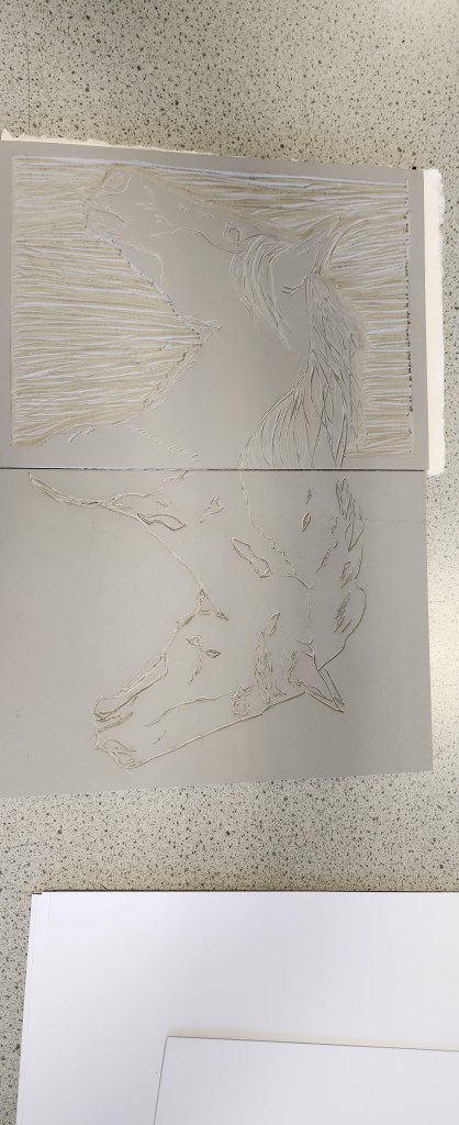
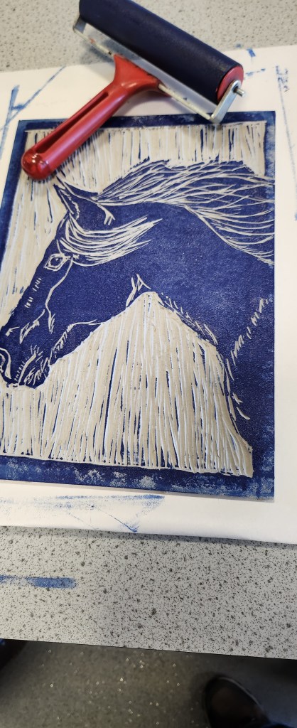
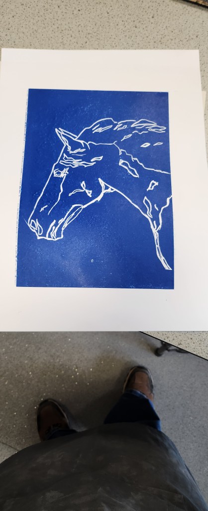
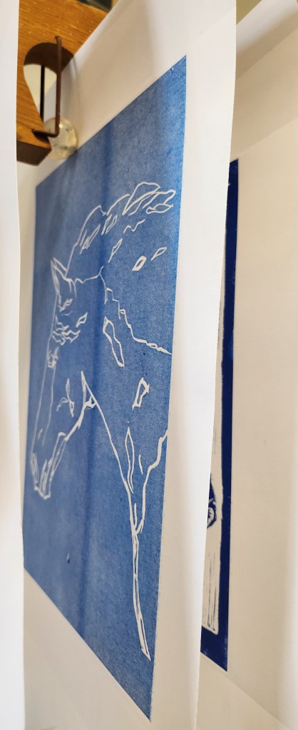
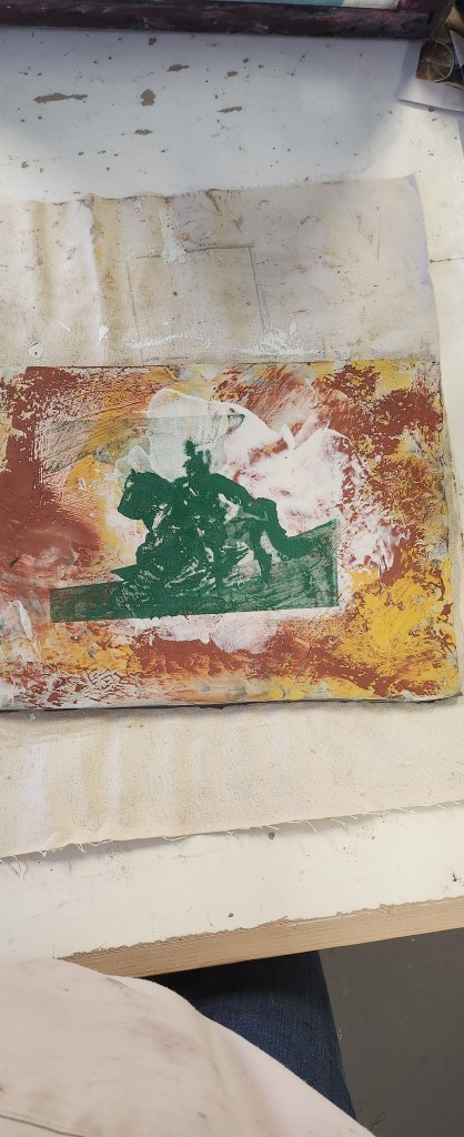
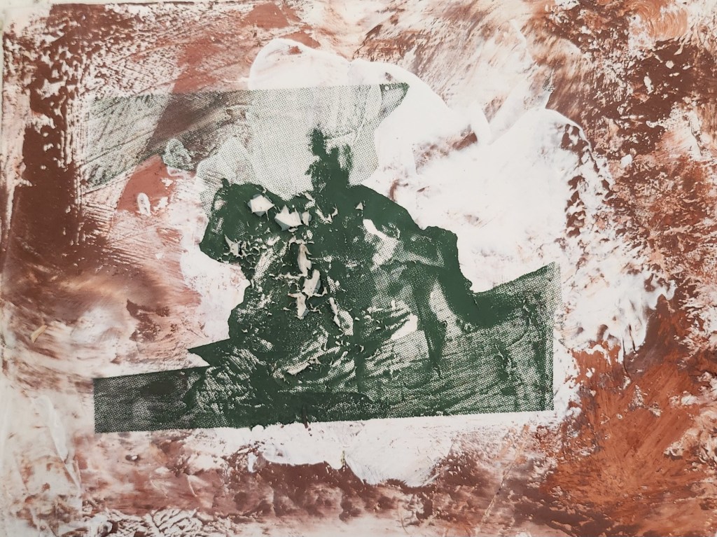
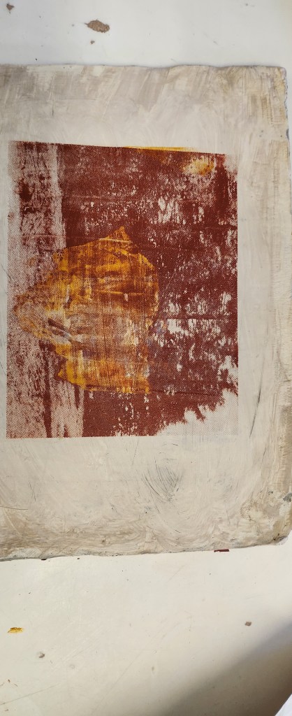
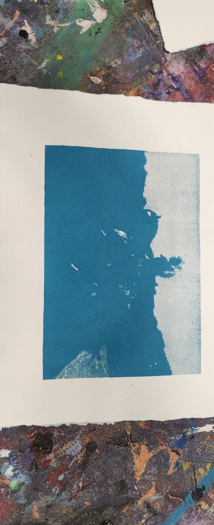
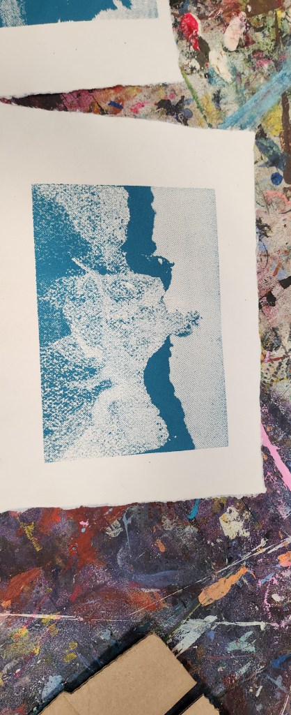
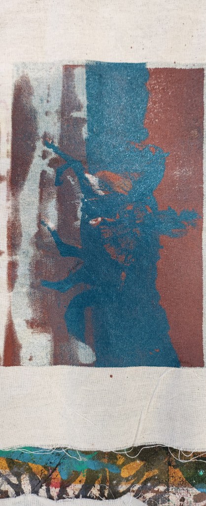
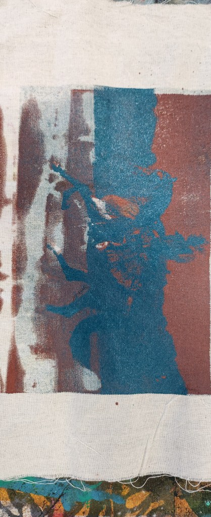
I also have a couple of linocut pieces that I can use again should I ever be lucky enough to have a
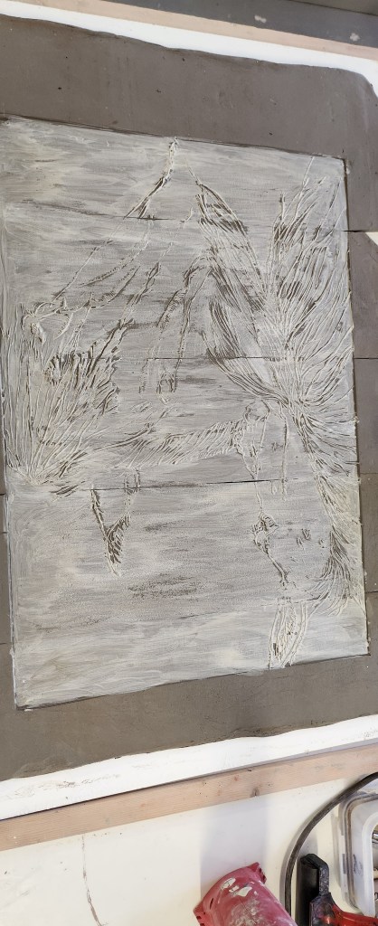
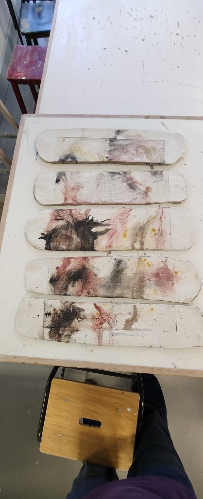
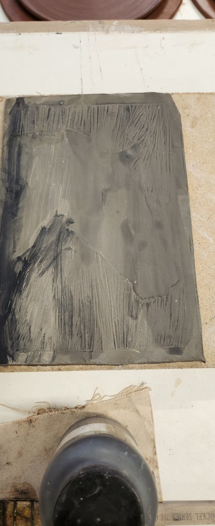
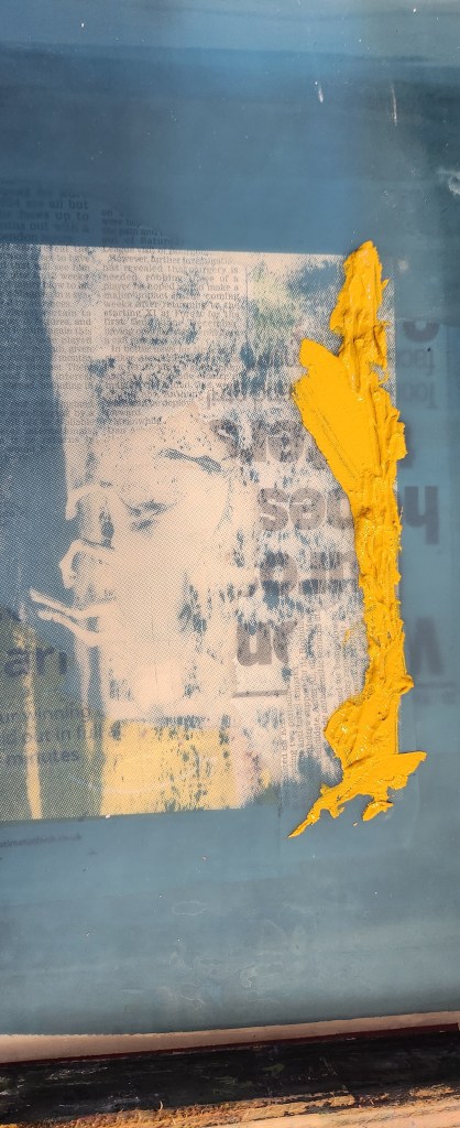
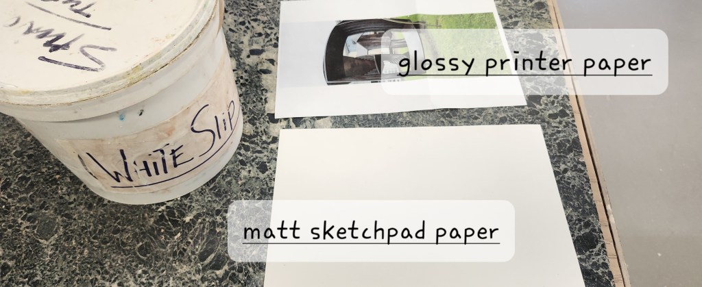
back catalogue and someone requests it.   Finding images to use for this process, and image transfers is not going
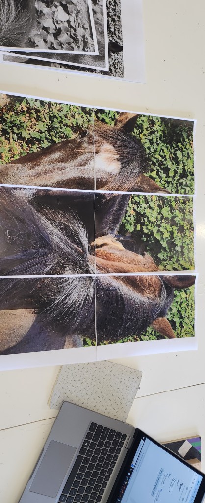
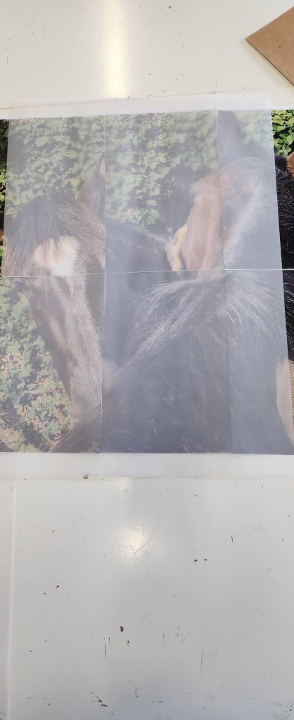
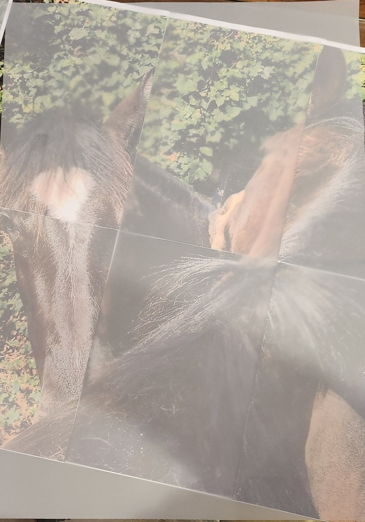
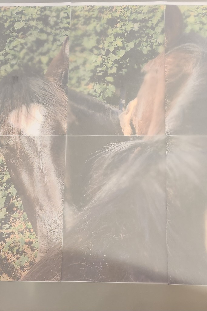
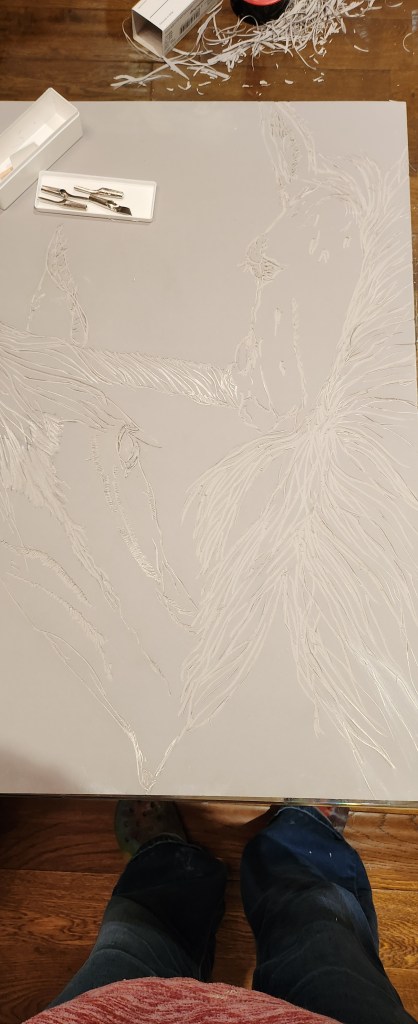
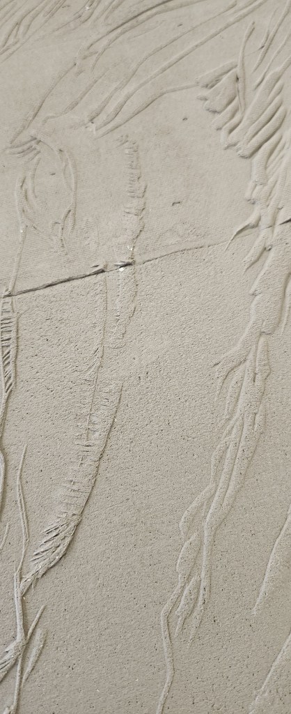
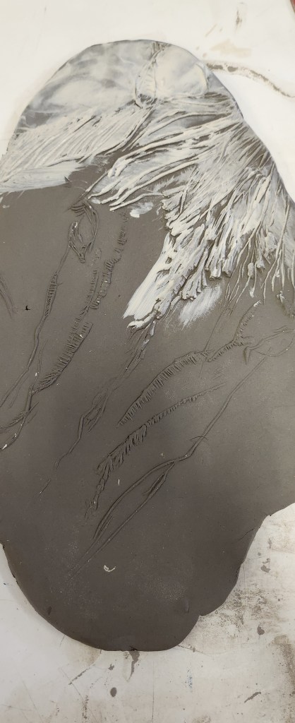
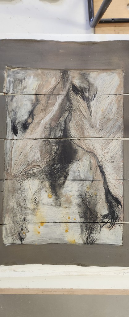
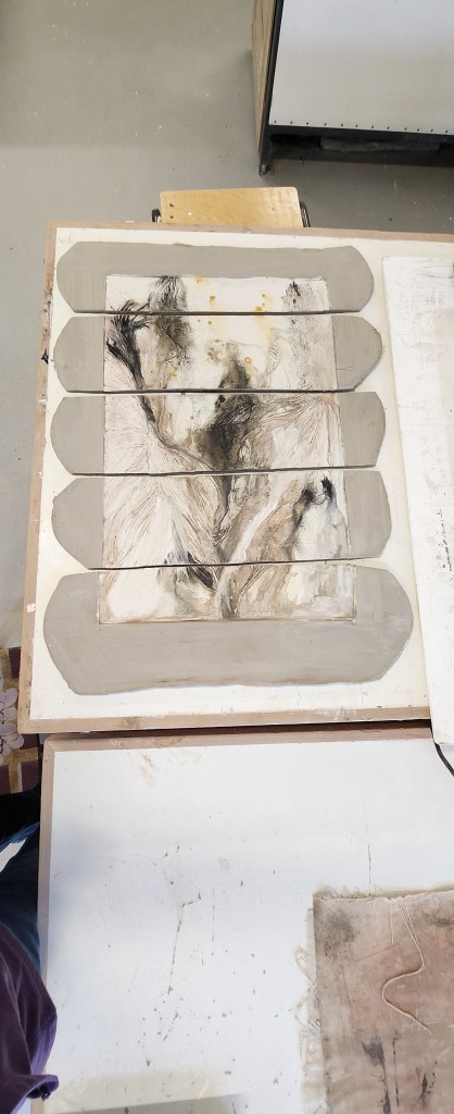
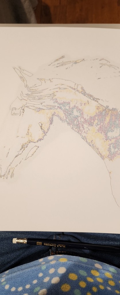
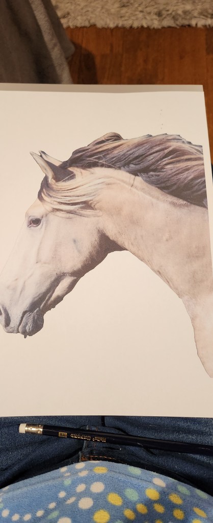
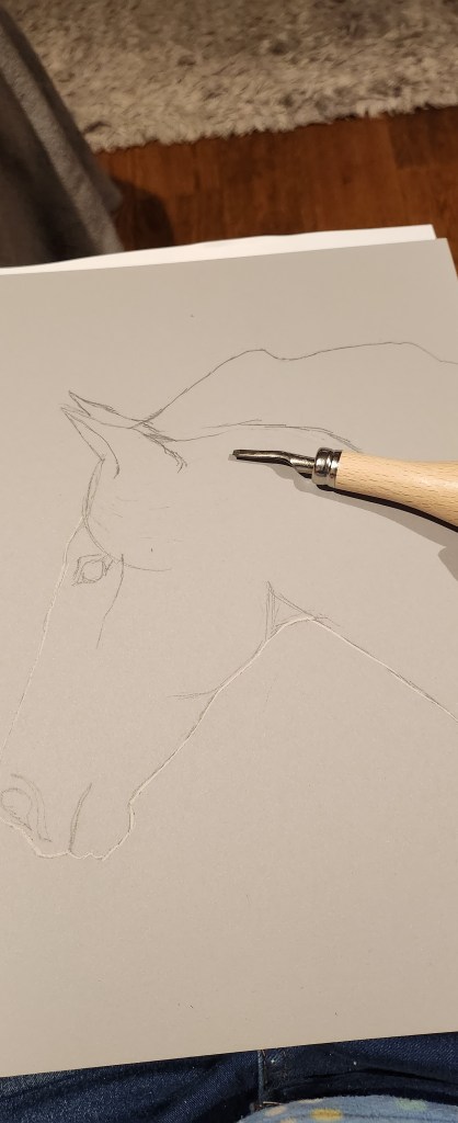
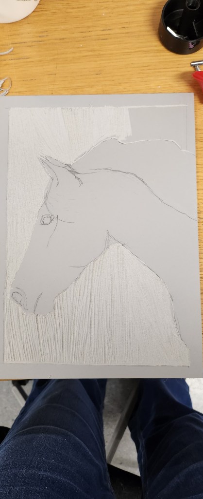
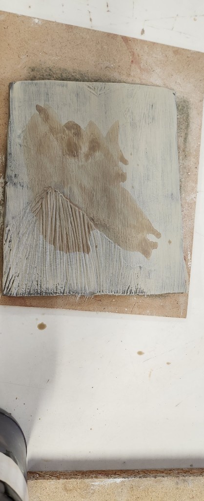
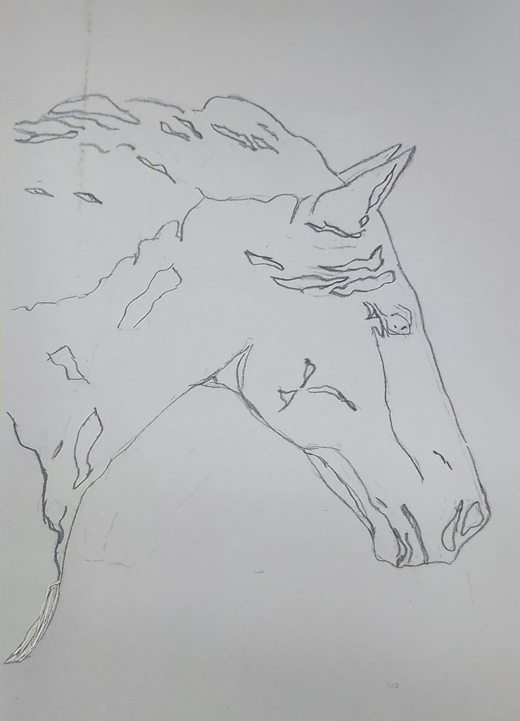
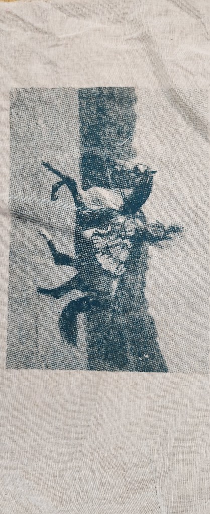
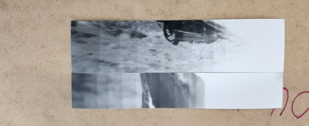
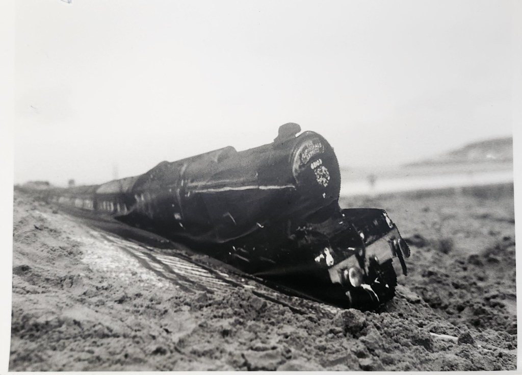
to be too dificult as I have literally thousands on a hard drive at home.  I think realising that my passion is horses
and it’s a subject matter I know well, was a big turning point during the second part of the year.   I have a more
natural feel for the story I wish to convey.


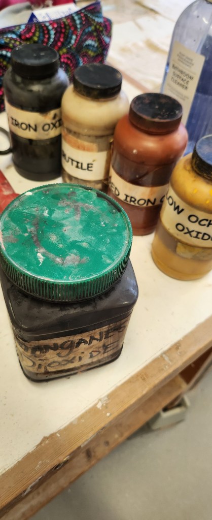
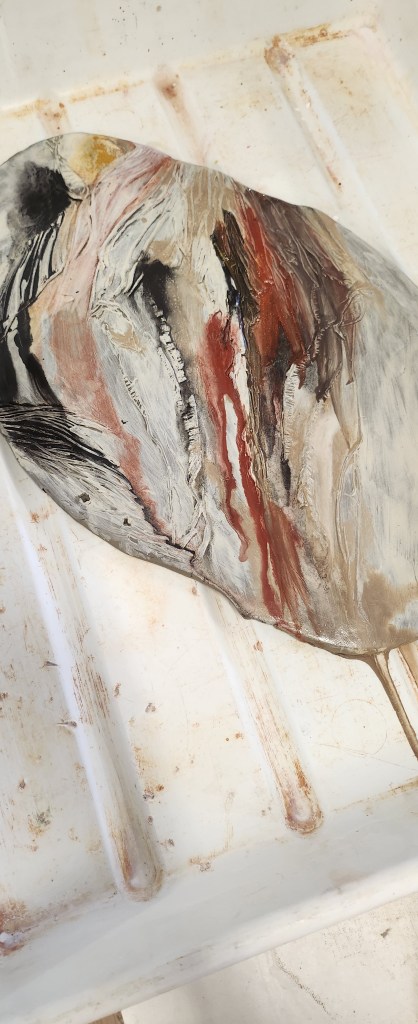
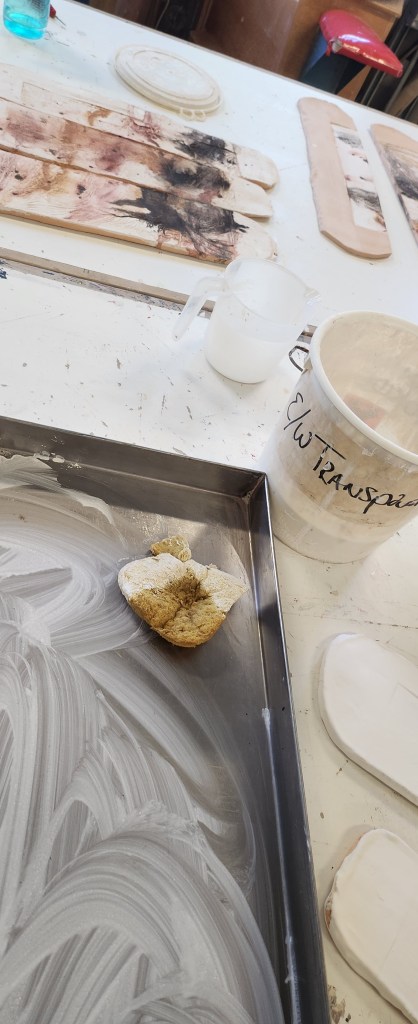
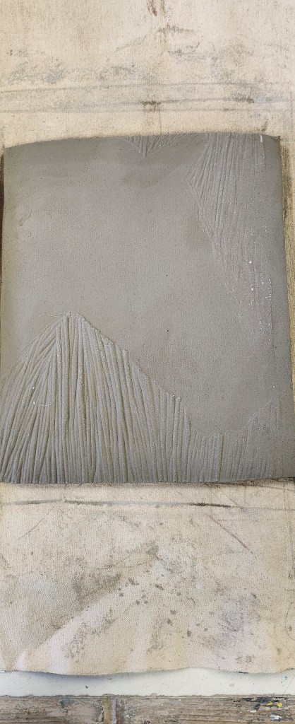
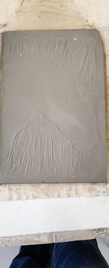
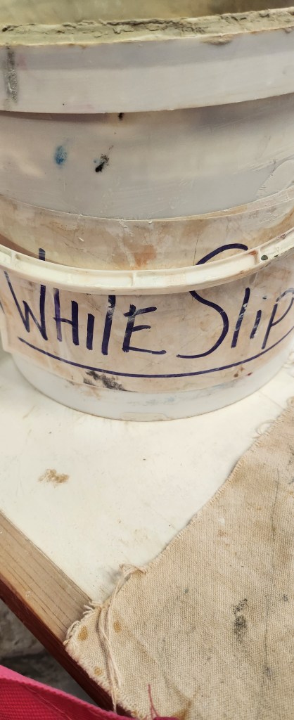
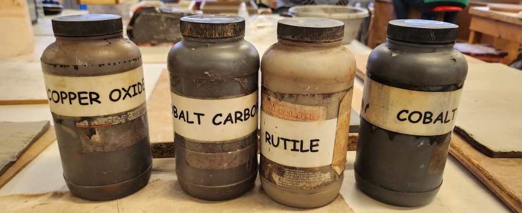
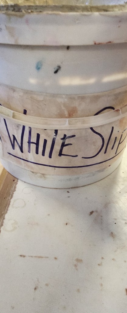
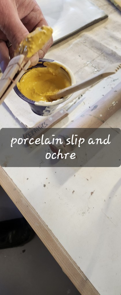
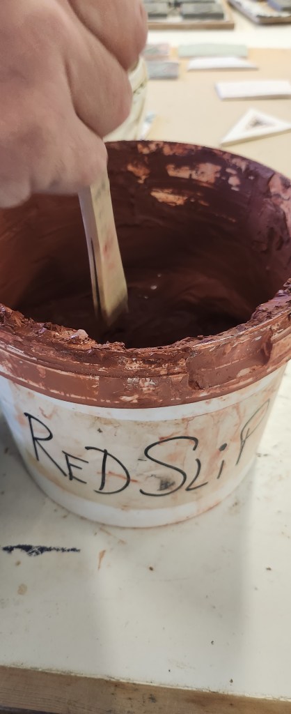
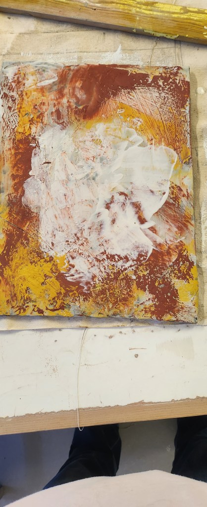
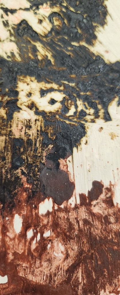
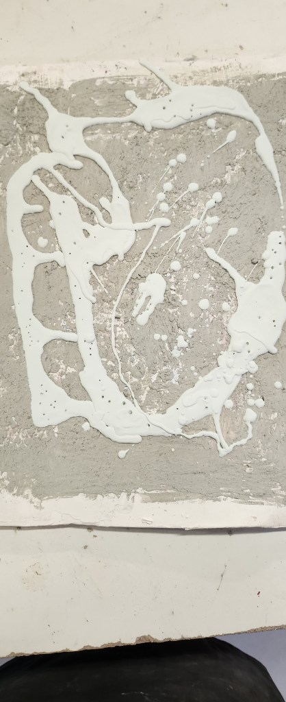
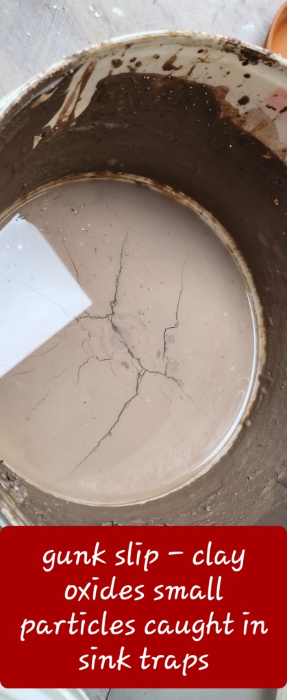
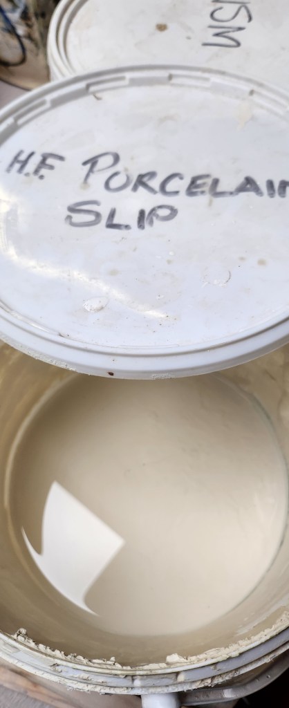
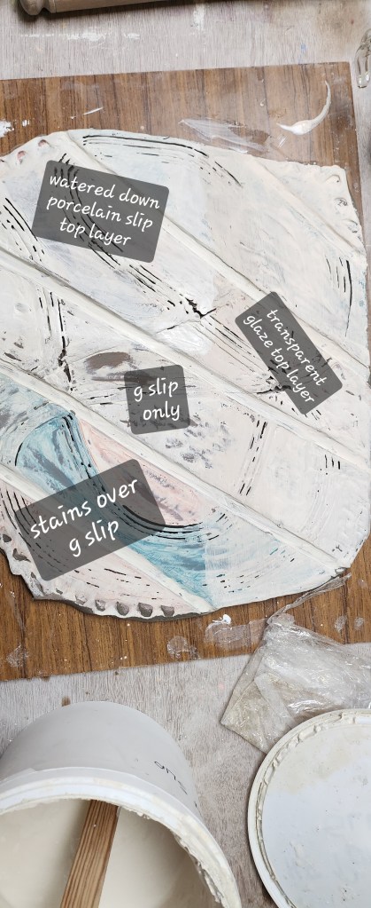
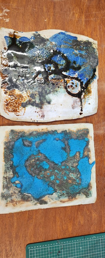
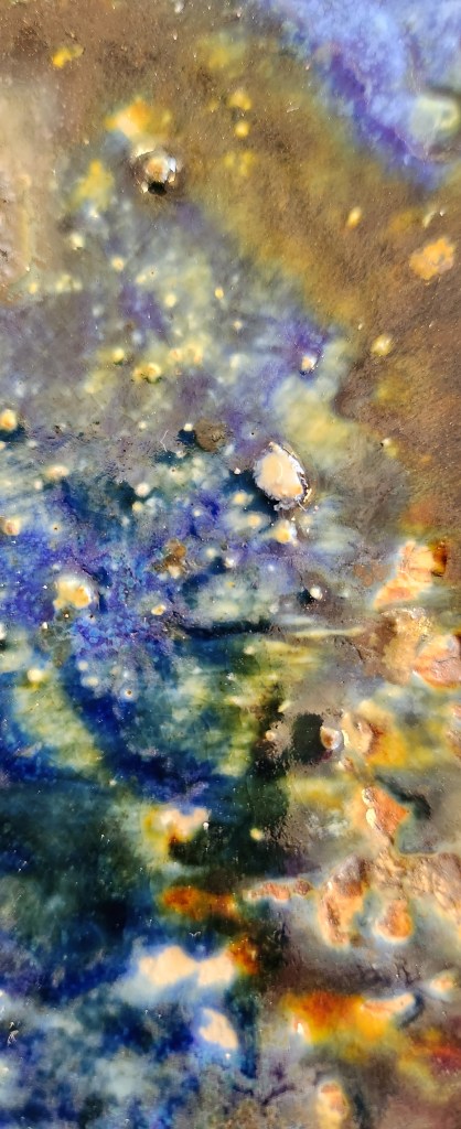
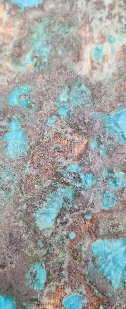
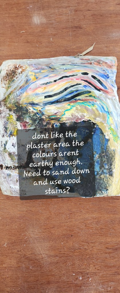
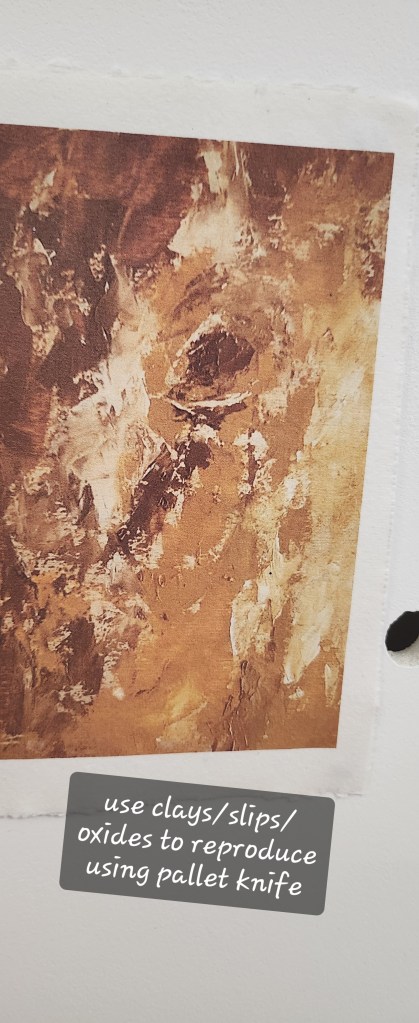
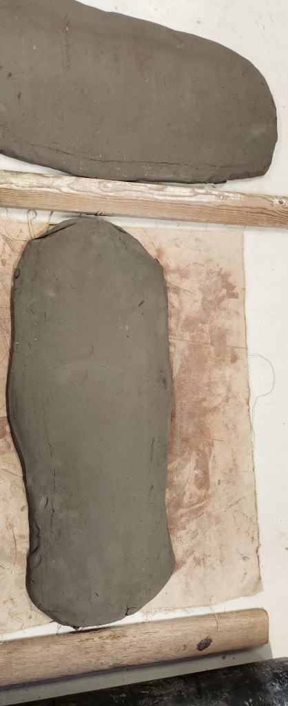
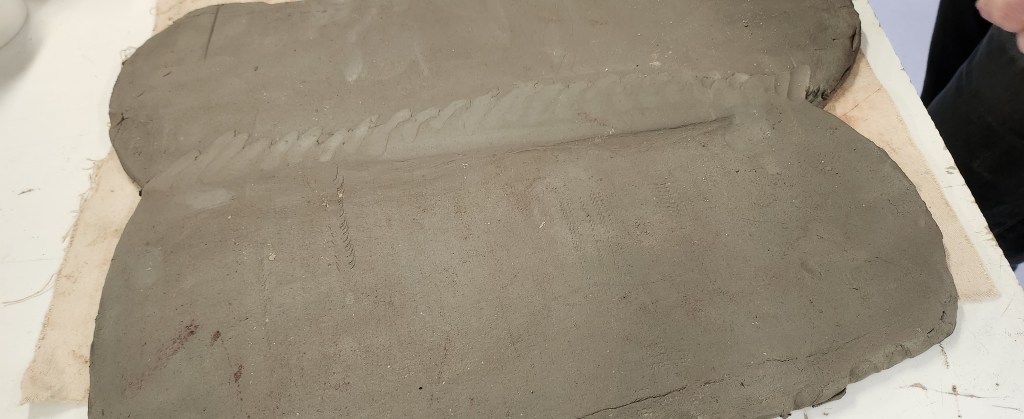
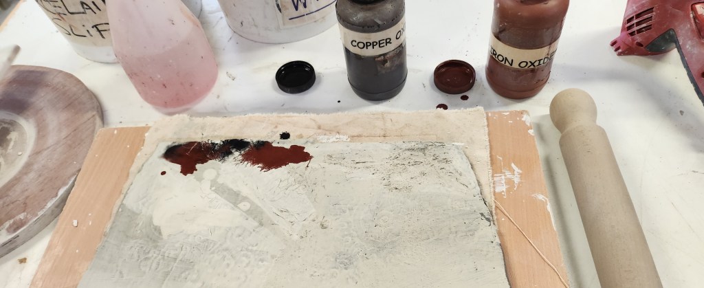
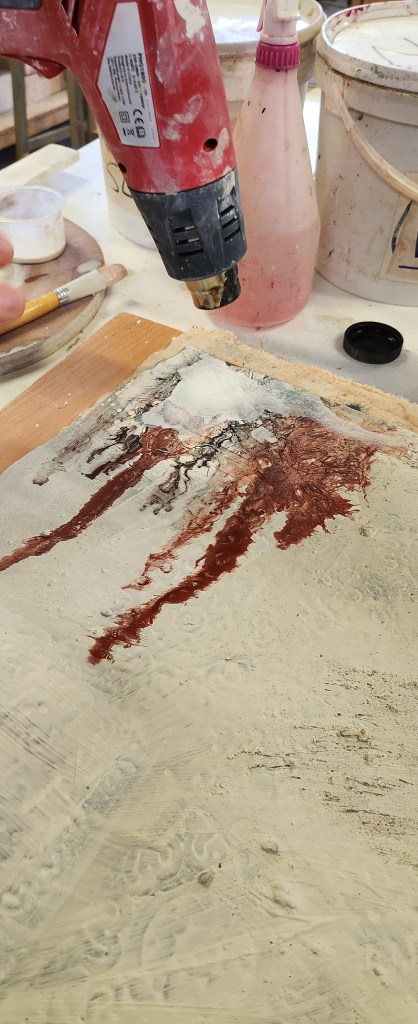
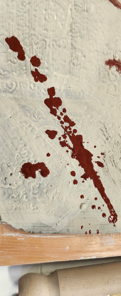
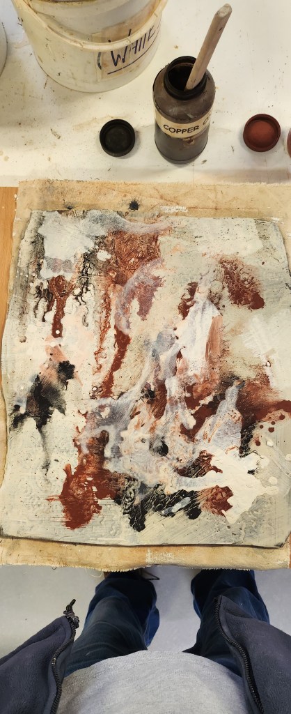
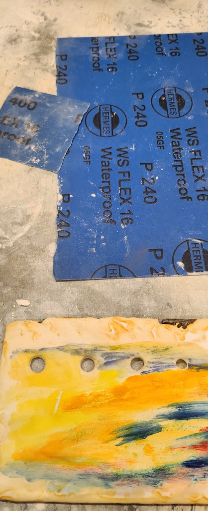
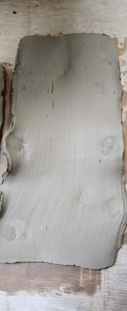
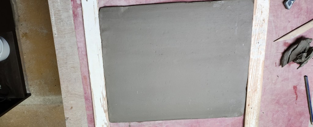
I am not sure I will concentrate on ceramics in the same way next year, but I will do this process again.  Now I understand a little more about the principles behind it.  I would like to explore using different colour slips and oxides, and possibly even experimenting with glazes to see what effects I can get.


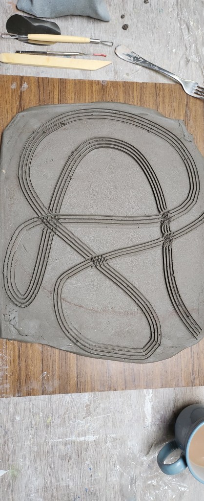
I think all the experimenting and trial and errors over the past year have only really touched on the tip of the iceberg where creating images, portraits, printing onto clay techniques are concerned and I still have a lot to improve and understand.  I have been learning techniques whilst also trying to work out how far you can push them or stray from the preferred way of doing a process.  This has at times made me want to choose the easy route.  I’m really glad I didn’t and that I have been pushed out of my comfort zone as I have stumbled across something that I really enjoy doing.


Would this be something I would offer a client? Yes I would.  I have had some really good feedback from friends with horses.  They like my work think it’s imaginative and unique.

And that is probably why I have struggled to find artists, ceramicists and sculptors to reference.     As I’ve said before, I still want to sculpt a horse.


the final touches

The last part of my main show exhibit is monoprint form the lino. I used the safe wash oil based ink, black only, and printed it out on to three types of paper. Standard Cartride, Cotton Rag Handmade and Nepalese Tea Paper.

Hanging the final prints to dry, I loved the almost translucent feel of the Nepalese plant based tea paper and knew that one of those prints was to be hung in between my two ceramic pieces.

I have also been working on a laser cut block design and decided to emboss a small piece of cotton rag paper and include it in my final display.

I decided that having both sets of ceramic slabs slightly offset was the more aesthetically pleasing way to hang the exhibit on the wall.

Time to take the plunge

I would like to say it took a lot of deliberation to decide on what to do. However, I enjoy the process of linocutting. My final piece is to be based on an A2 image cut in lino and then pressed into clay. The issue I have after talking it through will be kiln space as it all gets busy towards the end of the year.

My proposal is to make up one image in 5 different slabs of clay, that way they can be stacked in the kiln if necessary, making it easier to fill the kiln for firings.

I chose the picture of my two mares scratching, then worked out the best angle to trace it so that it had a bit of an interesting abstract feel.

It took me three days to cut the detail in to the lino deep enough to be pressed into the clay. I decided this time, to just cut out the highlights on the image, to try and define bone structure and seperation of the two horses.

The first set of slabs I covered all of them with white slip and then rolled the lino into them. I had two problems, one of my horses hadn’t really been cut deep enough into the lino and got lost in the slip, and secondly I hadn’t used enough pressure to roll the lino into the clay, it could have gone deeper.

Back to the drawing board I cut more boldly into the detail on the second horse. Then this time pressed the lino into the second set of clay slabs before adding white slip, which I only did in the centre.

It wasn’t as easy as it sounds to press, as even using the heavier roller, we ended up kneeling on the table to get the right pressure down on the roller.

you have to dust the lino to stop it sticking to the clay
I did a small test slab of clay and pressed part of the image into it, so that I could experiment a little with the oxides.

After practice, it was time to do the main slabs. The first set of slabs I did each one individually, the issue here was to try match the oxide patterns when I sprayed them with water and used the blower to get the direction of the colour.

I decided to find a tray big enough for the whole of the second set of slabs to go in as one piece of work and apply the oxides in a way that unified the patterns more. I still sprayed with water and used a blower to direct the flow of the oxides as I tipped up the tray. The issue with this is one of the bottom corners seemed to attract all the water and the clay cracked so and emergency repair needed to be done.

I was extremely pleased with how they came out of the bisque firing. Next step was to pour earthenware transparent glaze over each individual slab. My pouring technique is not the best as I am very cack handed but I am relieved to say I managed a reasonably even covering on each of the ten slabs.

The final fired pieces came out really well, the oxides had dulled a little but they were still very vibrant. I am really pleased that each piece are unique.

Doing this again I would definitely say the second way I approached the piece by pressing lino into bare clay, then adding the slip and the oxides after is the preferred and more logical approach.

How about Lino?

February 2024

From pressing items into clay, you get a texture. I really want to get, for example, a horse portrait on clay. The next thing to try besides sgraffito is pressing a lino cut into the clay tile.

source an image, remove the background, trace the image, I did this in photoshop as well as the traditional way of print photo, use tracing paper and then transfer onto the lino.

I then had to decide what I was removing, and cutting out the lino. On this image I decided to cut away around the head.

This is when I realised you had to cut into the lino quite deeply for the details to show in the clay.

I had a couple of small tiles so on one I pressed the lino into the tile at white slip stage and added the oxides after, on the other I washed the oxides onto the lino and then pressed it into the slip for the oxides to transfer that way.

I prefer my second choice, where I washed the oxides onto the lino and pressed it into the clay. It removes some of the white slip with it and leaves a mottled effect.

I then decided to do a slightly different trace design, but this time I cut it with the intention to just print on paper.

Because I am trying to stay true to being as sustainable as possible I tried using a water colour ink, and a safe wash oil based ink. I chose them both in the same colour so that I could do a comparison.

On application to the lino the waterbased ink dried a lot quicker, so you had to have your print roller and paper set up and ready go.

The water based ink took a lot longer to dry on the paper, and the edges of the image weren’t as sharp. Which in itself isn’t a problem, but I think if you ae planning to use watercolour ink, you maybe need to factor those points into size of print and detail of the image.

I really love the two images together, and I printed out on Khadi Cotton Rag Handmade paper. I use Khadi papers because they are ethical and sustainable, and support the local enviroment and communities in India and Nepal.

Screen Printing

January 2024

Another way to transfer an image on to ceramics is by screen printing. I had two images that I created as greyscale images, printed out onto acetate and then exposed on the screen. I had a slab that I’d made earlier and using white slip dried it out slightly.

I am trying to recreate a look that resembles oil paint and pallet knife application. My tutor showed me how to mix up coloured slip using a small amount of white porcelain slip and yellow ochre. I then applied it with the brush, along with red slip and used the rubber kidney to mix and blend.

The centre is where I wanted the image to be so I used white porcelain slip to lighten it a little. I then dried them off. Using the screen in the same way you would when printing on paper. Instead of ink I used green slip and pulled it down across the tile. I found it was easier to do evenly if I went back over with a rubber kidney.

It had to dry before going in a bisque firing. I was quite pleased with the outcome. When it came out the kiln however it had flaked a little. Talking things through with my tutor and the technician, using this technique again I will need to ensure the slip used is of the right consistency and not too thick.

I still glazed it with an earthenware transparent glaze.

I practiced again with the other image on another slab, using the red and yellow ochre slips. I did the background first and then went over the horse, with the second colour. It didn’t quite work out and was kind of a splodge. On reflection, I don’t think I had let the screen dry long enough before doing the second colour.

I then ‘painted’ around the image and blended the edges, rather than painting the whole slab first with the slips, as I think the first time around there was slightly too much. I really need to do a lot more of these practice slabs to get the desired effects. A lot to think about with the consistency of the slip you are printing onto, and the consistency of the slips used to print with.

As I had the images on the screens, I decided to try printing onto material and paper. I was struggling to dry the screen properly between tests and the ink wasn’t pulling down evenly. Although, I have some interesting happy accidents and ghost images on paper.

It all gets a bit messy….

December 2023

The original slabs are now ready to be glazed.  I’ve zoomed in on some of the details it’s interesting how the oxides have highlighted the texture in some area, but in others they have got a bit lost.

I like how the stains have come out with the image transfers.  This has been a successfully experiment.  I need to experiment a little with glazes so unfortunately some of this detail is likely to be lost.  I found using the stains to do this kind of image transfer a good idea and I will park this for now and revisit it at a later date.

Choosing glazes, I’ve gone for a favourite of mine and two that I haven’t used before.  In the interst of being loose and experimental – I just jmkind of splodges it on, didn’t worry about even pouring, or I brushed it over the slabs.   The glazes have their own chemistry and can affect each other where they blend or are over each other.   The also affect the oxides, and I struggle to remember if I need an earthenware or stoneware glaze to make them retain their vibrancy.

Gaps in my knowledge are the temperatures things need to be fired on – its not because I’m not told, my brain just struggles to retain the information.

I ought to say my slab making is getting better, but it’s still a struggle to getting the thickness I want whilst keeping the surface as flat and even as possible.

This time round, I decided to make textures by cutting into the slab with tools.  I used the different quarters of the slab to use various slips and stains.

Slightly unconventional I used a transparent glaze over part of the slab before it’s first firing.
This is now ready for bisque firing…  so next phase look at the slabs that have been glaze fired and take some things to another level of experimentation.
These two slabs have come out of their second firing.  The one with most of the blue, this is the slab that had the stains for image transfer, will be used for screen printing on.

The other slab with the textures, I will use to carry on with my plaster experiments.

I like some of the accidental colours and textures where the glaze covering was a little thin.
Back across the corridor from. The ceramics room into the plaster room.  Mixing up a small amount if plaster to adhere to the tile.
I did use a small amount pva glue to help it purchase, but also got my fingers crossed that the texture in the grittier areas will give the plaster something to attach too.

This time I decided to use water-based oil paints on the plaster, they were a lot more vibrant than the watercolours. In fact they ended up being slightly too bright. I muted them by sanding them down and using inks over the top, mainly nut brown.

I also used a sponge and dabbed the oil paint over other parts of the tile, unless it had pva glue under it wiped of really easily. They may seem like obvious points to a lot of established ceramicists but the point is I need to be able to say why I won’t be using these techniques and what I have found by doing things in a slightly crazy order.

Looking at this I will probably remove the plaster area and take this back to the original glaze tile, because I liked the way the oxides and textures worked together.

This is something I did last year. I would like to reproduce this loose feel using clay slips and oxides. I think this image is definitely what is becoming known as my style and what I enjoy recreating.

Slabs and Textures

8th November 2023

I have it in my mind that I somehow want to use clay as my canvas and create art on it. A way of combining my love of working with clay and painting. My usual work with ceramics is either modelling lumps of clay or roll pots and vases of varying sizes and decorating with slips and glazes. I want to take this further and create something a bit unique and unusual art.

My rolling out skills are not great, everyone says it’s just like pastry and baking etc. The problem here is I don’t bake and if I need pastry I tend to cheat and buy it ready made/rolled. So I have two long thing pieces of clay, but I want to create a square slab. This is where I learnt a new skill, joining the two slabs together and cutting straight edges and adding to the corners until I had the shape I needed.

Once the slab was rolled out and reasonably evenly square, I used white slip and porcelain slip in different areas to get different shades of white/cream and used embossed wallpaper to press into the wet clay. I aslo sprinkled on different textured grit/sand so that some areas were smooth and others you could feel the raised textures.

I wanted to add colour so I used oxides. I applied the oxides by splashing it on using a brush, then holding the slab up at an angle I sprayed water on, to get the oxides moving. I used a heat blower to help move the water around as the oxides dried.
I like how the oxides started to pick up the textures and patterns in the clay. I am told I don’t experiment enough and allow myself to be looser with the applications/patterns. I find this really hard, as I really have this fear of failing, it is really hard to let go and I’m looking at these images thinking, “that’s it, you’ve ruined it.”

Whilst this was drying off, it was back to the plaster and sanding it down to see how the water colour paint had soaked into the plaster, if it blended well, how deep it went etc. I think it had a nicer effect after I sanded it, the colours blended into each other better. I found when I was painting the plaster that because it soaked up the wet it didn’t give me the opportunity to manipulate the paint and direct where I wanted it to go. It felt very streaky and in solid blocks.

I also made another slab. Unfortunately the clay had a number of air bubbles in it and this caused lots of long holes, so it had to be wedged so that I could use it again. The upside to it being wedged is that instead of being a rectangle it could be flattened and rolled out as a square, well an almost square. I still had to trim the edges and corners to straighten it off.

Experimentation with Plaster

4th October 2023

I want to use my own photographs, to create images. By that, I want to experiment with ways of transferring images onto different surfaces and paint over them with different mediums. I started by taking two sheets of paper, one glossy printer paper that had an image on it already and a blank piece of sketchbook paper. I then painted white slip on them and let it dry.

I found that as the slip dried it started to flake off the glossy paper and as I painted on it with watercolour paint, it lifted even more exposing the image underneath. I did find the watercolours were not as vibrant.
With the matt paper, the slip managed to find something to purchase because of the texture so it stayed without flaking. Even when it was painted over with watercolour paint.
Another experiment was using plaster on different surfaces like wood and metal.
I quite possibly put a little too much plaster on both, but that’s more to do with the fact that I am hopeless at measuring out plaster, especially if I haven’t done it for a while. I had to leave the plaster to dry before I could do any painting on it. What I do like is that the plaster reacted tot he metal and this rusty pattern made its way up through the plaster.

The watercolour paints were very vibrant on the plaster, although I had to do a few applications as the paint soaked into the plaster.

This has got me thinking about texture and I do like the natural ridges that have occurred in the plaster pieces. I probably won’t use clay slip on paper, it’s not quite what I am looking for as a finish. Although this early in the year I’m not really sure what I’m looking for.

Re-Frame Project Day 4

28th September 2023

I enjoyed today. We developed our film photographs. It was a good experience learning about the exposure unit and how to test the time needed to get the right exposure, and how to enlarge the image.

Follow the instructions on the cards, and fingers crossed it should all work.

Test Sheets – you have a piece of card that you move along the test strip at second intervals, then you count the number of sections along to give yourself the correct exposure. I love this because you are in control of the feel of the image, making it softer or sharper. I often thought developing film was shrouded in lots of mystery and difficult. It isn’t, but because of how my brain learns things, I will possibly need my hand held a few times before I feel brave enough to go it alone.

I loved this image, and I would have liked it to have been the one the rest of the team chose to be enlarged and put on the wall as our final image. It hasn’t been.

I really feel like I’ve stepped back into some dystopian novel the way the tracks appear from nowhere and go nowhere. The train is just abandoned on the beach.

Re Frame Project Day 3

27th September 2023

The weather forecast is a bit grim and today is the photograph your object in a completely different location to where it would normally be day. In view of the forecast one of the year one students took the train home yesterday and took it to the seafront with her family. She managed to get some photos using her own DSLR and large format film camera with the sunset in the background.

Start of the day and we had instruction on how to use film cameras that our tutor had requested from the Photography department. This is the first time I’ve ever really used a film camera since I got my first digital camera. Even then, I only ever really used the point and shoot and take your film to Jessops or Boots to get it developed. Anyway, digressing!

Myself and the other first year took the cardboard train down to Uphill Beach, trying to beat the weather to get some photos. We were quite lucky in sourcing a good location, as the previous weekend had been the beach races so we had mounds of sand to use. Because of the wind we had a few problems in getting it to stand up, so we used the sand to support the back a little bit. The effect of this was that it made the train look like it was coming out of the sand.

When we finished trying different angles to get the images we wanted, we then went back to Uni to develop the film.

This part of the day was the most interesting for me as I love photography and have never really been involved in the developing of my own film. Actually winding the film on the spool in the dark was quite a challenge.

Whilst we were waiting for the negatives to dry, I used the time to develop the images I’d taken with my DSLR camera on photoshop. The brief was black and white so really it was just sharpening the clarity, cropping and changing from a colour image. I could have set my camera to shoot in black and white – but honestly I can’t always remember when I’m on the spot which function menu is which.

Looking forward to tomorrow developing the images.