It all gets a bit messy….

December 2023

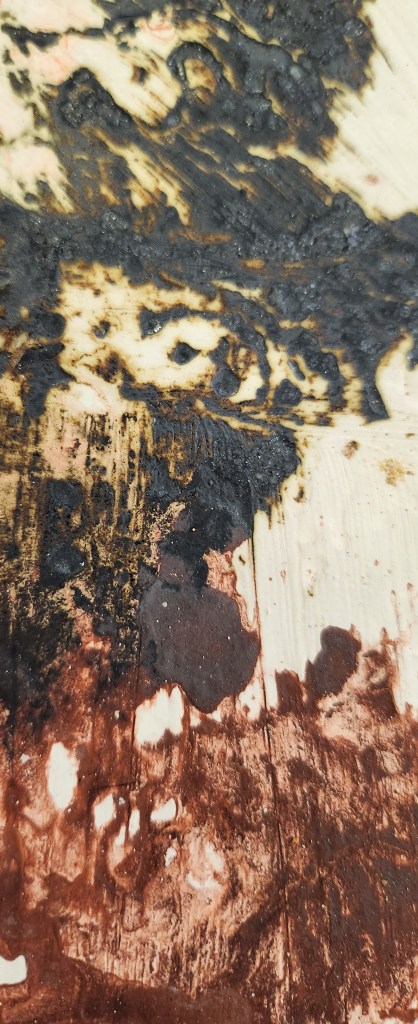
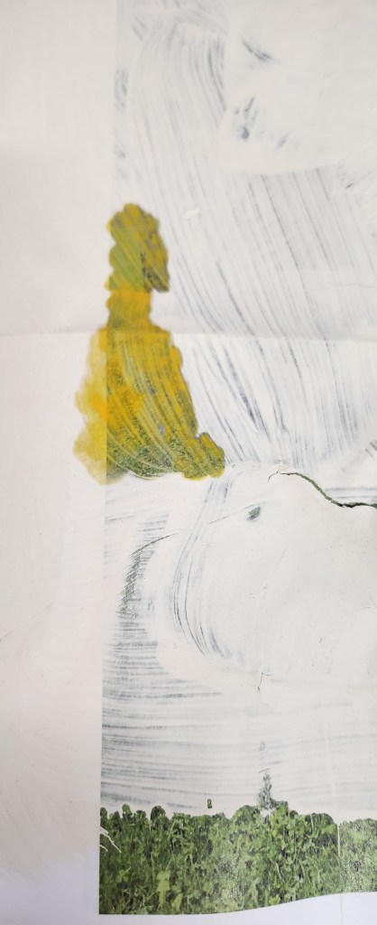
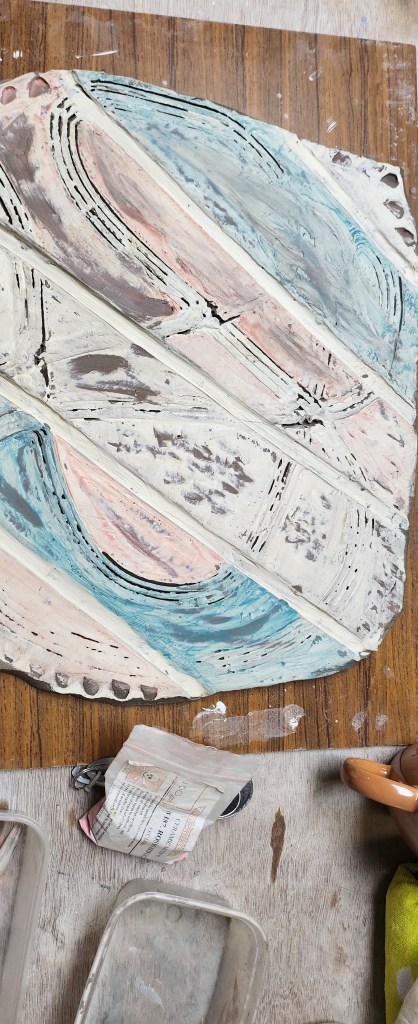
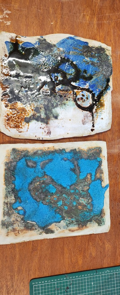
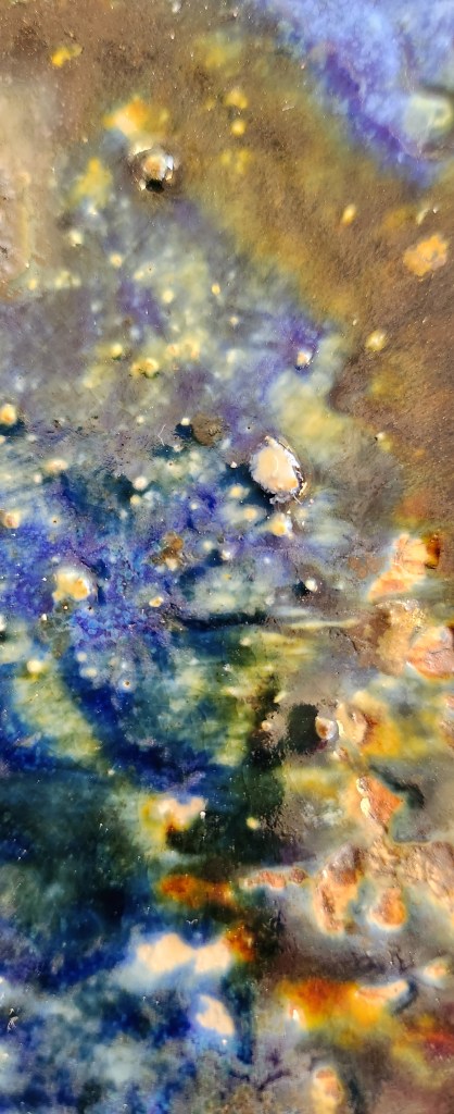
The original slabs are now ready to be glazed.  I’ve zoomed in on some of the details it’s interesting how the oxides have highlighted the texture in some area, but in others they have got a bit lost.

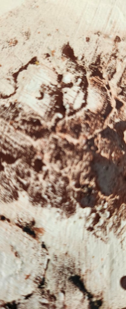
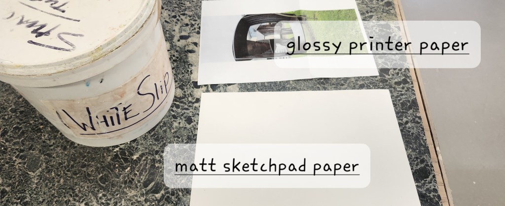
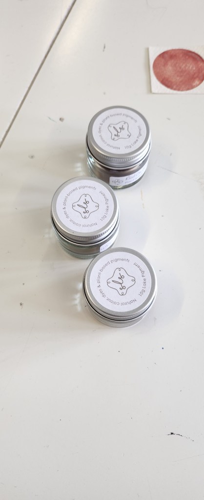
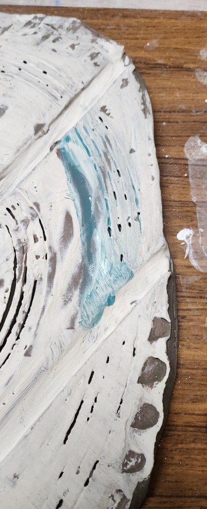
I like how the stains have come out with the image transfers.  This has been a successfully experiment.  I need to experiment a little with glazes so unfortunately some of this detail is likely to be lost.  I found using the stains to do this kind of image transfer a good idea and I will park this for now and revisit it at a later date.

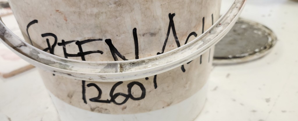
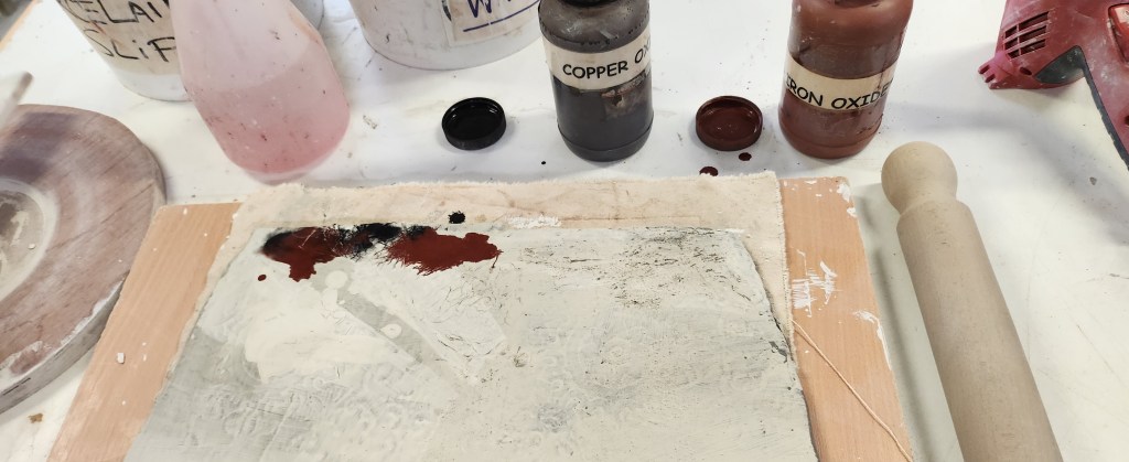
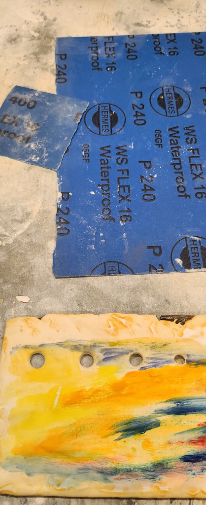
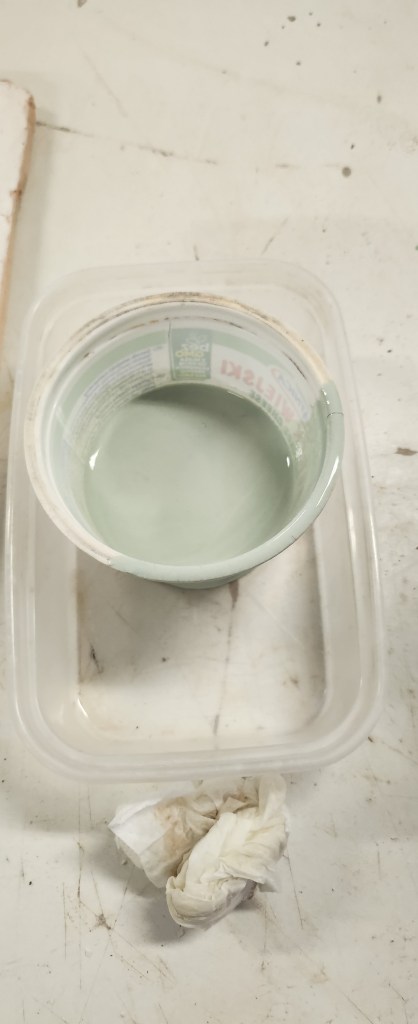
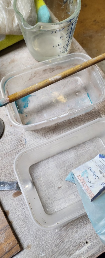
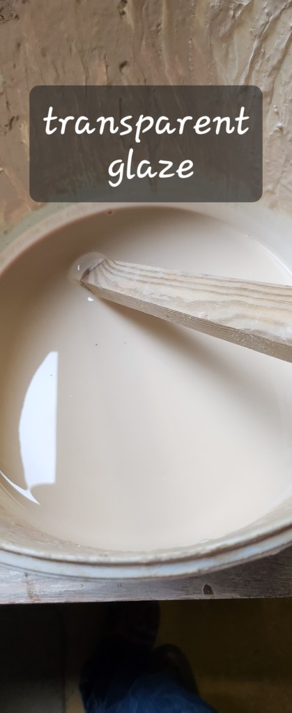
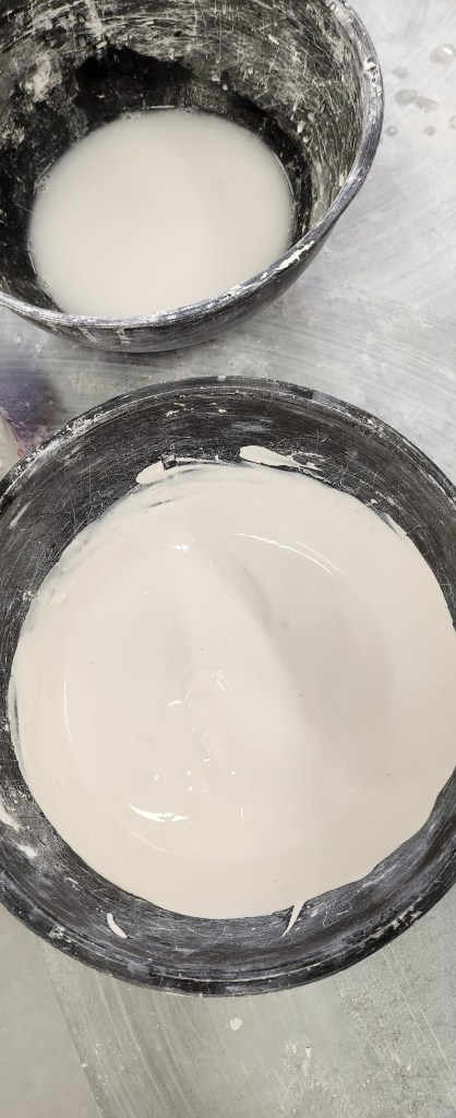
Choosing glazes, I’ve gone for a favourite of mine and two that I haven’t used before.  In the interst of being loose and experimental – I just jmkind of splodges it on, didn’t worry about even pouring, or I brushed it over the slabs.   The glazes have their own chemistry and can affect each other where they blend or are over each other.   The also affect the oxides, and I struggle to remember if I need an earthenware or stoneware glaze to make them retain their vibrancy.

Gaps in my knowledge are the temperatures things need to be fired on – its not because I’m not told, my brain just struggles to retain the information.

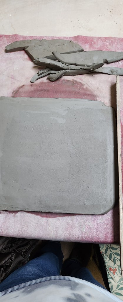
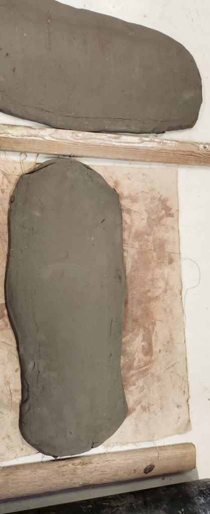
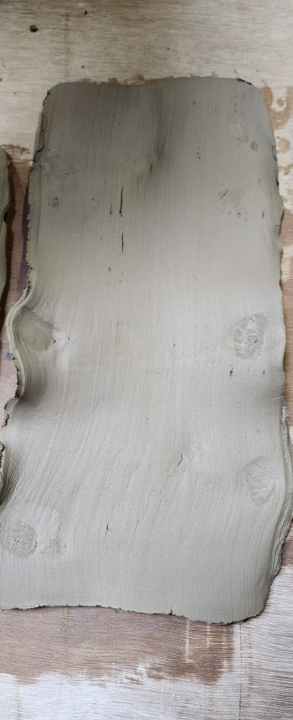
I ought to say my slab making is getting better, but it’s still a struggle to getting the thickness I want whilst keeping the surface as flat and even as possible.

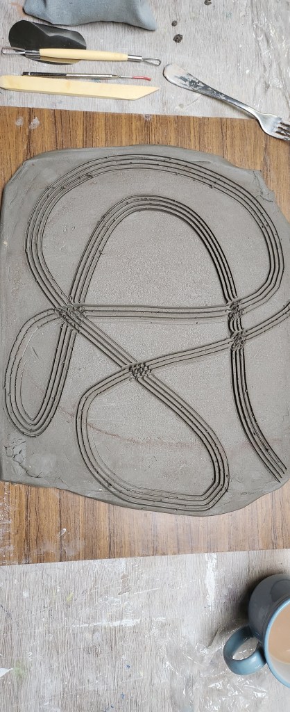
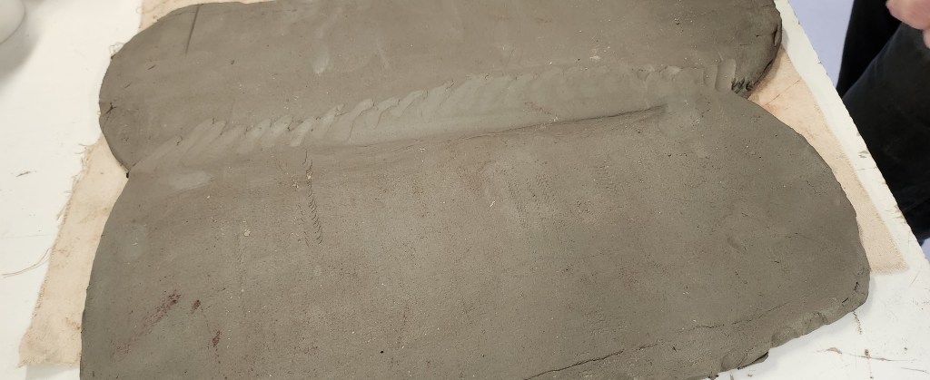
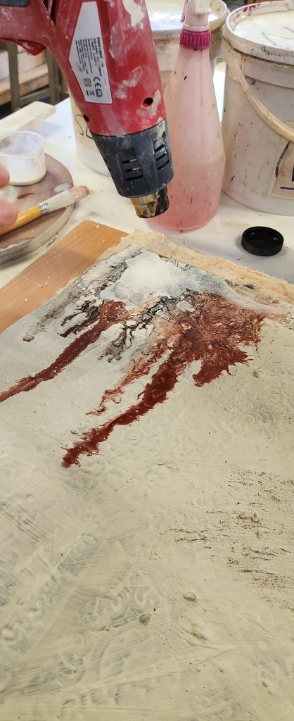
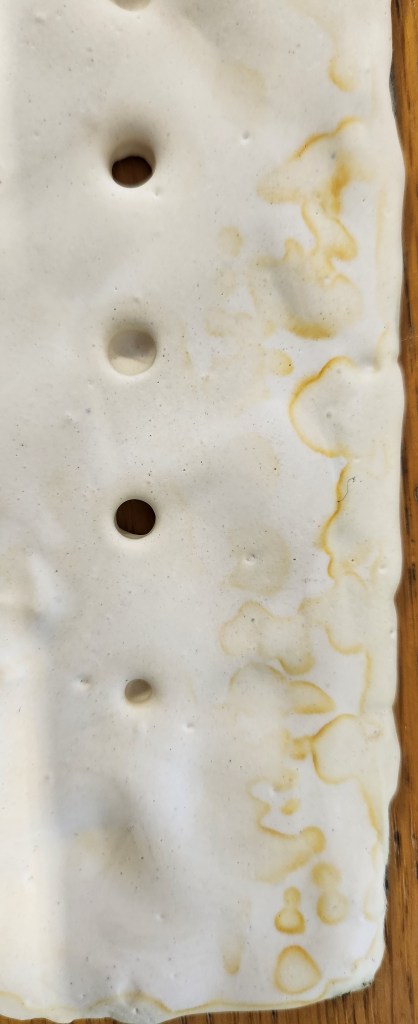
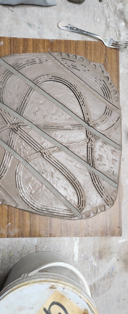
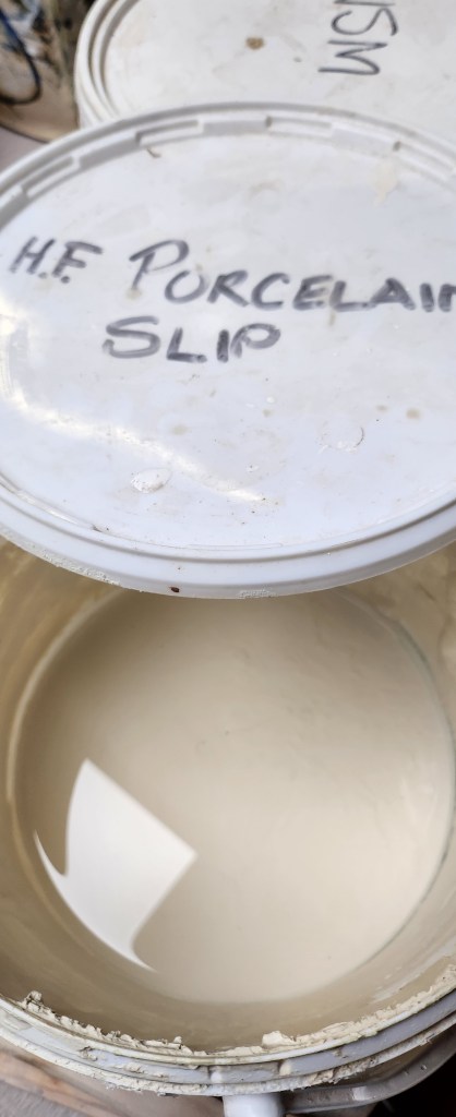
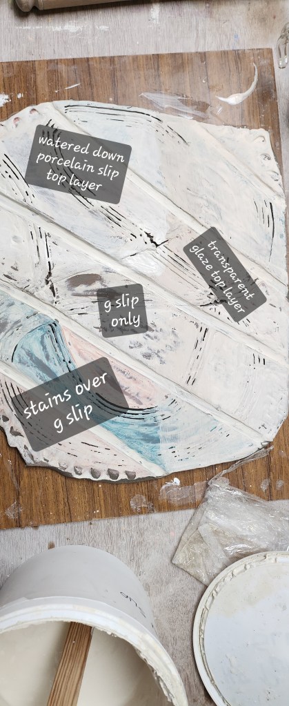
This time round, I decided to make textures by cutting into the slab with tools.  I used the different quarters of the slab to use various slips and stains.

Slightly unconventional I used a transparent glaze over part of the slab before it’s first firing.
This is now ready for bisque firing…  so next phase look at the slabs that have been glaze fired and take some things to another level of experimentation.
These two slabs have come out of their second firing.  The one with most of the blue, this is the slab that had the stains for image transfer, will be used for screen printing on.

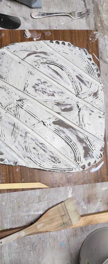
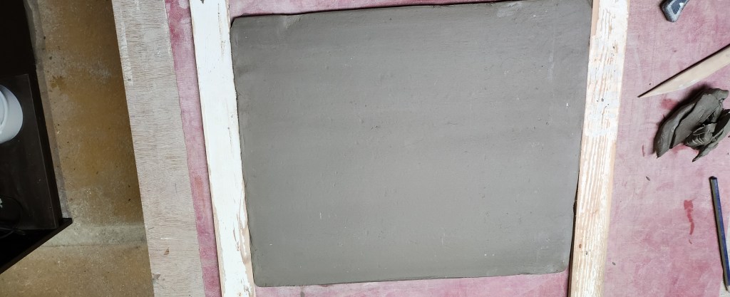
The other slab with the textures, I will use to carry on with my plaster experiments.

I like some of the accidental colours and textures where the glaze covering was a little thin.
Back across the corridor from. The ceramics room into the plaster room.  Mixing up a small amount if plaster to adhere to the tile.
I did use a small amount pva glue to help it purchase, but also got my fingers crossed that the texture in the grittier areas will give the plaster something to attach too.

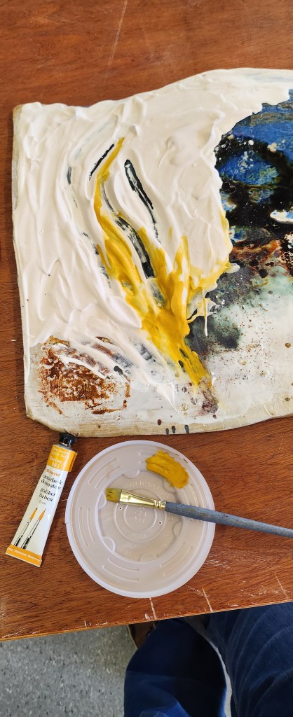
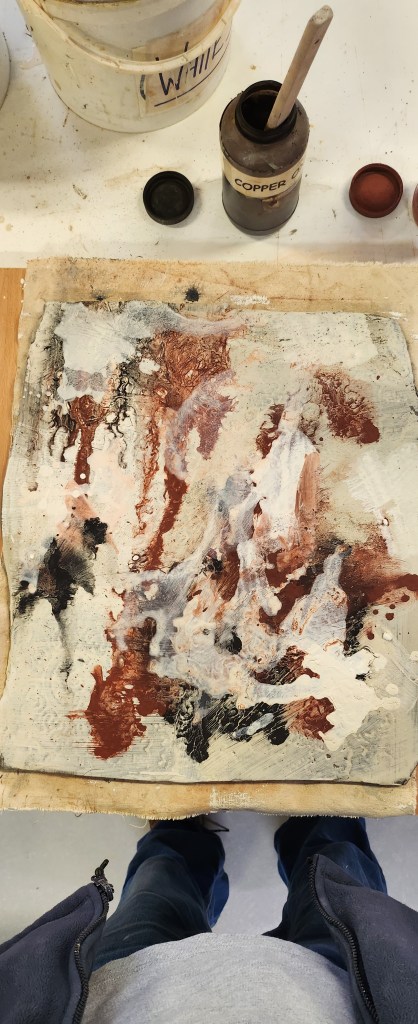
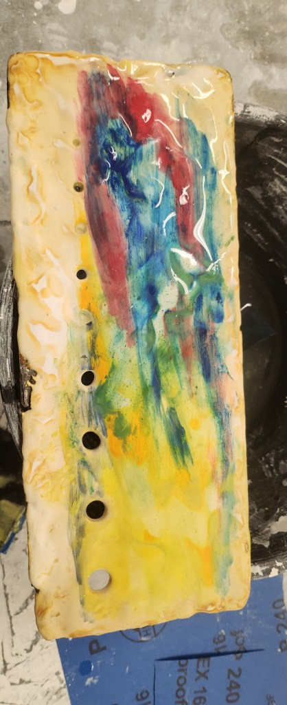
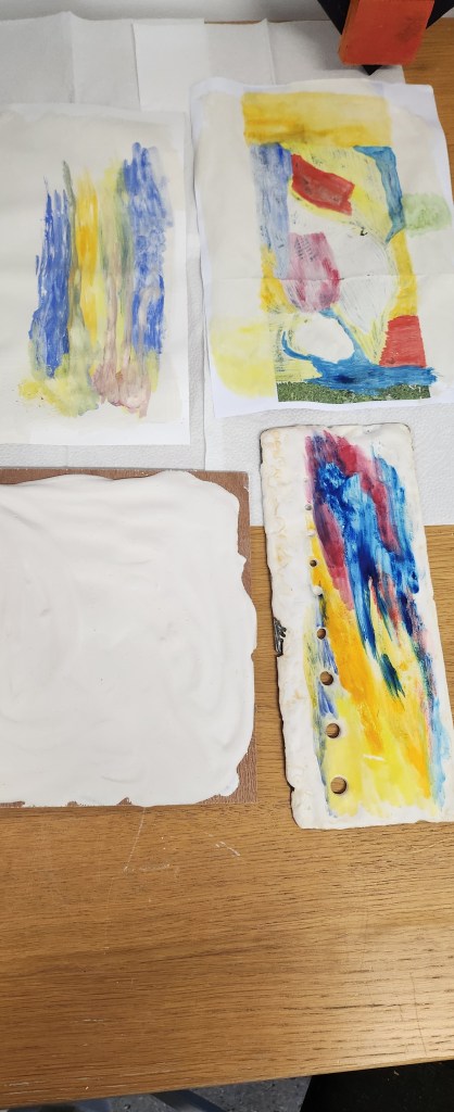
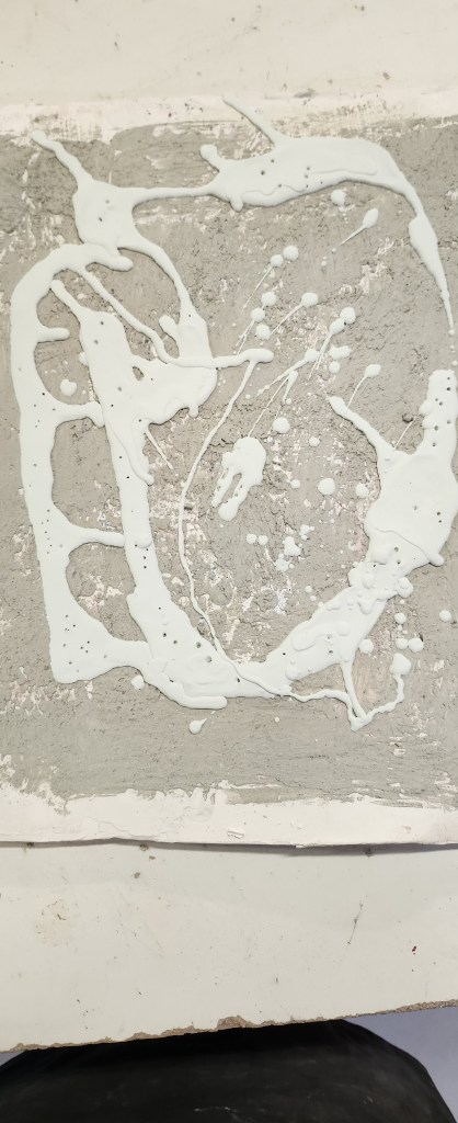
This time I decided to use water-based oil paints on the plaster, they were a lot more vibrant than the watercolours. In fact they ended up being slightly too bright. I muted them by sanding them down and using inks over the top, mainly nut brown.

I also used a sponge and dabbed the oil paint over other parts of the tile, unless it had pva glue under it wiped of really easily. They may seem like obvious points to a lot of established ceramicists but the point is I need to be able to say why I won’t be using these techniques and what I have found by doing things in a slightly crazy order.

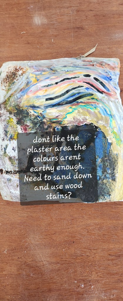
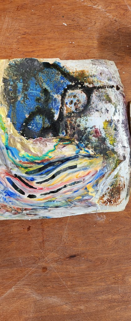
Looking at this I will probably remove the plaster area and take this back to the original glaze tile, because I liked the way the oxides and textures worked together.

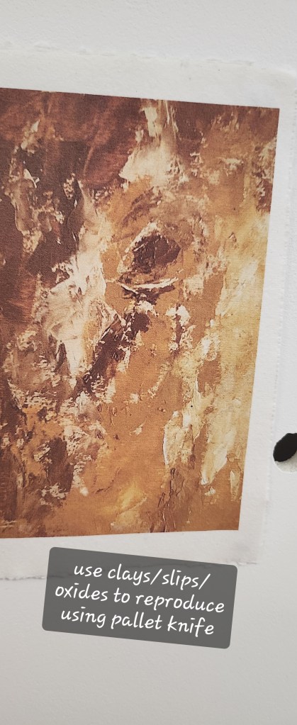
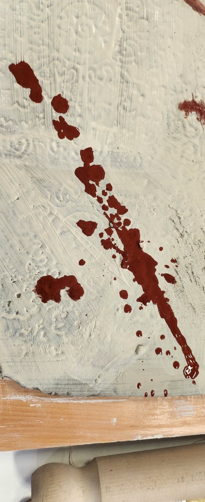
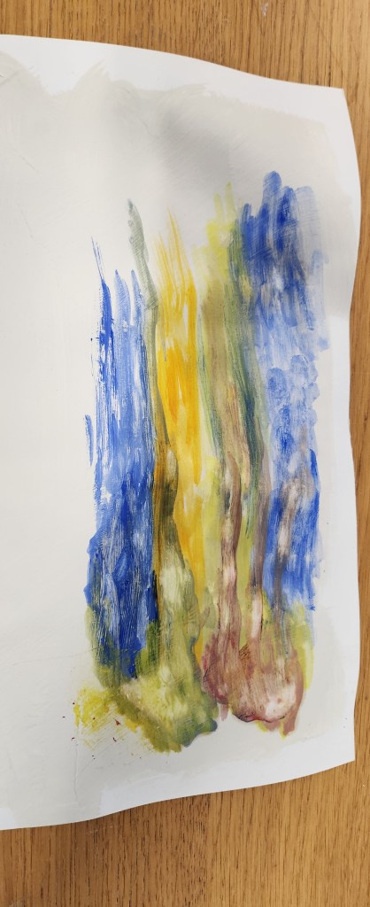
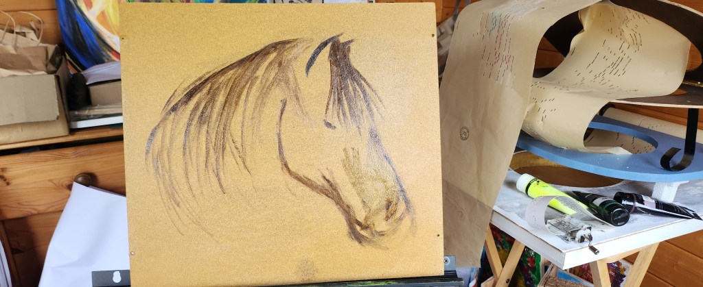
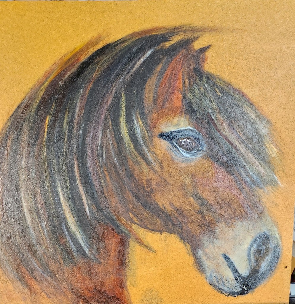
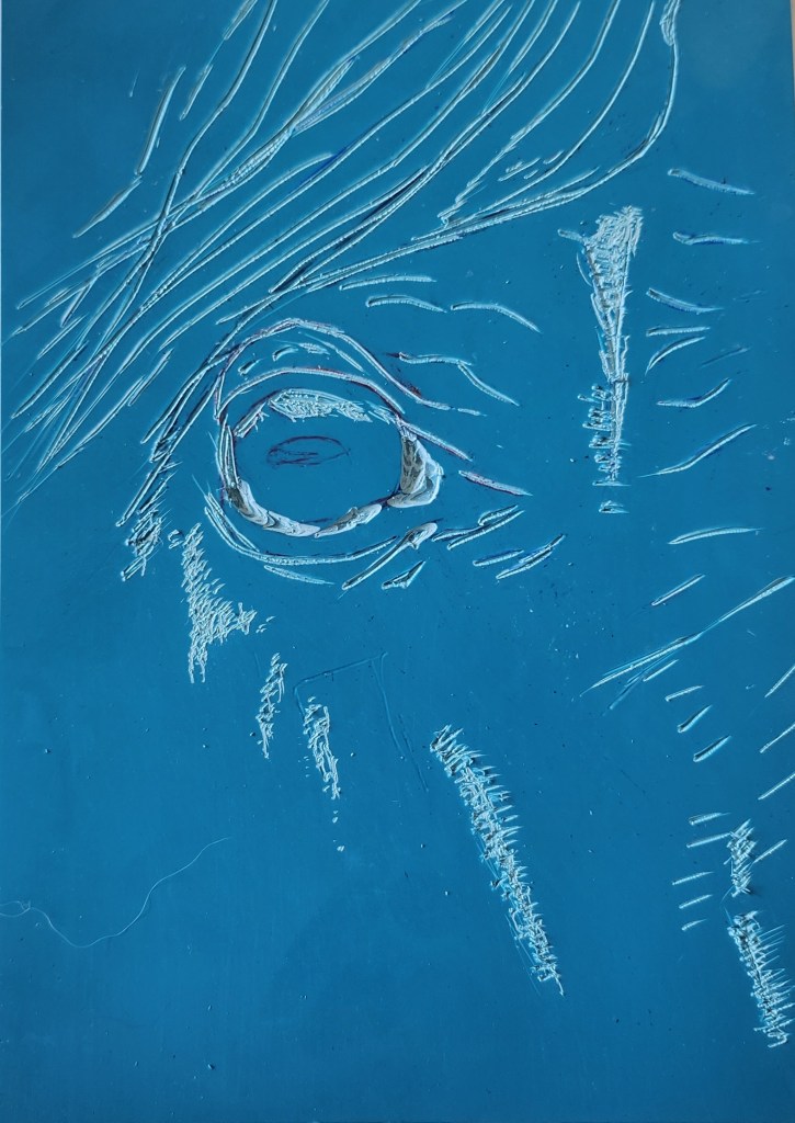
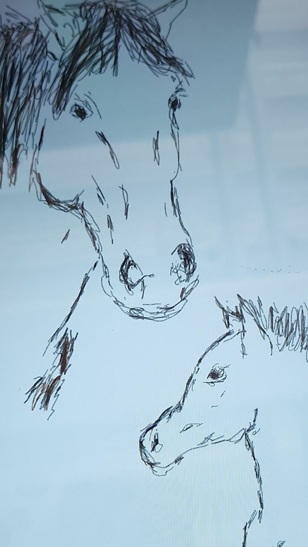
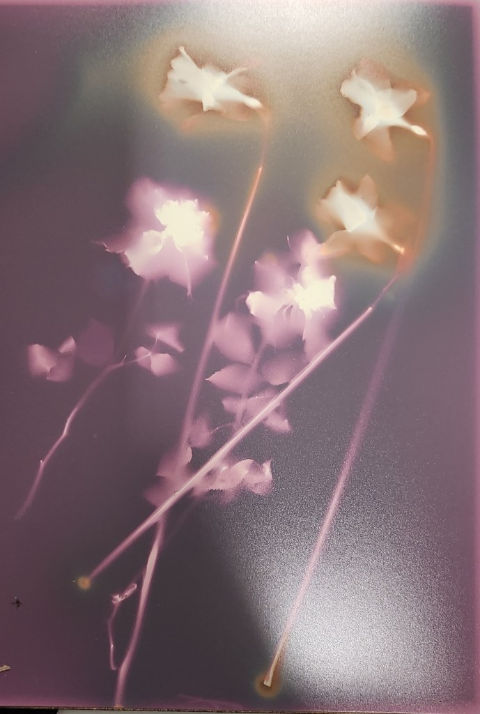
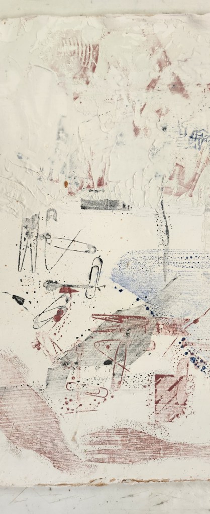
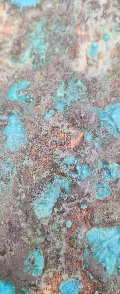
This is something I did last year. I would like to reproduce this loose feel using clay slips and oxides. I think this image is definitely what is becoming known as my style and what I enjoy recreating.

Slabs and Textures

8th November 2023

I have it in my mind that I somehow want to use clay as my canvas and create art on it. A way of combining my love of working with clay and painting. My usual work with ceramics is either modelling lumps of clay or roll pots and vases of varying sizes and decorating with slips and glazes. I want to take this further and create something a bit unique and unusual art.

My rolling out skills are not great, everyone says it’s just like pastry and baking etc. The problem here is I don’t bake and if I need pastry I tend to cheat and buy it ready made/rolled. So I have two long thing pieces of clay, but I want to create a square slab. This is where I learnt a new skill, joining the two slabs together and cutting straight edges and adding to the corners until I had the shape I needed.

Once the slab was rolled out and reasonably evenly square, I used white slip and porcelain slip in different areas to get different shades of white/cream and used embossed wallpaper to press into the wet clay. I aslo sprinkled on different textured grit/sand so that some areas were smooth and others you could feel the raised textures.

I wanted to add colour so I used oxides. I applied the oxides by splashing it on using a brush, then holding the slab up at an angle I sprayed water on, to get the oxides moving. I used a heat blower to help move the water around as the oxides dried.
I like how the oxides started to pick up the textures and patterns in the clay. I am told I don’t experiment enough and allow myself to be looser with the applications/patterns. I find this really hard, as I really have this fear of failing, it is really hard to let go and I’m looking at these images thinking, “that’s it, you’ve ruined it.”

Whilst this was drying off, it was back to the plaster and sanding it down to see how the water colour paint had soaked into the plaster, if it blended well, how deep it went etc. I think it had a nicer effect after I sanded it, the colours blended into each other better. I found when I was painting the plaster that because it soaked up the wet it didn’t give me the opportunity to manipulate the paint and direct where I wanted it to go. It felt very streaky and in solid blocks.

I also made another slab. Unfortunately the clay had a number of air bubbles in it and this caused lots of long holes, so it had to be wedged so that I could use it again. The upside to it being wedged is that instead of being a rectangle it could be flattened and rolled out as a square, well an almost square. I still had to trim the edges and corners to straighten it off.

Experimentation with Plaster

4th October 2023

I want to use my own photographs, to create images. By that, I want to experiment with ways of transferring images onto different surfaces and paint over them with different mediums. I started by taking two sheets of paper, one glossy printer paper that had an image on it already and a blank piece of sketchbook paper. I then painted white slip on them and let it dry.

I found that as the slip dried it started to flake off the glossy paper and as I painted on it with watercolour paint, it lifted even more exposing the image underneath. I did find the watercolours were not as vibrant.
With the matt paper, the slip managed to find something to purchase because of the texture so it stayed without flaking. Even when it was painted over with watercolour paint.
Another experiment was using plaster on different surfaces like wood and metal.
I quite possibly put a little too much plaster on both, but that’s more to do with the fact that I am hopeless at measuring out plaster, especially if I haven’t done it for a while. I had to leave the plaster to dry before I could do any painting on it. What I do like is that the plaster reacted tot he metal and this rusty pattern made its way up through the plaster.

The watercolour paints were very vibrant on the plaster, although I had to do a few applications as the paint soaked into the plaster.

This has got me thinking about texture and I do like the natural ridges that have occurred in the plaster pieces. I probably won’t use clay slip on paper, it’s not quite what I am looking for as a finish. Although this early in the year I’m not really sure what I’m looking for.

Re-Frame Project – Review

28th September 2023

As a collective across the two years, we have a good sense of humour. A lot of us felt the final arrangement of our pieces was a good message about the place we live, intentional or not.

Part of working as a collaboration is that we have to evaluate how well we feel it had or hasn’t gone. Being totally honest here, I have not 100% enjoyed this project at all. There were elements that I absolutely loved like the film photography and learning about developing negatives and exposing the images. That I found really interesting, although my brain did ache.

We had a very rough start and I honestly didn’t think we were going to work well together as a team at all. Although we did and I’m not quite sure how that happened, possibly because the three of us all wanted to do well in the first project of the year.

I still feel we didn’t follow the brief, although looking at the final result of the works together, it turns out to have worked really well to create a bizarre yet accurate reflection of Weston Super Mare.

For me what didn’t work was the fact the initial brief was more or less ignored and I guess that set the tone for how I wanted to engaged with the other two. When they both said about wanting train tracks and actually agreed with each other, I seized on that idea and knew that I had various images of trains on tracks from having days out with my son. The one that everyone liked was the Flying Scotsman passing through Weston Super Mare. The only flaw being that the original file sent across wasn’t a good quality jpeg. This limited us in how big we could blow up the image without it being too distorted with pixelation.

What worked well was that the three of us problem solved and came up with some good solutions as ideas were bounced back and forth, like standing the train up at an angle to the track. The threat of the storm on the day we were supposed to be doing outside photoshoot of the object, meant that we risked only having indoor images. One of the first years took the cardboard image home the evening before and took some photographs on the beach, so we at least had some outdoor images to choose from. However, the rain held off and the two of us that hadn’t taken images went to the beach and enjoyed working together to get some images. The funny thing about this is that I was using all my knowledge of being an amateur photographer to try and line up the light, focus and wait for the background to be clear. Yet the other person was just randomly snapping and I think she got one of the sharpest and better angles of the train coming at you from the sand. Her images were really good, yet she dismissed using them.

I do feel that when we came back and the other person was editing their DSLR shots that they had decided what the final image would be. I did make some comments about it being better if the train had looked a bit closer to the sunset, and by the end of the day I think it had been edited that way. The tutors all like it, and the other first year was happy to go along with it. Sometimes it’s better to just go with it, I feel like any objections I have would come out as sour grapes.

At the end of the day did we fulfil the project? Yes I guess we did, we took a photo of something, enlarged it and rephotographed it in a place you wouldn’t expect to see it. So technical yes we reframed it.

Was I a bit black and white in my views on this? Yes, and that’s probably because my initial views and ideas were dismissed without even being listened to properly. I still feel that we should have agreed to rephotograph something together on the college grounds and go with that, as that was the initial brief.

Am I happy with the final outcome? Yes.

I have a film photograph of the Flying Scotsman rising out of the sand on Weston Super Mare beach, that I think even my dad, an avid steam train enthusiast, would have found amusing.

Re-Frame Project Day 4

28th September 2023

I enjoyed today. We developed our film photographs. It was a good experience learning about the exposure unit and how to test the time needed to get the right exposure, and how to enlarge the image.

Follow the instructions on the cards, and fingers crossed it should all work.

Test Sheets – you have a piece of card that you move along the test strip at second intervals, then you count the number of sections along to give yourself the correct exposure. I love this because you are in control of the feel of the image, making it softer or sharper. I often thought developing film was shrouded in lots of mystery and difficult. It isn’t, but because of how my brain learns things, I will possibly need my hand held a few times before I feel brave enough to go it alone.

I loved this image, and I would have liked it to have been the one the rest of the team chose to be enlarged and put on the wall as our final image. It hasn’t been.

I really feel like I’ve stepped back into some dystopian novel the way the tracks appear from nowhere and go nowhere. The train is just abandoned on the beach.

Sustain Exhibition

Weston Super Mare Museum

I had piece of hardboard, that was perfect for the sustain exhibition. I am going to run out of left overs from our DIY projects soon. I used water-based oil paints, mainly yellow ochre, raw umber, burnt sienna, red ochre for my pallette.

I hid myself away in the summer house and over the process of a few days managed to paint my Exmoor Pony. I chose the Exmoor Pony for various reasons, they are used in by Natural England in conservation projects and the are one of Britains Rare Native Breeds.

I took the perspex out of the picture frame and mounted using some number plate tape which was in the garage. The perspex will be used to replace broken glass in a couple of photo frames that have suffered minor falls.

I loved working on this little picture, I completely lost the track of time when painting and I loved seeing it on display in a public place.

Papers and Pigment Printing

19 March 2024

Pigments and paper made from coffee, tea, and mixed plants were purchased by out tutor. Whilst he mixed up the pigments into inks, we were left cutting a small lino print.

There was a small hiccup in preparing the ink from the pigments. They needed to be ground/mullered into finer granuals as they were a bit gritty. However, we carried on using the Safe Wash Cranford Oil Inks, which can be cleaned up without the need for solvents. Vegetable oil is very good for this. I tried printing on the different types of paper, and I really like how the texture came through. They add to the image.

Our tutor mentioned how expensive these materials were to buy and that we had to factor that into the cost of production. Say my hourly rate is £25 per hour, and it takes me 4 hours to make up the inks bought from the pigments, that’s £100. How long will the ink last when it’s made up? and how many prints could you use it in? I find that the small pots of pigment last a long time in their raw state but depending on how airtight the container is, it may not last that long when made into an ink. This is an area I still need to experiment. But my point being, I could buy the sustainable ink already made up, and just charge for the time to make the piece of artwork. And, still earn the £100 in my day job to pay the bills. This is why I feel there is no right or wrong way because it depends on individual life circumstances.

Be the best sustainable artist you can be withing your limitations.

Exmoor Hike

27th February 2024

I absolutely loved today, being out in nature and in my element! I only saw exmoor ponies in the distance. However, when I did spot a couple moving off I admit my inner child came out and I squealed with delight and set off at an almost run to see if I could get a better view, photo opportunity.

The landscape around Dunkery Beacon was full of muted colours, yet felt really vibrant to me. It was a really long hike and my legs are going to hurt! I forgot to put the battery in my DSLR camera, left it in the charger on my desk, thankfully we all carry mobile phones and the camera’s are good.

The idea was to feel the landscape and research ideas for the Sustain Exhibition being held in our local museum.

Nature provides us with so many different landscapes and textures and colours. It survives long after we do adapting and reclaiming any man made structures.

Here’s a hint as to what my subject matter will be for the exhibition. My first attempt at a digital drawing, more practice definitely needed.

Experimental Photography

5th March 2024

I have really enjoyed using the large format camera and developing print. It was because the image is in the negative and upside down and you develop from straight from the camera ‘plate’/photo paper. A downfall is you can’t move and the subject can’t move. Gives me a greater respect for the timed movement sequences that Eduard Muaybridge took of horses.

I used the environmentally friendly chemicals to develop the image of Sam, and used coffee to develop the image of the teapot. I really like the old sepia feel to the teapot. Something I can replicate at home without worrying about the disposal of harmful chemicals.

We also did some Lumen prints. I duly brought in some flowers from the garden. This is a great use for out of date photography paper. Happily made a little collage in a frame and stood them outside in the Sun. The issue with these are that they have a very limited life span so we needed to scan the images if we wanted to print them out again or fix them. However there are no guarantees how long a fixed image with chemicals will last.

My Lumen print is wrapped up in paper in a drawer, I will revisit it in 6 months and see how its doing.

Cardiff Trip

31st January 2024

We went to Cardiff to the Artes Mundi 10 exhibition at the Chapter Arts Centre and Cardiff Museum. I appreciate the creativity and thought processes and messages conveyed in the films at the Chapter Arts Centre, but they were not really my thing. And that’s ok.

However, one exhibit from the Cardiff Museum really stook out for me and that was by Rushdi Anwar. Not just because of the materials used, but also because the aesthetics help convey the story of conflict and genocide. This was such a poignant exhibit, I think it will stay with me for a very long time.