Final Exhibition Work

31 March 2025

This academic year has not been the best for me as my mum passed away. I was struggling for ideas for my final piece and exhibition work. I have to be realistic about the time I have available to attend the campus to use facilities on the days that I am normally working. I am playing catch up with both my paid work and my studies.

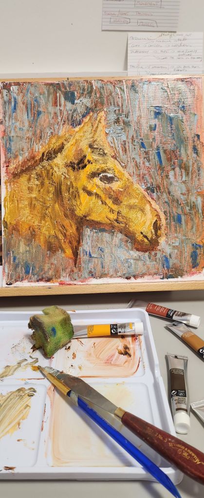
I would have loved to done a ceramic relief image, however, realistically I haven’t refined the process and I am not in the right head space to do that with the pressure of having something outstanding at the end of year show, in the time available.

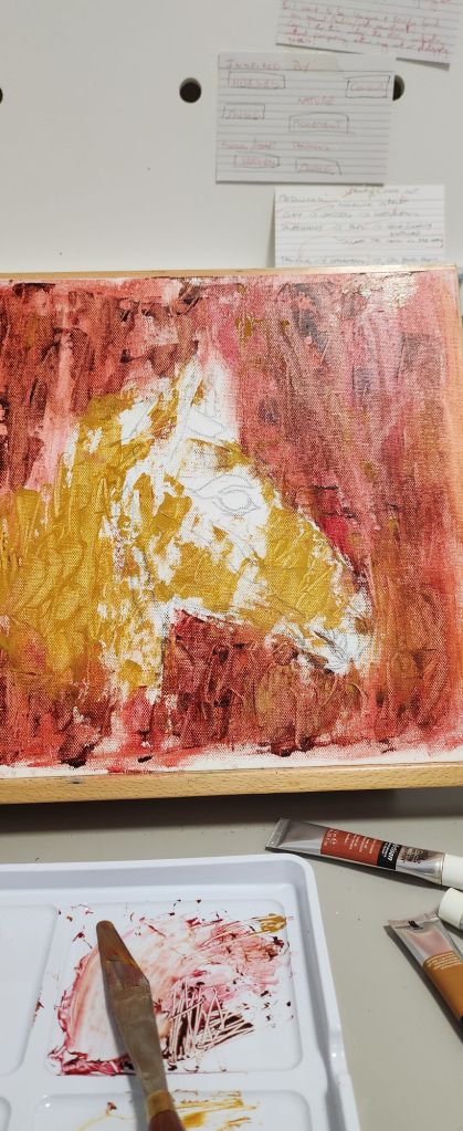
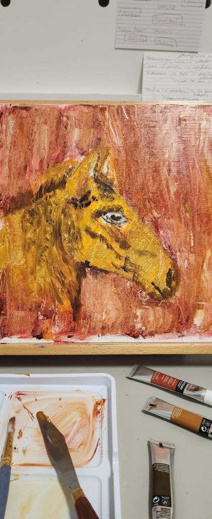
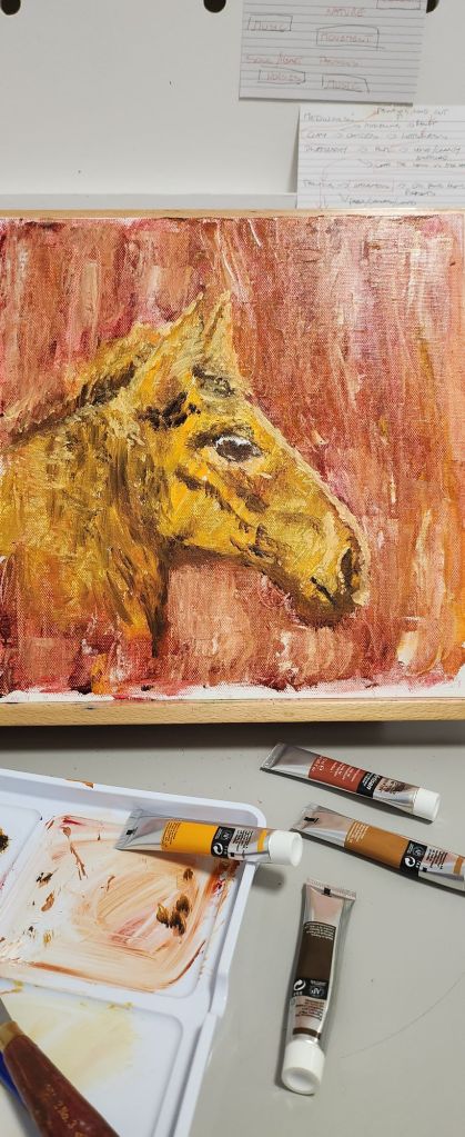
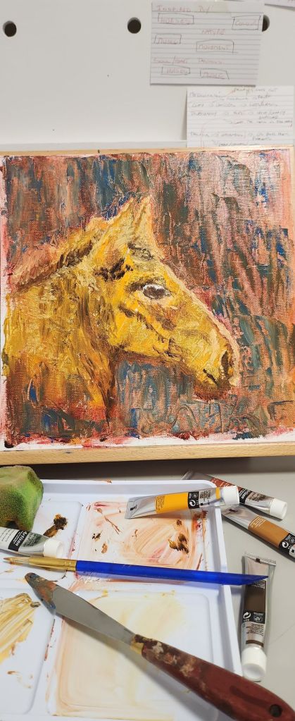
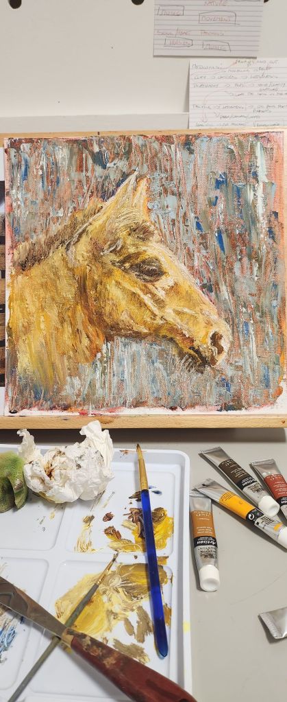
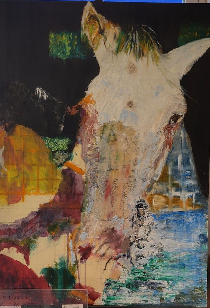
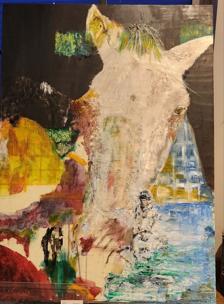
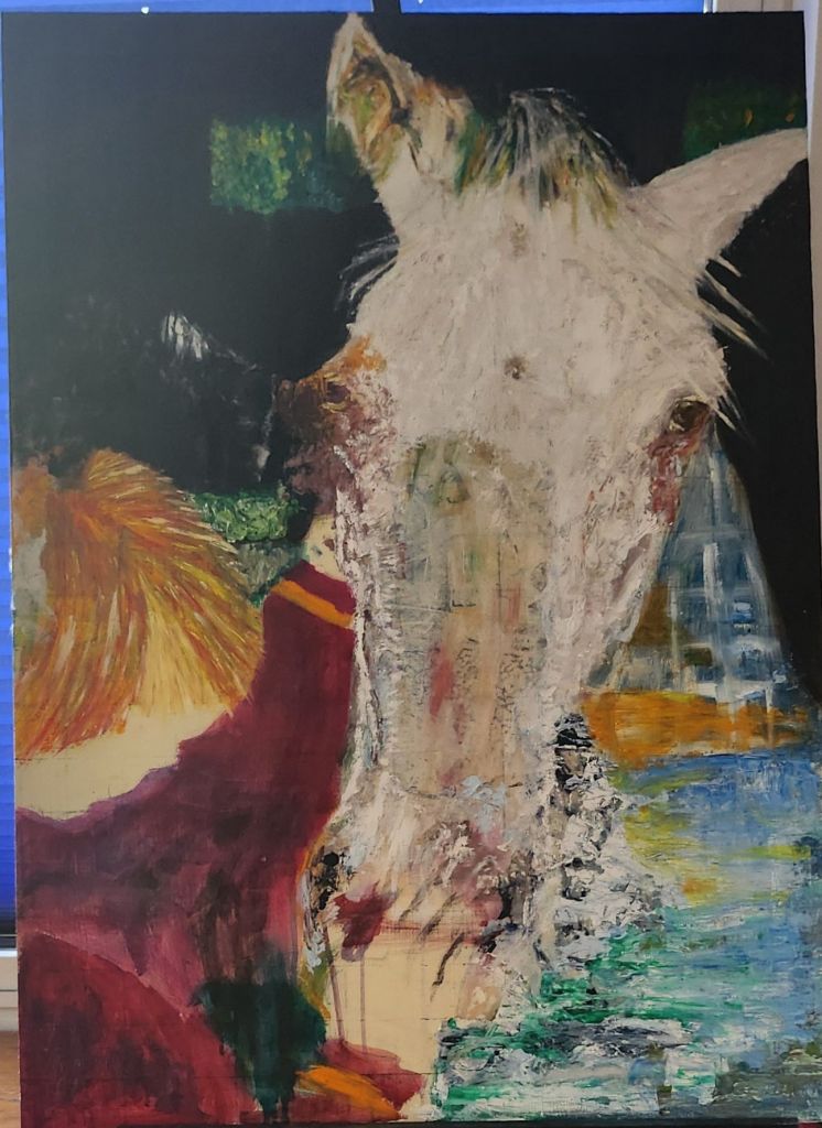
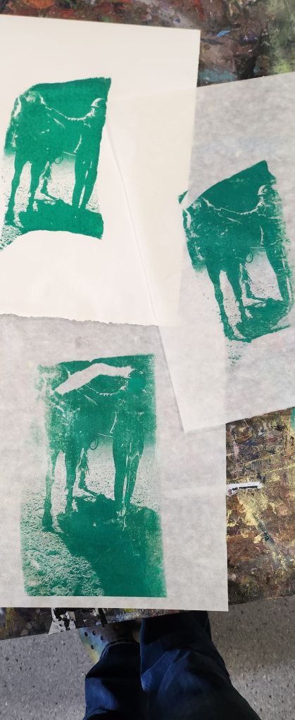
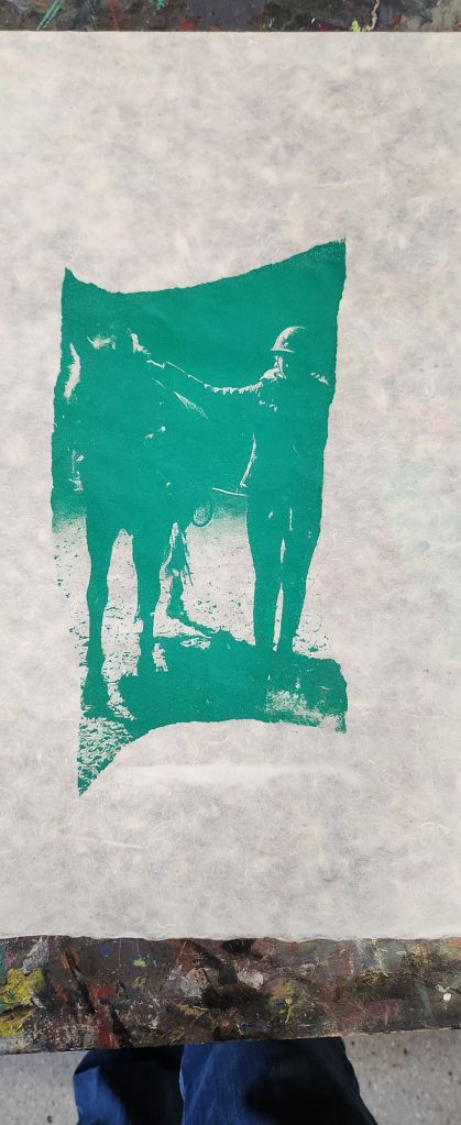
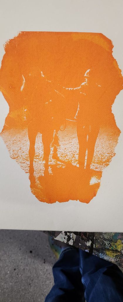
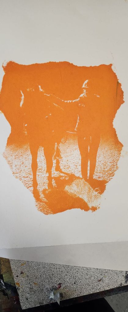
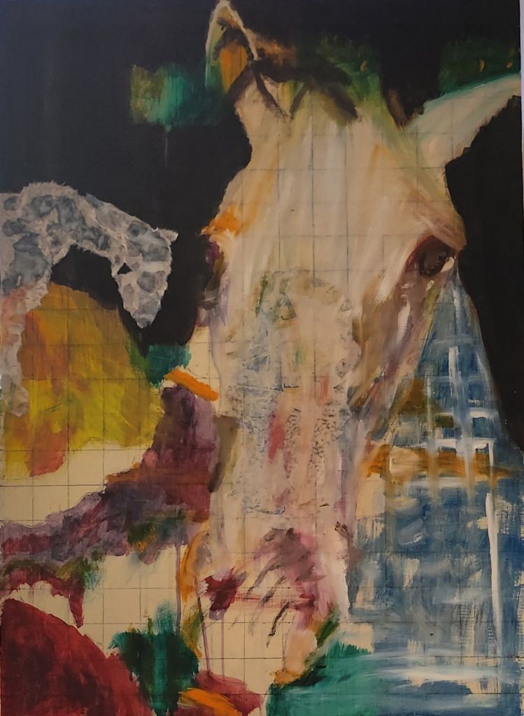
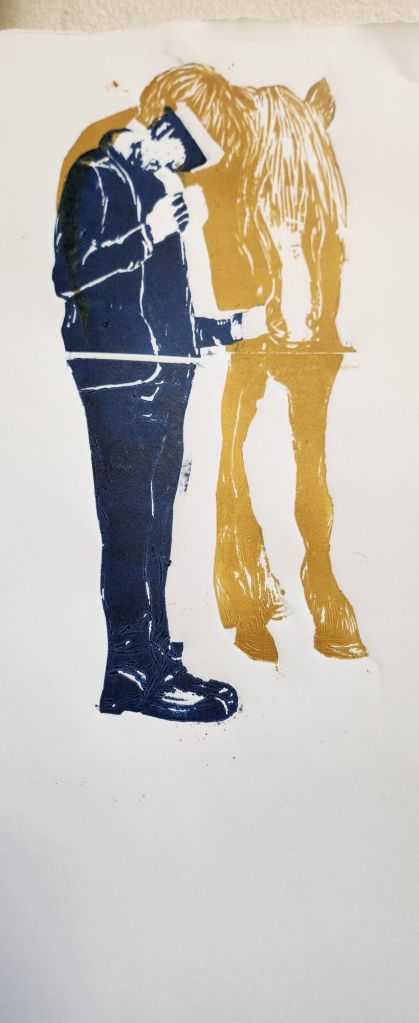
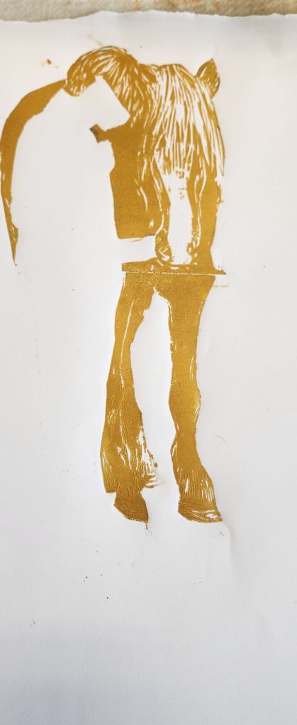
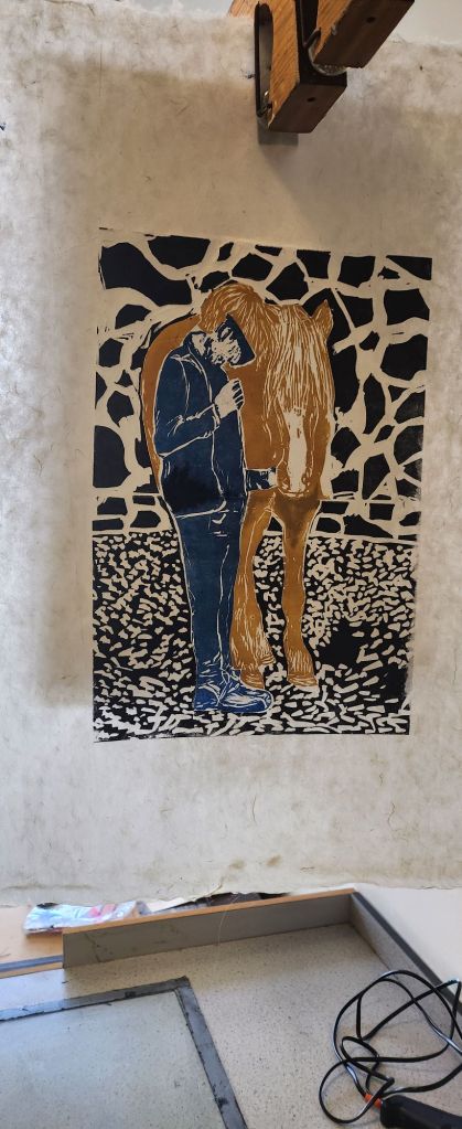
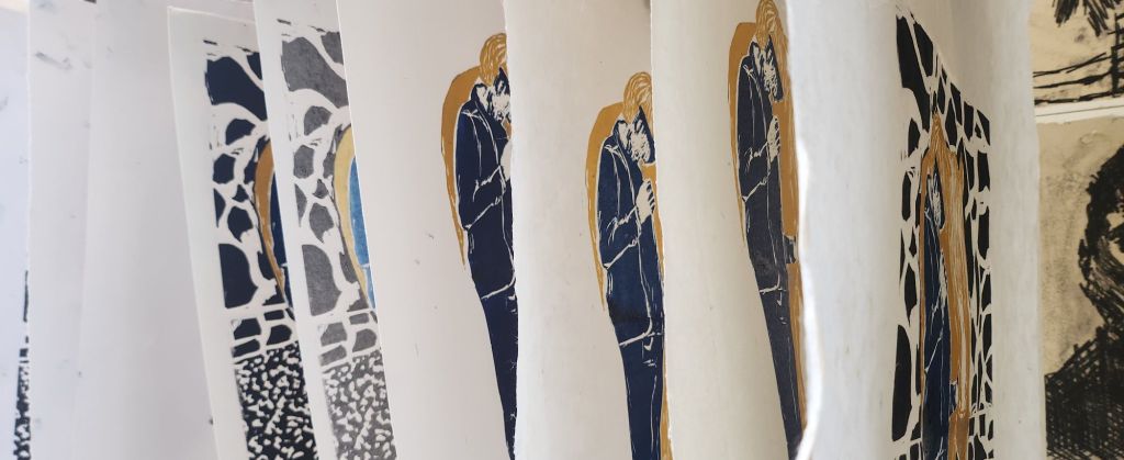
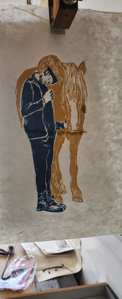
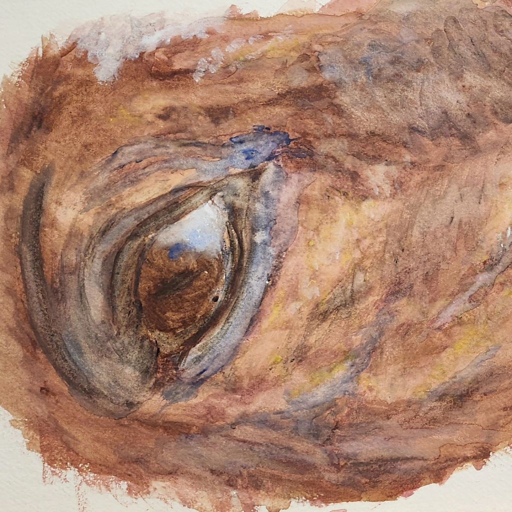
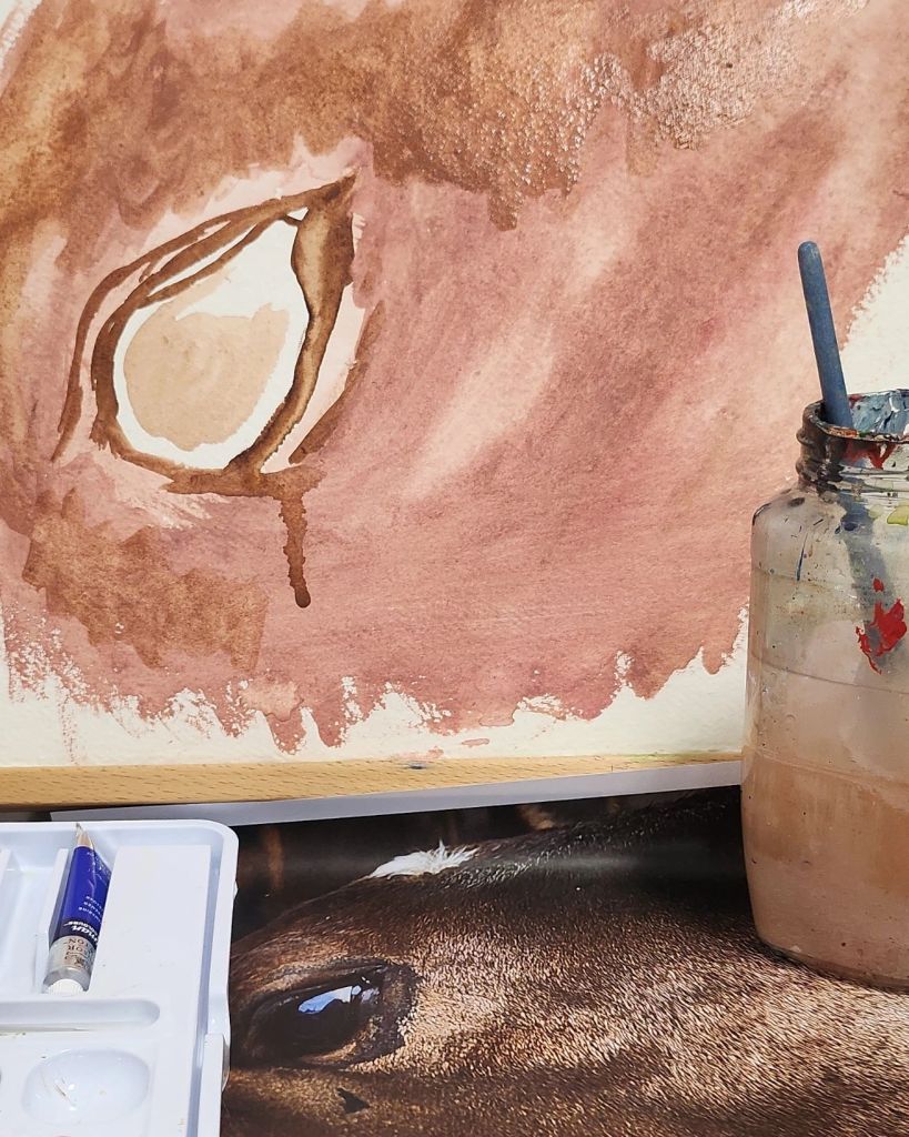
Over the three years of the degree I have mixed so many ways of creating together, photography, painting, printing and ceramics. For the final piece I have decided to have a painting supported by some prints. “Just a boy who loves horses”

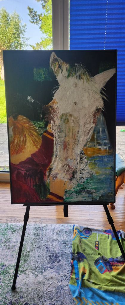
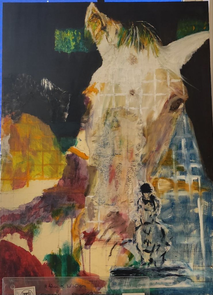
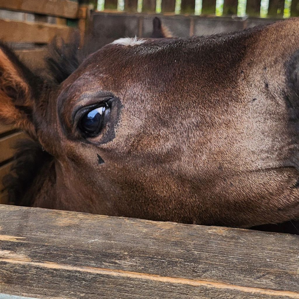
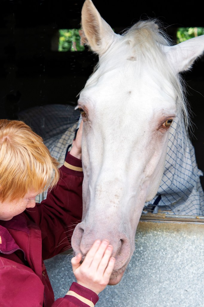
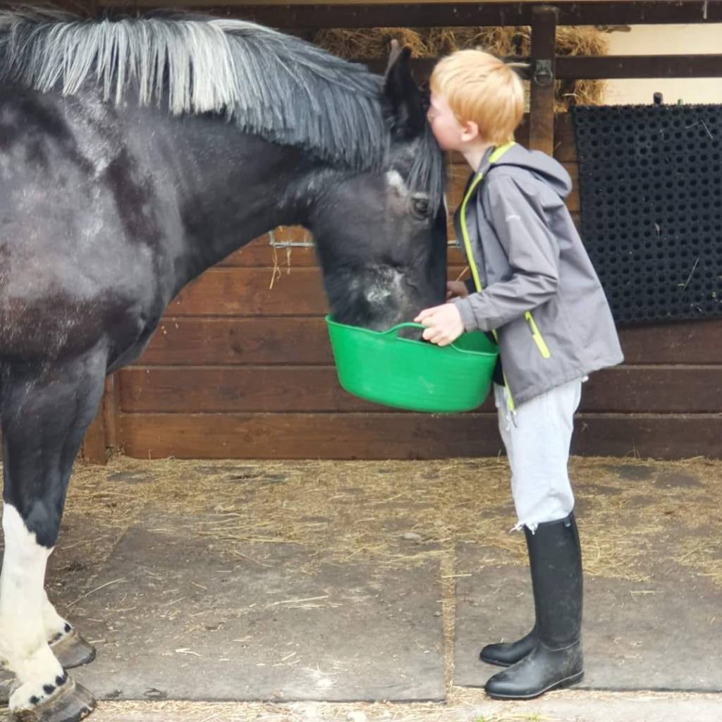
I am choosing the main image to be that of my son with my friends stallion Embrujo JL as it holds so much emotion.

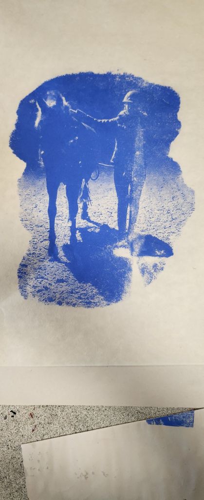
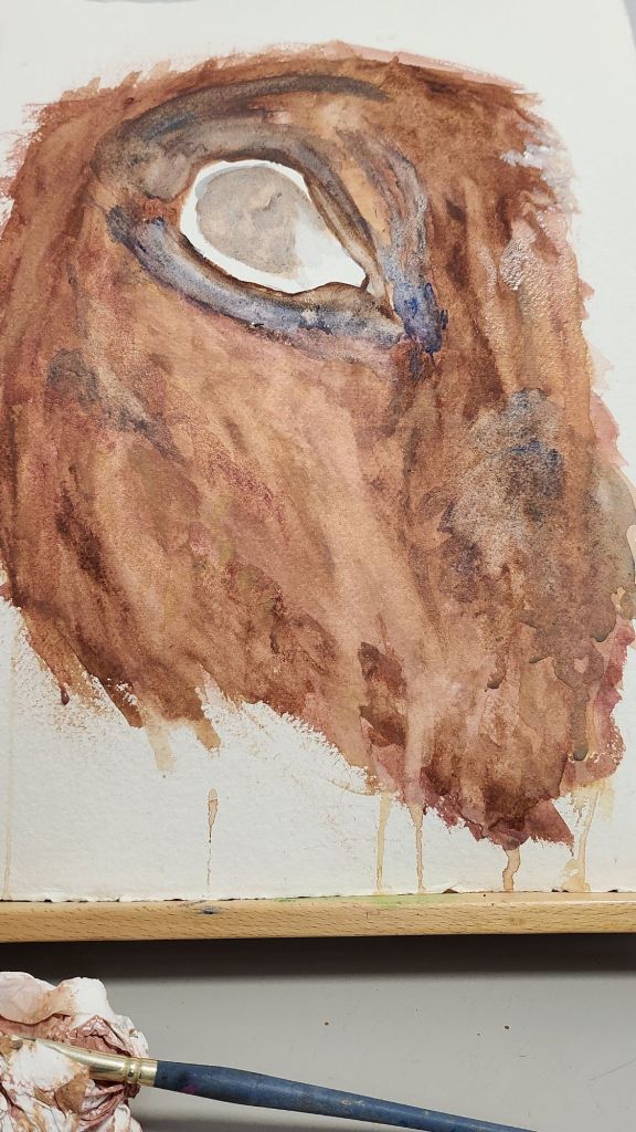
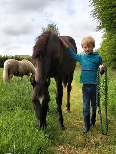
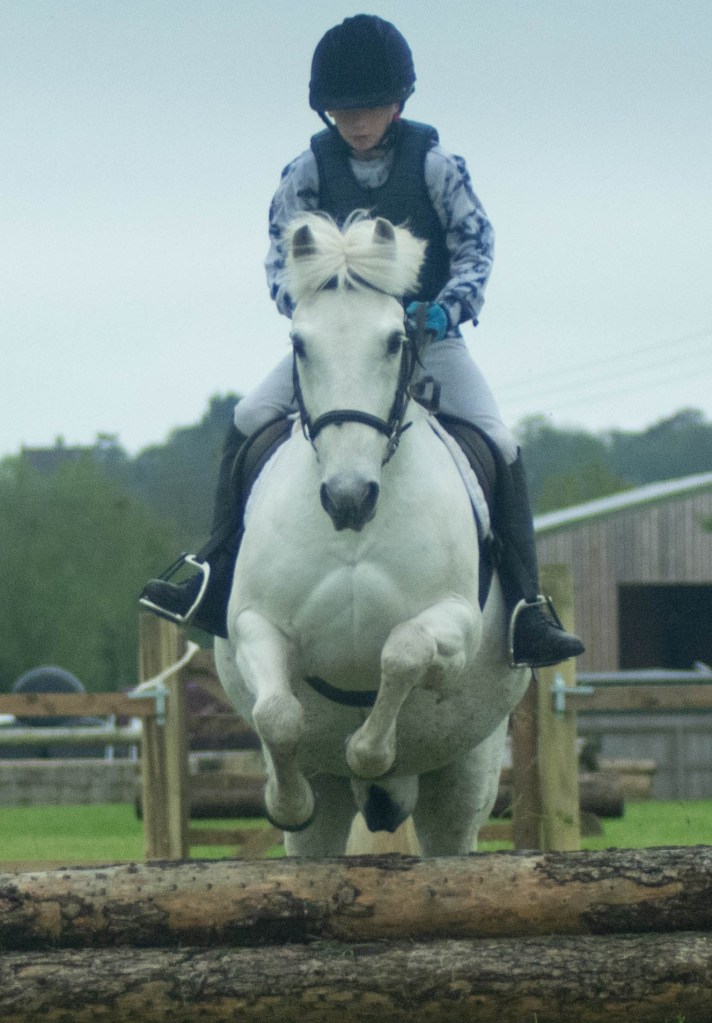
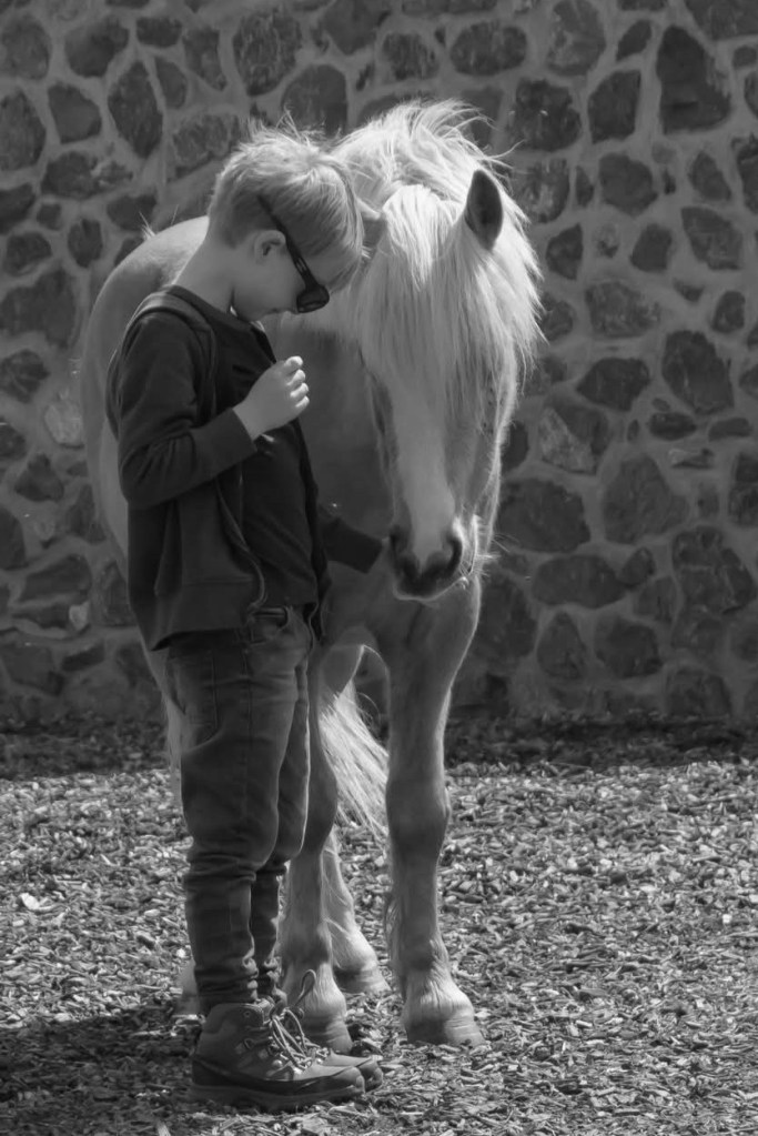
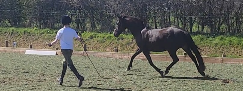
We then have Norma SA and Arthur, Cameron Mr Sandman and Arthur, Goldie (Taraco Chalina) and Arthur, Gaona JL (Minimoo) and Pheonix Flyer with Arthur. They are all horses and ponies that have meant so much to him and have been in our care at home over the past 6yrs. Arthur is 6yrs through to 12yrs.

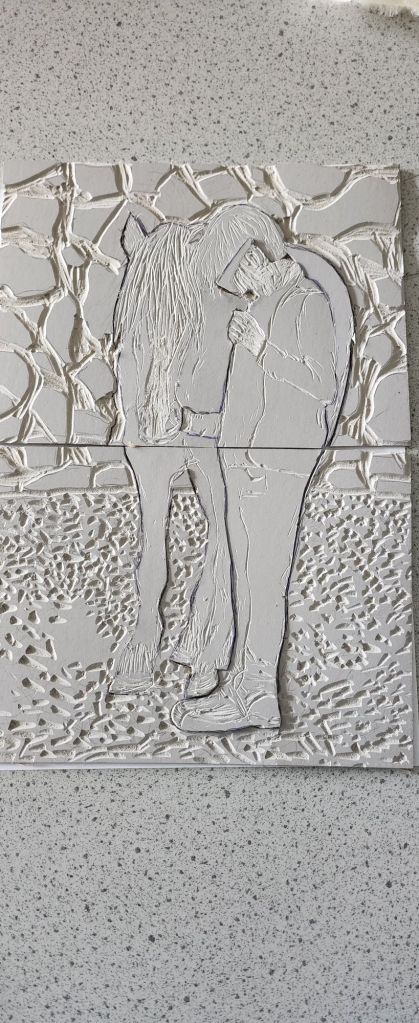
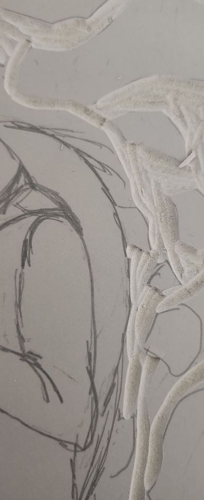
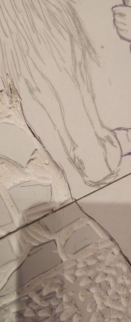
I used photoshop to merge, layer, edit and overlay the images until I had the result I was looking for. Next step is to try and recreate this as a realistic abstract and convey the story I want to show.

Foal in Acrylics

15th October 2024

I need to refine my painting skills in all mediums. The next logical step was to use acrylics. After researching Alfred Munnings and the way he had a touch of abstractness in his backgrounds. I thought I would try and do this in my own style. I also wanted to use a slightly limited pallet.

I realised once I started to paint the foal onto the image that my background colour clashes rather than complemented the coat colour.

The more detail I put into the foal’s coat, adding shadows etc, it was still not the right background colour choice of reds and oranges with the golden coat.

I decided to cool it down by adding blues, this had the desired effect of making the foal pop out.

The final result is better than I thought it would be, especially as I had made such a mistake about the background colour initially. I would have liked the foal to look a little more realistic, although this is hard as I actually don’t want to be the kind of artisit whose paintings and drawings look like photographs. That realism is commendable, but I don’t think it suits my thought process and loose way of painting. I like attention to detail, however, I respect photography as an art form in it’s own right and if I had taken a photograph that was worthy of putting on the wall, I wouldn’t want to duplicate it in a painting. I would rather have the original image blown up and printed on canvas.

Screenprinting

12 May 2025

For a bit of versatility and to add to my exhibit, I did some screenprinting. One of the images didn’t quite turn out as I expected to so I am using the other one in four bright colours to display in a pop art format.

A Golden Pony and her boy – printing

9th May 2025

I had to cut the khadi handmade papers down to size, I printing out with the background and without the background.

An issue I had was matching the pieces together and dealing with the fact then when I thought I’d ordered A4 lino I actually ordered smaller pieces in the wrong size. This left me with a line across the image which I had to use a paintbrush to smooth out and fill in.

Khadi Papers

I have left them drying. but will include the best with the background and the best without to my final exhibit.

A Golden Girl and her boy

7 may 2025

For another final piece I am doing a jigsaw lino cut in three colours, the reference photo is Arthur and Goldie, she was his first pony.

I am also trying to do the marks in the lino deep enough that I could reproduce this as a clay relief tile later, if the lino holds together.

Finishing the Foal in Watercolour

7th October

Once I got into the process, it didn’t take me long to work out the best way to use the direction of my brush and layering. 

I often turn my paper, canvas on its edge, and upside down to add details.  Unfortunately, this meant I had some water streaks, which, when the image is the right way up, defy gravity. 

I had to wait for it to dry before I added some of the darker shadows.  I didn’t water the paint down as much when I applied it.

Comparing the final image to the photograph, I think it’s a reasonable likeness if a little light, where his coat is darker.  On reflection, I should have mixed in a little more ultramarine blue to create a little more depth and darker the shade of his hair.

I do like this closer look at his eye.  It’s the one thing that makes the paintings come alive.  Getting the catch lights right.   Not that Astreaus SA is going to see his portrait, but I think I managed to capture a glimpse of his curious personality.

Foal in Watercolour

27 September 2024

Inspired by Brian Smith’s watercolour, and the work I did for Botanics.  I wanted to see if I could refine my technique.

I had a photo I’d taken of my friends foal peaking over his stable door, and thought although it’s very much a limited colour pallette, getting the shadows and tone of his coat will be a challenge.

I sketched the outlines I needed freehand using paint, which I haven’t done in a Kong time.  I really enjoy painting and getting the first layer down even though I’m not as confident using watercolour.

Part of me wanted to dab and wipe the run offs, but I decided to leave them and see if I can incorporate them in the shading further into the painting process