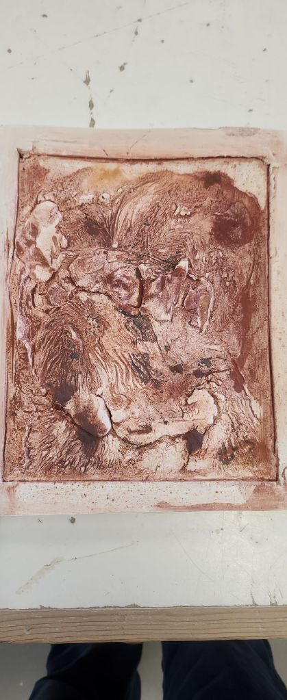
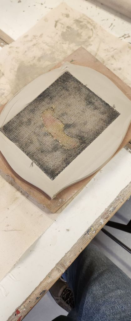
I’ve missed a post on one of the process steps, the tiles pictured below are after I had used white slip on the tiles and used oxides. The ones I use are ruttle, yellow ochre, red ochre, red iron oxide, and black iron oxide.
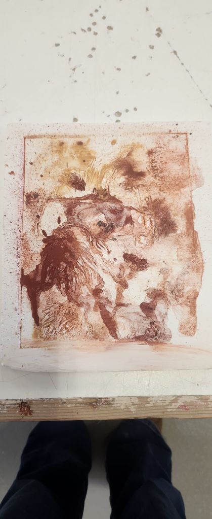
When I removed the lino from the tile above, I realised that I had forgotten to dust it with powder to stop it sticking and the didn’t dry the clay out enough before I pressed the lino in it.
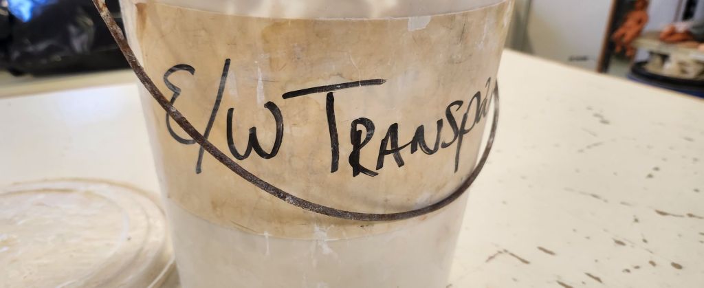
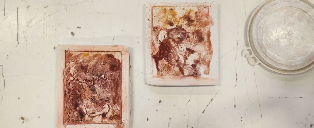
The second press was better as I remembered the steps mentioned above. I then glazed them with earthenware transparent glaze. I wiped off a bit more on one than the other as part of the process.
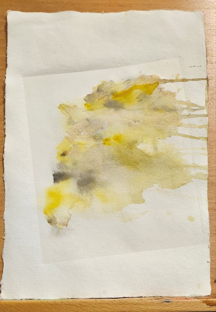
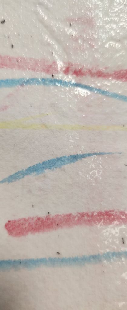
Before I started working in clay, I did another embossed paper image. This time I used more earthy colours, yellow ocher, burnt umber and raw sienna, with a little touch of black ink. I used a similar approach to how I applied oxides on my ceramic pieces last year and squirted water to direct the colour flow.
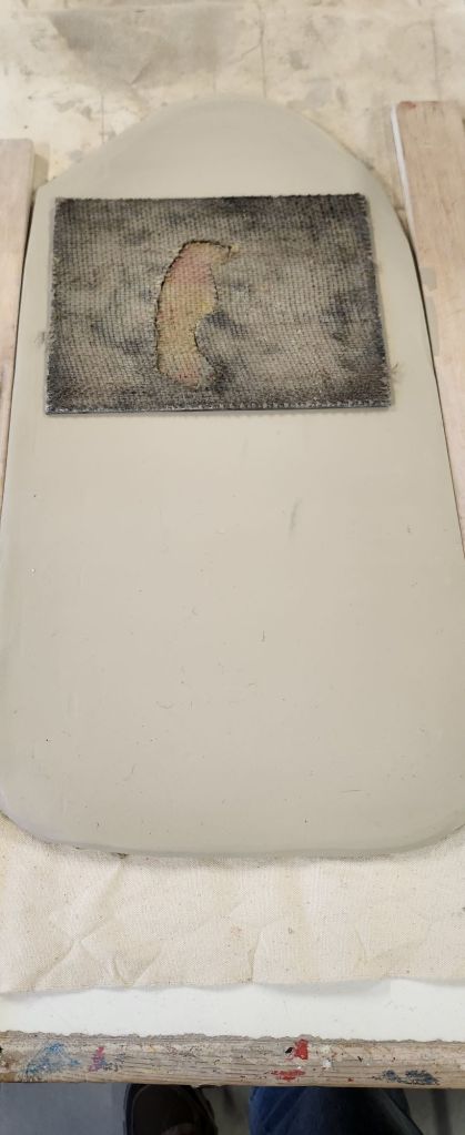
The process of producing work using lino is – print the images from it first, emboss any paper if I wish, and then use it for clay relief work. The clay is quite harsh on the lino.
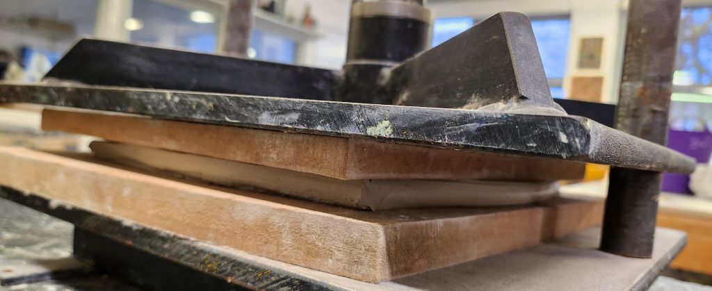
I rolled out a slab of clay, I can get two A5 images from one slab.
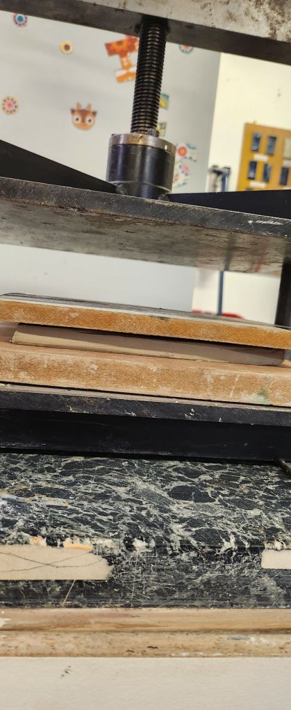
Instead of using a roller and pressing hard, I used the tile press as the clay tiles were small enough to fit into the press.
As you can see from the image above there is a little seepage around the edges and these needed straightening and tidying up to create a nice looking tile.
Last year I was experimenting with linocut pressed into clay. I decided to have a go at using making some plaster reliefs for the Vision Pop Up Shop.
To make the plaster reliefs I poured the plaster on the lino and the weight of the plaster as it settles sets into the crevices on the lino. I used a vaseline based gel over the lino so that I could pull it out of the plaster once it had set. The idea was for the portraits to be able to stand on a shelf without needing to be framed, make it more versatile and suitable for homes with not much hanging space on the walls. To enable them to do this I had to sand down the rough edges, level and smooth the edges and backs. This way they were able to be free standing but would also lie flat against a wall if someone wished to mount or hang them in some way.
My work on display at the pop up shop. I’m really pleased with how they look and my four prints look just as I envisioned them when I thought about how to display them.
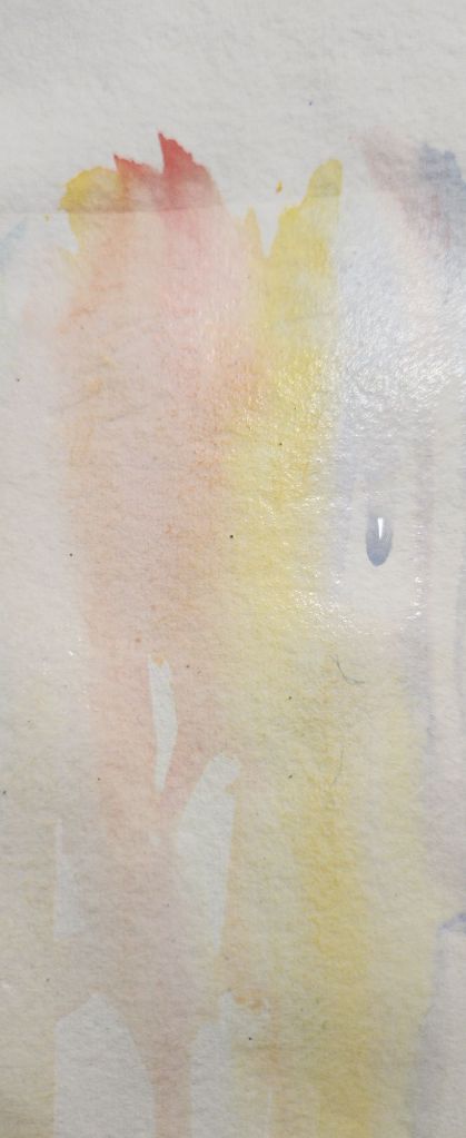
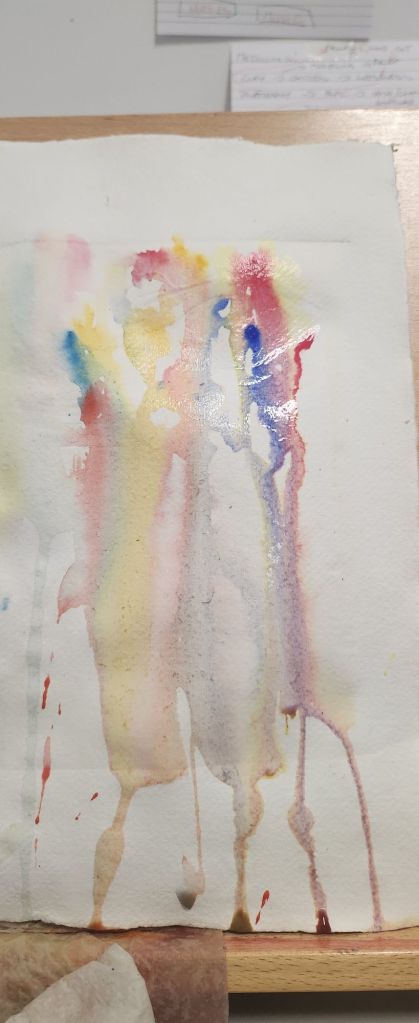
I have been experimenting with other ways to make images, that hint at what’s there and make you want to look deeper. I used the lasercut horse head image from last year to emboss some paper. I used my handmade cotton rag paper from Khadi.
I then used water colours to add colour to the embossed paper and experimented with different ways to apply the paints.
The way that worked best was applying wet on wet and spritzing the water to help it flow into the embossed image and give it a sense of movement.
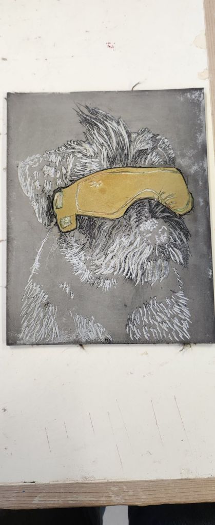
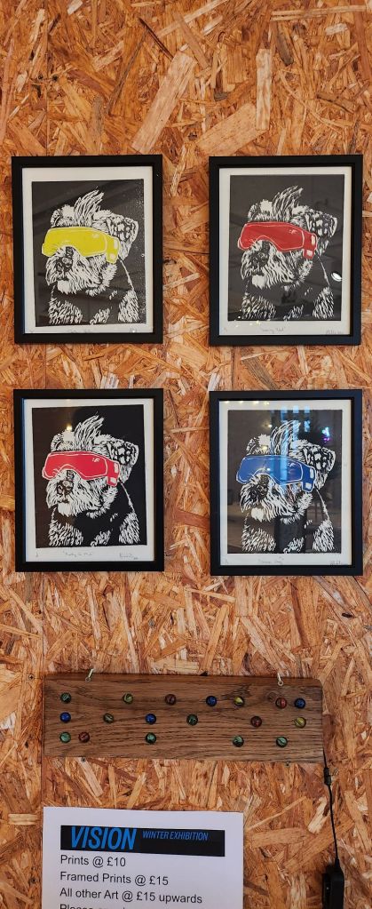
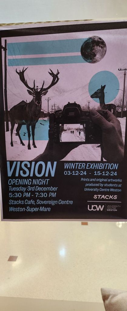
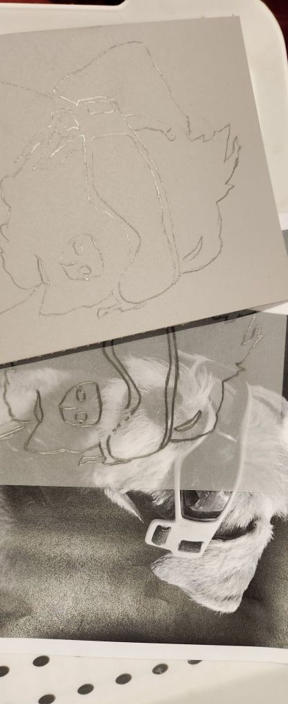
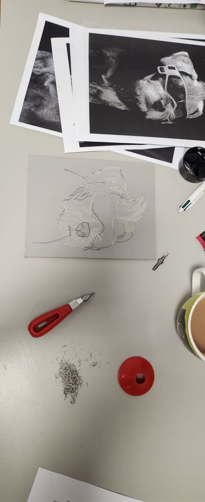
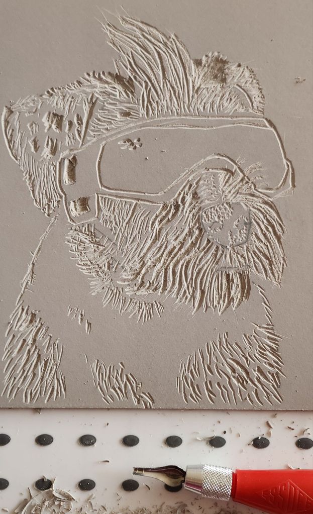
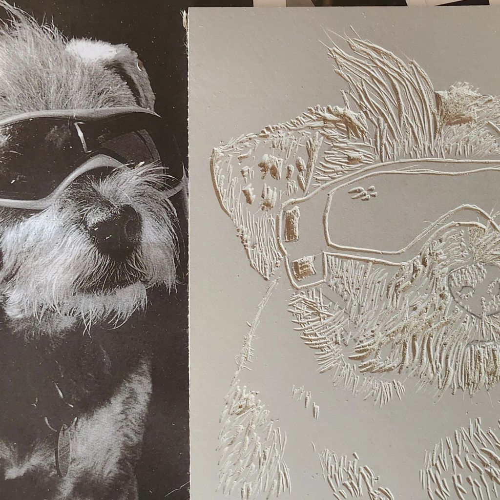
Every year the Art and Design students create work for a pop up shop. This years theme is Vision. I have really struggled to come up with something, trawling through my thousands of photographs of horses and friends at shows. I came across a photograph I had taken of my friends Border Terrier, Kauri. Kauri suffers from uveitis and has to wear special doggles to protect her eyes from sunlight. She has the most amazing pink pair and that’s how she’s ended up being my muse for Vision.
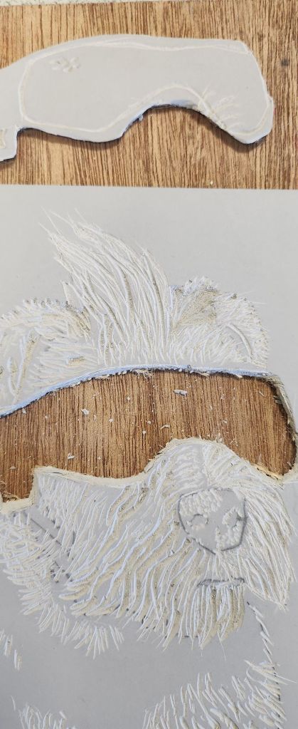
I have seen videos on instagram from other linocut printers that were in different colours using the jigsaw technique. I had the idea that the doggles would be a bright colour so I cut them out as a seperate piece of lino.
The test prints worked out very well. I had the idea to print them in four different colours and a limited run of each. I kind of have a pop art vision of them being displayed in a square on the wall.
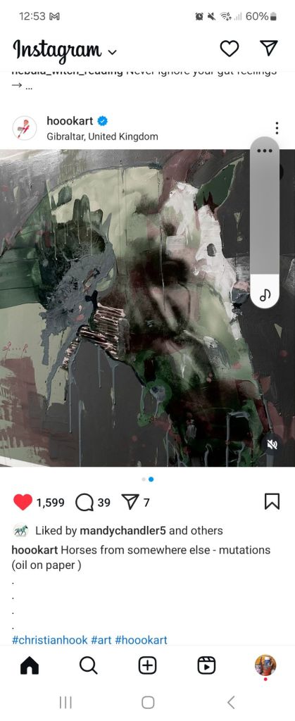
I love Christian’s work, especially his equestrian paintings. His earlier work is a little more realistic. I have enjoyed looking through the years on his website and seeing how his style has developed and emerged. Realism mixed with abstract and the feeling of a collage.
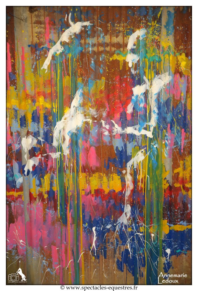
Bizarrely I came across Liska whilst on a horse facebook group I’m in. I don’t think I will ever turn my art into a performance like she does, basically because I cannot dance as well as her! Her equestrian art is amazing. I watched a video of her painting whilst, dancing, and also having a horse and rider performing at the same time. I’m just leaving this post here because I felt her art. https://www.liskallorca.fr/
I am following her on social media I just find her way of working, emotional and her work so beautiful.
In her own words she likes to combine traditional depiction with painterly abstraction. She believes that the edges is where all the magic happens. Looking at her paintings on her instagram and website, I was drawn into the paintings and I would love to be as skilled as Lisa is at seemlessly melding the background into the portrait. I felt as though I was glimpsing something at the edge of my imagination trying to breakthrough.
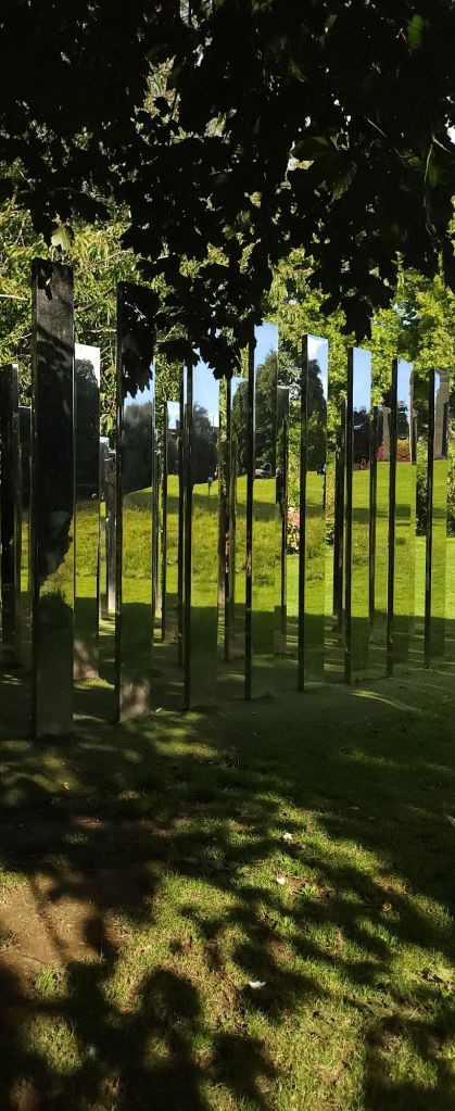
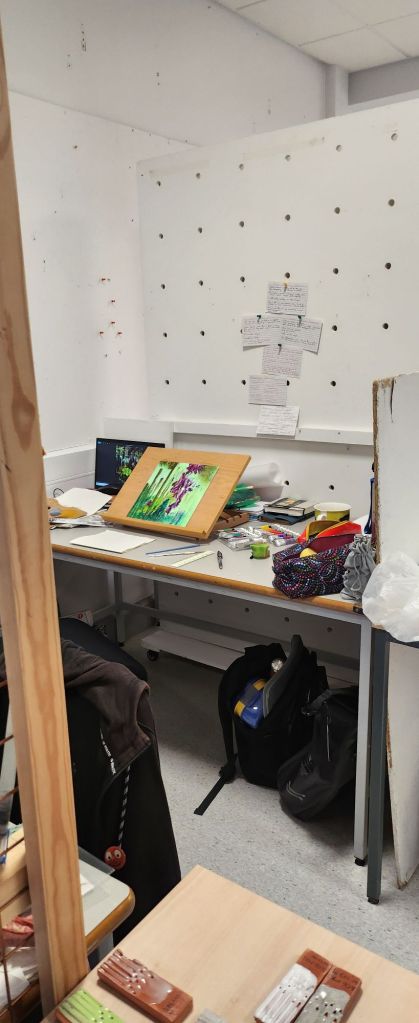
The brief is to create a price of work that is inspired by our visit to the Royal Fort Gardens. Literally have two days to create and finish. This is good for me as I spend a lot of time overthinking ideas and discarding them quickly due to my imposter syndrome.
I have three photographs that I keep being drawn back to from the morning in the gardens.
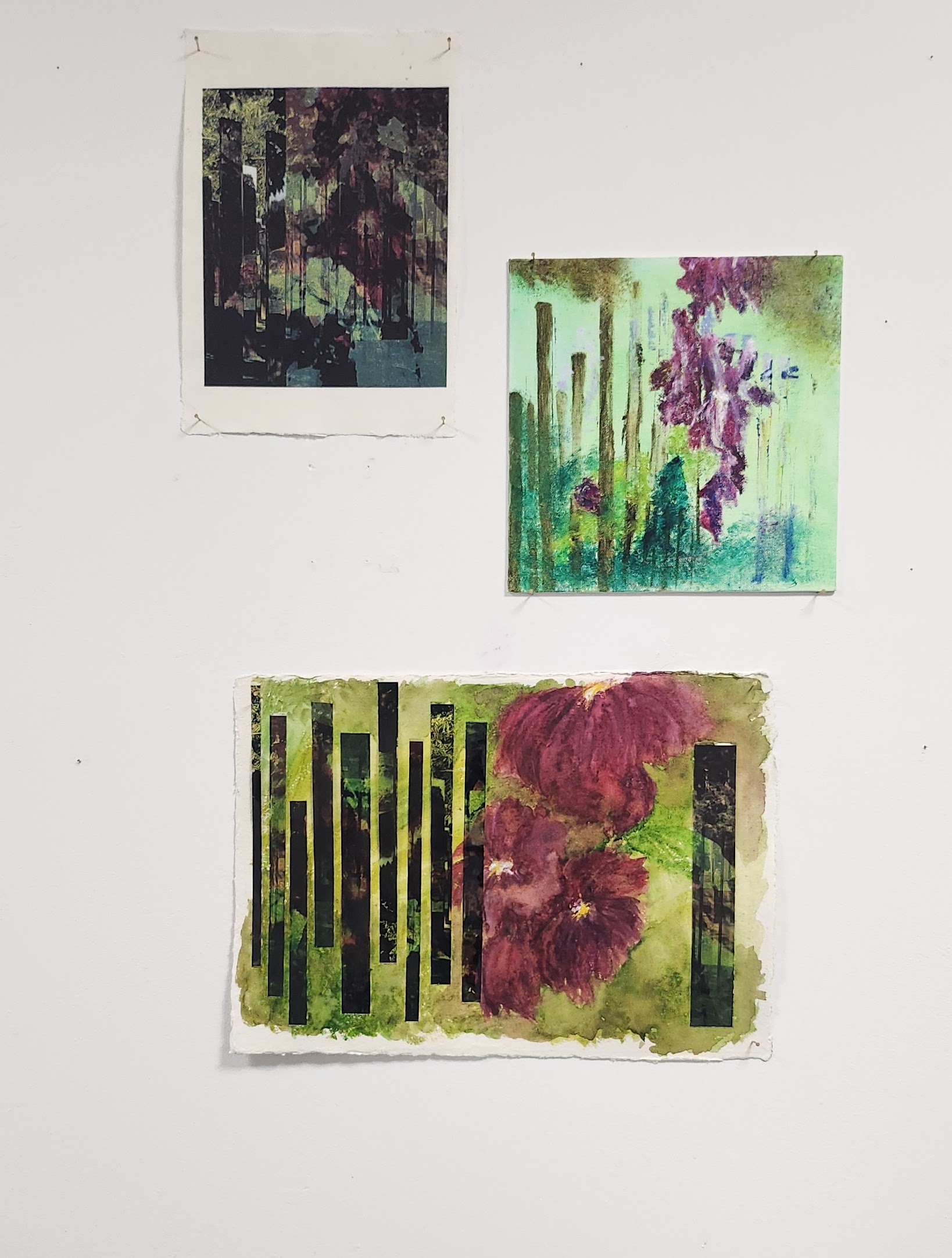
Using photoshop I layered the images and cropped to a square, adjusted the opacity of the two upper layers to finalise the colour balance I wanted.
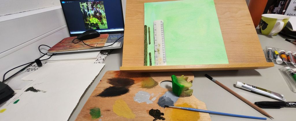
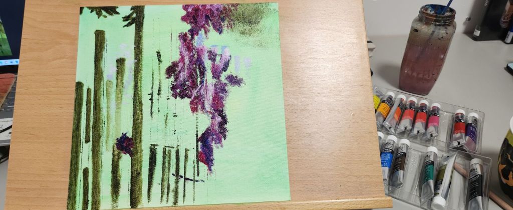
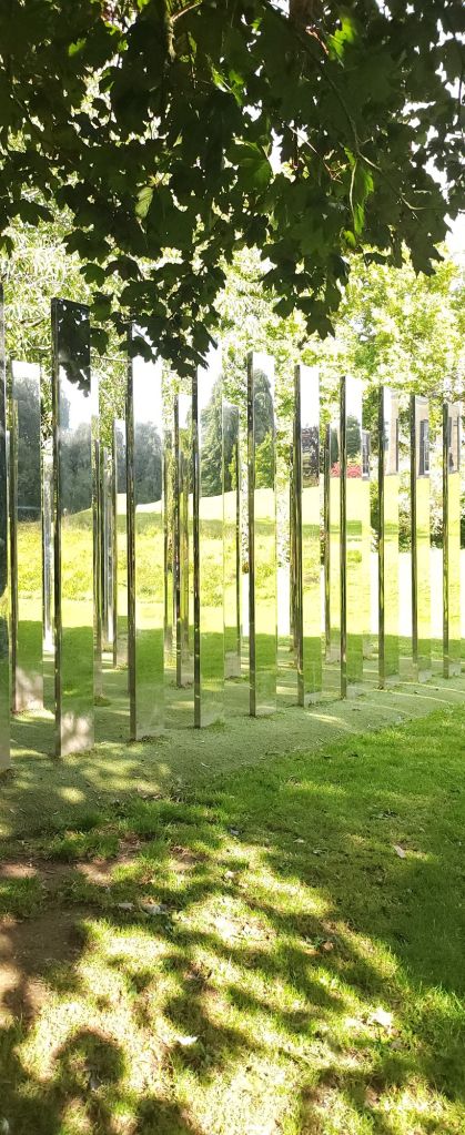
I have a small 10 x10 inch square canvas board and some handmade Khadi paper of different thicknesses, using water based oil paints and water colours I plan to recreate a form of my image as a collage. The paper should add to the texture and depth to replicate the illusion from the mirror maze.
Discussions with my tutor had to take it further – use different textures print photograph on acetate and handmade paper, the Print on Khadi paper has worked really well
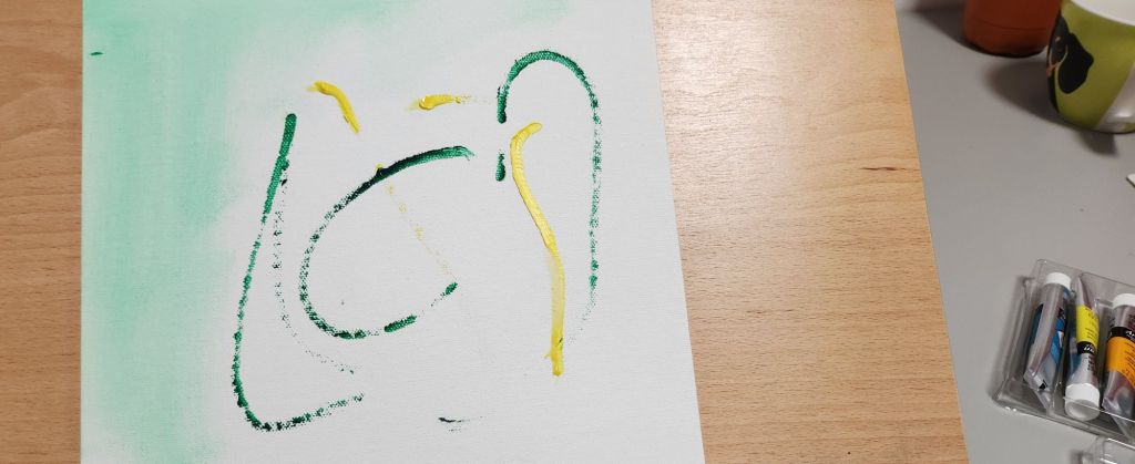
Use watercolours – I need to use them wetter so they kind of bleed into each other and I need to block more and I need to follow the fact that I have a darker pattern across the paper with the acetate’s cut and stuck so I need to make them blend into the flowers and block with more burgundy and dark green, follow the pattern lines. give the watercolour image a better composition.
David Whittaker and Emil Nolde are two artists I need to research in more detail.
I printed the final photocollage from photoshop on hand made cotton rag paper, the paper added depth and texture to the colours. The top right image is using water based oil paints, I like the way the flowers hang in the air, a bit of a dreamy japanese feel to them. The bottom image is watercolour on handmade cotton rag paper 140gsm, heavier than the paper used for the photograph. I also printed the image on acetate and cut it into oblong strips to represent the mirror maze. I the arranged them on the paper to contrast with the water colour. It was pointed out to me that the flowers needed to be darker and blend more together. I found this really hard, water colour is one of my weaker mediums to use.
I think each piece holds it’s own and all have a totally different feel to them. Something to consider for future, what am I trying to convey? what would that look like in the medium I’m using? could a different medium or composition work better?
In all the years I’ve lived in Bristol, I’ve never visited these gardens before. Thankfully the weather gods were kind and we had a lovely sunny day.
I left my digital camera at home, deciding to take my 35mm slr and new acquisition that has been languishing in my mother in law’s loft, an Ensign e20 pocket camera. We have no idea if the bellows are still lightfast so it is going to be interesting to see if any images weere taken. Another challenge with this camera is that I had to get used to the view finder, and then remembering to wind the image on. So out of eight frames I’m definitely going to have a few that are happy accidents as we say. I now need to find a dark room to develop them.
With the 35mm film, I stick to using black and white, I’ve also been challenging myself by using it on manual mode. Again, I need to get the film developed.
My phone camera, I used as I would a dslr and played around with exposure, focus etc in the professional mode. I did fins it a little restrictive in how the settings wanted to still automatically interact and change each other – but maybe I need to investigate it further as I am probably missing something really simple.
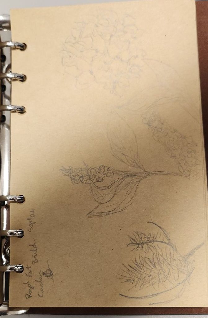
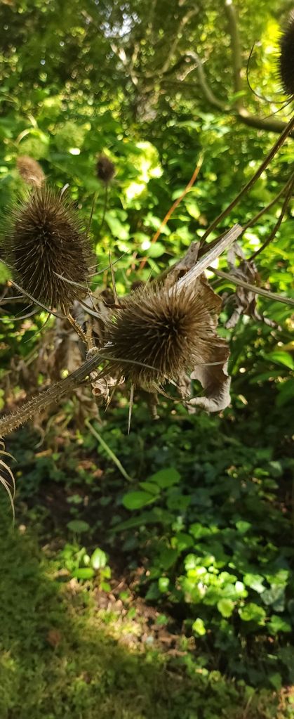
Drawings…..
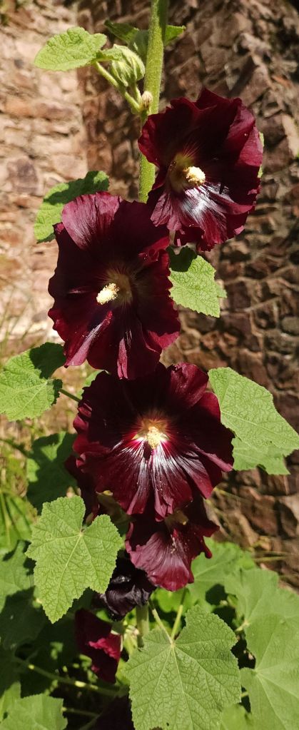
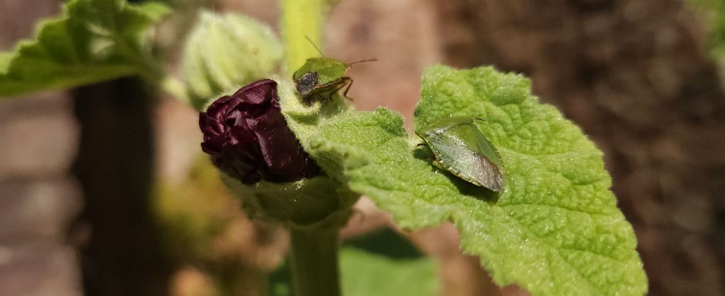
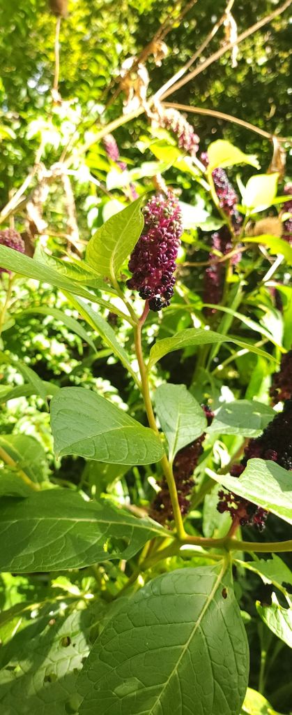
Flowers….
Mirror maze…
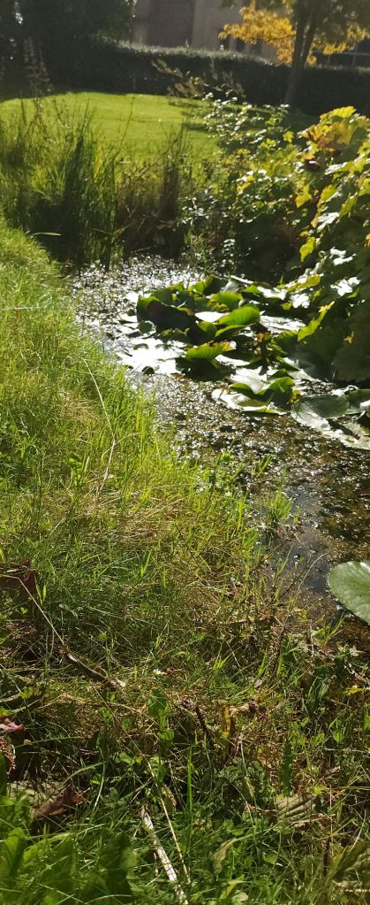
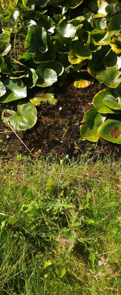
Pond…..
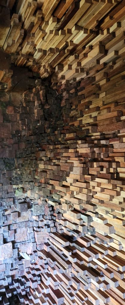
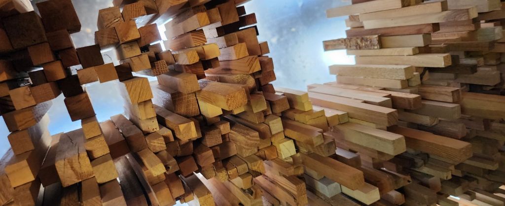
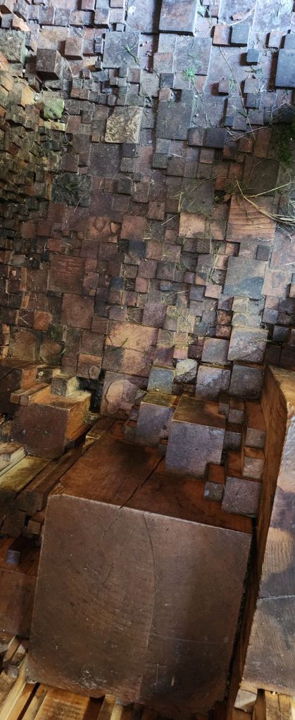
Wood structure…
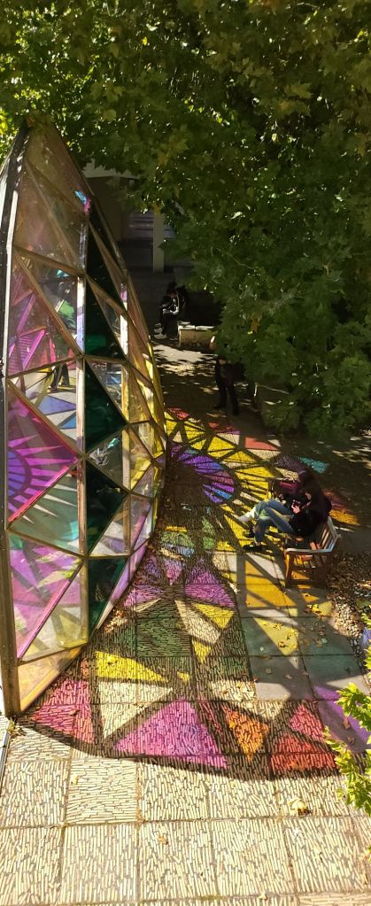
Prism…..
These are some of the images I took in professional mode on my phone camera. I have to develop my slr 35mm images and the medium format ones. Once I’ve got those I will add them to a seperate blog post. I think it will be interesting to see how they’ve turned out.
I’m drawn to light, textures and contrasts. This is evident from the kind of images I take. I think I need to finetune that a little. I use photoshop to overlay images and use the textures to create interesting backgrounds and patterns. How can I utilise this to help portray the horse? Tell the story of what I see, and the personality of the equine model I am using either in a commission or a one-off personal piece? Experimentation is the only way forward.