20 January 2025
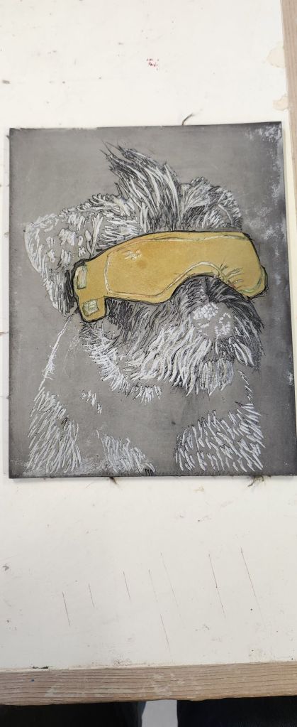
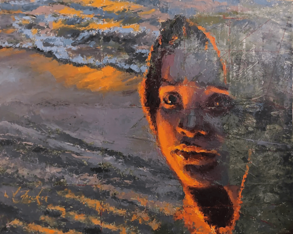
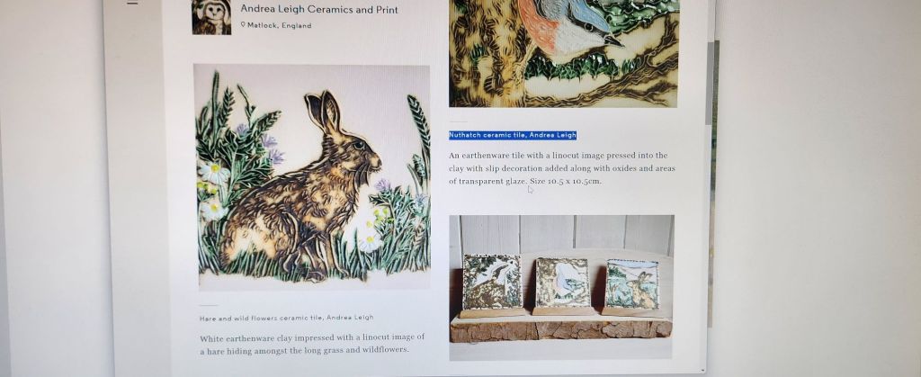
Trying to find ceramic relief artists is very difficult. Using stamps, or reliefs in creating pots and tableware etc, is a technique often used. I have only found one artist who paints the reliefs although Andrea Leigh paints the oxides on for a more detailed painting.
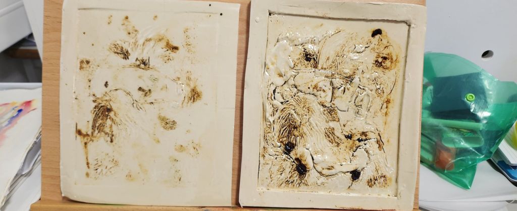
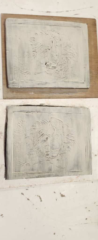
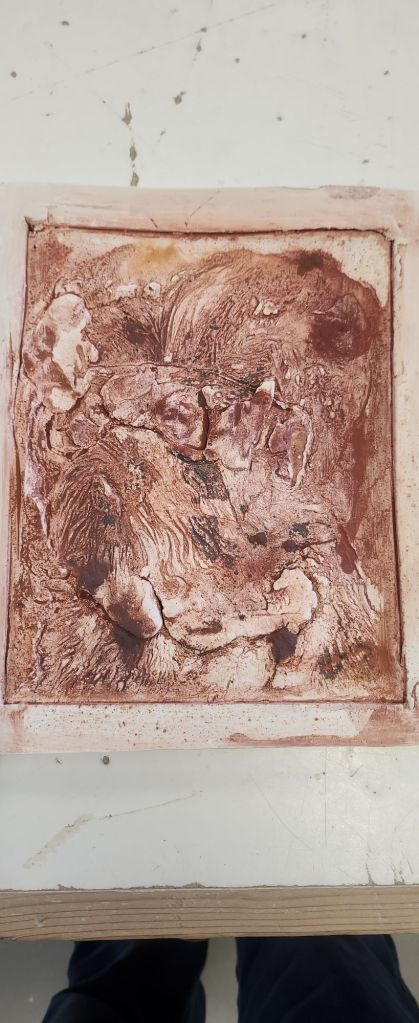
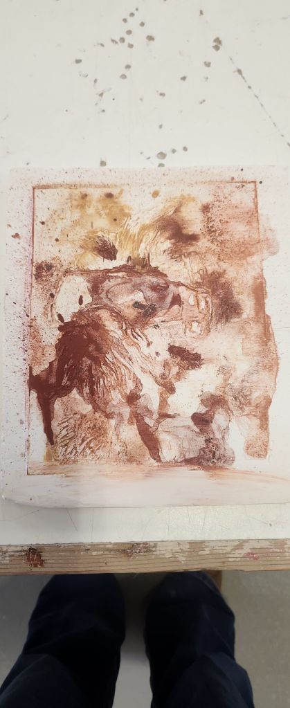
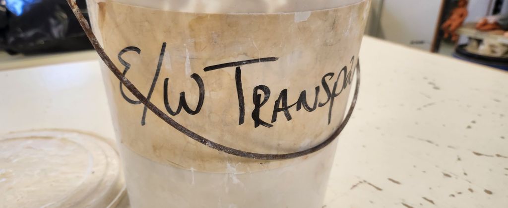
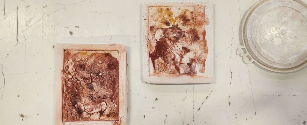
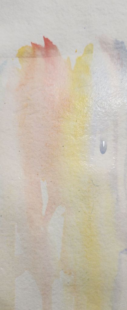
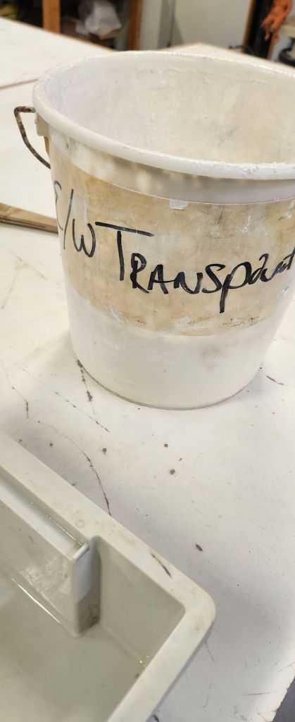
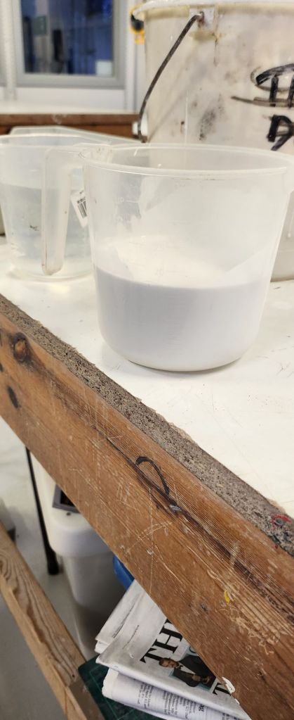
The tiles have been bisque fired and are ready for glazing. After talking things through with my tutor, I realised that last year I diluted the transparent glaze even more before I applied it to my relief work.
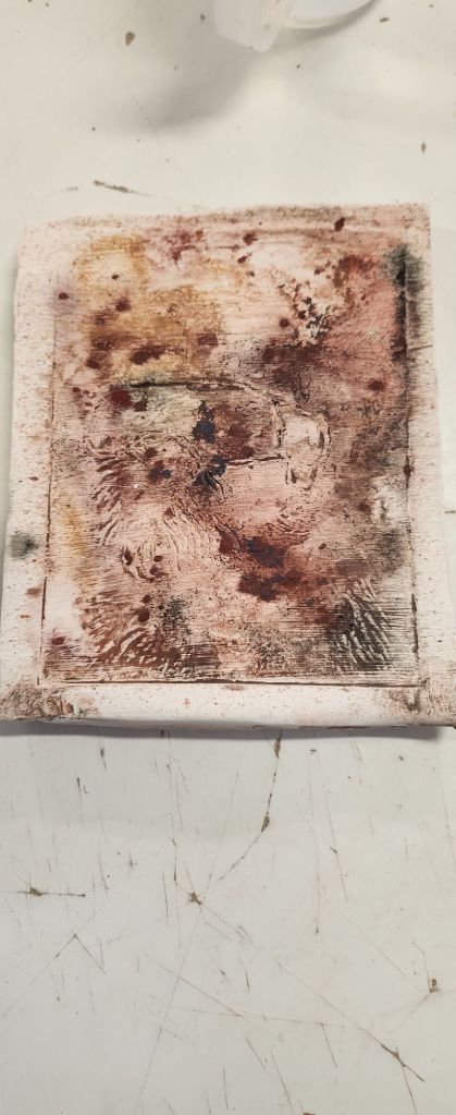
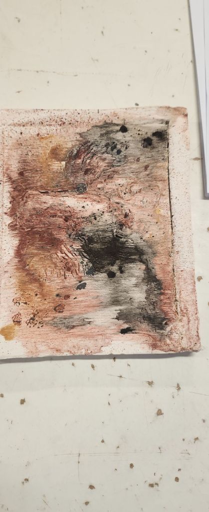
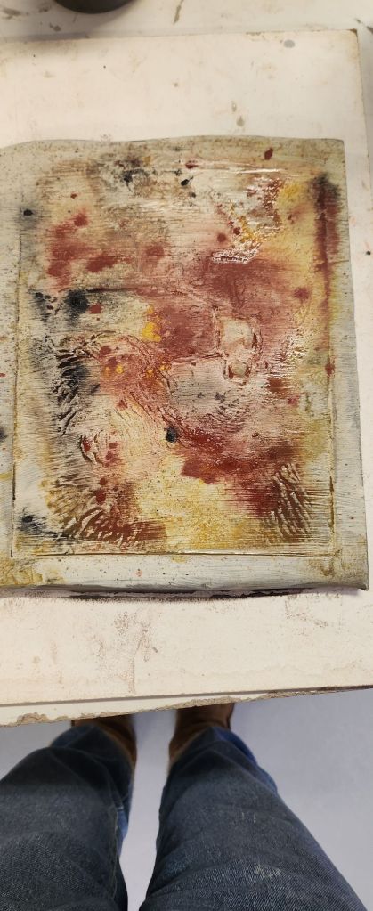
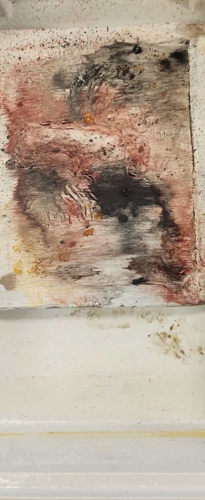
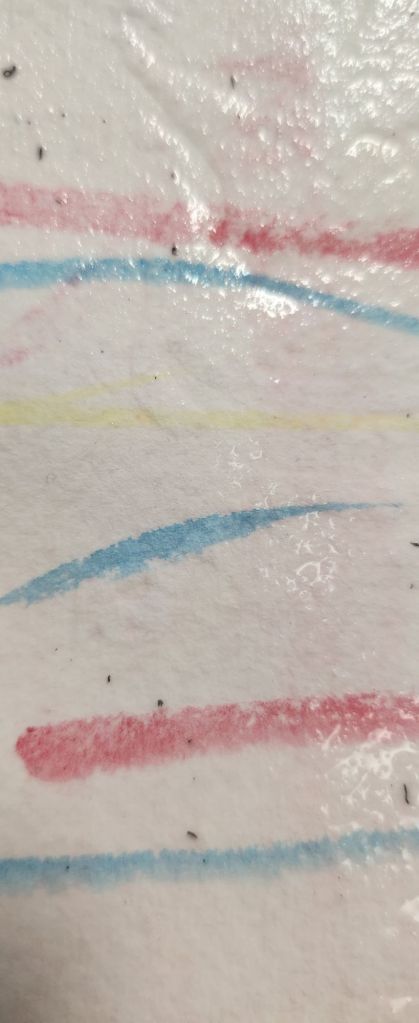
Even though I applied the oxides more uniformly on both tiles, they reacted differently on each tile during the firing process.
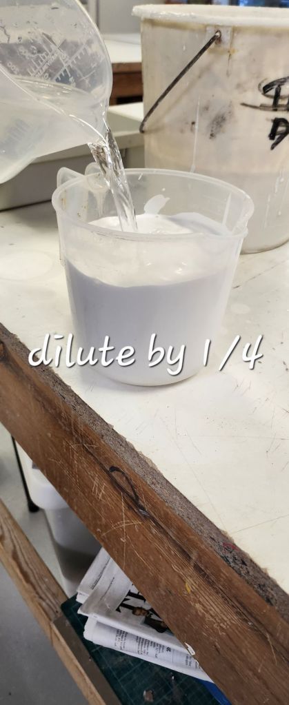
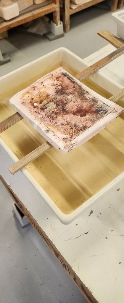
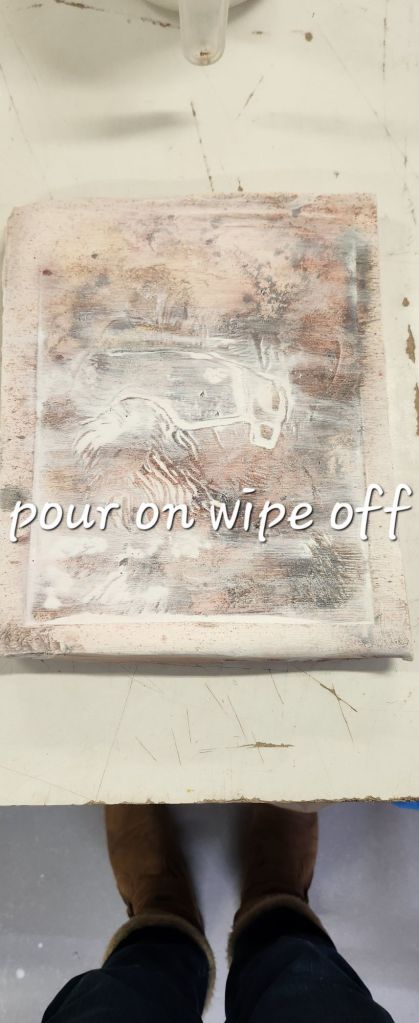
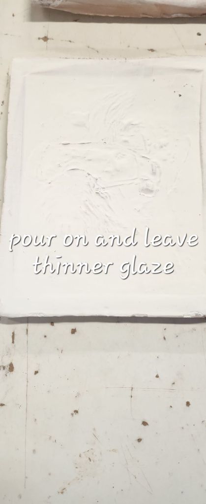
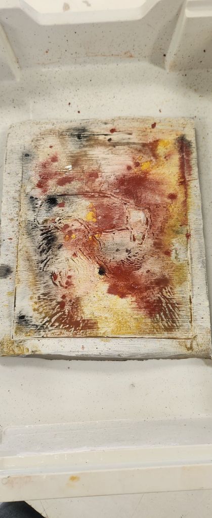
As you can see I poured the diluted glaze over the tiles and wiped off on one tile and left it on the other tile. This is testing to see which process produces a similar finish to the work I did last year.