22 September 2022
Carrying on from yesterday’s work, we were still using the array of still life objects, only this time looking at tonal values and using charcoal do another still life piece.
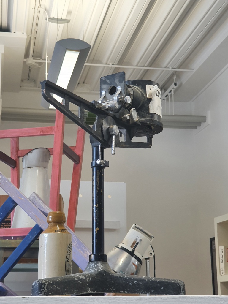
I deliberately chose a more industrial object, made of metal, with angles and curves and lots of highlights and shadows. Being objective my perspective is definitely a little skewed, and respecting the different tonal values of the two different metals was hard and did find myself getting a little carried away with some parts and having to hastily rectify them to more accurately reflect the object I was drawing and the angle I was seeing it from. I’m rather pleased I pushed myself out of my comfort zone, there are some elements that I did well, but obviously still have a lot to work on. I seem to keep coming back to perspective. I need to do more of this. I don’t necessarily want to be ultra realistic, but the proportions still need to be more accurate. I have no idea what the original object is, would it have helped if I did? Possibly not, because if I could relate to it there is a chance I would have drawn what my mind thinks it should look like, rather than what it actually does look like from the angle I am viewing. I could have used negative space better to aid with the highlights and shadows, but again this is something I don’t do as a matter of course, so more practice needed.

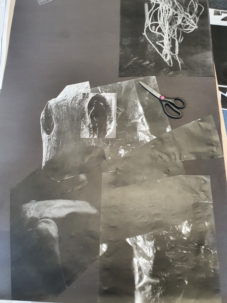
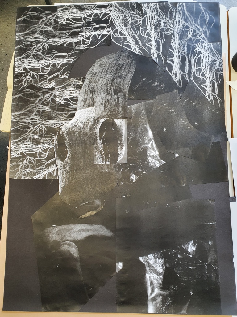
Another part of the exercise to look at tonal values and high/low contrast, was to take the photographs from yesterday and print them out in black and white. We could reduce, enlarge, cut out elements, replicate as many times as we needed, and create another image. The purpose was really to not overthink it, although trying to remember the design principles and keeping the balance was a little challenging. I enjoyed not really having an idea to start with, yet once I started playing with the images and layering them on the paper I could see a pattern forming and shapes and textures that I wanted to include. There were some repeats that I hadn’t noticed and it was only when Simon, our lecturer, was stood talking through what I was doing and picking up some of the photos himself, that I saw what he did and realised that placing them slightly differently the balance of the tones in the final image looked a lot better.

Breaking this subject down into the simple exercises we’ve done over the past couple of days, has helped me consider my approach to creating ‘Art’. If anything, I’m learning to be brave and not worry about turning things around and looking at them from different angles and perspectives, learning to look at all the angles and stripping away the colour so that you are just left with the tones is really good for understanding composition and seeing things as they really are, not what you think they should be. Who knows, maybe you’ll get to see something in a different light.
