I missed this lecture due to a hospital appointment. This links to the assemble project in the Creation and Production module.
It’s about understanding the colour wheel and how our decisions as artists will affect the final composition. The rule we use or disregard in a piece of work have a bearing on how we would like our work to be viewed. Its important to understand where you wish the observers eye to be drawn, and does the composition encourage it to follow a certain path or not. What colour’s you use can help highlight certain areas of the image, or set the mood because of the choice of warm or cool colours, or a blend of both.
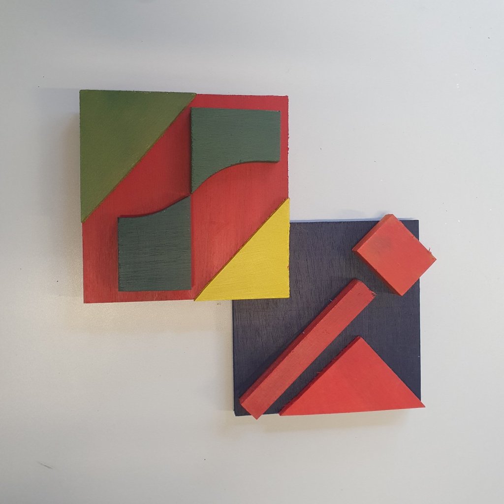
I decided to use a simple complimentary pallette and tried several way of fitting the shapes together. For me it works best with the yellow triangle in the centre.
