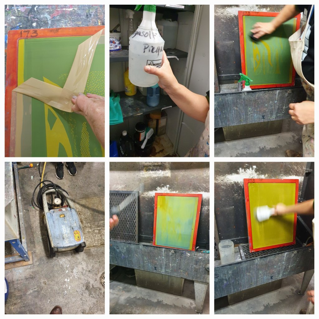
Started by being shown the process of cleaning the screen off properly, this enables us to then use again for new designs.
The most interesting part for me was learning how to use photoshop to turn an photograph into a bitmap greyscale, so that it can be printed on acetate and then exposed onto the screen.
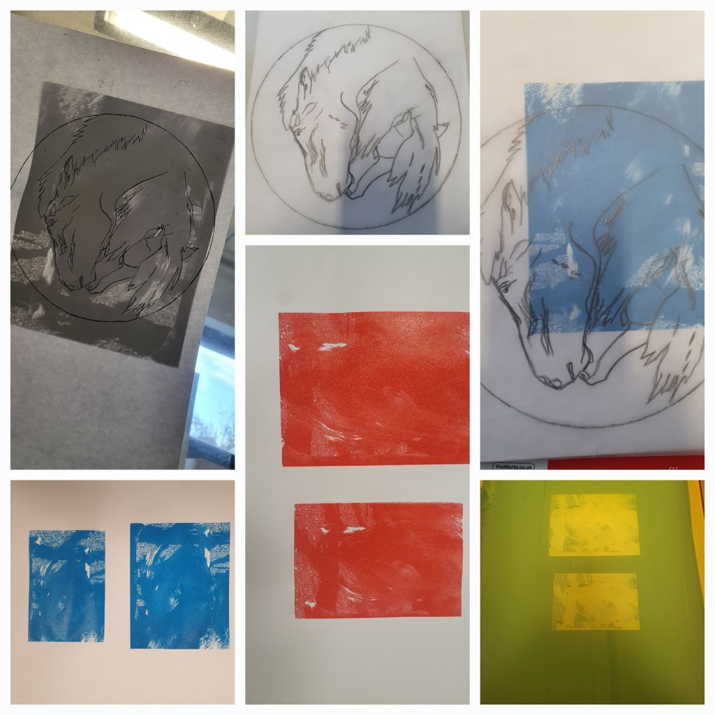
I used an image I had of my two horses when we first got the youngster, and then traced around part of it to create a line design for a two colour screenprint for the pop up shop. I experimented with different colours but neither the red nor blue were included in my final print.
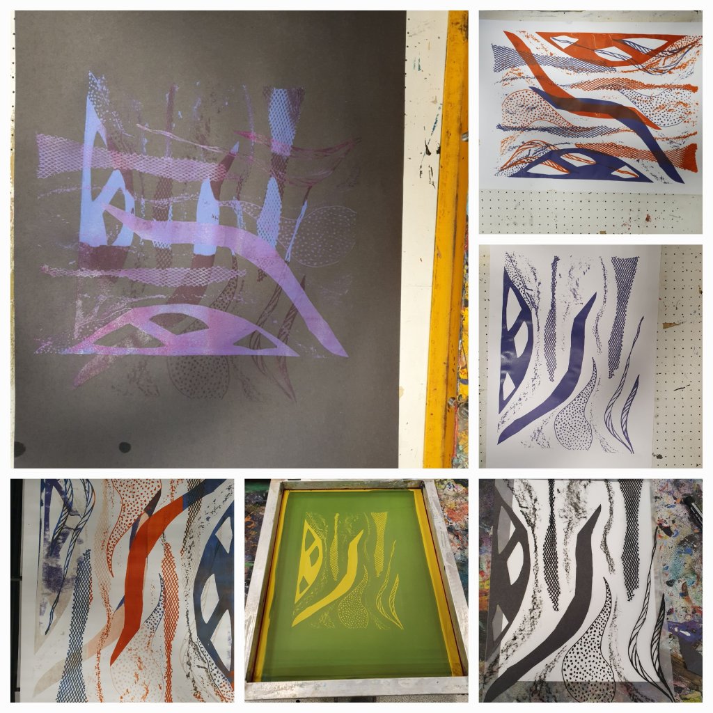
Using bits of paper and textured materials which I cut and designed into shapes. I then stuck these on acetate film to make a pattern. This was then used to expose a pattern on a blank screen.
This screen was then used to print from and I really enjoyed experimenting with different colours and paper, I think my favourite was the black paper with the purple and blue ink.
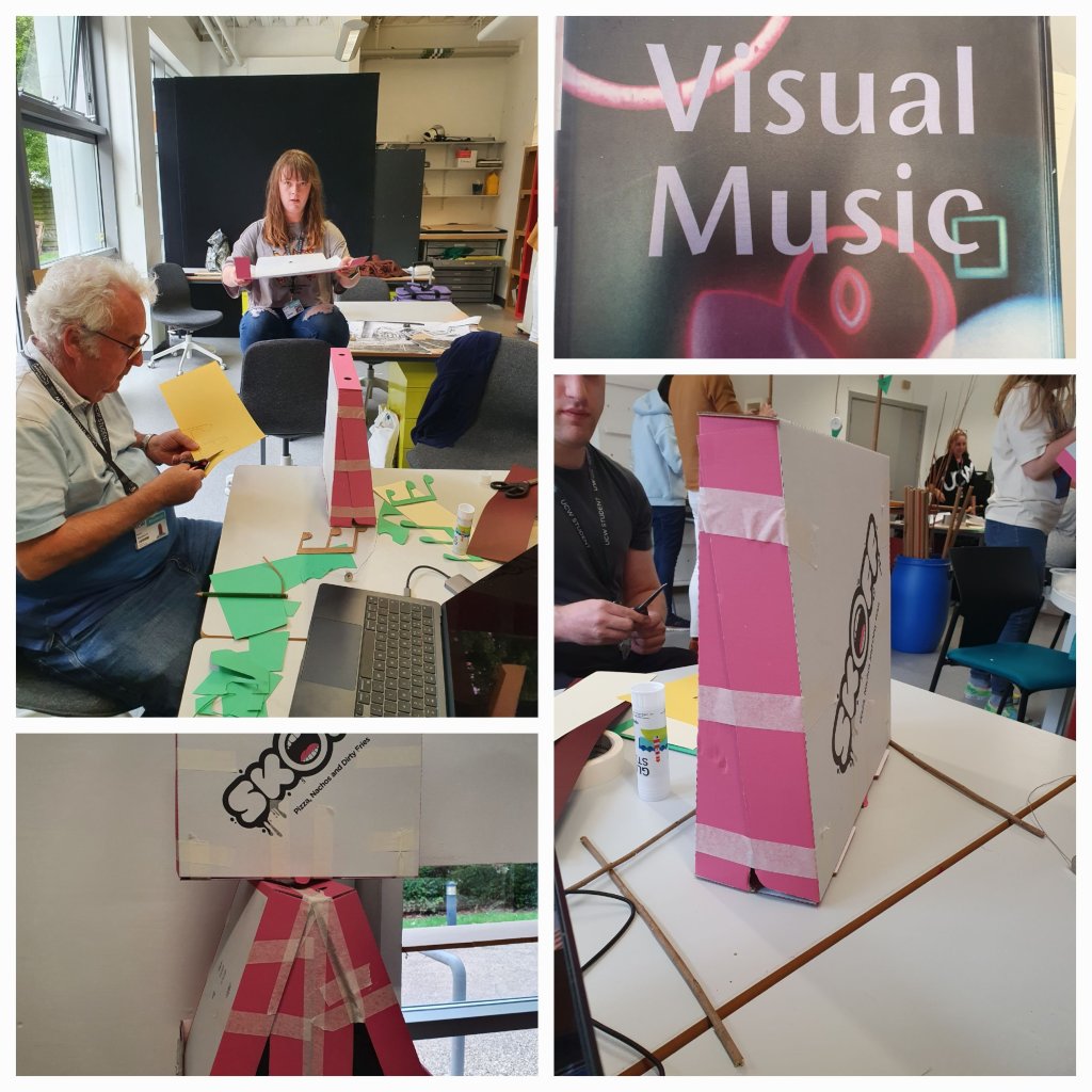
We were briefed on the project and were split into four groups to work as a collaboration, the outcome to be a form of abstract kinetic art. The idea being that as a group we worked to each others individual strengths. So what did we need to do:
research kinetic art
use abstract outcomes
develop ideas by selection, design, making
must be a collaborative practice working to our individual strengths
KINETICS – movement – light and concept of moving, make it real
LIGHT – tonality – alive? – High to low tones, drama
2D art Static 3D use physical movement & light Alexander Rochenko sculpture moves and reacts with light
We looked at a few examples of artists work as part of the briefing lecture on Kinetic Art
Bridget Riley – pointilism, dots to blend clolours, lines close together optical illusion of movement
Paul Fillier – captive light used to create different shades, iridescent colours, study of light
Jean Arp – sculptures – static – you move around it
Marcal Duchamp – “Mobile” his sculpture moves
Alexander Calder – sculpture, mobile, abstract art – it moves itself
Man Ray – known better as a photographer, created first “mobile” he called it ob/struction – ob=objects/struction=putting together
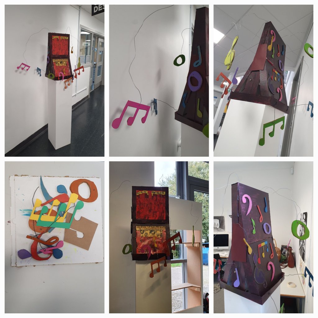
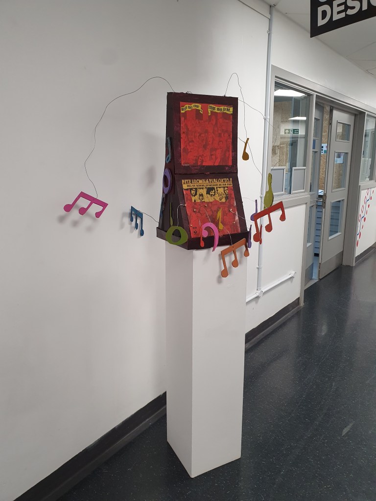
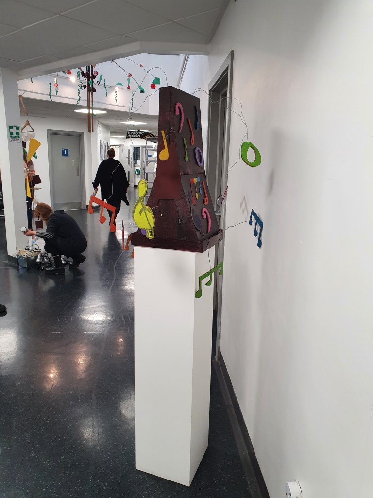
The kinetic sculpture would be displayed in the atrium.
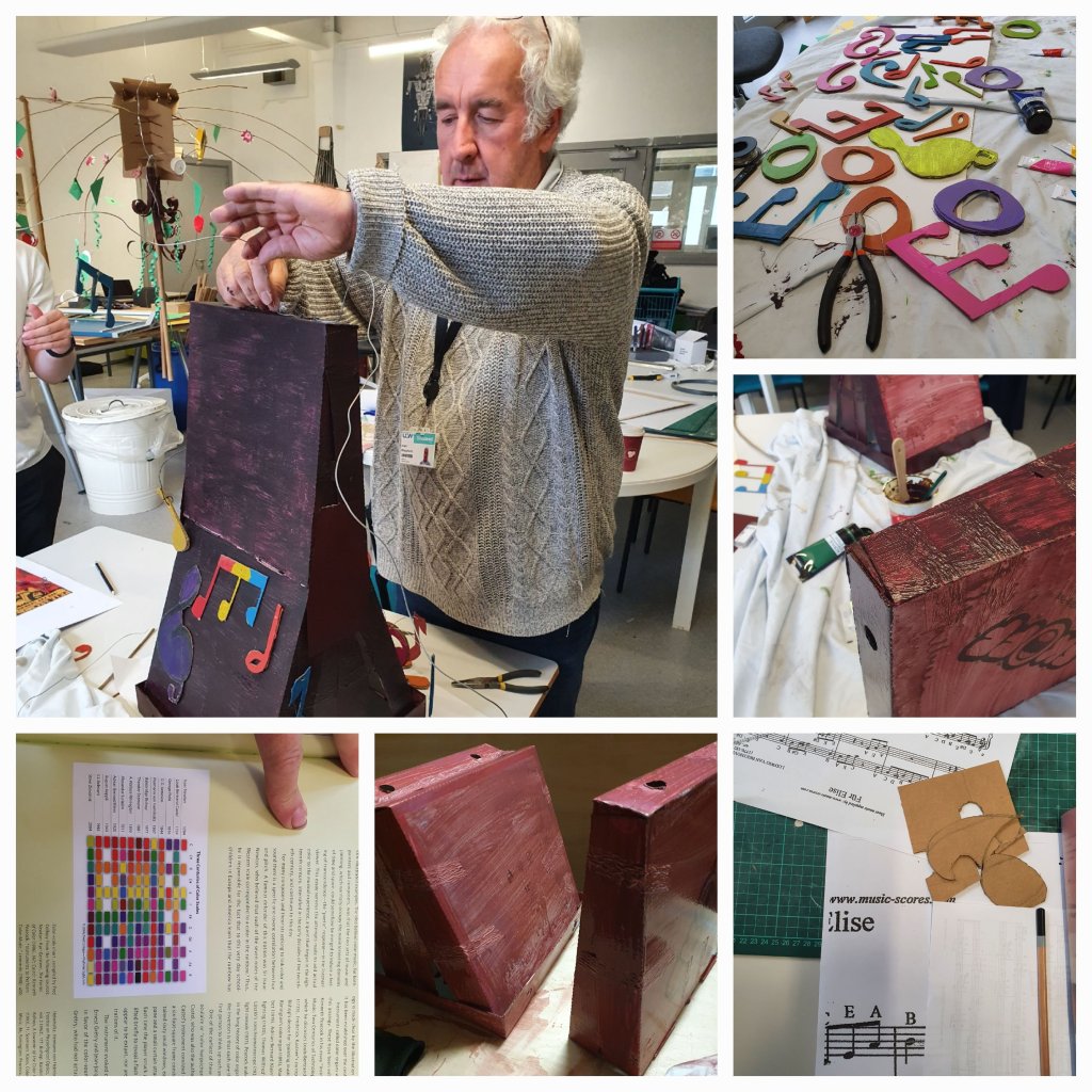
I was in a group with Alan, Alicia, Seb and Lexi. The kinetic artists that seemed to inspire at least two members of our group were Alexander Calder and Rebecca Horn, we then had a discussion about what we liked, didn’t liked and what we were likely to acheive in the timescale we had. Alexander Calder’s pieces were very automotive and although Alan may have had the skills from his engineering background to design and build, it wouldn’t have been possible with the materials we had available to use. Rebecca Horn is interested in sound and musical instruments and uses them in her art installations. Seb wanted to incorporate the music score for “Fur Elise” and whether it’s because of my interest in the art of music and research I did last year on Wassily Kandinsky, I was all up for attempting this. There were comments that music was black and white, so I explained briefly about visual music a book that I had read on Syneasthesia: The Art of Music, and showed them the chart that that every note had a colour, I still feel there was some scepticism but we went ahead with our rainbow notes.
Our initial idea was to use a pedestal and have a pivot in the middle with musical notes hanging of it.
Alicia and Alan started gathering bits together, and working out how to make the pedestal with the pizza boxes, whilst Seb and I went to the photocopier armed with the music sheets to see how we could enlarge them. It was pretty clear that this idea wouldn’t work, so back we went into the studio and I suggested I draw the notes used in the music and we cut them out and paint them. Alicia suggested different weights with cardboard and coloured paper. She also had the hot glue gun to stick a couple of the cardboard notes together to make them heavier. We set up a bit of a production line and got started. At the end of the day Alicia and Seb took the notes home to paint them, and I took the three pizza boxes to home to paint them brown.
The following day Lexi joined us, so we quickly caught her up to speed and she helped with the painting of notes, attaching wires and sticking and attaching them to the pizza box stand. Alan and Alicia worked their magic with glue gun, and we all started attaching the notes and wires to our pedestal. We decorated the pedestal with notes but also with an album cover that Alan had found:
“Things may come and things my go but…… the Art School Dance Goes On For Ever” Pete Brown & Riblokto!
We hit the deadline, we managed to get it all completed if a little tacky in places and displayed in the atrium. As part of the installation and presentation we placed a blue tooth speaker under the pedestal and played “Fur Elise”.
In conclusion I think it was a successful project although, I admit there were points when I really didn’t think we would get everybody on board with a cohesive idea, are there things we could have done differently? Yes as it was quite a fluid construction with lots of problem solving along the way.
Carrying on from yesterday’s work, we were still using the array of still life objects, only this time looking at tonal values and using charcoal do another still life piece.
I deliberately chose a more industrial object, made of metal, with angles and curves and lots of highlights and shadows. Being objective my perspective is definitely a little skewed, and respecting the different tonal values of the two different metals was hard and did find myself getting a little carried away with some parts and having to hastily rectify them to more accurately reflect the object I was drawing and the angle I was seeing it from. I’m rather pleased I pushed myself out of my comfort zone, there are some elements that I did well, but obviously still have a lot to work on. I seem to keep coming back to perspective. I need to do more of this. I don’t necessarily want to be ultra realistic, but the proportions still need to be more accurate. I have no idea what the original object is, would it have helped if I did? Possibly not, because if I could relate to it there is a chance I would have drawn what my mind thinks it should look like, rather than what it actually does look like from the angle I am viewing. I could have used negative space better to aid with the highlights and shadows, but again this is something I don’t do as a matter of course, so more practice needed.
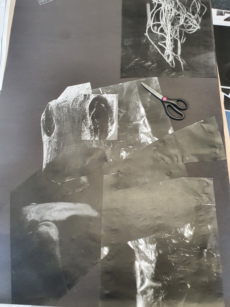
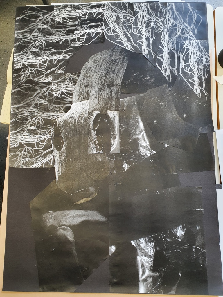
Another part of the exercise to look at tonal values and high/low contrast, was to take the photographs from yesterday and print them out in black and white. We could reduce, enlarge, cut out elements, replicate as many times as we needed, and create another image. The purpose was really to not overthink it, although trying to remember the design principles and keeping the balance was a little challenging. I enjoyed not really having an idea to start with, yet once I started playing with the images and layering them on the paper I could see a pattern forming and shapes and textures that I wanted to include. There were some repeats that I hadn’t noticed and it was only when Simon, our lecturer, was stood talking through what I was doing and picking up some of the photos himself, that I saw what he did and realised that placing them slightly differently the balance of the tones in the final image looked a lot better.
Breaking this subject down into the simple exercises we’ve done over the past couple of days, has helped me consider my approach to creating ‘Art’. If anything, I’m learning to be brave and not worry about turning things around and looking at them from different angles and perspectives, learning to look at all the angles and stripping away the colour so that you are just left with the tones is really good for understanding composition and seeing things as they really are, not what you think they should be. Who knows, maybe you’ll get to see something in a different light.
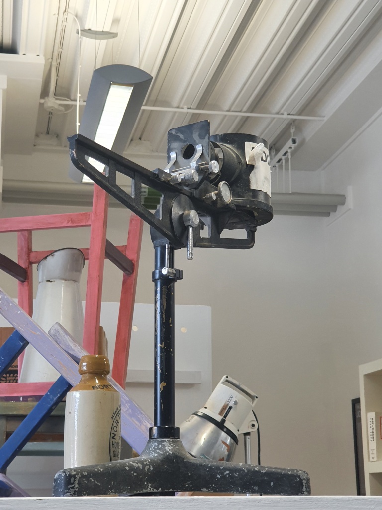
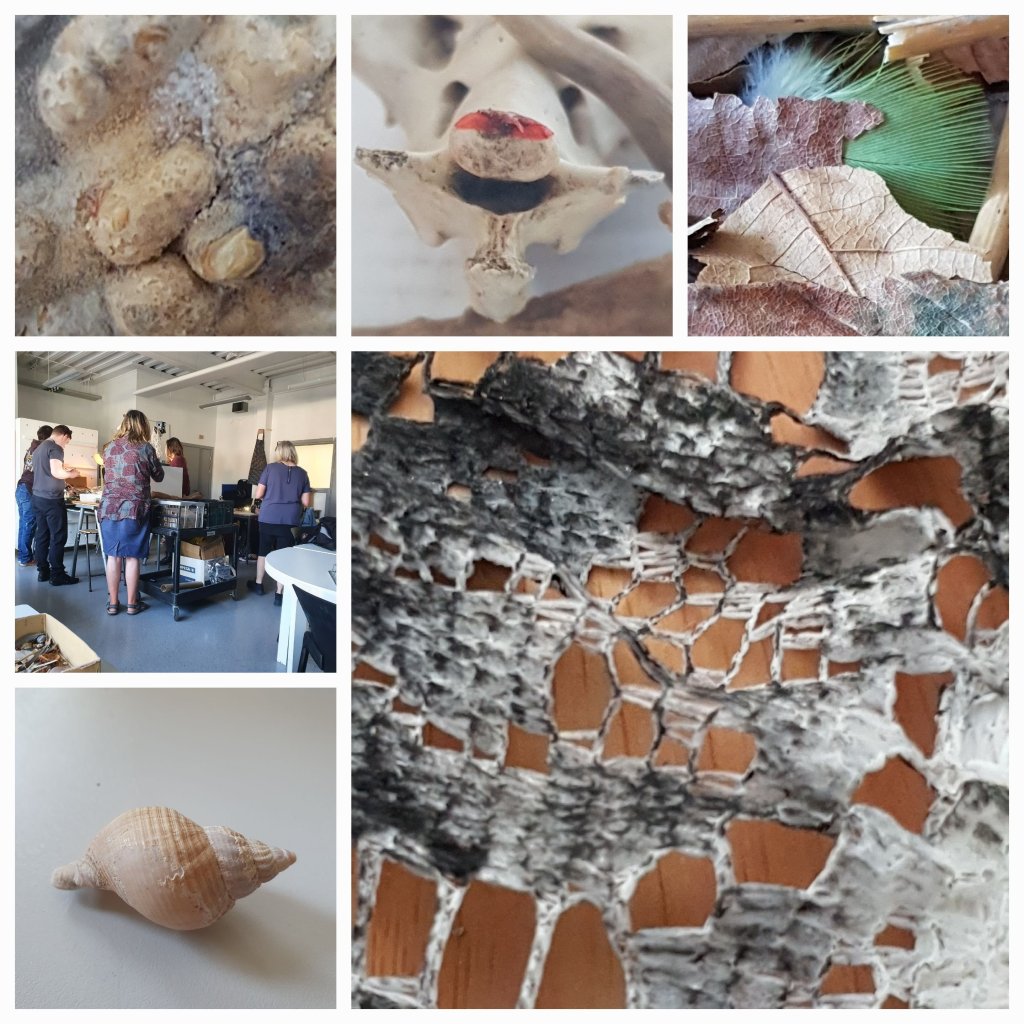
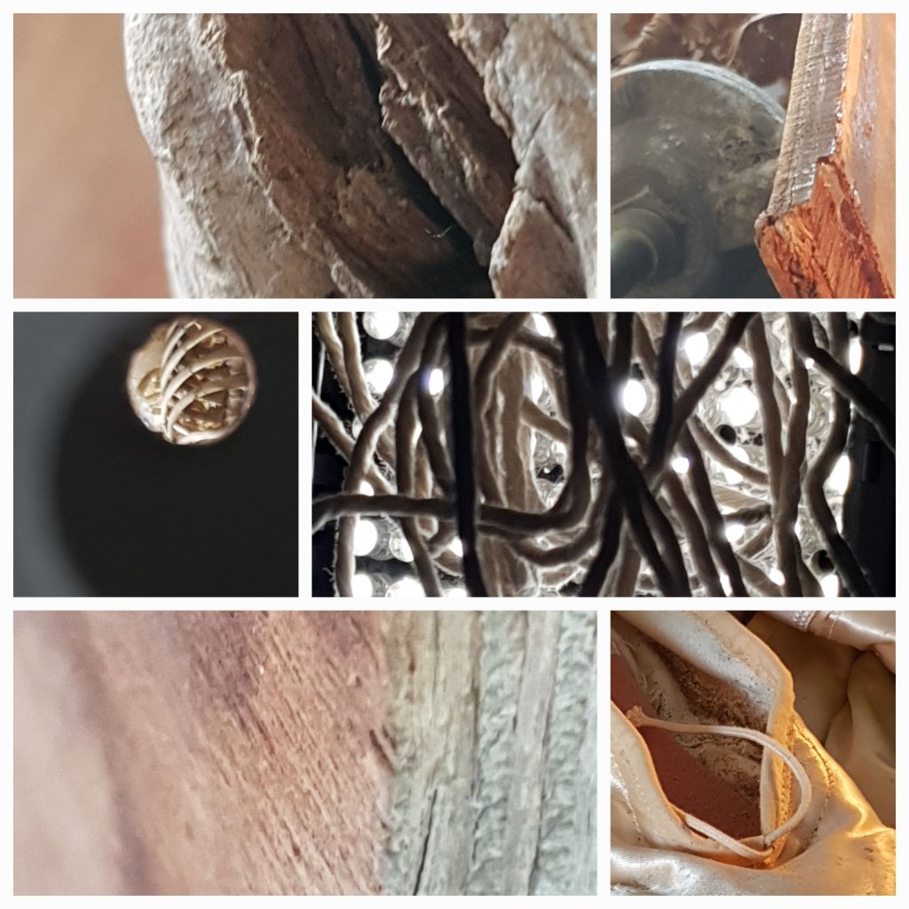
We were joined by the year two students as we are all working on Shape, Form, and will be working on a collaborative project as part of this tope. Our lecturers had an assortment of interesting objects, shells, pieces of wood, feathers, bone etc. Our first task using the Nikon D90 cameras, was to take interesting shapes, and group items together, or single them out and thing about why we found them interesting. We needed to thing about the formal elements of art and the principles of design and consider how we could use these images. It was a good way to consider lighting, how we can change it, how we use the negative spaces, take photos from different angles by not only moving objects, but moving around them ourselves.
I found that I was very interested in textures and the more natural patterns, I was also attracted to curves rather than purely linear patterns. Which I find quite interesting, as most of the time I draw freehand I will start with a slightly wavy line or a circular motion rather than straight and angular. I was also drawn to the more natural materials on the table, rather than the manmade structures, or metal. Maybe that’s where I find my inspiration? I love being outdoors and like the more earthy colours. Yet sometimes, like the strands of wool fibre hanging in front of the spot light, I love the clash and harshness of the lights behind the softness of the wool. I also like the tones acheived by the harsh shadows. The delicacy of the feather and the dried leaves, and the contrast of the bright green with the autumn browns, it made me think of a woodpecker that visits my garden. The well worn ballet shoes, I could almost hear the music and the “one, two, three” count of the teacher as the dancer practiced the movements over and over. That’s what these images evoke in me, and remind me about, as I was taking the photographs and considering the best way to reflect them, I was imagining the stories behind how they got to be there.
The final individual outcome is to be monochrome, but we took the original images in colour. The whole idea of this exercise is to get us back into the habit of recording everything and developing good practice.