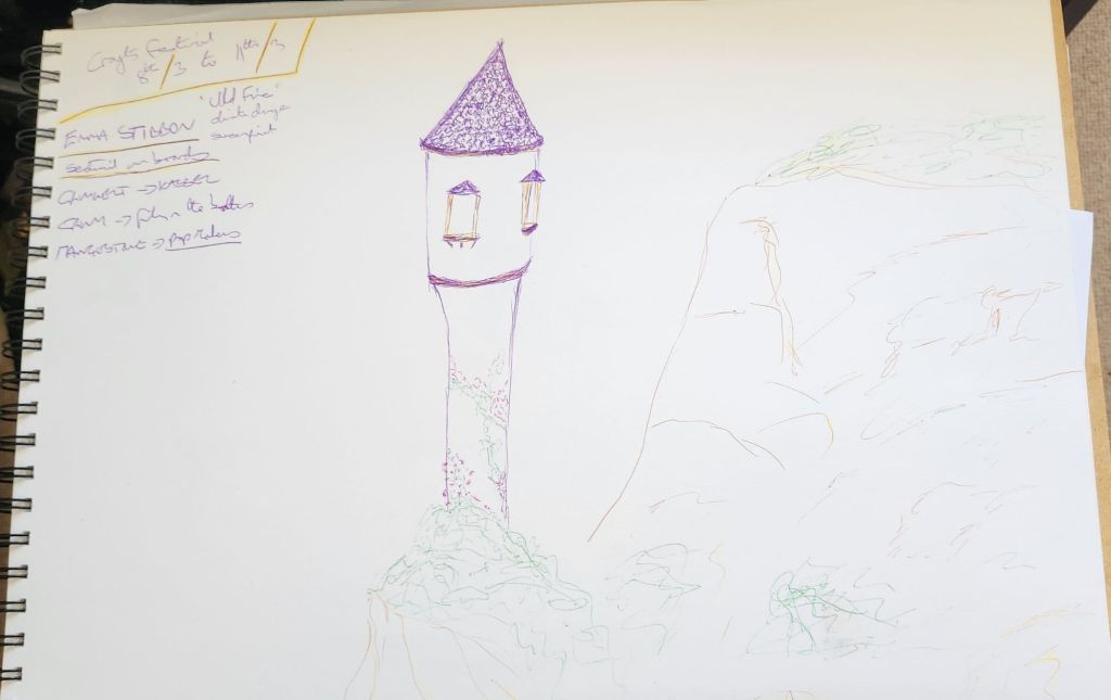
Brothers Grimm

March 2024

This is a collaboration with the HMMP Year 2 Students. Their theme for this year is Brothers Grimm and our commission is to work with them to design backdrops for their end of year exam photoshoots.

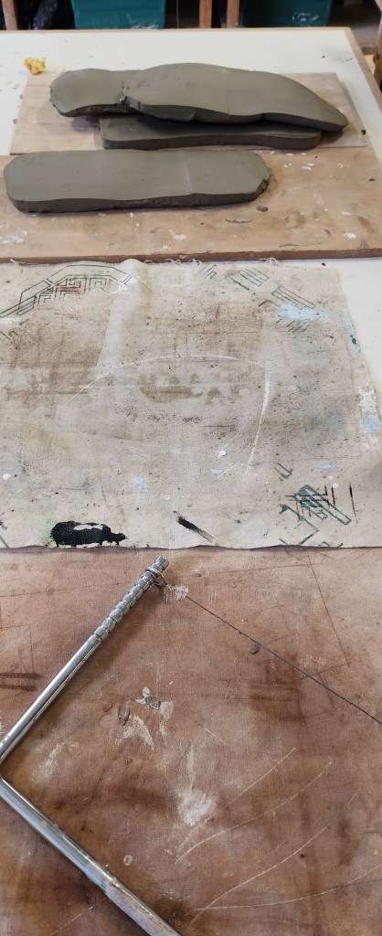
We were working in our two groups, there are 6 students, so we took 3 designs each. A quick update on our group, we no longer have Alan and Caroline has joined us instead and our name has been changed to Art-iculate.

This is the first project I feel excited and happy to be involved in. I think that’s because I love all the fairy tales and make believe – even the darker versions of the popular ones we tell our children. Our groups three back drops are:

  • Seven Ravens – The story of seven brothers who failed to return with a jug of water to baptise their sister and their father, cursed them by wishing they were ravens.
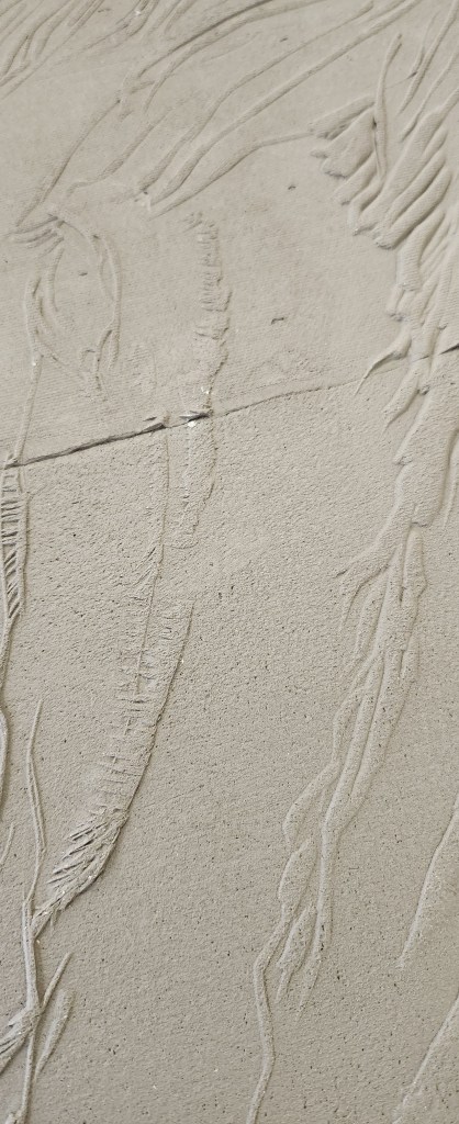
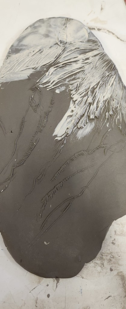
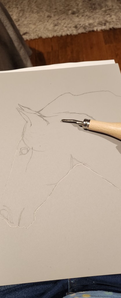
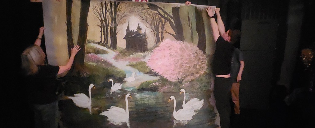
  • Six Swans – the story of the sister who escapes being turned into a swan by her evil stepmother’s, mother whose a witch, but has to stay mute for seven years.
  • Into The Woods – which is really an adapation of Grimm fairytales with Red Riding hood as the main character it revolves around.

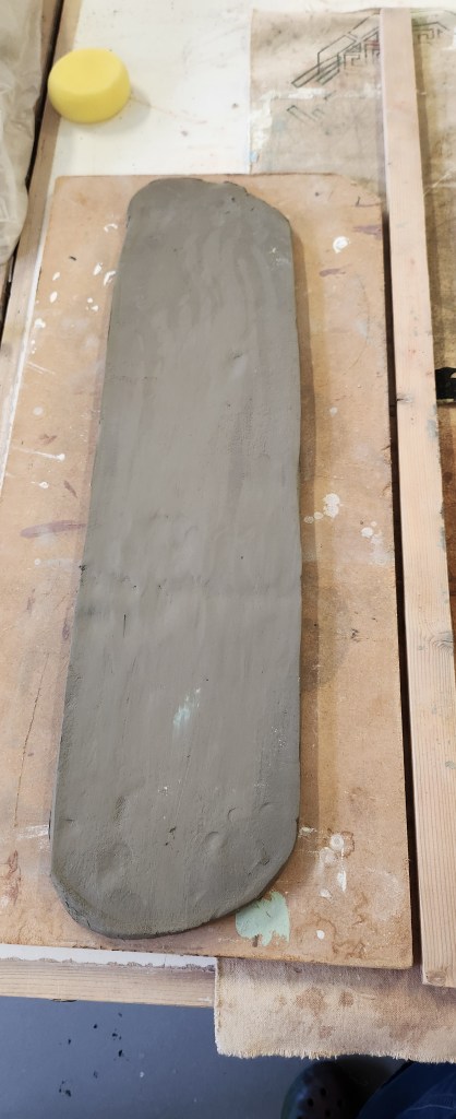
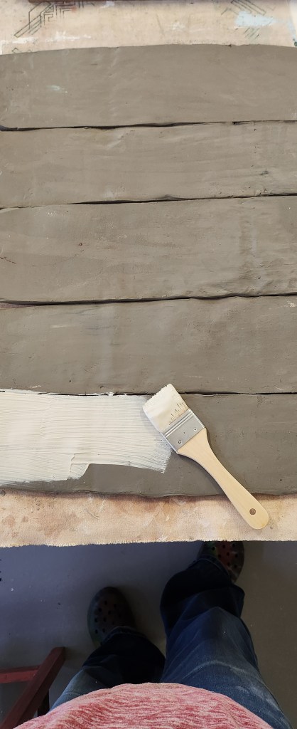
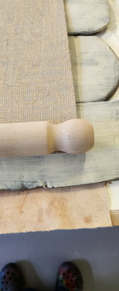
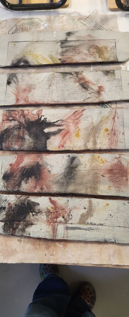
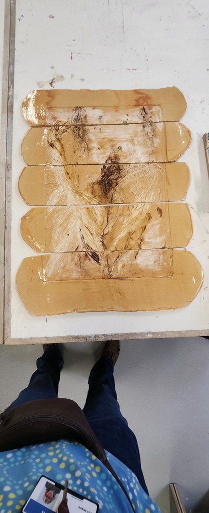
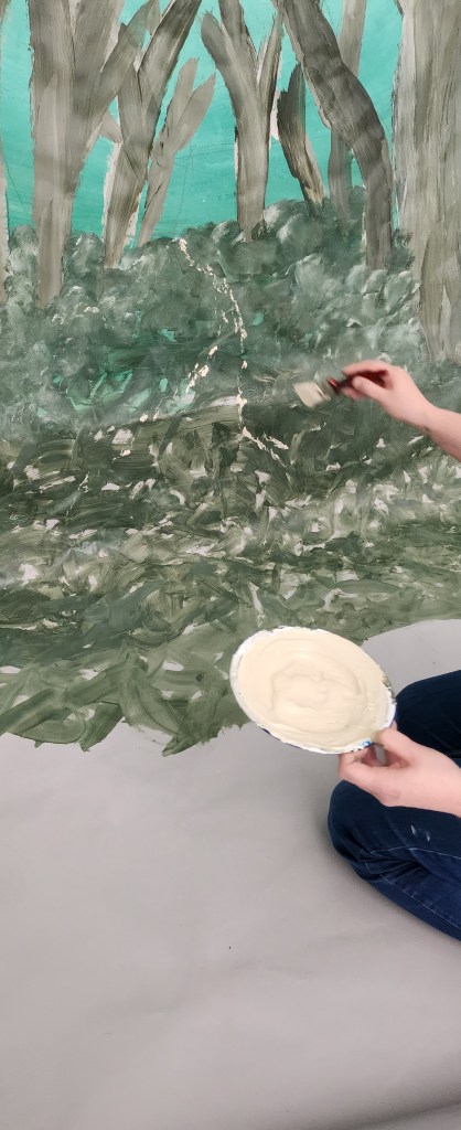
We split the three backdrops between us to work on, Sam and Alicia had into the woods, Caroline and Claire Seven Ravens, and I started on ideas for the Six Swans.

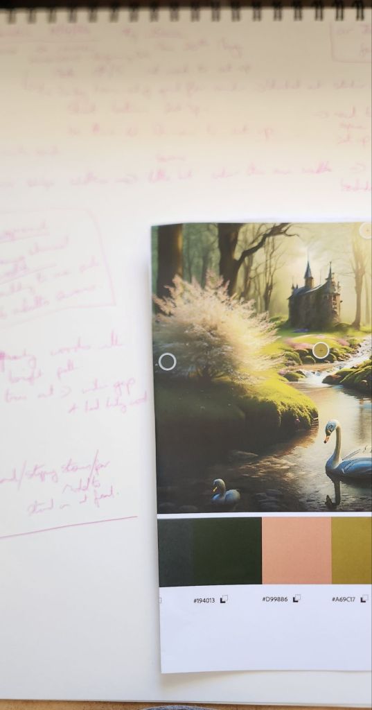
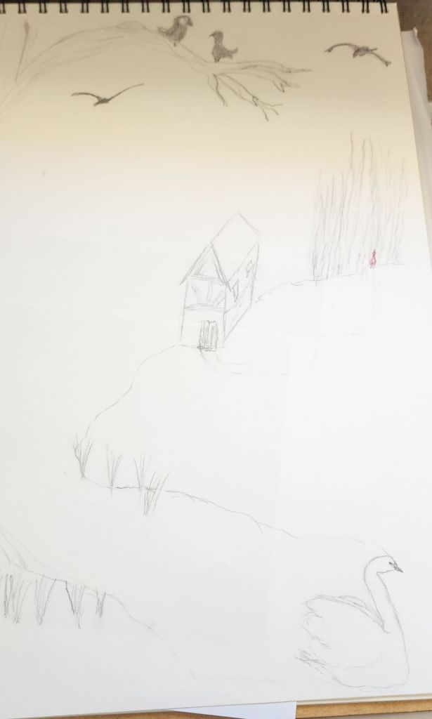
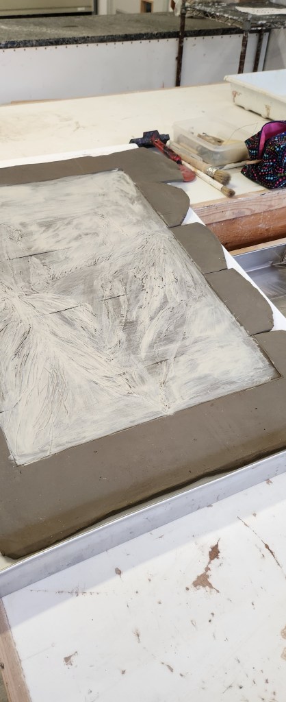
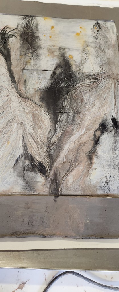
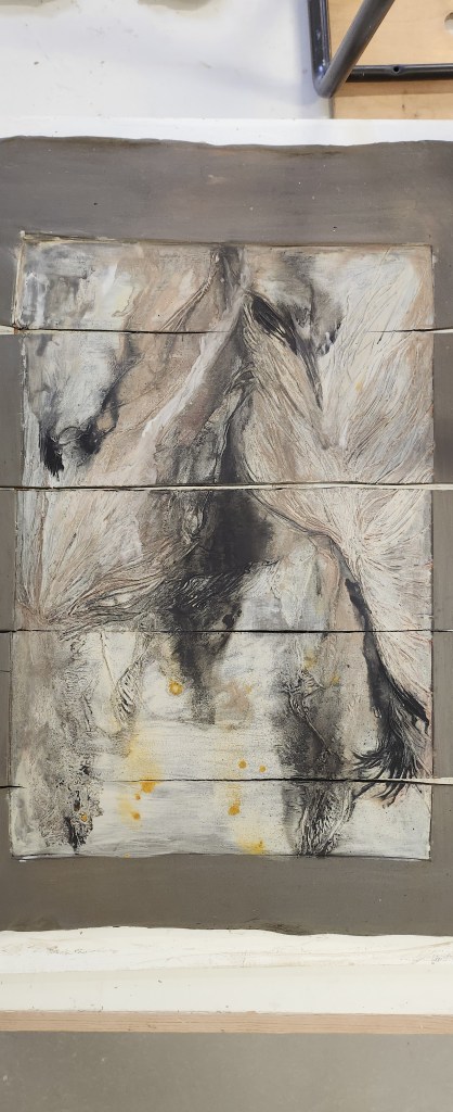
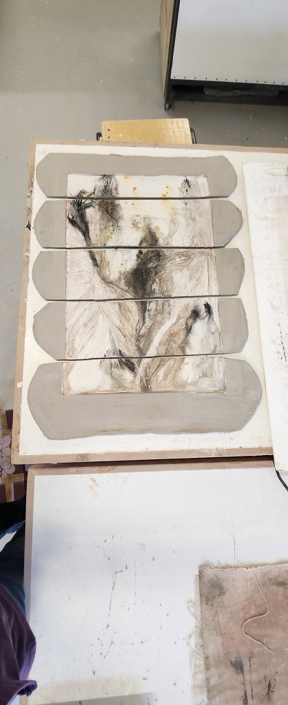
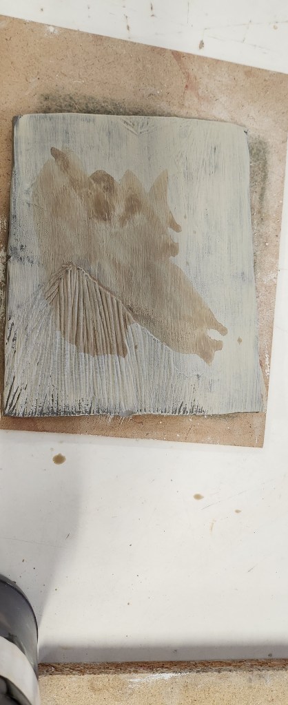
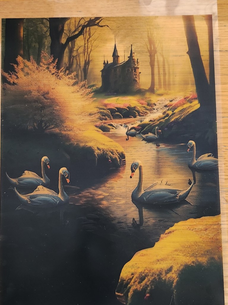
I loved that Ffion wanted light witchy woods, with a stream or pond, with six swans on it and a medieval village/house in the back ground. It was very reminiscent of ballet scenery and backdrops from the theatres when I’ve seen Swan Lake, so I already had ideas bubbling in my head.

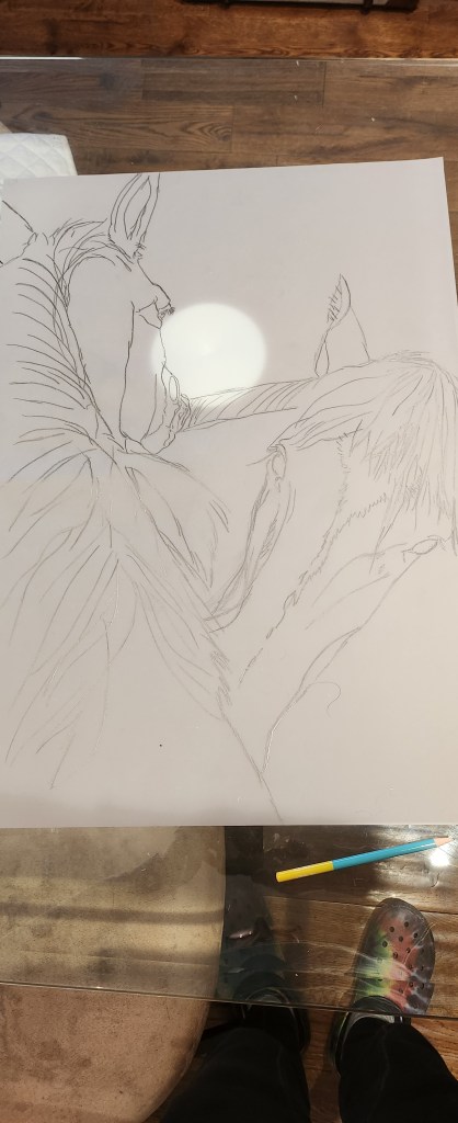
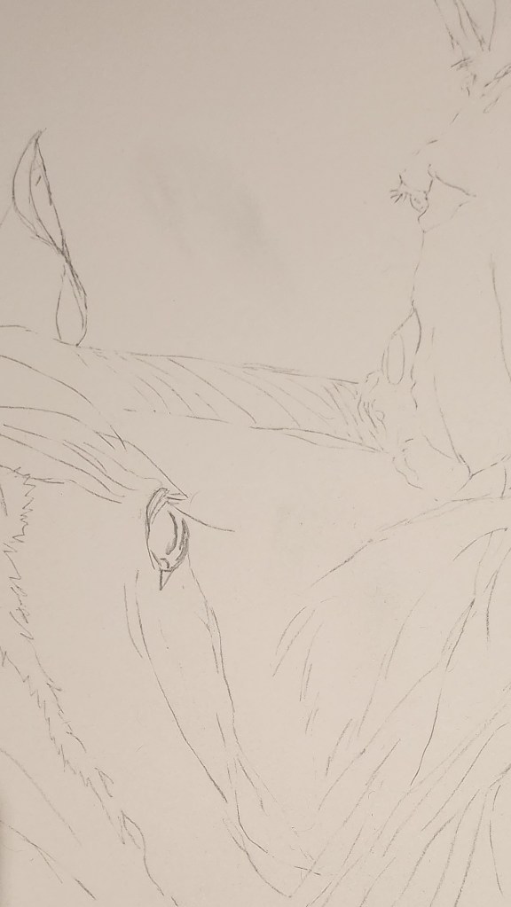
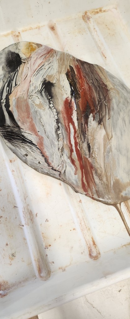
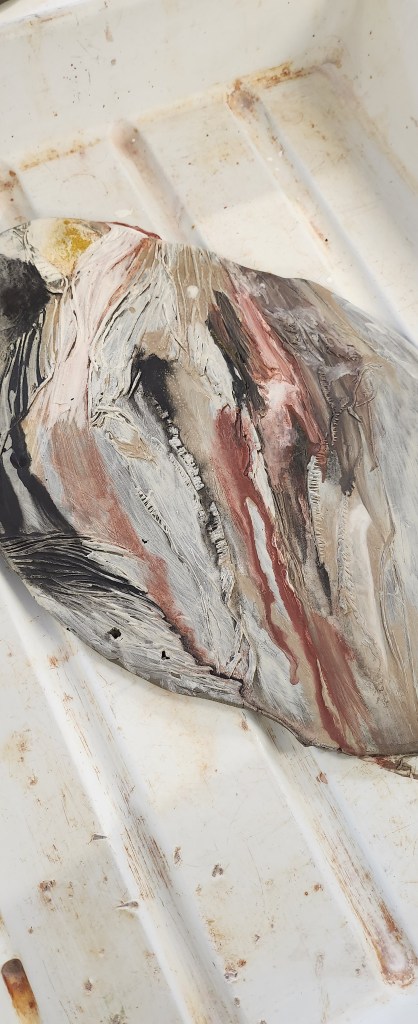
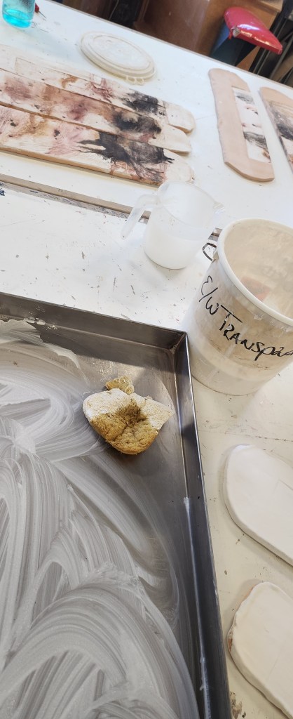
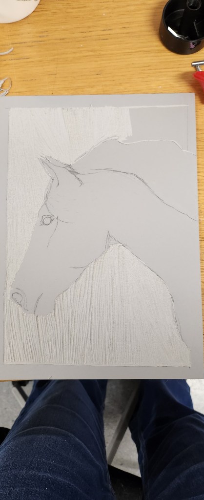
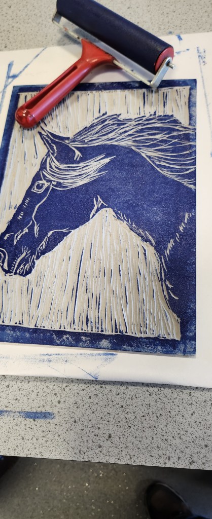
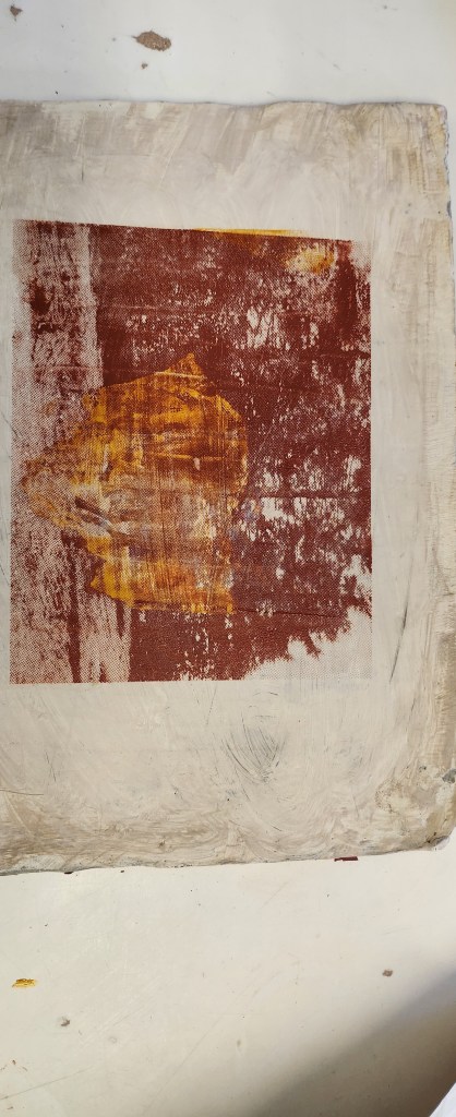
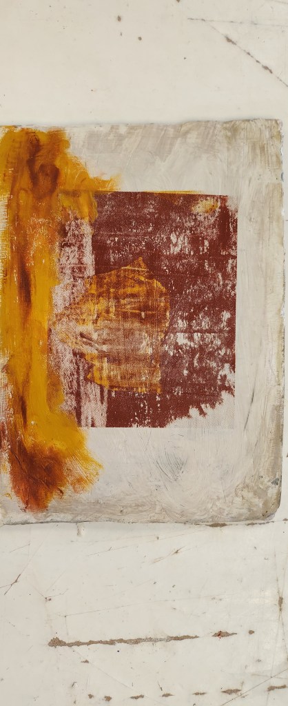
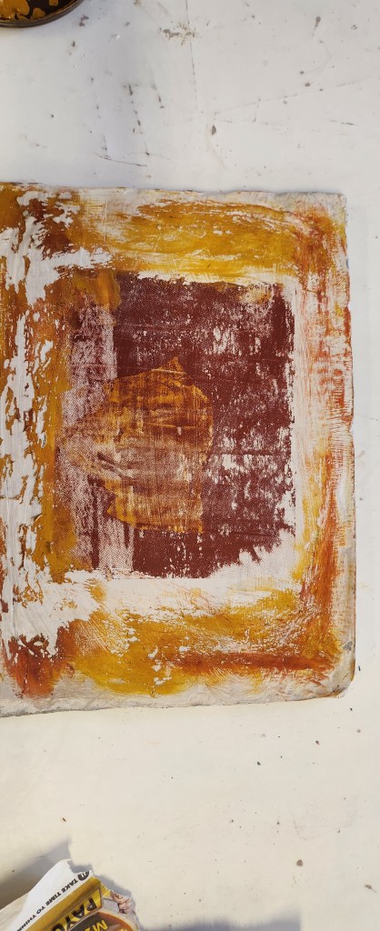
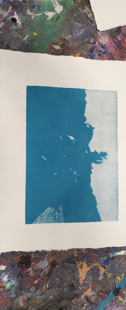
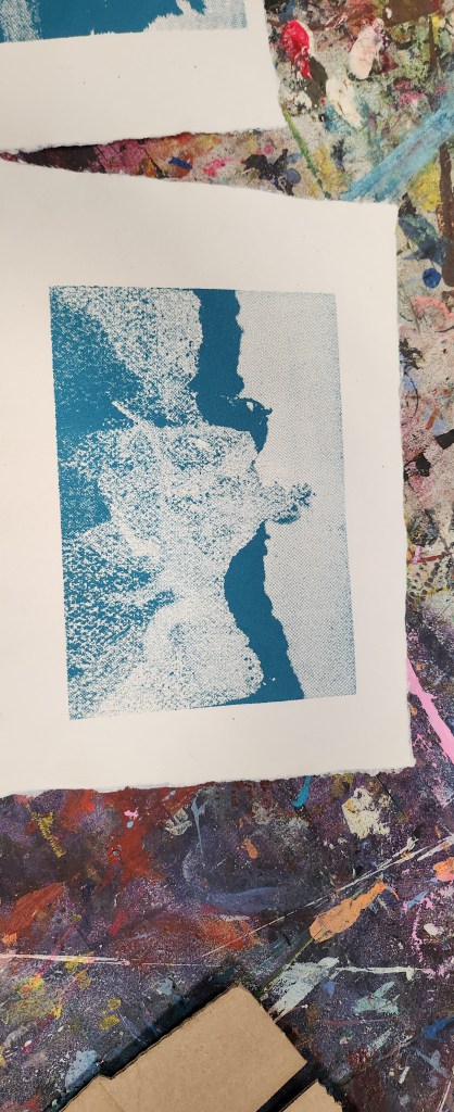
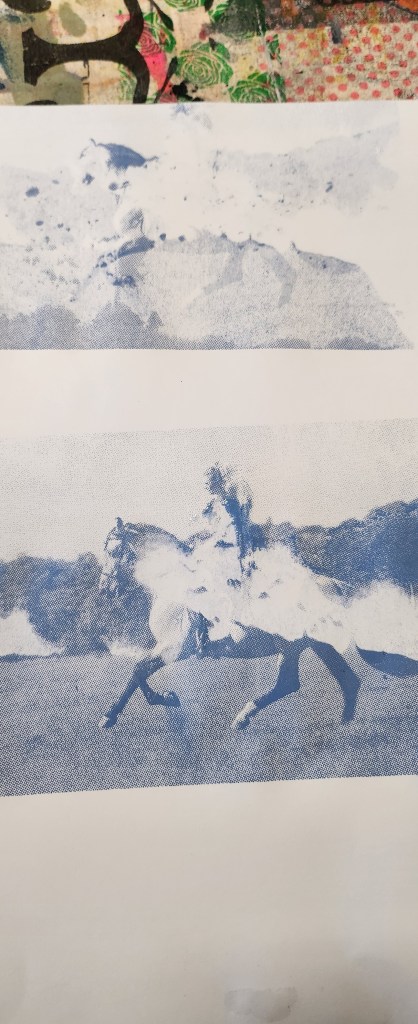
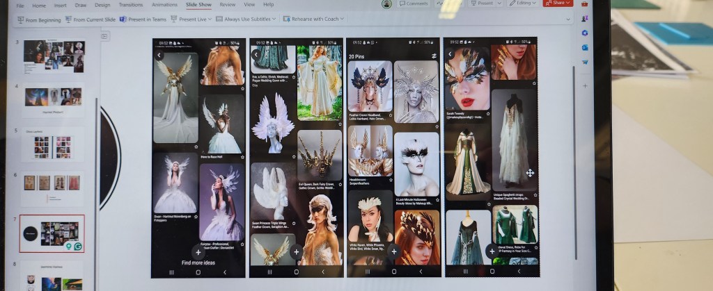
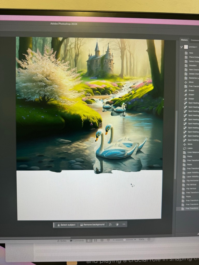
The catch of course is that the mood boards needed to be generated digitally and using Adobe AI products. Not sure if you’ve ever used AI technology but what you get out is only really as good as the word descriptions you put in. I did struggle and couldn’t quite get six adult swans but that was rectified by using photoshop once the design was agreed on with Ffion.

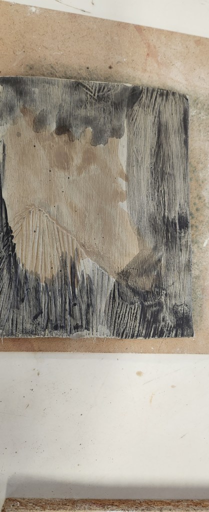
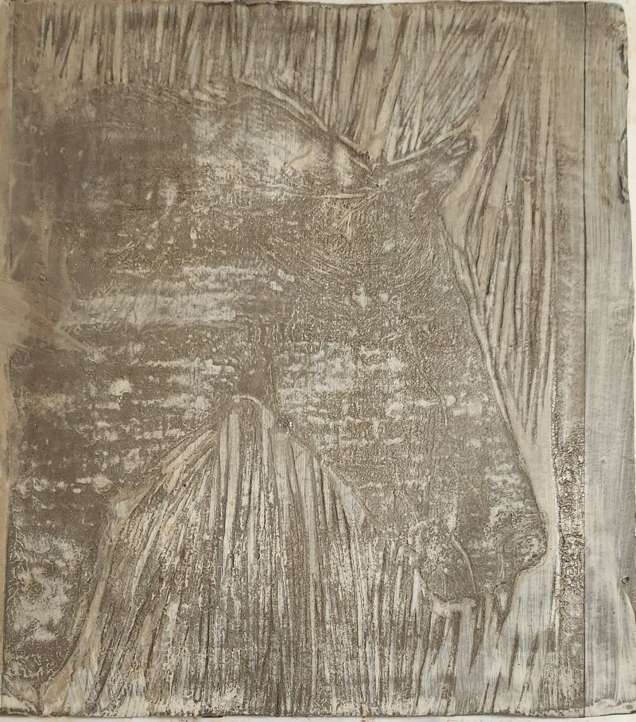
Ffion chose the middle mood board, I then made changes in photoshop that had been requested, like more adult swans, and a bit of land at the front it didn’t look like her model was in the water. For once, I actually felt as though I knew what I was doing and enjoyed using photoshop to get the final look.

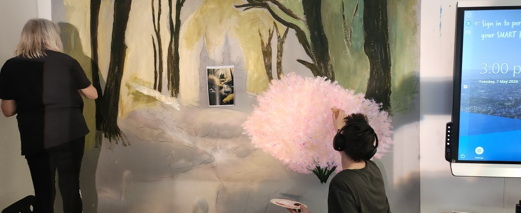
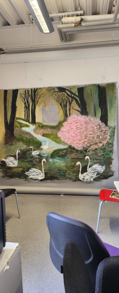
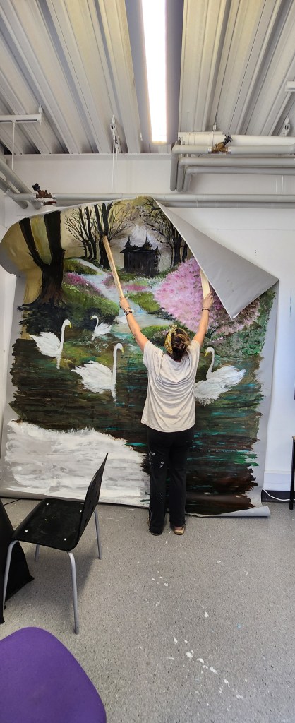
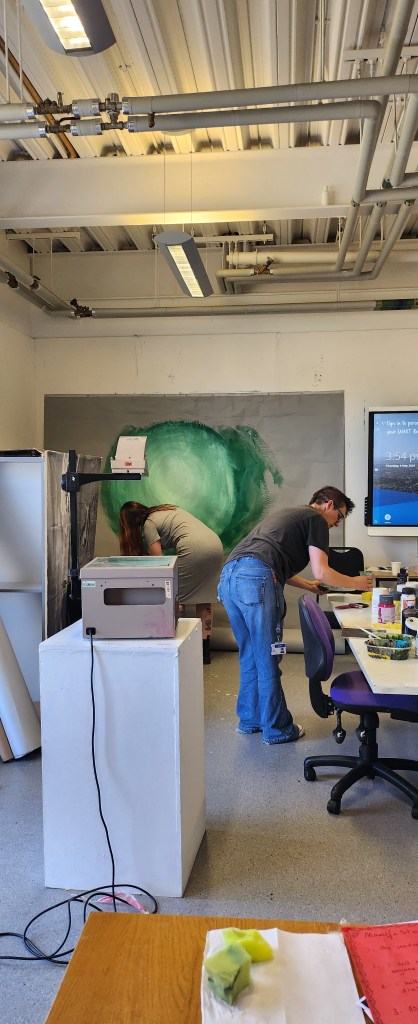
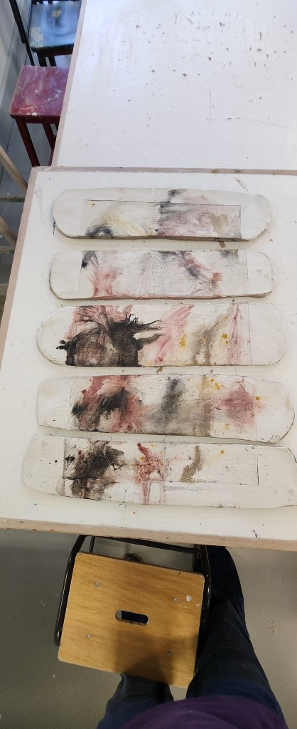
Exam Day…. we installed our frame for the backdrops and our system of having two so that we could photograph one, and have the next ready to go worked really well. Because it was a Monday and not our usual university days I couldn’t stay for all of it, however, I did capture a few photos.

Into The Woods
Seven Ravens
Ffion and her swan
Six Swans backdrop being hung in place

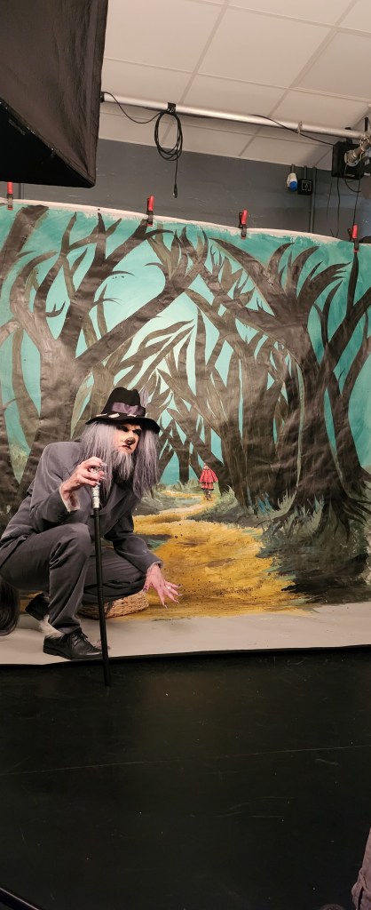
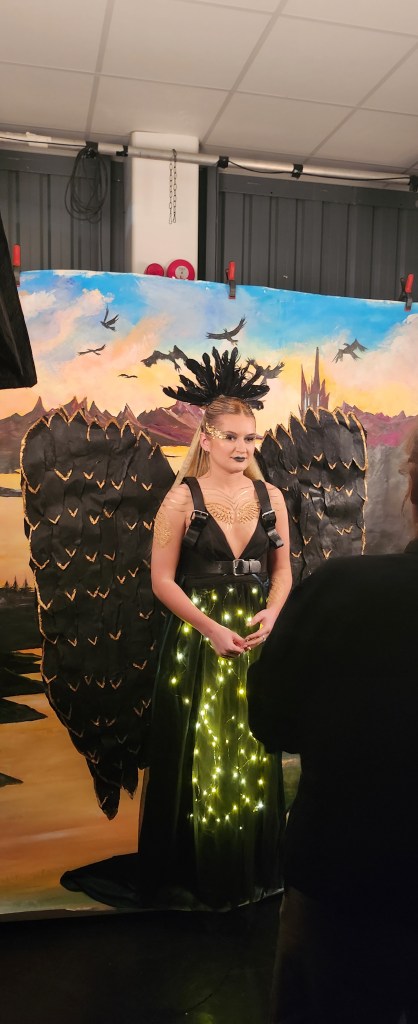
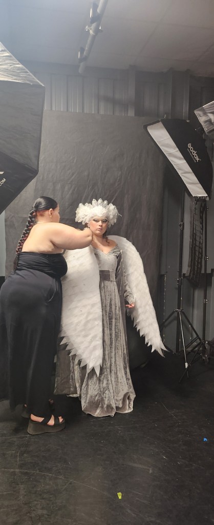
My overall conclusion on working on this collaborative piece is that I loved the HMMP students, they were actually pretty easy going, had really clear ideas on what they wanted. The hardest part for us I think is remembering it’s their final exam and our work, even though we are also being marked on it, really shouldn’t overshadow theirs. I think we managed to complement their final costumes and models quite well.

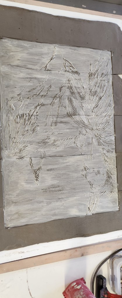
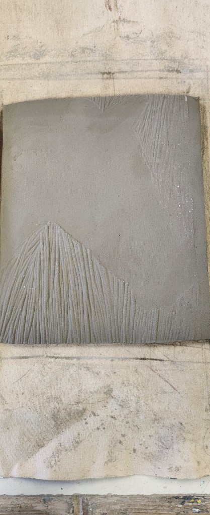
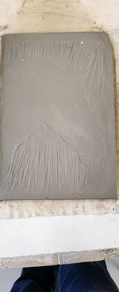
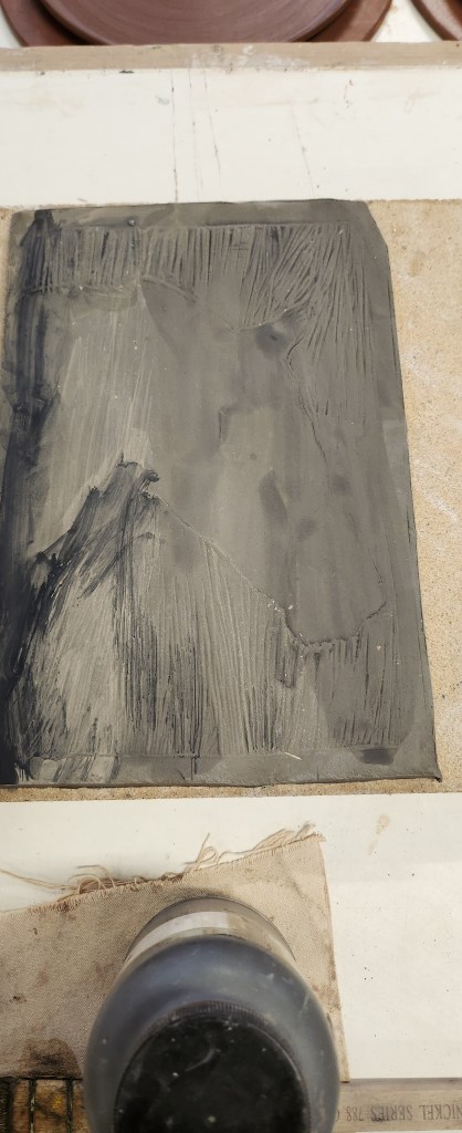
The change in dynamics of our team was a little more difficult as we ended up with two very strong characters, one of whom tended to bulldoze on and not really consider others feelings until after something was done. I was annoyed because we had worked out the lighting direction for the six swans backdrop after it the acetate had been put on the overhead projector with everything on the opposite side. And this person was asked to do the house because that was their skill, and they just got carried away and repainted over areas that had already been done. The affect of this is they changed the direction of light, were pretty messy with the dark colours and areas that had been finished had to be re painted and blended in. However, they didn’t ruin the backdrop and it all came out in the end, it was just really difficult when we were all stressed trying to finish this project of and our final end of year pieces for the Summer Show.

I did get a little fed up of my ideas being spoken over and some good ones from other people being totally disregarded. The final collective outcome was a booklet that was designed by Caroline, which was great but again, some requested changes were ignored and if things weren’t to her deadline, regardless of what else we had going on, you felt like you weren’t being a good member of the team. I have no problems with acknowledging we all had different deadlines with our various bits of work but did feel that the same consideration wasn’t always given back. I am aware that the quieter member of the team has been singled out as not having much input. Whereas, they helped on two backdrops, especially into the woods. Honestly, if I’d been spoken to like she was then maybe I would have stopped voicing opinions and ideas as well.

I think that’s the issue with any project where you are working with various personalities that are sometimes polar opposite. It’s also interesting how we all have a different perspective on who did what and whether all of us were pulling our weight. Personally, I think we all did. I also think that despite the feelings I definitely had about it not being a democracy at times, we actually achieved what we had set out to do. That is to create three backdrops on the themes required.

Am I going to actively look at collaborative work probably not, but if I was asked to work in a collaborative collective on a project – I will definitely meet the key people and consider the personality vibes I pick-up before I commit.

Penguin Cover Design Award

January 2024

This is an individual project, the brief being to choose one of the three books they list and design a new book cover for it. All the details are here https://www.penguin.co.uk/company/work-with-us/cover-design-award

  • Atomic Habits – Adult Non Fiction
  • Daisy Jones and The Six – Adult Fiction
  • Stolen Magic – Childrens Fiction

I’ve chosen Daisy Jones and The Six, apparently it’s also a netflix series. I’ve never watched the series but I did buy the book and did a quick synopsis of the main characters and the story line. I didn’t agree that the main character was a “Stevie Nicks” persona. from the first description of her walking down the streets of LA, I got a real Janis Joplin vibe. I also think that the strongest character of the book, and who the story was really about was Camilla Dunne the wife of the lead singer Billy. So straight away, I’m at odds with the book synopsis but I really wanted to tell the cover story as I see it.

My sketchbook notes.

My original idea was to use a 3d plaster sculpture that I had made a couple of years earlier, that looked like a broken record and paint my design on it then photograph it. I started mocking up a collage of “Daisy” using images I found, to me she was mix of Janis Joplin and Florence of Florence and the Machine. I also found patterns of 1970’s style clothing and a Halston robe, to give me an idea of the flower pattern I wanted to use in relation to the Wild Flower Project mentioned.

My nemesis here is that I had to use in-design and whilst I was great at my paper mockup, actually using the computer was not really my forte. I think to say I struggled was an under statement.

This image to me, is what the book is all about. The strong woman in the background, her story.
I needed a not so famous face for my collage, hence this image.
I envisage flowers around the side and Daisy with The Dunne’s in the background, on the top of the broken record. My plan is to then overlay the two photographs I take in photoshop.

I haven’t enter the competition, I wanted to but I’ve missed the deadline. Also, this is my mock-up of something I wanted to paint. I’m not happy that this ended up being my final piece of work because I don’t feel like its finished. I don’t feel like I’m done with the idea.

I think it would be great for my work to be considered for a book design cover, not this one, but any future work I do, its one of my quieter ambitions.

Pop Up Shop

November 2023

This year as Yr 2 students we were responsible for the marketing, putting up, pulling down and rota for manning the pop up shop. Also making sure any monies from sales were given to the relevant students at the end of the year.

The theme this year is “Light” and we have to create two or three 10″x8″ pieces of that relate to our current practice/materials. Already got a stumbling block because I’m really not sure what mine is at this stage.

The venue this is was “We are Super” in the Sovereign Centre in Weston. As soon as the rota came out I put myself down for the only day I knew I was able to do due to work and family commitments. I also helped set up the display, and checked the monies at the end of the week.

So, I guess me being me I went a little of tangent in that I decided to screen print cotton tote bags. Re-useable bags are always handy and they can be folded down to fit the required measurements. I also had a couple of prints of the slogan on paper. However, I did sell a bag so I consider that a positive result.

A couple of ideas of how to do the designs for the bags, using a quote by Maya Angelou “Be a rainbow in someoneelse’s cloud” I then chose the colours and learnt how to mix them up with the medium for fabric printing.

Did some test prints of the designs on cotton fabric scraps. Decided which one I liked best and then set up the production line to print out 10 bags.

I then used the same screen to print out onto paper, the writing didn’t really stand out the same on paper so I decided to line up and go over the words in black.

The problem we had sorting out the money is that we didn’t really set a spreadsheet up to record the sales properly, and some of the students got paid privately for work. Coming from an accountancy background it would have been really easy for me to set some simple tracker up that could have been printed out. Being totally transparent, I didn’t want to do that. Just because I could and I have the financial knowledge. It really didn’t take very long to reconcile the records we had.

I also think, that as there were lots of gaps on the rota because the 1st years wanted to do their spot with their friends, we should have given clearer guidines on it only being one person at the quiet times, and if you insist on it being two of you then you do two shifts. One of the 2nd year students did more than their fair share of covering shifts that people couldn’t.

Boston Library Sketch Book

November 2023

Over the two reading weeks we had a sketchbook project to complete. It is based on the Brooklyn Art Library idea where people completed sketchbooks every year based on a theme and sent them in to be kept at the Brooklyn Library, a lot of them have been digitised. The project lasted 17 years. https://brooklynartlibrary.org/

This year the idea is to start our own “UCW Art Library” – we had to come up with 5 themes to choose from and we had 2 weeks to complete it. The sketchbooks are A5. After the two weeks we will write our own rules to launch the project to the Level 3 students to complete over Christmas. There are lots of possiblities to grow this idea, engage with the wider University and College community, track and promote it.

My Ideas:

  • Daily Rituals
  • Habits of pets
  • Sunrises and Sunsets – Tails of the day
  • Nature
  • Connections
  • 6 degrees of seperation

The Group Ideas:

  • Portraits
  • Journey
  • Random Thoughts
  • Places
  • Home
  • Big Hats
  • Wind Down
  • Tales of the Day
  • In Nature
  • Bits & Bobs
  • Ermmmm
  • Feet
  • Dinner
  • Straight Lines
  • Dreams
  • Rituals
  • Collections
  • Sunset

We put them all in the computer and did spin the wheel to create a random choice.

The lucky 5:

  • Wind Down
  • Big Hats
  • Bits & bobs
  • Tales of the Day
  • Sunset

My choice out of the 5 is Tales of the Day. Honestly I started out with good intentions, but I am actually really really rubbish at journalling/sketching on a daily basis. I have on several occasions tried and failed at making a habit out of these things. Like my blogs I seem to have a mental block. It’s like I’ve already written these or live it, and I’ve got memo notes in my main diary or in my main sketchbook, or photos on my phone. Why would I want to repeat stuff I’ve already done! And another part, the insecure part of me actually doesn’t want anyone to have a glimpse into my inner thoughts, feelings and imagination. Due to things that have happened in the past it’s my way of protecting myself.

I bought my husband a record deck for his birthday which was at the beginning of the two weeks. It gave me an idea to base my daily theme around songs.

It’s done. Have I got into the habit of sketching every day? No.

Form a Collaborative

October 2023

Today was the offical launch of the collaboration module. Under this module we will have group projects and a couple of individual ones, along with guest lecturer talks and visits for primary research purposes.

Sketch Book Half Term project – Individual

Pop UP Shop – Group

Penguin Book Cover – Individual

Backdrop for HMMP yr 2 students – Group

Project Reframe – yr 1 BA Art & Design – this one we have just completed.

Before being split of into our groups, we did a SWOT analysis on ourselves.

Strengths, Weaknesses, Opportunities and Threats – what are my skills? how would they work in a group setting? what can I bring to a group? What does it mean to me to be a part of a collaborative? At the moment the last question is easy, it’s my worst nightmare. After doing Project Reframe I am really not looking forward to the rest of this academic year.

I’m in a group with Alan, Claire, Alicia and Sam – our group name is using our initials Art CAAHS

We need to look at branding, instagram, an identity of who we are. My initial thought is we are a collective with diverse skillsets. We’ve already set up a teams chat, I think Sam is going to set up the Instagram – I would but I actually have 5 linked to my name already two personal, HelenLouiseArt, Horses & Dogs Photography, Awakening Beauty (hardly used) and Helen Dougill Creative (predecessor to my separate art and photography ones). I think added another would send my main account into meltdown.

We need to think about how we are going to brand ourselves and the identity we will present to the outside world.

Where am I going from here?

June 2024


I have honestly been out of my comfort zone a lot during studio development and I feel this had
inhibited my style and creative process. Ceramics has always been more of a hobby, my time, my little bit of
therapy.  Putting the pressure on myself by wanting to use clay as a canvas for my artwork has been quite challenging because I don’t feel I have enough knowledge to do each element confidently.   I still don’t.  Am I glad I did it? Yes.


What I take from this whole year is that from one photograph I have created several pieces of artwork, using a number of different mediums.  I can decide to either follow these skills and create more refined ceramic pieces as either unique pieces or limited editions.


I also have a couple of linocut pieces that I can use again should I ever be lucky enough to have a
back catalogue and someone requests it.   Finding images to use for this process, and image transfers is not going
to be too dificult as I have literally thousands on a hard drive at home.  I think realising that my passion is horses
and it’s a subject matter I know well, was a big turning point during the second part of the year.   I have a more
natural feel for the story I wish to convey.


I am not sure I will concentrate on ceramics in the same way next year, but I will do this process again.  Now I understand a little more about the principles behind it.  I would like to explore using different colour slips and oxides, and possibly even experimenting with glazes to see what effects I can get.


I think all the experimenting and trial and errors over the past year have only really touched on the tip of the iceberg where creating images, portraits, printing onto clay techniques are concerned and I still have a lot to improve and understand.  I have been learning techniques whilst also trying to work out how far you can push them or stray from the preferred way of doing a process.  This has at times made me want to choose the easy route.  I’m really glad I didn’t and that I have been pushed out of my comfort zone as I have stumbled across something that I really enjoy doing.


Would this be something I would offer a client? Yes I would.  I have had some really good feedback from friends with horses.  They like my work think it’s imaginative and unique.

And that is probably why I have struggled to find artists, ceramicists and sculptors to reference.     As I’ve said before, I still want to sculpt a horse.


the final touches

The last part of my main show exhibit is monoprint form the lino. I used the safe wash oil based ink, black only, and printed it out on to three types of paper. Standard Cartride, Cotton Rag Handmade and Nepalese Tea Paper.

Hanging the final prints to dry, I loved the almost translucent feel of the Nepalese plant based tea paper and knew that one of those prints was to be hung in between my two ceramic pieces.

I have also been working on a laser cut block design and decided to emboss a small piece of cotton rag paper and include it in my final display.

I decided that having both sets of ceramic slabs slightly offset was the more aesthetically pleasing way to hang the exhibit on the wall.

Time to take the plunge

I would like to say it took a lot of deliberation to decide on what to do. However, I enjoy the process of linocutting. My final piece is to be based on an A2 image cut in lino and then pressed into clay. The issue I have after talking it through will be kiln space as it all gets busy towards the end of the year.

My proposal is to make up one image in 5 different slabs of clay, that way they can be stacked in the kiln if necessary, making it easier to fill the kiln for firings.

I chose the picture of my two mares scratching, then worked out the best angle to trace it so that it had a bit of an interesting abstract feel.

It took me three days to cut the detail in to the lino deep enough to be pressed into the clay. I decided this time, to just cut out the highlights on the image, to try and define bone structure and seperation of the two horses.

The first set of slabs I covered all of them with white slip and then rolled the lino into them. I had two problems, one of my horses hadn’t really been cut deep enough into the lino and got lost in the slip, and secondly I hadn’t used enough pressure to roll the lino into the clay, it could have gone deeper.

Back to the drawing board I cut more boldly into the detail on the second horse. Then this time pressed the lino into the second set of clay slabs before adding white slip, which I only did in the centre.

It wasn’t as easy as it sounds to press, as even using the heavier roller, we ended up kneeling on the table to get the right pressure down on the roller.

you have to dust the lino to stop it sticking to the clay
I did a small test slab of clay and pressed part of the image into it, so that I could experiment a little with the oxides.

After practice, it was time to do the main slabs. The first set of slabs I did each one individually, the issue here was to try match the oxide patterns when I sprayed them with water and used the blower to get the direction of the colour.

I decided to find a tray big enough for the whole of the second set of slabs to go in as one piece of work and apply the oxides in a way that unified the patterns more. I still sprayed with water and used a blower to direct the flow of the oxides as I tipped up the tray. The issue with this is one of the bottom corners seemed to attract all the water and the clay cracked so and emergency repair needed to be done.

I was extremely pleased with how they came out of the bisque firing. Next step was to pour earthenware transparent glaze over each individual slab. My pouring technique is not the best as I am very cack handed but I am relieved to say I managed a reasonably even covering on each of the ten slabs.

The final fired pieces came out really well, the oxides had dulled a little but they were still very vibrant. I am really pleased that each piece are unique.

Doing this again I would definitely say the second way I approached the piece by pressing lino into bare clay, then adding the slip and the oxides after is the preferred and more logical approach.

How about Lino?

February 2024

From pressing items into clay, you get a texture. I really want to get, for example, a horse portrait on clay. The next thing to try besides sgraffito is pressing a lino cut into the clay tile.

source an image, remove the background, trace the image, I did this in photoshop as well as the traditional way of print photo, use tracing paper and then transfer onto the lino.

I then had to decide what I was removing, and cutting out the lino. On this image I decided to cut away around the head.

This is when I realised you had to cut into the lino quite deeply for the details to show in the clay.

I had a couple of small tiles so on one I pressed the lino into the tile at white slip stage and added the oxides after, on the other I washed the oxides onto the lino and then pressed it into the slip for the oxides to transfer that way.

I prefer my second choice, where I washed the oxides onto the lino and pressed it into the clay. It removes some of the white slip with it and leaves a mottled effect.

I then decided to do a slightly different trace design, but this time I cut it with the intention to just print on paper.

Because I am trying to stay true to being as sustainable as possible I tried using a water colour ink, and a safe wash oil based ink. I chose them both in the same colour so that I could do a comparison.

On application to the lino the waterbased ink dried a lot quicker, so you had to have your print roller and paper set up and ready go.

The water based ink took a lot longer to dry on the paper, and the edges of the image weren’t as sharp. Which in itself isn’t a problem, but I think if you ae planning to use watercolour ink, you maybe need to factor those points into size of print and detail of the image.

I really love the two images together, and I printed out on Khadi Cotton Rag Handmade paper. I use Khadi papers because they are ethical and sustainable, and support the local enviroment and communities in India and Nepal.

Screen Printing

January 2024

Another way to transfer an image on to ceramics is by screen printing. I had two images that I created as greyscale images, printed out onto acetate and then exposed on the screen. I had a slab that I’d made earlier and using white slip dried it out slightly.

I am trying to recreate a look that resembles oil paint and pallet knife application. My tutor showed me how to mix up coloured slip using a small amount of white porcelain slip and yellow ochre. I then applied it with the brush, along with red slip and used the rubber kidney to mix and blend.

The centre is where I wanted the image to be so I used white porcelain slip to lighten it a little. I then dried them off. Using the screen in the same way you would when printing on paper. Instead of ink I used green slip and pulled it down across the tile. I found it was easier to do evenly if I went back over with a rubber kidney.

It had to dry before going in a bisque firing. I was quite pleased with the outcome. When it came out the kiln however it had flaked a little. Talking things through with my tutor and the technician, using this technique again I will need to ensure the slip used is of the right consistency and not too thick.

I still glazed it with an earthenware transparent glaze.

I practiced again with the other image on another slab, using the red and yellow ochre slips. I did the background first and then went over the horse, with the second colour. It didn’t quite work out and was kind of a splodge. On reflection, I don’t think I had let the screen dry long enough before doing the second colour.

I then ‘painted’ around the image and blended the edges, rather than painting the whole slab first with the slips, as I think the first time around there was slightly too much. I really need to do a lot more of these practice slabs to get the desired effects. A lot to think about with the consistency of the slip you are printing onto, and the consistency of the slips used to print with.

As I had the images on the screens, I decided to try printing onto material and paper. I was struggling to dry the screen properly between tests and the ink wasn’t pulling down evenly. Although, I have some interesting happy accidents and ghost images on paper.