Can you see me?

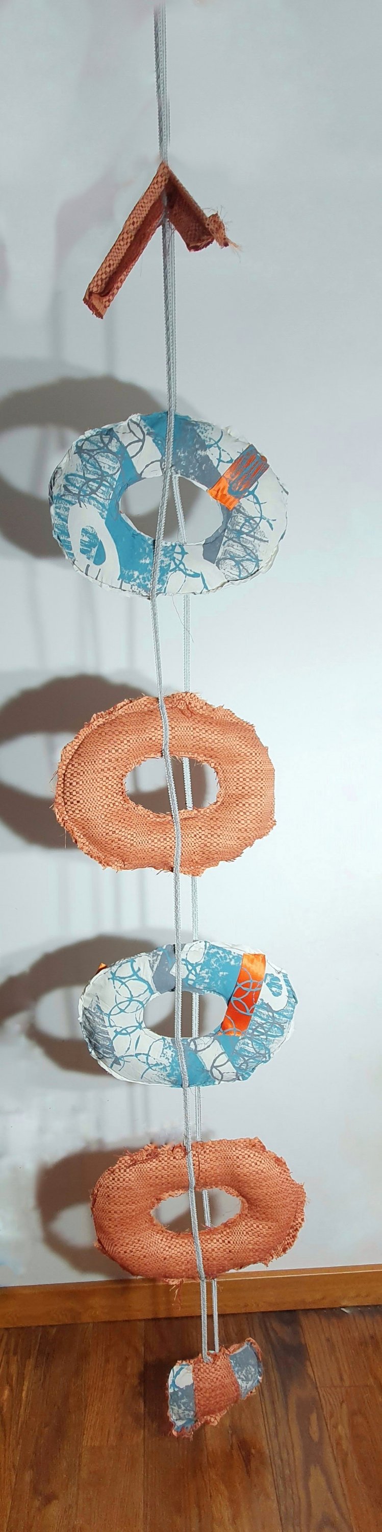
Our latest project is “Displacement”. The brief was to look at the rules and accepted systems behind composition, shape, form and aesthetics. The idea behind the project was to deconstruct and rearrange compositions of colour and shapes. We had to create a body of work in 2d and 3d.

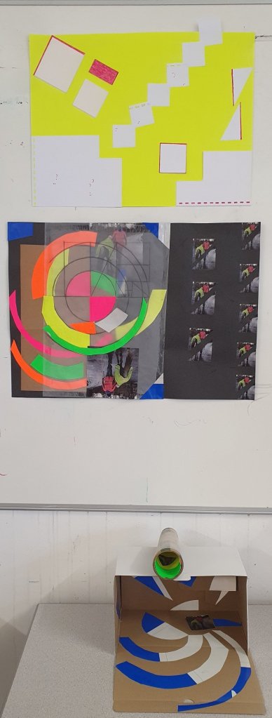
I’m not certain I followed the brief as intended but in choosing the materials for my first brief my mind went off on a little tangent. Armed with a sheet of braille, neon yellow paper, white card and a bright pink felt tip my first creation was very rectangular and a bit instinctive in approach. When I put my work on the wall I realised that the braille wasn’t obvious. The words “can you see me” formed in my head. So looking up the Braille Alphabet, I decided to colour the raised dots with the pink felt tip.

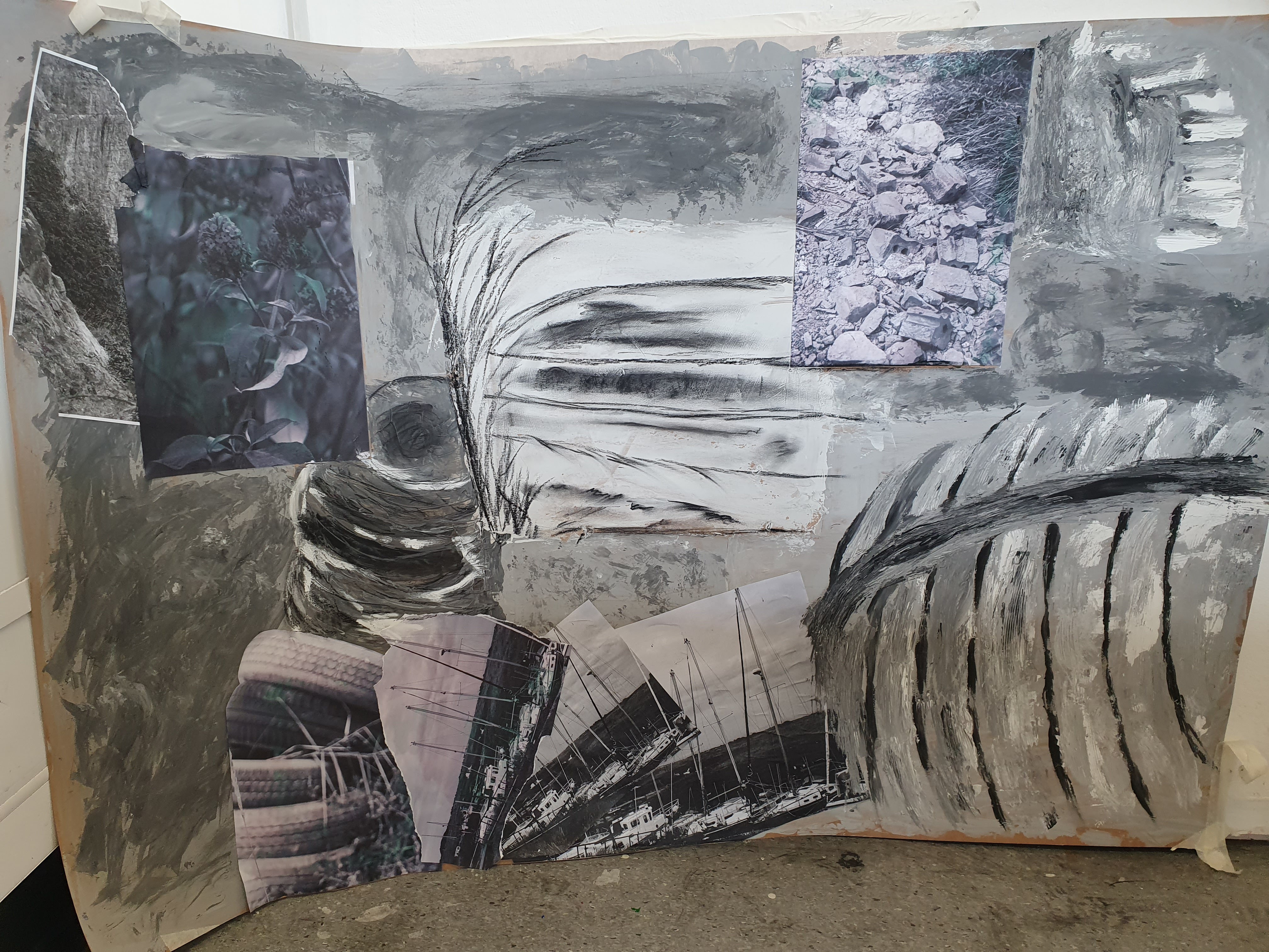
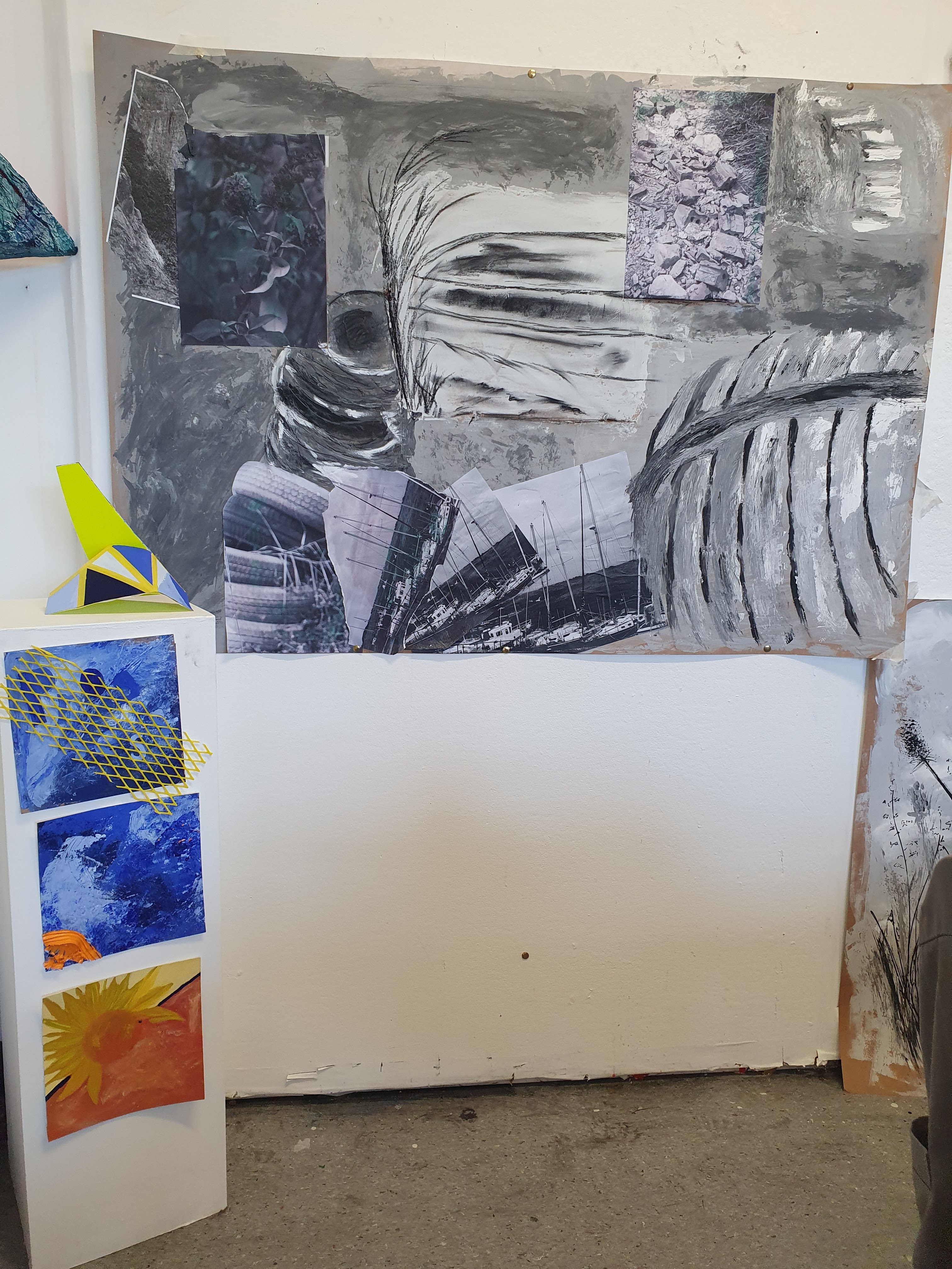
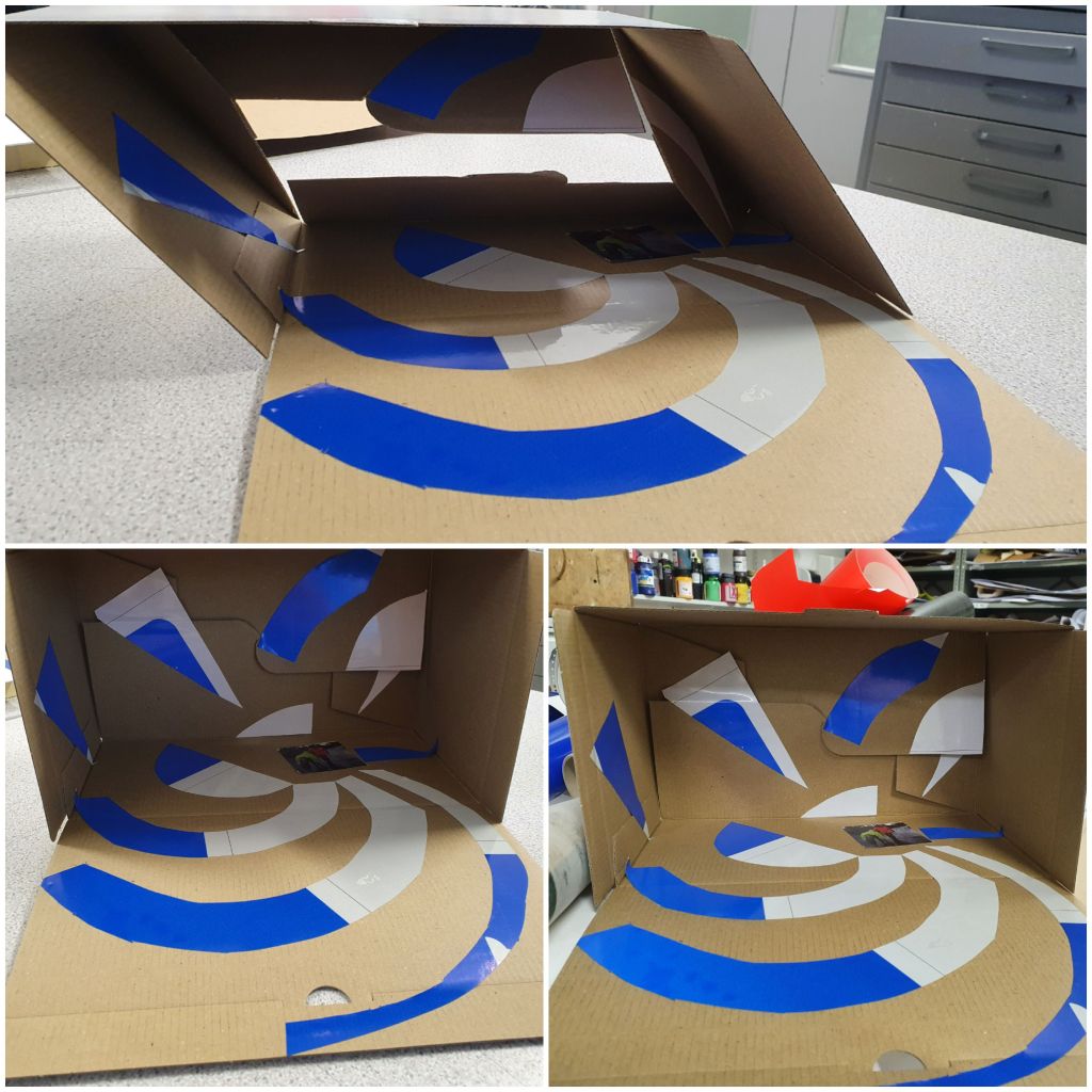
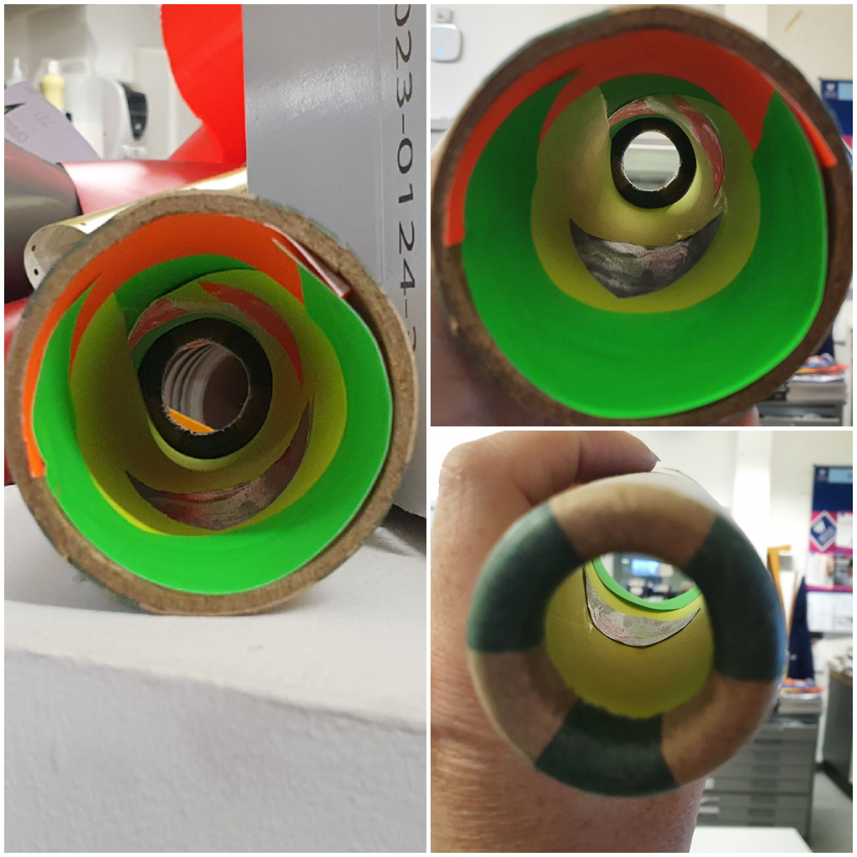
The pink next to the yellow reminded me of the hi-viz clothing I wear when out and about with the dogs and horses. Amongst the materials we could use I chose a misprinted road sign in blue and silver, neon paper in orange, green, yellow and pink, a cardboard box and a cardboard cone.

I did a couple of visual experiments with the colours, shapes of the box and cone, I also used a torch to see how the special light refraction material of the road sign worked. It was interesting to see the way our focus shifts when looking down the narrower end of the cardboard cone. Our eyes automatically focus on different shapes/colours with the change in field of vision and light change with it.

Can you see me?

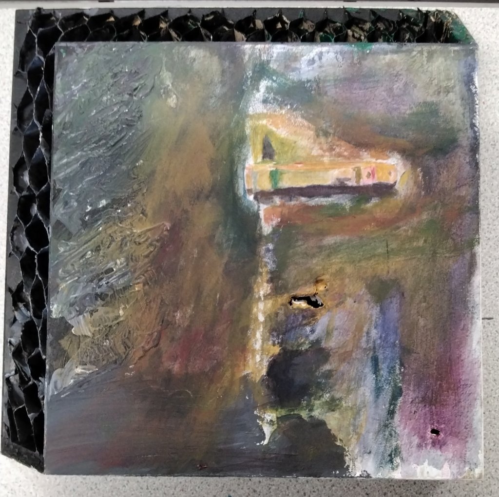
I found an image of me and our pony in our reflective gear. I used the same image in all my pieces of work. The final piece I used tracing paper to mute the tones. I had drawn a geometric pattern using the golden ratio and had traced this on the paper to cut shapes out of the neon paper. I then decided to use a black and brown paper background. I wanted to understand which colours and tones stood out the best.

I’ve deliberately used the same image of me and the pony as I wanted to understand how visible that would be. The tracing paper effect is very similar to fading light, misty rain etc.

What colours stand out for you?

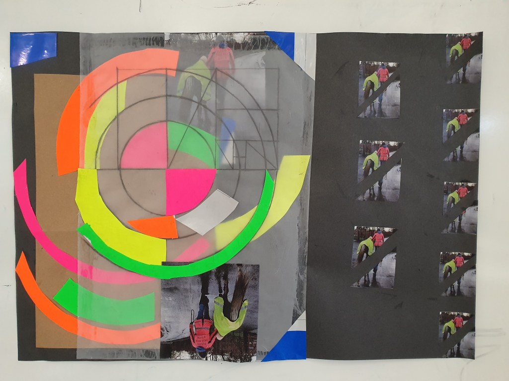
I was very surprised at how clearly the neon green stands out and I can see that at different times of the year that mixed with orange and yellow it would be a good colour to wear. The reflective silver is definitely the best choice for cyclists or walkers out at night. Most of my hi-viz are a mix of yellow, orange and pink after doing the exercise I will definitely invest in the silver reflective and neon green.

If I was displaying this body of work in a gallery I would make them larger and try and recreate more shadow effects and use headlight bulbs to show the different effects of the colours and materials and how they all work together to make the wearer more visible. I would also replicate each piece with a bright sunny day image and more summer colours as that would give a more rounded conclusion. The more vulnerable road user groups are just as invisible on a bright sunny day as a gloomy winter one.

So, as I asked in my first piece of work – can you see me?

What is behind the door?

The final option of Edges and Overlaps for me is Interdisciplinary Fine Art. This is my favoured pathway even though I chose to do it last out of the three options. My reason for that is I didn’t want to prejudice my learning experience in the other two pathways, I really wished to have a very open minded experience.

For this pathway I used reference photographs I’d taken whilst on a walk around Burrington Combe. This is an area that is full of history, with Iron Forts, nature reserves, caves to explore and cliff faces to climb if you want to. Having my 9 year old son with me means that we took the path least followed, naturally.

It wasn’t long before we stumbled across the rusting door, the cavern room behind was flooded so we couldn’t really get much of a glimpse inside. It was a natural space that has been repurposed by man and reclaimed by nature. I loved the contrast of the moss and leafy vines against the bluey purple hues of the rusting door. I didn’t wish to recreate the image on a large scale and having developed a taste for using surfaces that aren’t standard canvas/paper, I settled on a piece of cut off MDF worktop.

I spent a couple of days sketching ideas, testing out colour palettes and mixes. I thought I had my acrylic paints all sorted, but as usual once I started actually creating, processes morphed and changed for the better. I have grown more confident in my creativity by asking questions and having some of the techniques explained to me in a very practical application way by my tutor. The issue with being mainly self taught and left to my own devices when I reach a block, is to just stop and put my work to one side with the intention of looking something up and coming back to it. Which, of course, I never actually do.

However, being at college I reached out and asked for assistance, through this I was able to find solutions. Two of the artists I researched in this pathway are Lucien Freud and Jenny Saville. They are both great inspirations for the way I tend to naturally approach my way of thinking and working and how I freely apply the paint. Without realising it I tend to use a lot of Impasto in my work, but in this piece I was able to refine it more with my new understanding of blending, mixing and layering colours both on my palette and the painting itself.

Initially I did an image transfer of my photograph onto the MDF. Then using some pieces of cardboard that was structurally similar to the MDF, I experimented with my ideas of just painting the honeycomb to reflect the surrounding rock face, or layering and painting them? I decided to leave them and paint insitu as I didn’t want to detract from the focus being the door.

I then used blocks of colour to define the lock and painted the rest of the surface using layering and blending techniques. My initial blacks were too dark, as I had used the basic error of actually using black rather than mixing my own blue/black. Unfortunately, the last day I was ill so have had to evaluate on an unfinished piece that still needs highlights and a few patches of colour.

For me, I have really enjoyed the process and I think working through my personal block counts as a success. I still feel that panic and fear of messing up the whole project when I start the highlights. However, it’s not as intense and I’ve come to realise that creating from this place is how I’m going to evolve and produce my best work. And if it all goes horribly wrong? Well that’s where I learn from experimenting.

So what is behind the door?

A world war 2 munitions bunker? A cave closed off for safety? An old quarry store room?

Or, as my son has decided, a prison cell used by troll hunters and dragon kings.

Rewind and Replay

Before we moved onto our final option of Edges and Overlaps, we were set a week long project by our tutors. The project an audio cassette tape in an envelope with the following instructions:

  • I must be the focus of your outcome/s
  • I must be used in my entirety
  • I can be into multiple things or used more than once
  • I can be combined with others on the course
  • I can be used in conjunction with other materials
  • I want to be reinvented

As a music lover who still has cassette tapes in the loft and part of my music collection, I was a little mortified at the expectation of possibly pulling it apart and breaking the tape. Then I really got into the idea of creating a portrait, I mean why not?

I’m really lucky that one of my friend’s has done the same course as me, so a quick message inviting myself for coffee, and we started going through cassette tape art images and ideas. I honestly didn’t realise it was as popular as it is. We also found collages by British artist Veebee Art and I was pretty inspired.

I really wanted to make this my own style, and decided to leave elements of the process as part of the final piece. For the collage I used photocopies of the cassette sleeve as well as the original, and typed up parts of lyrics from the album songs. I took one of the album photos and enlarged it, flipped it, then traced it. I chose a wooden board as my canvas, it’s heavy, but I really like the effect of the grain through the tracing paper. Sticking the tape and following the outline was a little challenging, but I kept the likeness and even though it’s a little abstract I am really pleased with the outcome.

My first portrait, using an unusual media, and of a famous person….. no pressure!

A short fun project that I think was successful. I’ll let you decide.

I am not like my mother, or am I?

The second rotation of Edges and Overlaps finds me in Visual Comminucation, the brief was to create an 8 page Zine using a different topic to the first rotation.  I had an idea straight away and it was based on realisations I had during my time in Surface and Form.  For years I have said I am not like my mum, as in our hobbies and interests are totally different I can’t deny I look like her, or have the same family mannerisms.  However, she loves sewing, knitting, zigsaws, puzzles and reading.  I share her love of reading, but my passions are horses, art, dogs, dancing and music both listening and playing instruments, currently learning the piano.

My mum loves music, she also used to dance as part of her mums Morris dancing troupe back in the 1950s, and dance halls on a Saturday night.  My love of music definitely stems from listening to the top 40 with my mum on Sunday evenings. And my recent realisation is that I loved using textiles to create with rather than dressmaking.

The Zine is to show in a very simple way how our creativity although taking different forms, along with our expression through music and dance overlap.  The brief was that the Zine was to be a limited pallet of black and white and two other colours.   As it was about both of us I asked my mum what colours she thought represented us and the choice was autumnal tones of orange and green.

After researching different collages, illustrations and layouts and idea dumping, I decided on creating a concertina Zine. To incorporate my art the concept of watercolour flowers over photographs on the front and back page.  My first question do months have flowers like birthstones?  Would they correspond with the colours my mum had chosen.  I found out that you can get green Iris’s and orange Daisies so the colour choice for each of us fit with that idea. 

Working out the paper sizes, I could use one sheet of A2 and fold it into A5 but the centre pages would need to be joined.  To reflect my mum’s love all things sewing and needlework, brainstorming both me and my tutor had the lightbulb moment of sewing the two halves together and the idea of two different coloured embroidery threads running through the zine and crossing over on the centre pages came to life.

The first task, find photographs of myself and my mum at a similar age.  I drew the flowers and photocopied them onto acetate.  Following the eight principles of design, I failed a little on the balance and needed to add a little more colour on the bottom of the  pages.  I also needed to tidy up the acetate cutting it closer to the edges of the flowers. For the rest of the pages I think I manged to follow the eight principles of design:

Balance – contrast – emphasis – proportion  – scale – rhythm – direction – unity

The dancers silhouettes I wanted the dresses to portray the fact different genres of dance played a huge part in our family life. Also the fact that my mum made her own and our clothes, and designed her own patterns especially my ballet, tap, ballroom, rollerskating leotards and dresses. I photocopied a scarf my mum knit for me and used that for the ballerina. For the rock and roll dancer, I found a pashmina that had embroidered flowers on it that matched the stitch I was going to use.

The initials in the spheres are my Grans and my sons, to reflect the continuity of family traits, how they are passed from generation to generation.

My mum’s page
My page

The centre pages are created from an illustration I found in a book. I had an image of my mum and me holding hands in my head, but felt the outstretched hands portrayed what I wanted to say so much better. After sewing the two pages together I felt that my original idea of an infinity symbol in the centre wouldn’t work. After going through the meaning of words to describe our bond in a celebratory way, I went with my tutors idea of the scattered word floating between the two.

I really enjoyed following this brief and the concept of celebrating whether I am like my mother or not. I feel it definitely shows our connectedness and bond in a very simple way. It definitely flows whichever way you read the Zine, from front to back, back to front or middle out.

We also created a digital version and I was pleased my design worked just as well as a booklet.

In conclusion, most of my research was primary, talking with my mum and sharing memories and insights on how similar we are over a cup of tea. What has the most influence nature or nurture? Either way, I no longer balk at the concept of like mother, like daughter, as my teenage rebellious self would have done. Rather, I celebrate and embrace it.

The Sound of Silence is…..

…… a constant ringing in my ears, according to the British Tinnitus Association 1 in 8 of the UK population are living with persistent Tinnitus.

“Tinnitus is described as a sensation or awareness of sound that is not caused by a real external sound source.  Approximately half of patients find it moderately or severely distressing with complaints of intrusiveness, emotional stress, insomnia, auditory perceptual problems and difficulties with concentration.”  thebsa.org.uk

How does this relate to art? Our current project is Edges and Overlaps, and honestly I was really struggling to get on board with an idea for this initially.  As I started the first of my option rotations in Surface and Form I was struggling with a migraine hangover and bad noise sensitivity.  Art is usually associated with creating from your passion and what drives you.  I decided to use my apathy for my reference photos from the Bristol trip, my reasons for this, 1) I wanted to do this course to challenge myself and experiment with new mediums and ideas, not fall back to “comfortable” genres.  2) I realised when reviewing the photos that I felt on edge in urban noisy areas because of my Tinnitus and how it was affected.

Tinnitus is a constant that suddenly appeared in February 2019.  It overlaps every single aspect of my life.  On the really bad days my nerves are on edge and I feel like I really can’t take anymore noise.

I really love music and lyrics have always meant a lot to me, I used to play the violin and cello and am currently learning the piano.  To me the ringing in my ears is one continous note that is about 2 octaves higher than the highest note on the treble clef. The best way I could think of representing that is as a minim, or string of minims.  I also wanted to represent it bouncing of a corner.  I designed screenprints with musical notes ideas and chose teal and grey ink, with a splash of orange on the first print, to represent the jarring effect on my nerves most of the time.

After mocking up ideas on a square format in paper, my vision wasn’t really working.  At this point Rachel, my tutor, started going through a couple of books in her room with me for inspirational ideas, and we found a piece of work by Cas Holmes that was like my row of minims on my first screen print.  We then discussed a long wall hanging concept and I went away thinking about how I could change and simplify my idea.

The final concept was decided on and I screenprinted four more pieces of material, and also some repurposed orange safety harness/seatbelt material.  The contrast in the materials and patterns used represent the different effects of Tinnitus and how I feel depending on environment, some days although it is the same pitch, it feels like it fades and softens into the background.  Other days it feels very busy and jarring.

Snippets from my sketch book

I see my final piece hanging in a gallery as part of a larger body of work, something the observer can walk around and see from different perspectives. Hopefully it would give them an idea of what it feels like for me.

For me there were several things I could have done better time management, trusted my instinct more, been braver and more confident in my decision making.

I had to hand sew the shapes, cut out the supportive board in the middle and I forgot to allow enough seam allowance and had to hand sew everything together.these mistakes though made for a more jagged and frayed hemline, as I was running out of time to finish I couldn’t be as picky about neat and tidy seams and overlocking the woolmix weave. The rawness not doing those things has created, make it feel more real and had it been finished neatly it would have a totally different feel.

Thinks I take away from this creative process are:

1. Keep it simple

2. Use my sketchbook more for idea dumping and working through.

3. Trust my instincts

4. Be more confident

5. Experiment more.

I really enjoyed my time in surface and form and am really pleased with the final outcome, for me it reflects the story I wished to tell.

Inspiration and the elephant in the room

I’ve missed a week, I started with good intentions of a weekly blog but the elephant happened and I’ll get to that later.

We had a field trip with college to Bristol, we visited the usual art places Spike Island, M Shed, Arolfini and the Bristol Museum.  The idea being to collect reference material for our latest topic “Edges and Overlaps”.  It was nice actually visiting the art exhibitions rather than online virtual experiences, in my opinion experiencing some of the larger art installations in person is the only way to do them justice.

The Vanguard, Bristol Street Art was by far one of the most interesting exhibitions I’ve seen in a long time. I learnt so much about the origins of the whole street art scene and how it has grown and developed over the years. I first moved to Bristol in the mid/late 80’s and feel that I’ve only recently, in the past 20yrs fully appreciated it. So I loved learning more filling the gaps in my understanding and education about what is literally on my doorstep. One artist stood out for me Antony Micallef and I am definitely going to research him further. It felt that it didn’t matter what angle I looked at his painting from, it was lifting out the canvas and very real.

The Vanguard Exhibition M Shed Bristol

As we wandered around the various galleries and museums, I realised that I am drawn to pieces of work that have shapes, colours and texture that resonate with me on a deeper level. In the museum I found myself really admiring the pottery and sculptures.

At Spike Island they had two exhibitors, Lucy Stein and Peggy Ahwesh. I found that some of Lucy Stein’s pieces of work I could take or leave but her large art installation “wet room” and a couple of her other pieces really connected with me on a deeper level. The colours she used and the fact that she references local folklore and mythologies intrigued my spiritual side.

And now for the elephant in the room Peggy Ahwesh, her work Vision Machines was extremely interesting, and in hindsight I should’ve listened to the nagging voice that I’d seen her work before and not to see the films behind the curtain. But nope, I’m with the rest of my class and in fact I’d got lost in the cgi of Vision Machines so entered the room part way through “The Scary Movie”, bizarrely at the same point I walked out of a screening of it in London a number of years ago. Fate trying to tell me something? I don’t know but this movie is the reason I couldn’t write a blog because I had to process how it affected me. I wasn’t prepared for the trauma response it triggered in me. It’s a very dark and disturbing take on gender roles, and exploitation of feminism, through two children acting out a horror movie. It was made around 1993 and I have to give Peggy a lot of credit for how cleverly she tackles these long standing societal issues. However, there are other taboo subjects that this film touches on, like the exploitation of children and the sexualisation of innocent games. The music score, sound effects and final editing were very cleverly done. As much I tried to watch with objectivity, as a parent of a young child I found it difficult to ignore the underlying messages, and as a survivor of abuse I found myself stuck in the past.

A lot of creatives use their chosen mediums to talk about, or highlight what is important to them, or want us to join them on journeys, through words, music, and pictures. Most of the time as onlookers we like what we see and hear, we love the escapism of Tolkien and Dahli, and the moments captured on canvas and film. I feel we shouldn’t ignore or dismiss the storytellers when the subject matter disturbs us in some way. We should be asking ourselves why? What is it that we are uncomfortable with? What, if anything can we do to change either our response, or the story…… How can we mold the future?

On that note, I will leave you with my photo of Lucy Stein’s “wet room” there really is something very peaceful about it.

It started with a boat called “Progress”

When we were given “Cause and Effect” as a project title, I panicked at some of the phrases in the briefing. I could almost hear my mind whirring as my thought processes started working overtime. It is such a wide subject that I could have taken it in absolutely any direction. The field trip to Uphill Boat Yard helped consolidate it all for me. As I looked around I could see the changes that had taken place over time. I noticed a boat called “Progress” and the idea formed about how we were all affected by progress and the effects on the surrounding landscapes, people and wildlife. Looking around I could see the discarded and forgotten boats, those being lovingly restored, those bobbing on moorings, and how the past present and future were all intertwined.

Reviewing my sketches and photographs I still wasn’t sure how to reproduce my ideas. I wanted to layer the images somehow incorporating the present and past using both photography and artwork. I also wanted to take on board creating with other pieces of equipment like sponges, pallet knives and fingers using charcoal and paints. After researching the global impact of progress I determined that I wanted it to be more local and my work to show how nature has reclaimed the space in places to live alongside the working marina.

I’ve learned that Uphill Wharf and Marina has quite a rich history. It is now predominately a leisure marina and part of the nature reserve, although it is still home to a working boat yard.

I feel that the original concept I was trying to portray is reflected in the artwork I’ve produced. Although accept you may need to see some of my original reference images to understand a couple of the smaller pieces eg, the blue and orange patina of the rusty boat hulls. I feel that the presentation of the four smaller pieces on the plinth helps convey the story in a very simple format, which compliments the brief of using a limited pallet.

With the large monochrome piece of work from an objective view point, although I do really love it, I feel this is the one piece that has most room for improvement. Had I thought more about the placement of the sections I could have used the negative space, leading lines and light placement far more cohesively. That way the eye of the onlooker could have been drawn into the work more effectively rather than to one side.

In my final piece I had greater success in layering and showing depth to the history, by using a clear sheet of acrylic and painting both sides, along with acetone photographs and using natural light to look through. I am also really pleased with the structural element of the final piece and how it invites you to view from different perspectives. I wish I had made more of the blue from the reclaimed fibre glass boat as it gets a little lost. Creating the structure was possibly the most complex part, how could I make it a stand alone piece of work? The end result was created by utilising the reclaimed fibre glass bit of boat, and cable tieing some off cuts of wood together. Depending on your view it looks like a mast or sail. All along I was going to display in front of a light box, but found that the softer natural light was just as effective. I see this piece as a light feature in a home, standing in front of huge picture windows during the day and having a soft uplight behind it in the evenings.

For my project I wish I had been braver and entered the working boat yard and asked permission to photograph them repairing a boat as that part of the wharf’s story isn’t shown. I need to work on trusting my instincts more and not getting too concerned about what I think the expectations are. I need to be brave and experiment more.

I am pleased with the outcomes, not only with the work that I have produced, but also how I am starting to develop my own creative process. It is starting to be a little more structured and a little less haphazard. I feel that the structure and developing curiosity are allowing me to be more intuitive with my work, and the knowledge and skills that are being added are enabling my process to flow. My research started on a global scale and I am so pleased that on a smaller more local scale I have been able to portray cause and effect. From estuary mudflats, thriving port and quarry, back to a leisure marina and nature reserve. There is still room for improvement on my approach to large projects and I feel that is going to be part of my own cause and effect journey throughout this Diploma.

Progress at Uphill

Cause and Effect

That’s the first two weeks of College overwith. It has been quite an interesting learning curve, not least because an old dinosaur like me is being dragged into the modern age as creating this blog is part of the course and a way to record our work on line.

The first week was mainly about mark making and creating drawings without using paint brushes and pens with our hands. We also had a trip to Uphill Boat Yard, we had a brief to make quick sketches of what we see, take photographs and collect any items that we may wish to use in our project. As someone who likes to spend hours on a sketch, the quick jotting down of several was a bit of an eye opener and whilst these early ones are not worthy of a spot in the Tate, I achieved the task.

In the second week we had two creative exercises to complete relating to cause and effect. Whilst at the boat yard I stopped to sketch by a boat called Progress, and it just made me think about how we are all caught in this net of progress and the effects it has on the things that fall by the wayside and get left behind. Therefore saw a lot of broken boats and parts of the yard that have been discarded and reclaimed by nature. Not least the cliff face that was created when there was a thriving lime quarry there, there are sections that amongst the discarded litter and face masks left by visitors to the nature reserve, you could find buddliahs and sunflowers, butterflies and bees and birdsong was prevalent. I wanted to capture this in the pieces I created, the large monochrome piece and the four smaller pieces using a limited colour pallet. I like using negative space, colour and fluid loose movements to achieve this, apart from the sunflower, all are mixed media and created without using a brush. The materials used were household emulsion, card, charcoal, acrylic paints and vynil sticky paper, and photographs I’d taken. The tools were my fingers, sponges and plastic cutlery.

Artists that influence my current style and who inspire me both past and present fall across a number of schools, Pre-Raphaelite, expressionism, symbolist and also the ones who are so realistic the detail in form and texture are things I can only aspire to recreate at this point. I have a print by Franz Rusicka at home and that definitely inspired my composition of the larger piece, my use of the blue is definitely inspired by Franz Marc the German expressionist and a British artist I’ve recently started to follow Dan Bullock. I aspire to be able to create realistic imagery like Tina Spratt and I’ve just found Jukka Mompa who mixes realism with bold abstract colours. Links to there websites are:

https://www.tinaspratt.com

htttps://danbullockart.com

https://jukkamompo.wixsite.com

In my final piece I wish to show the story of the Wharf as it progressed through time. It was originally wetlands and mud flats that formed part of the estuary. At one time it was a thriving port where people came to trade cargos like coal, salt and timber. Besides the quarry and lime kiln, Uphill was also home to brickworks and fishing boats. It’s still home to a working boatyard, but has a seasonal influx of holiday makers who stay at the campsite. It’s a regular route for cyclists and dog walkers as the nature reserve now links with other coastal paths to Brean.

Whilst researching the cause and effects of progress globally, I came across this trailer for a digital exhibition by Canadian photographer Edward Burtinsky encapsulating the effect of progress on the landscapes around us over his 40 year career. Our little corner of Somerset may not be on the same scale but the effects are there to see and the landscape certainly bears witness to its history.

Welcome to my blog….

I’m Helen.  I’m an art student.  This blog is a way to record my UAL Foundation Diploma in Art and Design that I am studying at Weston College.   I’m actually pretty rubbish at keeping journals and I’m not great with technology, you can ask my long suffering husband how that goes!   I’m not very good at promoting myself or my art…   mmmm lots of negatives here, lets see if I can rectify that.  I am passionate about horses, my art, dogs, my son (maybe he should’ve come first?), photography, I love music and being outside in nature.

Walking, riding, or just being outside with the horses and the sense of peace and self they give me are the best parts of my day and hiding in my studio (I nabbed the summerhouse as my creative space during lockdown), are the best ways to unwind from everything.   In these moments, I can forget I’m a daughter, mother, wife and just be me.

The past 18 months have seen big changes in how many of us work, go to school, interact with others etc, for me it gave me time to reflect on what I wanted to do with my life and going back to College has been a big change.  I’m looking forward to exploring and developing my creative style over the next year as part of the course and sharing it here.

Helen