I am really pleased with how it’s looks. I can see all the imperfections.
There are a lot of things I would do differently, working in oils I should have afforded myself more time. Time wasn’t my friend this year, more so than other years.
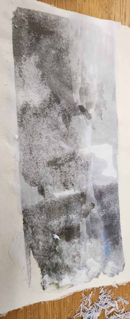
I hadn’t anticipated how hard it would be to get the mixed media of paper, hardboard, oils and ink to blend together.
I was as sustainable as I could be using water based oils, home made oil pigments and hand made sustainable papers. All the wood used were offcuts we had at home.
It was a personal subject matter, but I needed to do that, and this is one painting that will go up on the wall at home.
I am glad it’s all finished, I have acheived the start of a style of creating that suits my creative thought process.
This academic year has not been the best for me as my mum passed away. I was struggling for ideas for my final piece and exhibition work. I have to be realistic about the time I have available to attend the campus to use facilities on the days that I am normally working. I am playing catch up with both my paid work and my studies.
I would have loved to done a ceramic relief image, however, realistically I haven’t refined the process and I am not in the right head space to do that with the pressure of having something outstanding at the end of year show, in the time available.
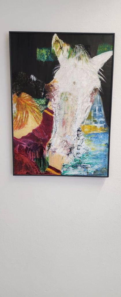
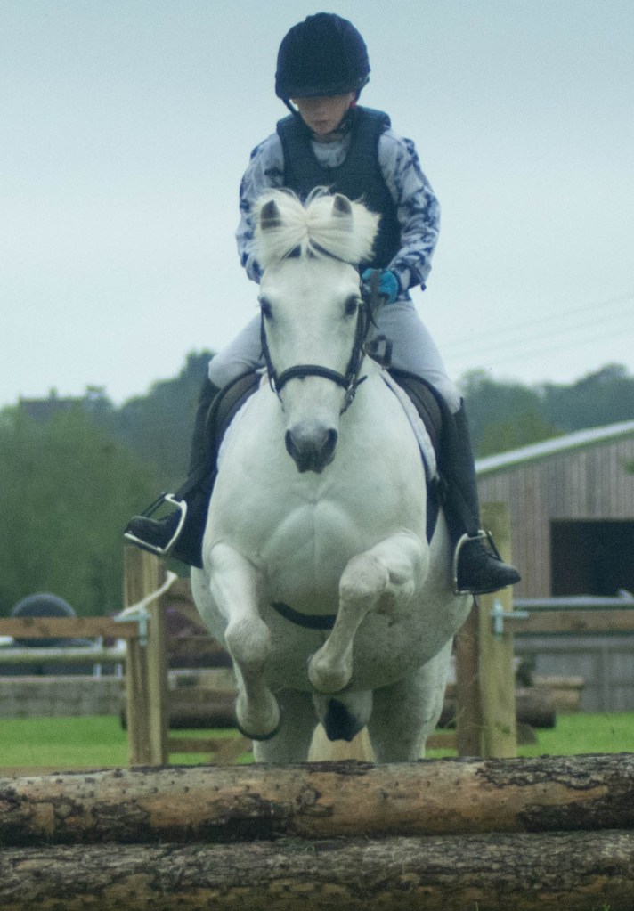
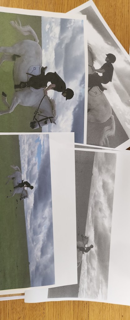
Over the three years of the degree I have mixed so many ways of creating together, photography, painting, printing and ceramics. For the final piece I have decided to have a painting supported by some prints. “Just a boy who loves horses”
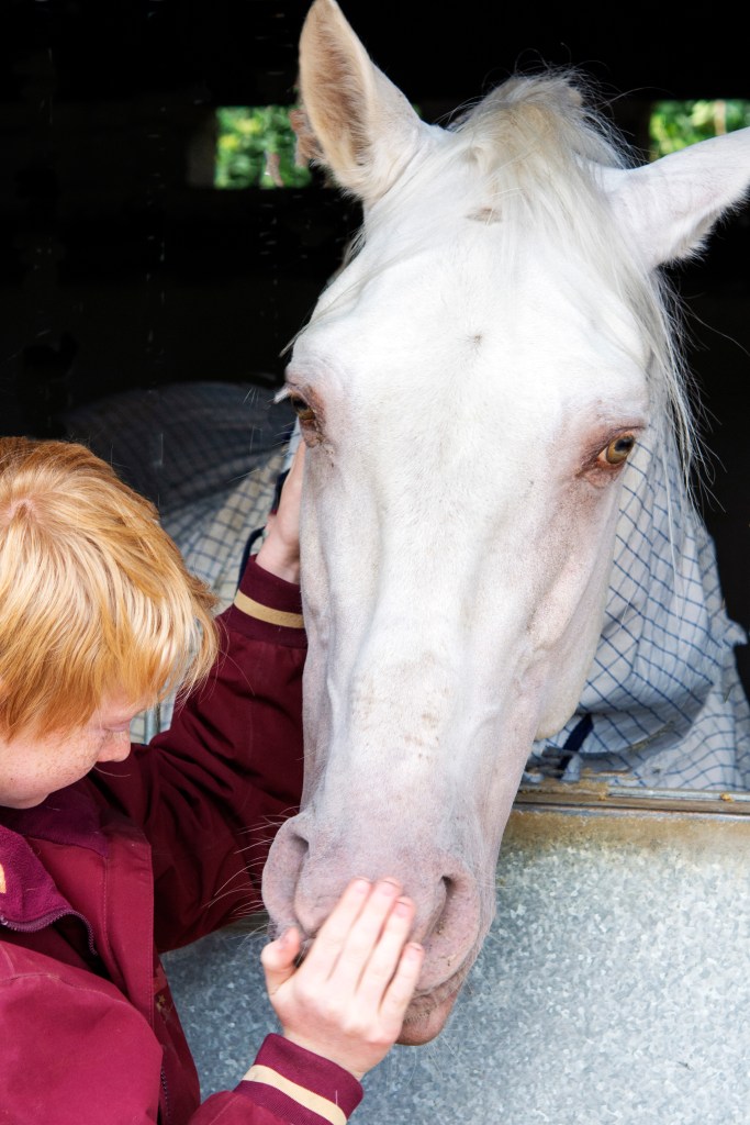
I am choosing the main image to be that of my son with my friends stallion Embrujo JL as it holds so much emotion.
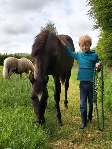
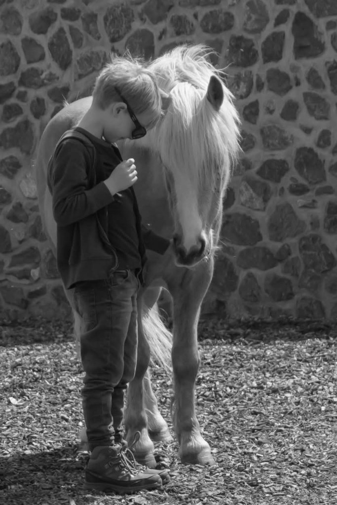
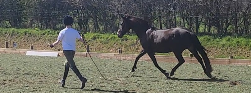
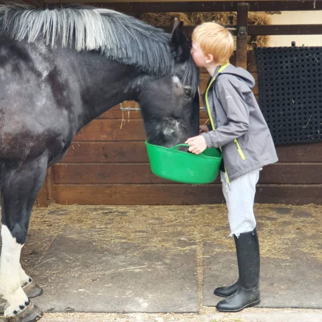
We then have Norma SA and Arthur, Cameron Mr Sandman and Arthur, Goldie (Taraco Chalina) and Arthur, Gaona JL (Minimoo) and Pheonix Flyer with Arthur. They are all horses and ponies that have meant so much to him and have been in our care at home over the past 6yrs. Arthur is 6yrs through to 12yrs.
I used photoshop to merge, layer, edit and overlay the images until I had the result I was looking for. Next step is to try and recreate this as a realistic abstract and convey the story I want to show.
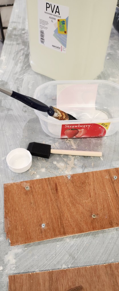
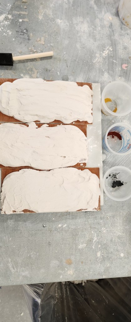
I noticed that the plaster had lifted off the wood in places, so I needed to find a way to purchase the plaster to the clay if at all possible. Its not a very environmentally friendly way of doing things as I used PVA only on one piece of wood, PVA and screws slightly raised in another piece of wood, and PVA smaller pieces of wood on the third. Also I was interested to see if the oxidisation effect of the rust coming up through the plaster would work with other materials so I used yellow ochre, iron oxide pigment and zinc filings.
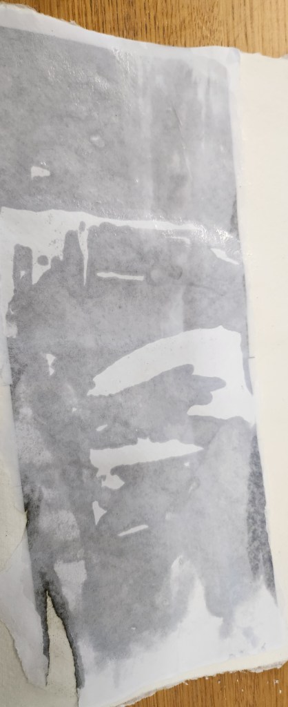
In my head, although I am being very structured, it all feels a little bitty and messy. Whilst waiting for the plaster to go off, I carried on with my idea of image transfer. Using mod podge I had a bit of plaster I didn’t paint so used that to practice the image transfer and also a piece of cotton rag handmade paper, just to see how it would work. I have done image transfer before onto MDF using emulsion so this was a familiar process to me.
I then gradually dampened the top image and started to remove the backing from the paper. It worked reasonably well. I didn’t get brilliant results on the paper, but it worked well with the plaster. Had a ghostly effect.
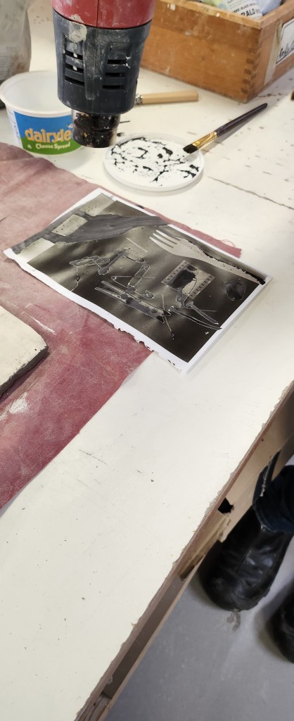
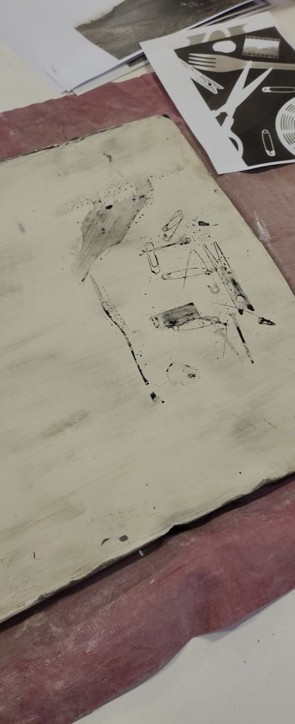
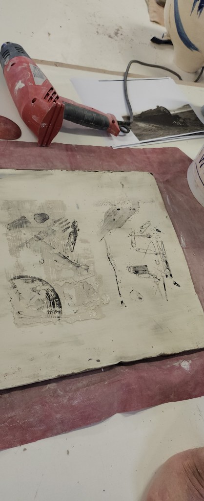
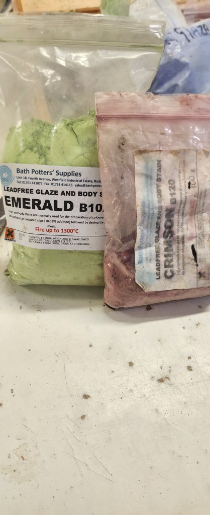
I had covered the slab of clay in white slip and found some black and white images. They have to be definite black and white images. My image of the train needed to be turned into a negative which I did using adobe software. Its the white areas that the stains adhere to. The image of bits and pieces I found in the recycled paper bin, so for the purpose of experimenting it is what I need.
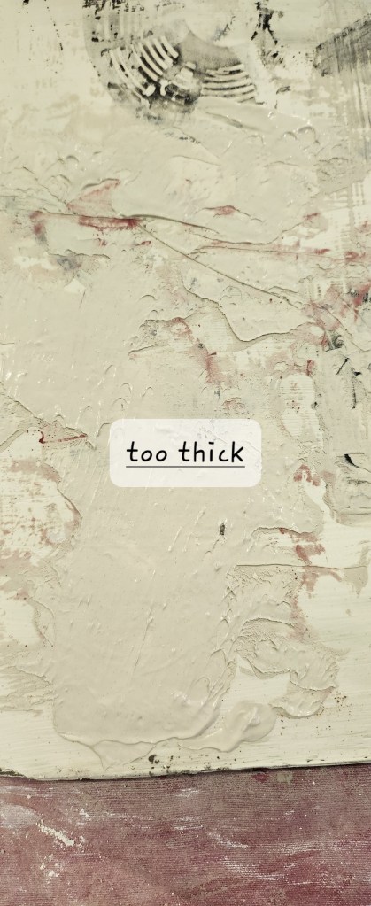
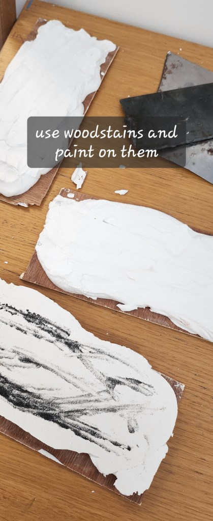
You mix up stains with water and brush it over the image then dry with a blower, then you press the image down into the wet slip on the object and smooth it over with a rubber kidney before lifting it off.I practiced with different stains, and had various results. If I got the consistency of the fresh slip on the slap wrong ie, too wet or too thick, it didn’t leave a clear image transfer.This slab needed to dry and then be bisque fired with the other slab.In the meantime, the plaster had hardened. the one that was just PVA didn’t stick. Also none of the filings had come up through the plaster, they had stuck to the PVA and I’m wondering if that had stopped the colour from seeping up through the plaster. This is probably when I feel like I’m doing a chemistry degree to understand all the reactions/non-reactions. I have an idea to try woodstains and different paints on these, but I need to come back to this. I still have more techniques to try before deciding on my final pieces.
Unusually for a Monday a coach trip to London to visit the Tate Modern. I haven’t been to the Tate for a few years so it was definitely nice to see the current artworks displayed there.
I am intrigued by the link between photography and art and how there is a crossover between the two. Since the dawn of cameras and photography artists have been known to photograph subjects and landscapes for reference ideas and photographers sketch out ideas for photograph ideas.
Whilst at the Tate I decided to have a guided tour and learn a little more about the paintings and artists than the little blurb description tells you.
Francis Bacon – Figure In a Landscape 1945Rita Donagh – Counterpane 1987-8
Both the above paintings were part of the guided tour and I was drawn to the fact that they were both based on photographs. Created 40yrs apart they are both intrinsically layered with politics, dissent, love and loss, and humanity. This is something I aspire to do, be able to portray a moment yet give the observer an insight into the whole story behind it.
I think Rita Donaghs image means more to me because its based on an incident that happened when I was 13yrs old. I remember the news footage of the guardsmen and their horses dead and injured, their bodies covered with coats and blankets. Some things stay with you. I’m also from a generation where we had the best linen and family linen, so to use what biscuits obviously an embroidered counterpane as a shroud over a strangers body, really speaks to me. It’s a reminder of love, family, history, grief, empathy.
I aspire to evoke and convey that much emotion with my art and now I realise that, I really don’t know where to start and imposter syndrome is creeping in with its usual paralysis.
Where do I take my research now?
Do I look at how I feel when I take photographs or when I lose myself in creating artworks?
Taking our image from last week, dissecting and folding to create a 3D form.
What did I picture this as? What was my final piece going to look like? Was it functional? Did it have a purpose or is it just an ornament? A piece of art to look at?
In my mind I pictured this as an abstract sculpture, the shapes I’d chosen in the image resembled elements of a horse and that is what I envisioned. As I folded and tore and stuck the paper together, I was picturing what it could like and the possibilities. It was definitely made out of metal, possibly steel, and the mane would dissect parts of the muzzle and fold back on itself. The you would be able to see through the nostrils and there would be refracted light, the effect of the mane would be through a cascade of water running down the curved metal into the pool below.
On a grand scale it’s a water feature I could see outside a stately home such as Gatcombe House, Burghley or Badminton. Yet I could also see it on a smaller scale in a local park or as a water feature in an inner city courtyard.
The paper maquette is currently hanging with others as part of the wall display at Uni, perhaps one day I will find a way of making the prototype water feature, with the right kind of metal that is shiny yet dull, and able to be textured, and have natural light causing an array of rainbow colours reflecting its surroundings.
So I shall leave you with the sound of water flowing, the warmth of the sun on your face and the sights, sound and smells you would find on a summers day in an English garden whatever it’s size.
Carrying on from yesterday’s work, we were still using the array of still life objects, only this time looking at tonal values and using charcoal do another still life piece.
I deliberately chose a more industrial object, made of metal, with angles and curves and lots of highlights and shadows. Being objective my perspective is definitely a little skewed, and respecting the different tonal values of the two different metals was hard and did find myself getting a little carried away with some parts and having to hastily rectify them to more accurately reflect the object I was drawing and the angle I was seeing it from. I’m rather pleased I pushed myself out of my comfort zone, there are some elements that I did well, but obviously still have a lot to work on. I seem to keep coming back to perspective. I need to do more of this. I don’t necessarily want to be ultra realistic, but the proportions still need to be more accurate. I have no idea what the original object is, would it have helped if I did? Possibly not, because if I could relate to it there is a chance I would have drawn what my mind thinks it should look like, rather than what it actually does look like from the angle I am viewing. I could have used negative space better to aid with the highlights and shadows, but again this is something I don’t do as a matter of course, so more practice needed.
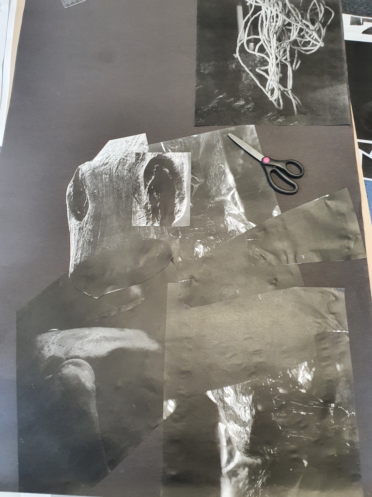
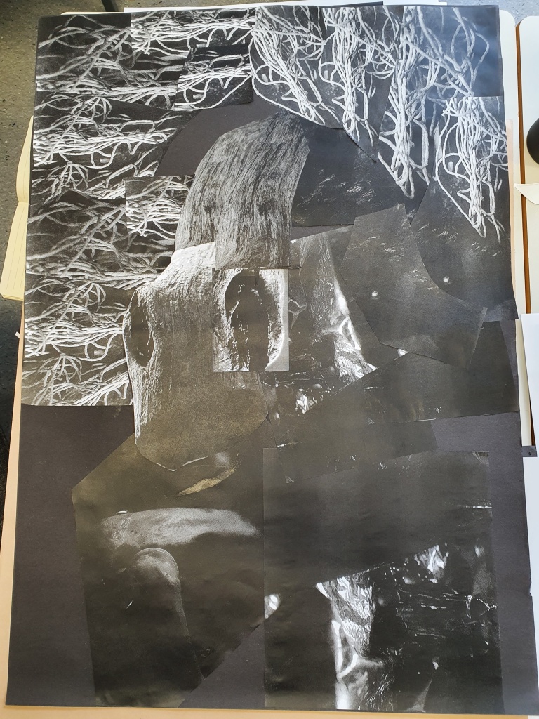
Another part of the exercise to look at tonal values and high/low contrast, was to take the photographs from yesterday and print them out in black and white. We could reduce, enlarge, cut out elements, replicate as many times as we needed, and create another image. The purpose was really to not overthink it, although trying to remember the design principles and keeping the balance was a little challenging. I enjoyed not really having an idea to start with, yet once I started playing with the images and layering them on the paper I could see a pattern forming and shapes and textures that I wanted to include. There were some repeats that I hadn’t noticed and it was only when Simon, our lecturer, was stood talking through what I was doing and picking up some of the photos himself, that I saw what he did and realised that placing them slightly differently the balance of the tones in the final image looked a lot better.
Breaking this subject down into the simple exercises we’ve done over the past couple of days, has helped me consider my approach to creating ‘Art’. If anything, I’m learning to be brave and not worry about turning things around and looking at them from different angles and perspectives, learning to look at all the angles and stripping away the colour so that you are just left with the tones is really good for understanding composition and seeing things as they really are, not what you think they should be. Who knows, maybe you’ll get to see something in a different light.
Clay that is! I have been spending my time since my college course finished wisely and am learning how to model/sculpt with clay. It’s very relaxing and therapeutic.
The Golden Diva
This little piece is based on our little Welsh Section A. Unfortunately there a little crack happened in the final firing process, but it can easily be fixed. I will then mount her in a box frame and place on my wall.
I am lucky to have three horses in my life so have decided it isn’t fair to just sculpt one, and the next project is going larger…
I will keep you updated on the progress throughout the summer.