Foal in Watercolour

27 September 2024

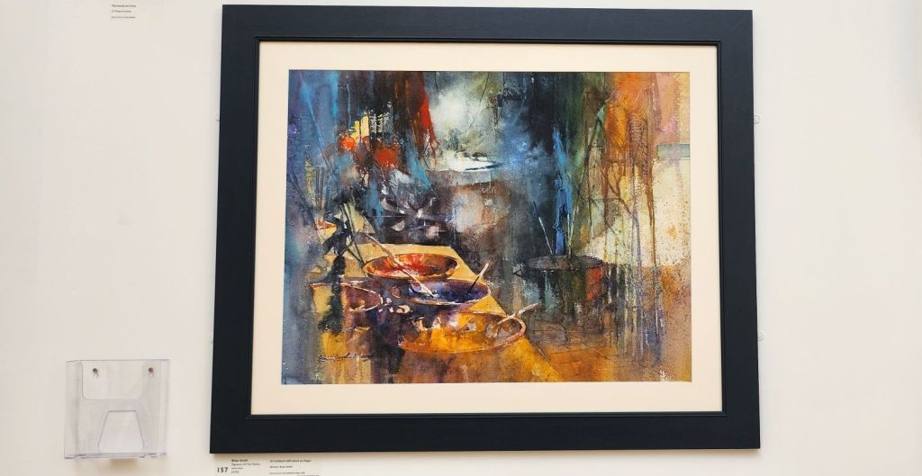
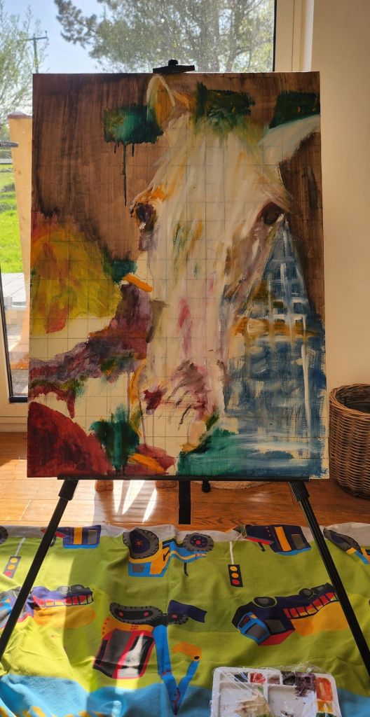
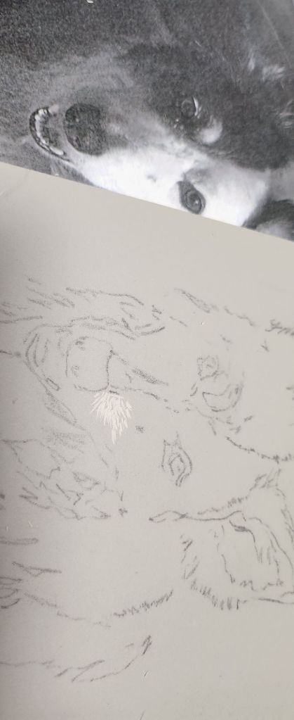
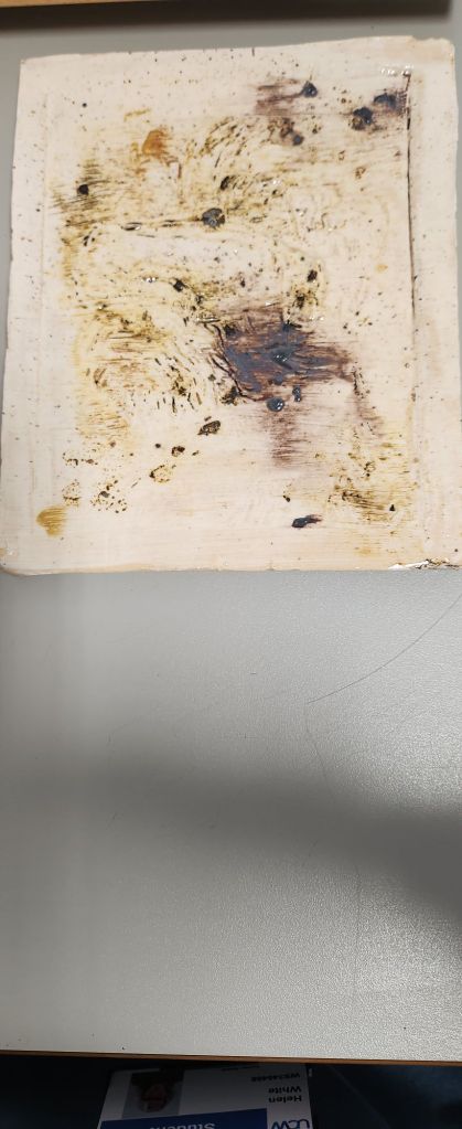
Inspired by Brian Smith’s watercolour, and the work I did for Botanics.  I wanted to see if I could refine my technique.

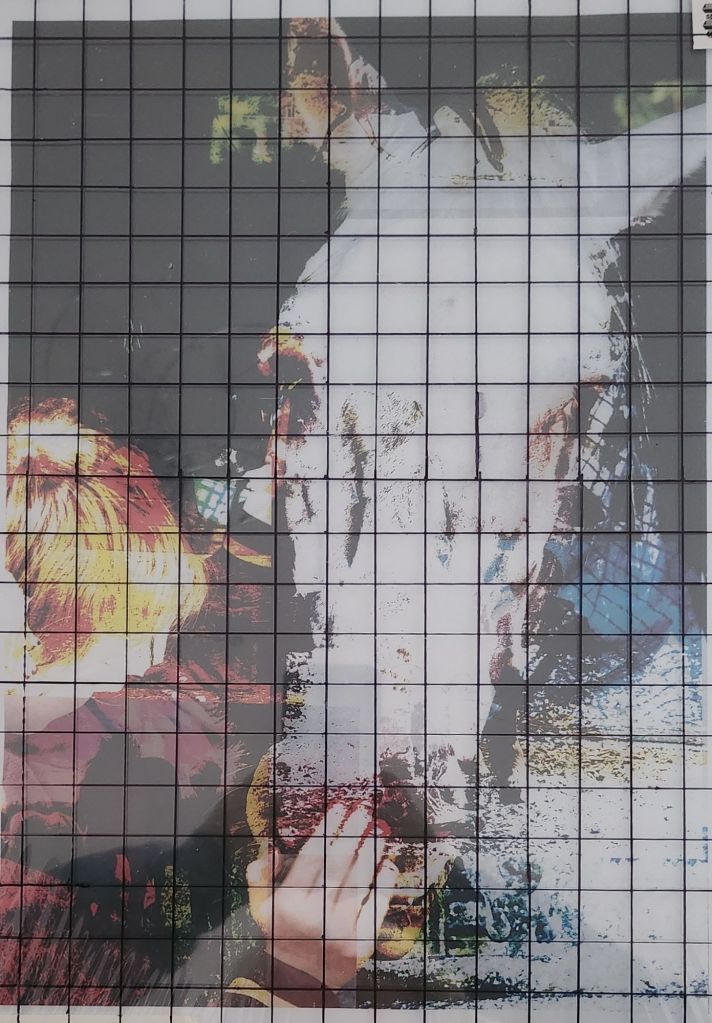
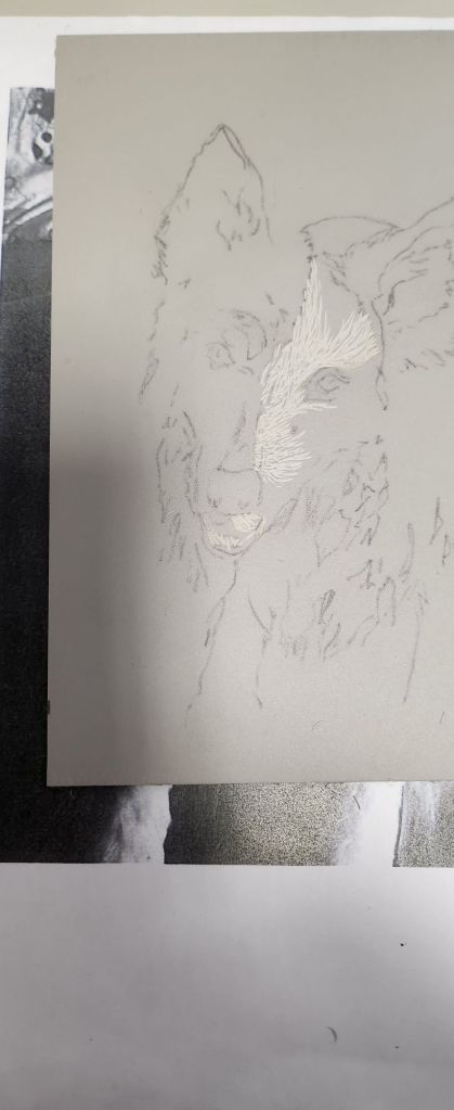
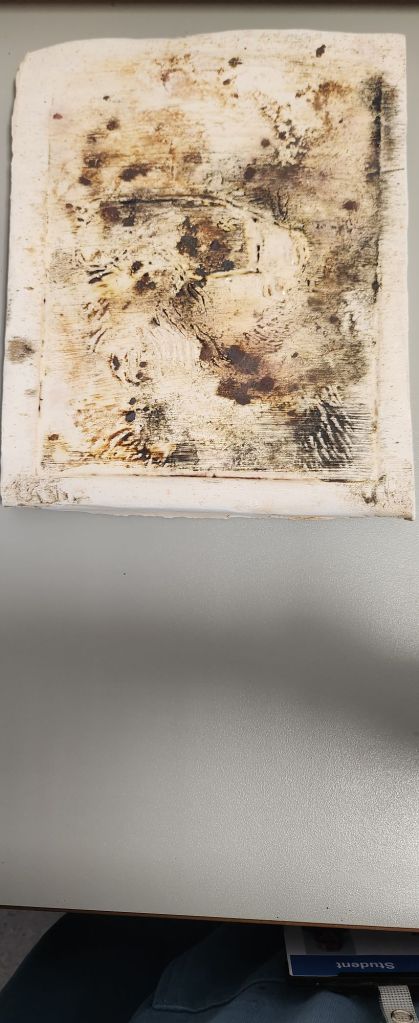
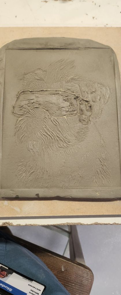
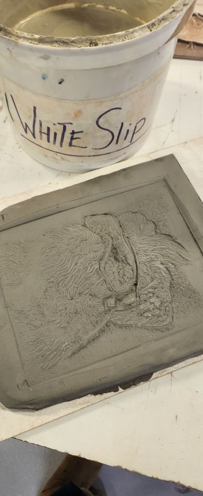
I had a photo I’d taken of my friends foal peaking over his stable door, and thought although it’s very much a limited colour pallette, getting the shadows and tone of his coat will be a challenge.

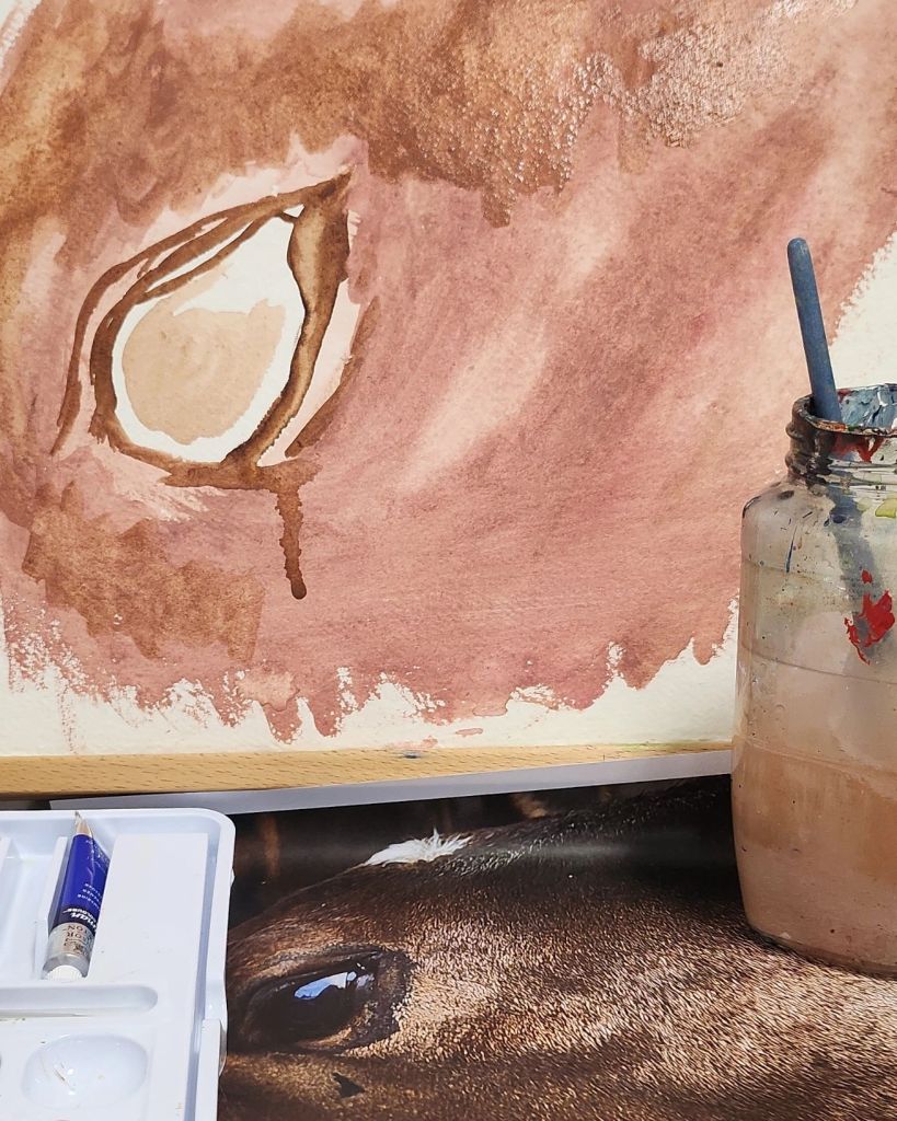
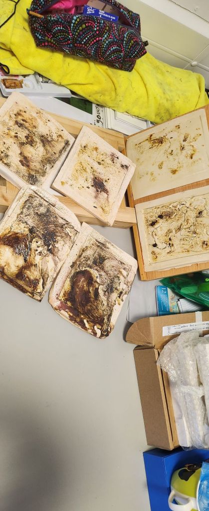
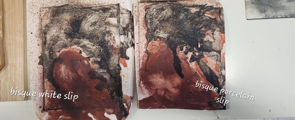
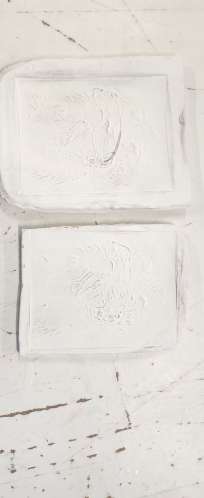
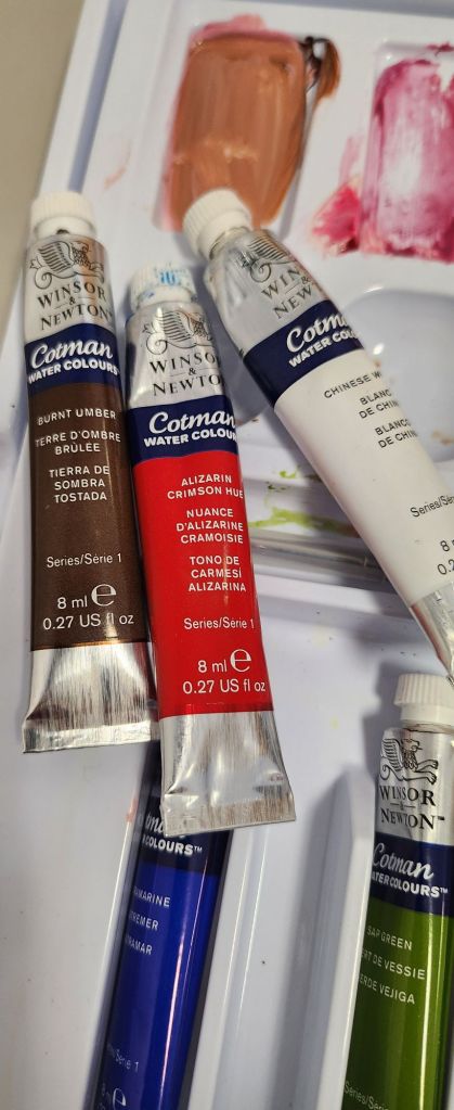
I sketched the outlines I needed freehand using paint, which I haven’t done in a Kong time.  I really enjoy painting and getting the first layer down even though I’m not as confident using watercolour.

Part of me wanted to dab and wipe the run offs, but I decided to leave them and see if I can incorporate them in the shading further into the painting process

RWA Visit

Sometimes when you visit a gallery or exhibition just one image really captivates you.  This year I kept coming back to this colourful watercolour by Brian Smith.  It’s called Pigments of the Medina.   I could almost picture myself in that room, mixing up colours to paint with.

Another piece that caught my attention, tucked away in another room  at the RWA was this little raku fired pot.  It gave of this air of fragility and I particularly like the way the horse hair and sugar blended with the clay and made their own marks during the firing process.

This year, there was an entire wall of images made from different printing processes.  I loved this as I enjoy printing and have used several different processes over the period of my degree studies.  It was really hard to single out just one that truly inspired me as each artist had their own way of presenting colour and detail. 

My takeaways from this years exhibition are to experiment a little more with printing and painting techniques and how I can blend these within my work.

Just a boy who loves horses cont…

22nd April 2025

The messy phase – it can feel quite despondent and as if you are just making it all worse as you add the base layers and background colours. I’m not happy with the eyes and I’m trying to concentrate on doing other areas rather than keep going back and making them worse. The problem is trying to get the head tilt perpective when one side of the face is more abstract.

Just a boy who loves horses

8th April 2025

I had found a piece of hardboard that needed to be prepared for painting and worked the size of the printed image and calculated the scale needed to fit the wood. I had ordered a large glass table kitchen worktop protector for my hand printing at home as an easy clean surface. I drew my grid on the cellophane/thin plastic it was wrapped in and taped the picture to the back.

Personal Skill Set

30th September 2024

The task for this lecture is to create a SWOT in term of my soft and hard skills as a creative and future business I wish to make for myself as an artist.

ANALYSIS OBJECTIVES

  • Review my arts practice
  • Develop a creative business plan

INTERNAL FACTORS

STRENGTHS +

Understand financial planning
Have reasonable techniques across different mediums
Have an unusual approach to how I use my different skills to create across mediums
Have an interest I’m really passionate about and are my main subject and inspiration for my work
Have a good understanding of the range
of work I want to produce

WEAKNESSES –

Poor at marketing myself
Not really mastering any particular skill because I create across a lot of mediums. Need to refine
what I use and how I use it.
Don’t create enough and experiment – lack the confidence
Don’t have the tools rely on access to
University facilities for some things
Haven’t built a relevant portfolio

EXTERNAL FACTORS

OPPORTUNITIES +

I already have access to a customer base I just need to promote myself because I am immersed in the
lifestyle
It’s a niche area and lots of opportunities
to get work out there

THREATS –

Feel the marketing is already saturated with artists
It’s a niche area

ANALYSIS SUMMARY

  • My lack of confidence in whether there is room for my style of work in a saturated market is
    holding me back
  • I need to be more confident at promoting myself and using social media effectively
  • I need to build more of a portfolio
  • The opportunities are there – I am holding myself back.

Sustain 24th March

The second years were holding a “Sustain” exhibition at The Cheddar Arts Quarter. I didn’t have any new work specifically for this, so I exhibited “Ghost” the two tone Peregrine Falcon I did in year one. It fits the remit as it was painted using hand mail white oil paint, and used engine oil, on hand made cotton rag paper by Khadi papers on an offcut of hardboard.

Lino Production Line

17th March 2024

I have chosen 5 images, some will just be straight monotone prints, but there are a couple where I will print in multicolours like I did for vision.

The hardest part when flipping and tracing the images for lino’s is remembering which way round the original image is so that you can cut out the correct area and use the negative spaces to create the print. This photo of my dog, I flipped the image when transferring to the lino. Her half white face will be on the opposite side when finally printed. However, as I was cutting into the lino I was close to doing it on the left side – I had to keep reminding myself it was flipped.

Frame Ideas and Prior

24 February 2025

I had a wooden frame made to help keep the clay in shape whilst using the press to create the relief. It also gave me an idea of how I can make a sustainable frame for the clay tiles so that they can be displayed either free standing on a shelf, or hung on a wall.

We are preparing for an exhibition at Prior shop and because my dog print was a success, I have decided to do some pet lino prints. Even though my main interests are in being an equine artist, there is merit in doing small prints that appeal to a wider audience.

The last pair of ceramic tiles have been glaze fired and I like them both for different reasons. I had applied the oxides more heavily, diluted the glaze and then wiped half. I think both slips have merit in how the oxides react. I will definitely do a mix of the two to create more tones in the images I create. I had accidentally wiped of the oxides with glaze on the porcelain slip, however I like the tonal range in the red iron oxide and black iron oxide mix around the nose.

Comparing them all next to each other I need to spend a lot more time refining this process for it to be consistent enough to produce on a regular basis.

Ceramic Relief Painting Cont…

11th February 2025

I am trying to see which turns out better so am comparing all the ones I’ve done so far with each other and my final pieces from 2024.

Last year I used a mix of both slips on the bottom piece, just in the centre and applied the oxides more heavily.

For these two tiles I have decided to wipe off half on each to see how they turnout after the final firing. I also added Manganese Oxide to the ones used to add a different shadow tone.

Ceramic Relief Painting Cont….

27 January 2025

The oxides still need to be applied more thickly as they are burning off in the firing process. The tile that had the glaze wiped off has more colour, unfortunately some areas had no glaze at all. Next time I need to be more careful about how much I wipe off.

Third test set under way. This time I used a mix of white slip and porcelain slip. The idea being that the two different tones of the slips will react differently with the oxides for a more tonal effect.