It was quite a nice gentle way to get back into thinking about relevant research and what categories the field trips, internet searches, workshops and books fall into.
We also watched the following Ted Talk about “Do schools kill creativity?” Worth a watch if you haven’t already.
The brief is to create a price of work that is inspired by our visit to the Royal Fort Gardens. Literally have two days to create and finish. This is good for me as I spend a lot of time overthinking ideas and discarding them quickly due to my imposter syndrome.
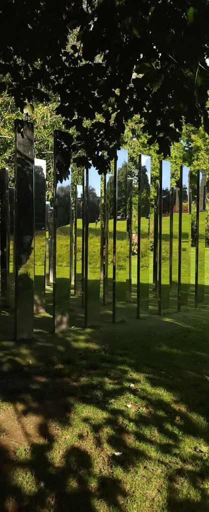
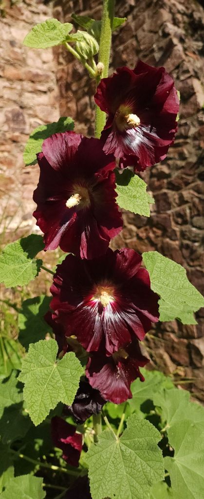
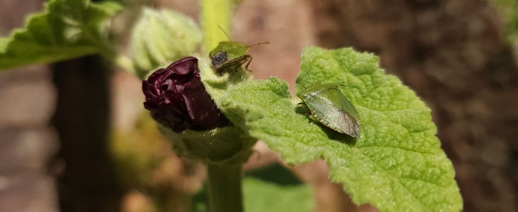
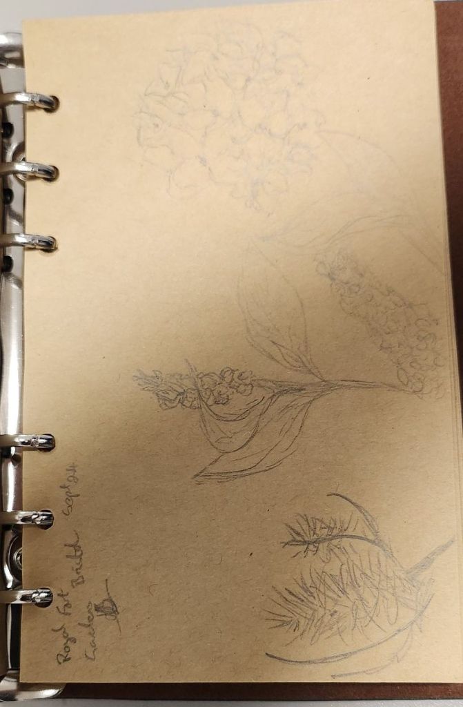
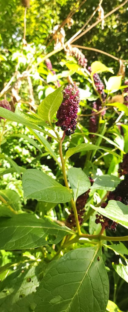
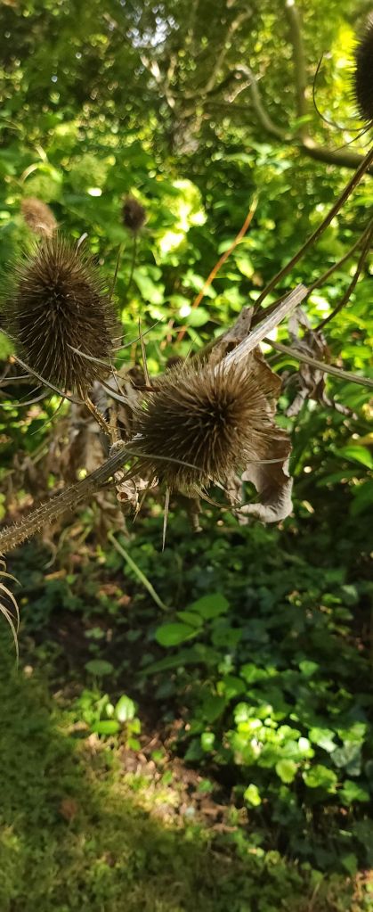
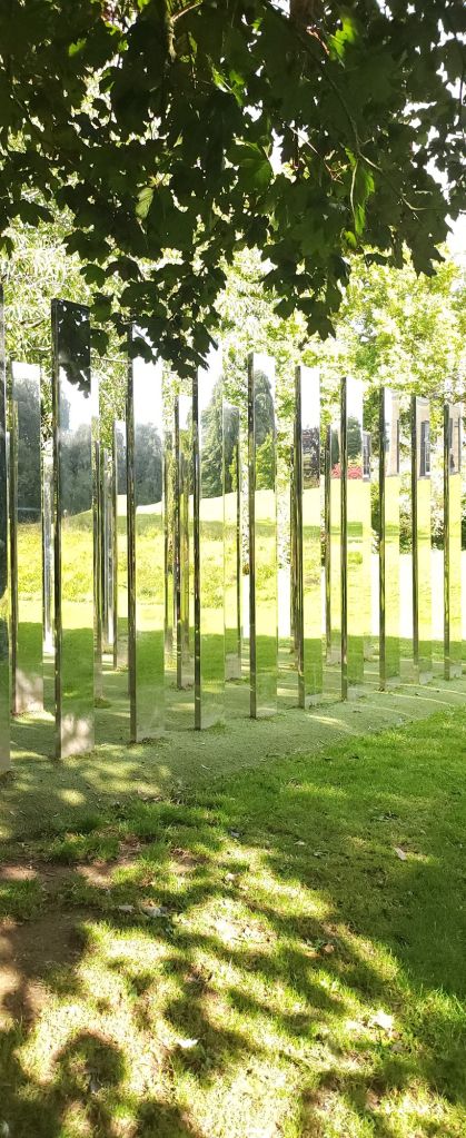
I have three photographs that I keep being drawn back to from the morning in the gardens.
Using photoshop I layered the images and cropped to a square, adjusted the opacity of the two upper layers to finalise the colour balance I wanted.
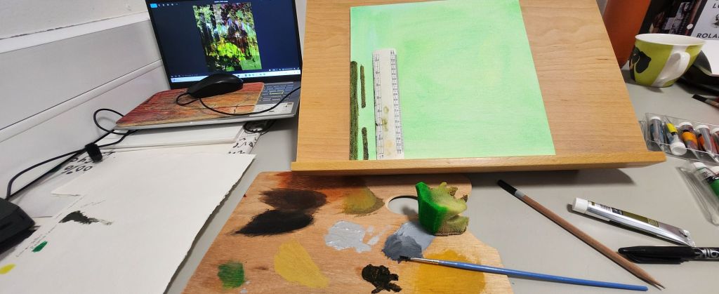
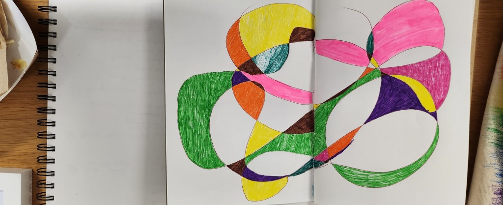
I have a small 10 x10 inch square canvas board and some handmade Khadi paper of different thicknesses, using water based oil paints and water colours I plan to recreate a form of my image as a collage. The paper should add to the texture and depth to replicate the illusion from the mirror maze.
Discussions with my tutor had to take it further – use different textures print photograph on acetate and handmade paper, the Print on Khadi paper has worked really well
Use watercolours – I need to use them wetter so they kind of bleed into each other and I need to block more and I need to follow the fact that I have a darker pattern across the paper with the acetate’s cut and stuck so I need to make them blend into the flowers and block with more burgundy and dark green, follow the pattern lines. give the watercolour image a better composition.
David Whittaker and Emil Nolde are two artists I need to research in more detail.
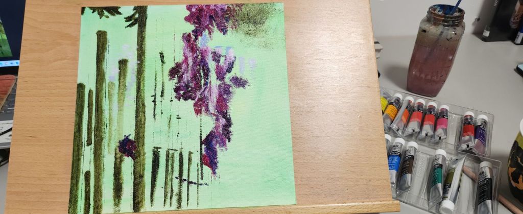
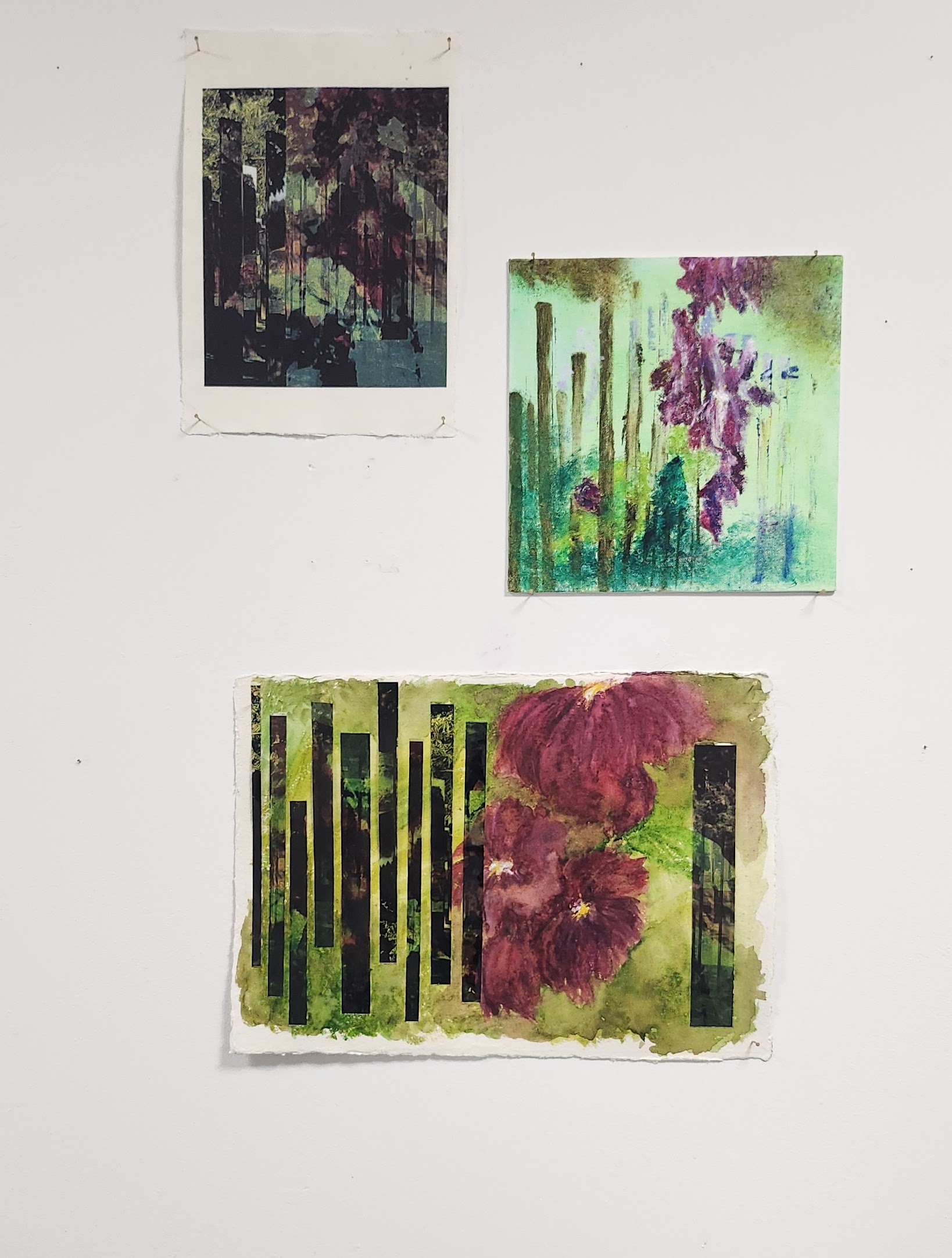
I printed the final photocollage from photoshop on hand made cotton rag paper, the paper added depth and texture to the colours. The top right image is using water based oil paints, I like the way the flowers hang in the air, a bit of a dreamy japanese feel to them. The bottom image is watercolour on handmade cotton rag paper 140gsm, heavier than the paper used for the photograph. I also printed the image on acetate and cut it into oblong strips to represent the mirror maze. I the arranged them on the paper to contrast with the water colour. It was pointed out to me that the flowers needed to be darker and blend more together. I found this really hard, water colour is one of my weaker mediums to use.
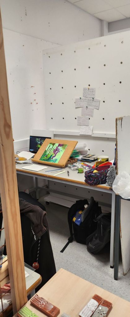
I think each piece holds it’s own and all have a totally different feel to them. Something to consider for future, what am I trying to convey? what would that look like in the medium I’m using? could a different medium or composition work better?
In all the years I’ve lived in Bristol, I’ve never visited these gardens before. Thankfully the weather gods were kind and we had a lovely sunny day.
I left my digital camera at home, deciding to take my 35mm slr and new acquisition that has been languishing in my mother in law’s loft, an Ensign e20 pocket camera. We have no idea if the bellows are still lightfast so it is going to be interesting to see if any images weere taken. Another challenge with this camera is that I had to get used to the view finder, and then remembering to wind the image on. So out of eight frames I’m definitely going to have a few that are happy accidents as we say. I now need to find a dark room to develop them.
With the 35mm film, I stick to using black and white, I’ve also been challenging myself by using it on manual mode. Again, I need to get the film developed.
My phone camera, I used as I would a dslr and played around with exposure, focus etc in the professional mode. I did fins it a little restrictive in how the settings wanted to still automatically interact and change each other – but maybe I need to investigate it further as I am probably missing something really simple.
Drawings…..
Flowers….
Mirror maze…
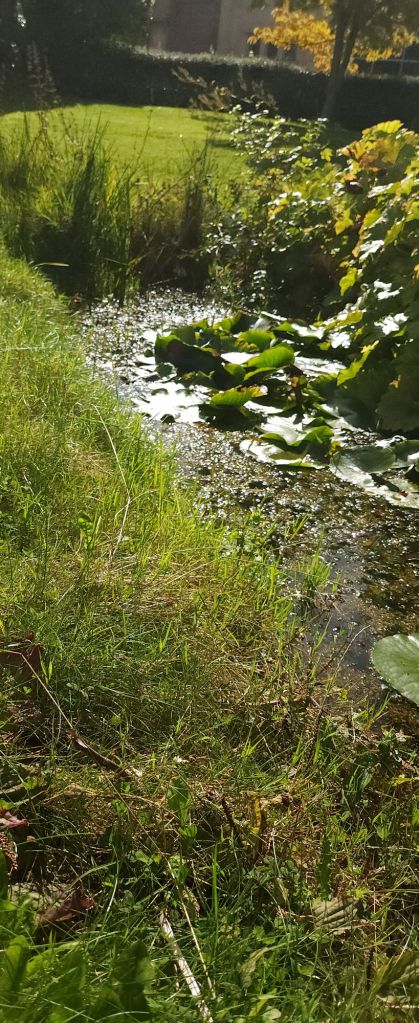
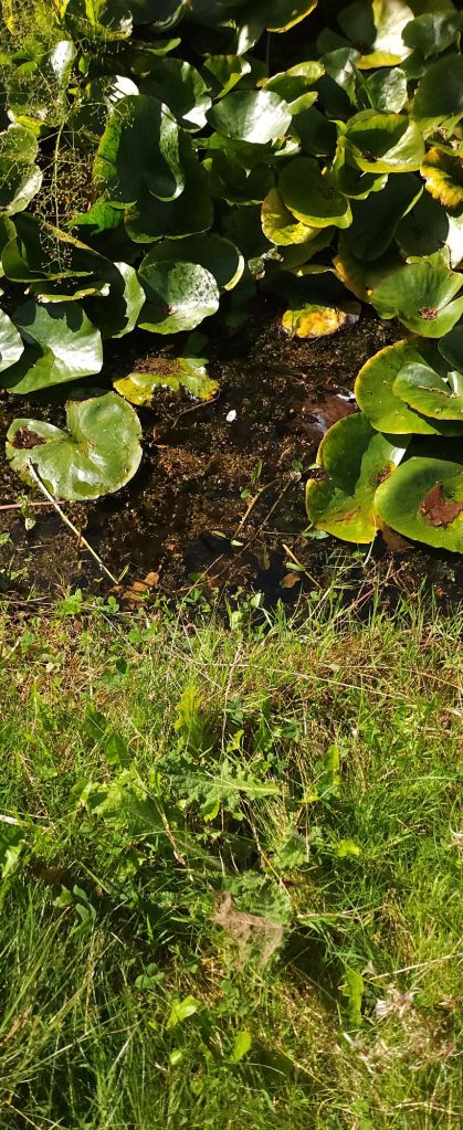
Pond…..
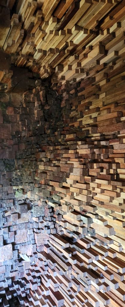
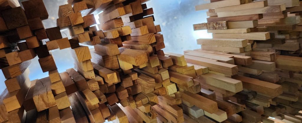
Wood structure…
Prism…..
These are some of the images I took in professional mode on my phone camera. I have to develop my slr 35mm images and the medium format ones. Once I’ve got those I will add them to a seperate blog post. I think it will be interesting to see how they’ve turned out.
I’m drawn to light, textures and contrasts. This is evident from the kind of images I take. I think I need to finetune that a little. I use photoshop to overlay images and use the textures to create interesting backgrounds and patterns. How can I utilise this to help portray the horse? Tell the story of what I see, and the personality of the equine model I am using either in a commission or a one-off personal piece? Experimentation is the only way forward.
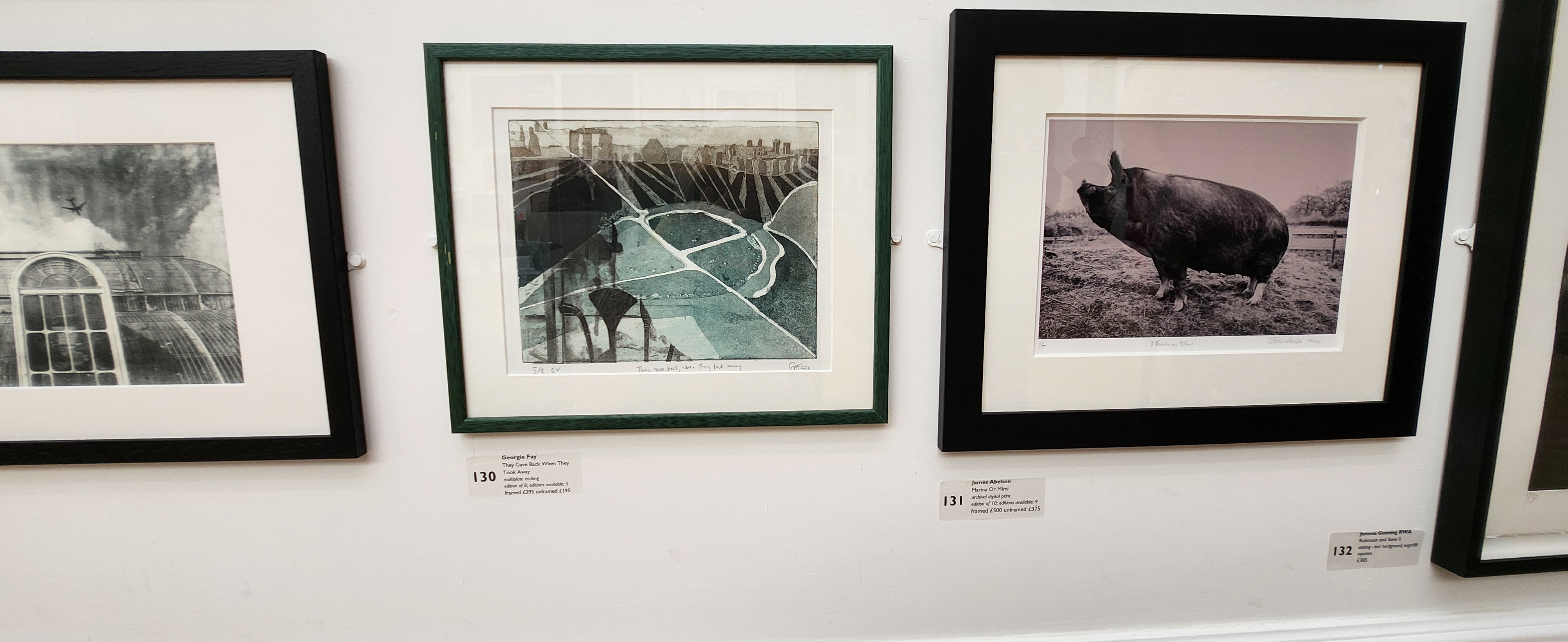
My first impression this year is that there are a lot of print creations in various forms. I’m inspired to understand a bit more about the various techniques as I would like to turn my photographs into etchings, how do I do that? can it be done in a less toxic way to the enviroment? Are there natural inks I can make that will work with screen printing and linocuts?
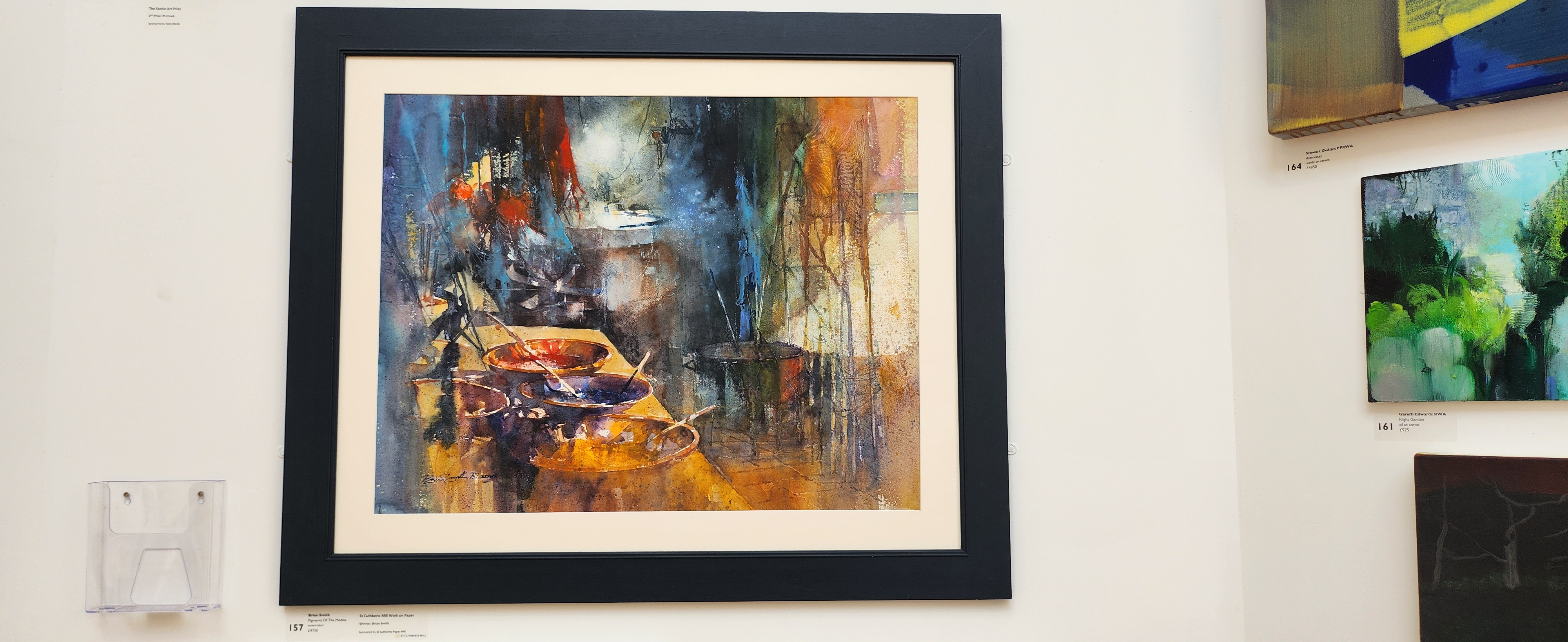
The following watercolour is probably the only image that I actually went “wow” I love the colours, I love the details held in the image, it’s softness and vibrancy at the same time. If I could paint watercolours like this I would be extremely pleased. It has the detail and realism, but abstract feel I like, and would like to emulate in my own works.
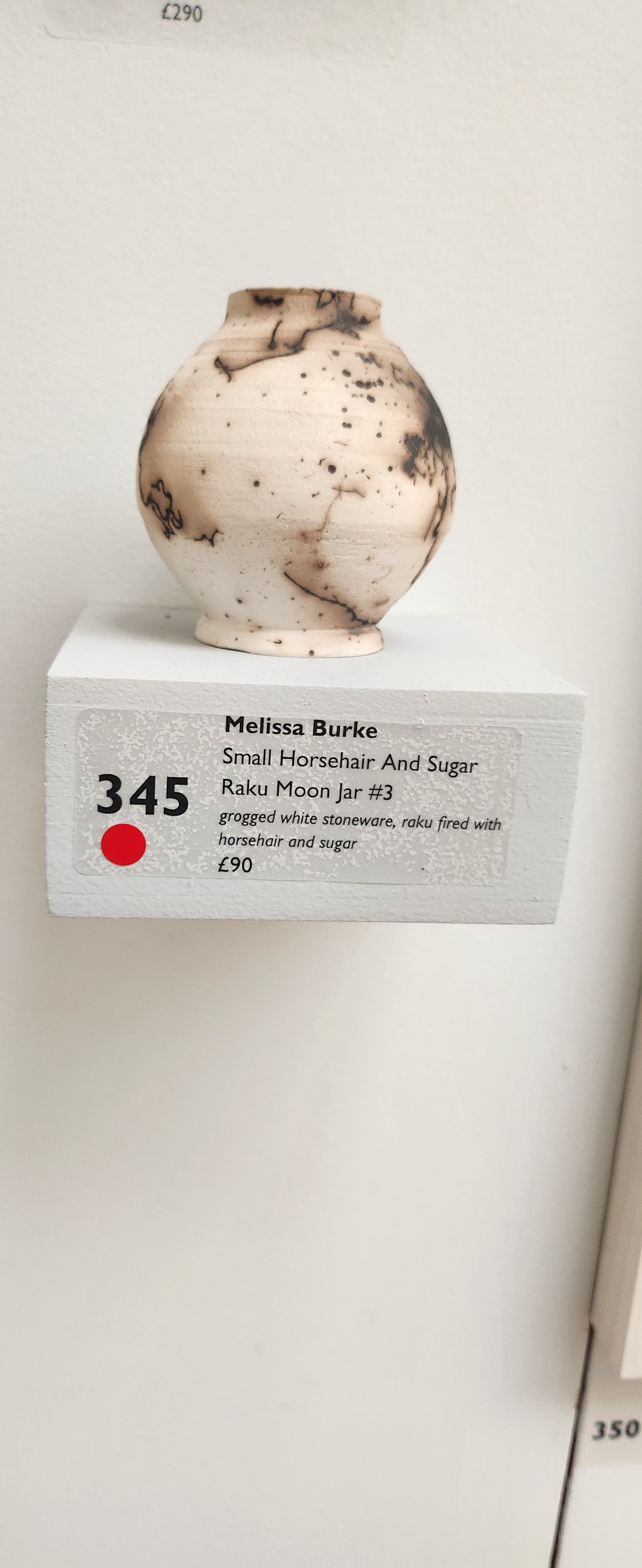
I also like this little pot, because I came across a video on one of the social media platforms that showed someone using the technique of using horsehair to create the pattern in the glaze in an electric kiln, rather than raku firing. Not sure I would be able to do this at University as you have to interrupt the firing and then put the hair on whilst it’s still warm.
I was a little underwhelmed with some of the work in the RWA, not sure why. I’m wondering if it’s because I’m looking for that special something but I don’t really know what that something is?
Sometimes what we are looking for is right under our nose and we don’t even realise it, I hope that’s the case with me. I hope that I can go back and review the photos I took and see someting I didn’t really notice before.
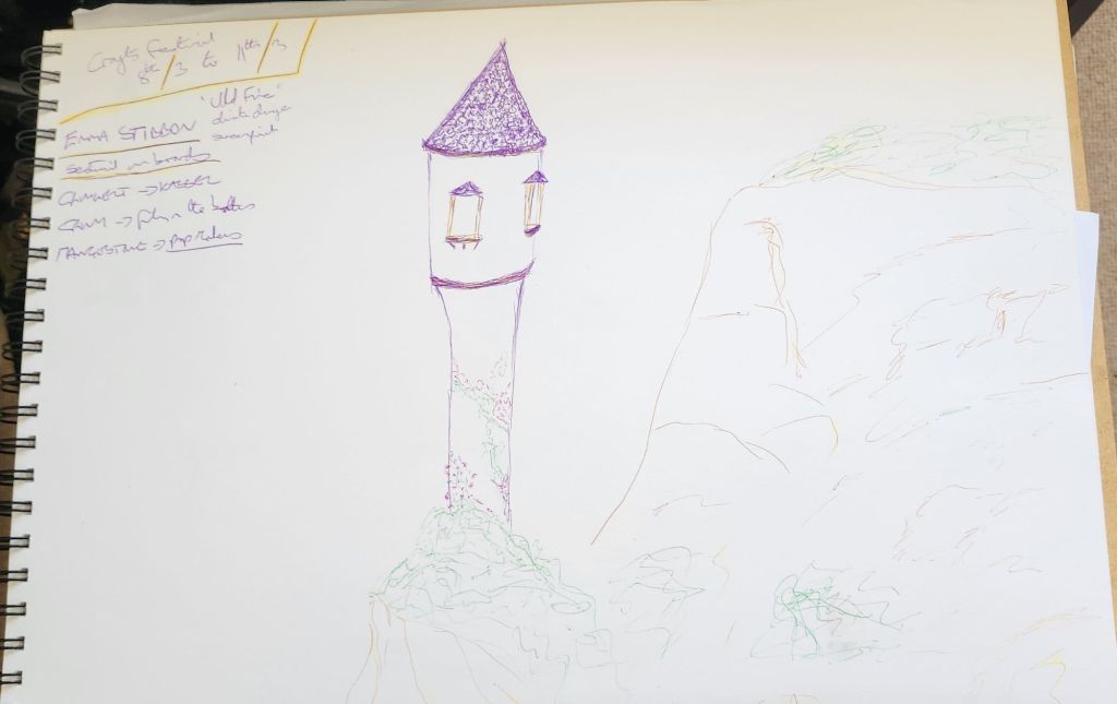
We had a brief introduction to the module, outcomes and dates. This year is really get all the experimentation done before Christmas so the techniques and outcomes are refined enough to produce good quality work.
So what am I concentrating on and where am I going?
Thankfully I have more of an idea than this time last year. My inspiration is still horses, they are such a part of my own story, I want to try and share their grace and beauty and gentleness in my art.
My style is pretty loose, I don’t want to create carbon copies of my reference images, I want my references to give me a place to start not be the place I finish.
This year I want to improve my techniques and experiment with printing techniques and photography development. I also want to concentrate on using a limited pallet, that utilises natural pigments and make my own paints.
How do I link the looseness of my painting style through to everything else? The softness and kind of abstract essay with the hint of something realistic…..
I need to do more painting and get samples of what I do out there if I want my art to be seen.
Today is the first day back to Uni and marks the start of my final year. This module is running from 16/9/24 – 19/5/25.
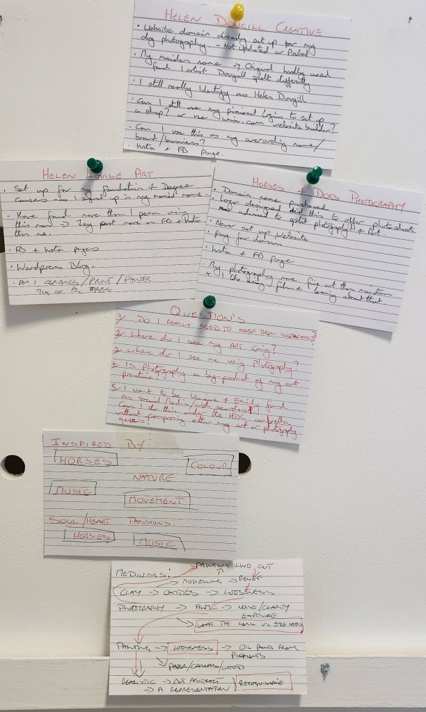
I need to start thinking about my future as an artist and where I see my creative careeer going. Taking all the research and producuctive lessons learned and somehow initiate a self directed business plan. I’ve been in a state of flux between the mediums I like to work with and where I see myself artist, photographer, print make or some very clever fluid mix of all three.
I already have website which i created over 10years ago as a way of my dog photography taken at events. Itwas a bit of a muddle as my facebook page sith the dame name had artwork on it. I was advised at the time to split the two genres. However, after doing a bit of mind dump today and tzlking it through I think it may be better to archive all my old social media posts on Facebook and Instagram and redesign my website, with the intention of creating an up to date digital portfolio.
My reasoning behind this is purely that in the past 18 months, more profiles/pages have appeared on social media with variations around Helen Louise art, or art by Helen Louise. Also I’ve hardly used my horses and dogs photography pages so I could set them up under one name. The key here is that my artistic and photography style are very similar and my passion is really horses, and how I look at an image with the stories I feel they tell.
Mind dump from today…. now I just need to get clearer on my business intentions and tidy up my social media accounts and website going forward.
I’m looking forward to fine tuning my experience and knowledge of business and finance especially in relation to the art and design industry sector.
One thing I’m taking forward from last year’s final tutorials is to improve the way I conduct contextual effective research and apply it in my outcomes. And also updating this blog.
Career planning is a little up in the air as I’m not sure exactly what I want to focus on other than my creative practice. However I feel that my practices are possibly niche rather than mainstream so will need some kind of regular income to pay the bills. Obviously my previous life as an accountant/bookkeeper is handy, but I really need to identify my skill base and how that will help me pursue a creative careerr
Personal skill marketing – this will be fun! I am pretty hopeless at selling myself so this is a major work I progress.
Branding…. I am my brand…. see above!
Locating an audience…. scared to get my work out there, so looking for ways to exhibit my work and competitions will be good for me.
I think that pretty much sums up today, tomorrow is a research tip to Bristol.
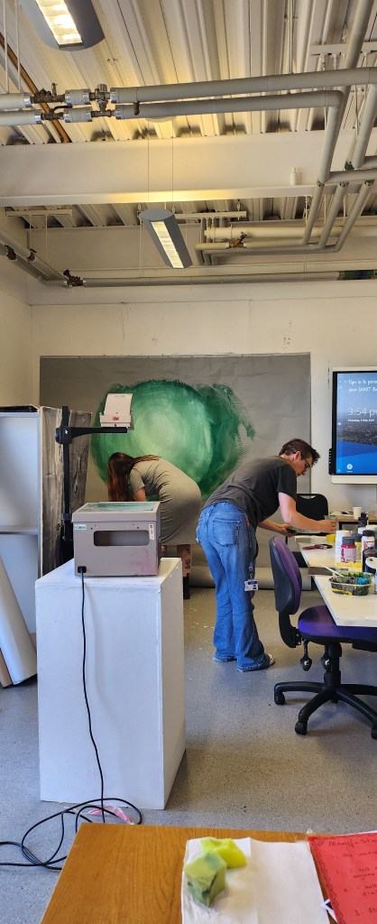
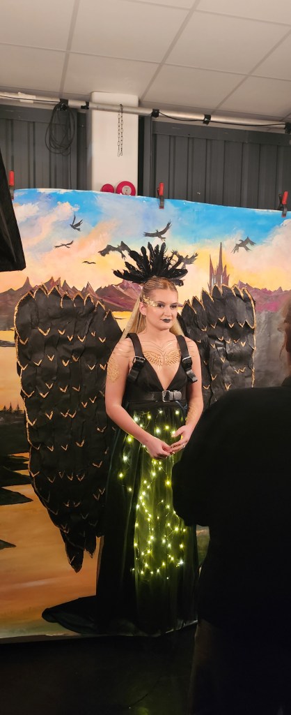
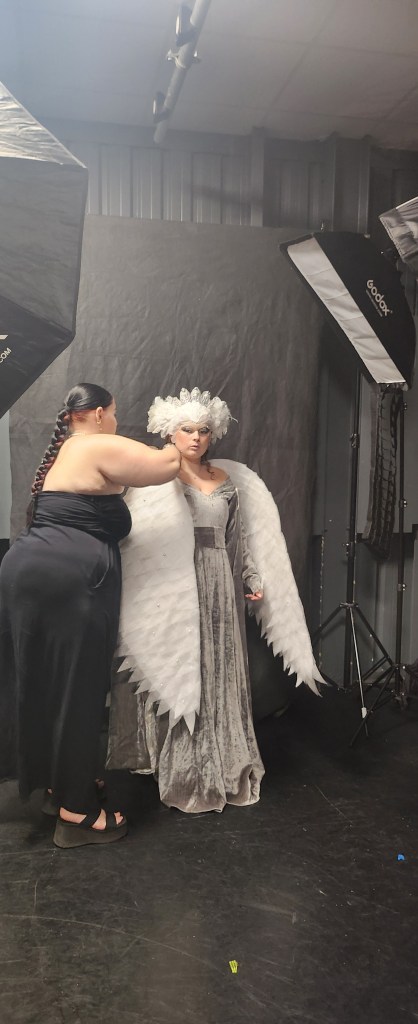
This is a collaboration with the HMMP Year 2 Students. Their theme for this year is Brothers Grimm and our commission is to work with them to design backdrops for their end of year exam photoshoots.
We were working in our two groups, there are 6 students, so we took 3 designs each. A quick update on our group, we no longer have Alan and Caroline has joined us instead and our name has been changed to Art-iculate.
This is the first project I feel excited and happy to be involved in. I think that’s because I love all the fairy tales and make believe – even the darker versions of the popular ones we tell our children. Our groups three back drops are:
Seven Ravens – The story of seven brothers who failed to return with a jug of water to baptise their sister and their father, cursed them by wishing they were ravens.
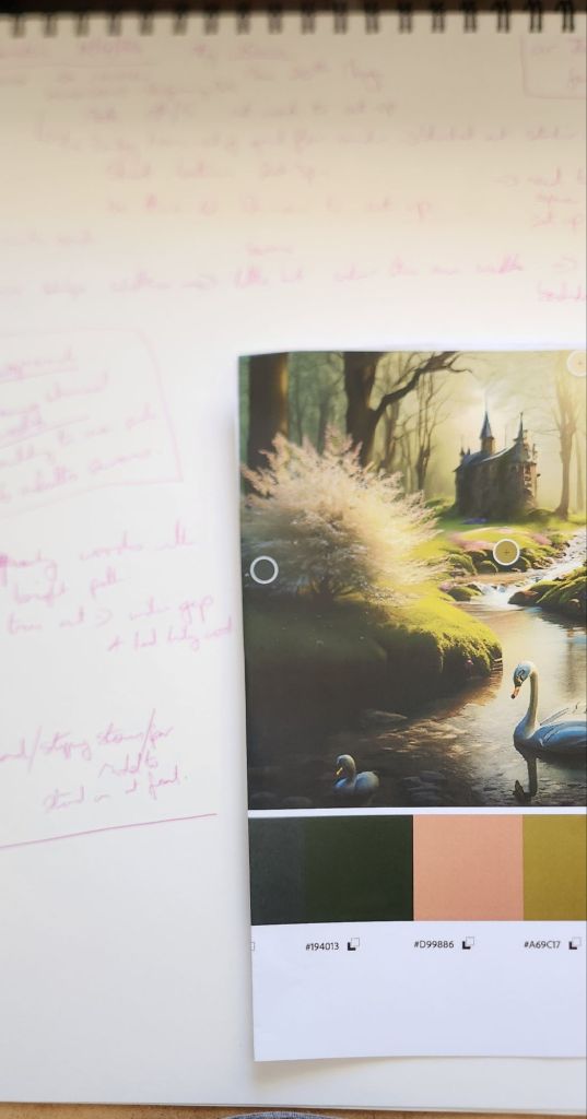
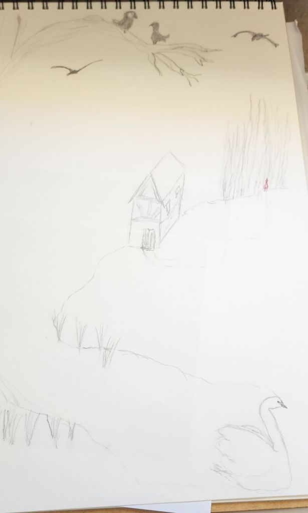
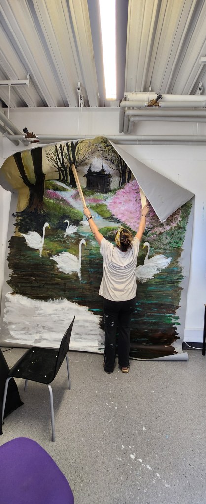
Six Swans – the story of the sister who escapes being turned into a swan by her evil stepmother’s, mother whose a witch, but has to stay mute for seven years.
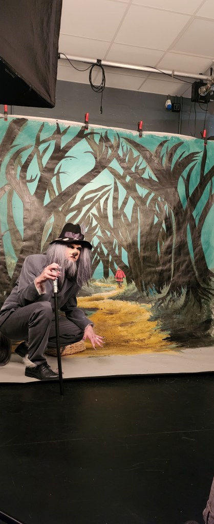
Into The Woods – which is really an adapation of Grimm fairytales with Red Riding hood as the main character it revolves around.
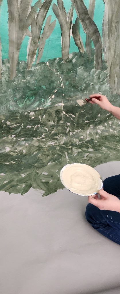
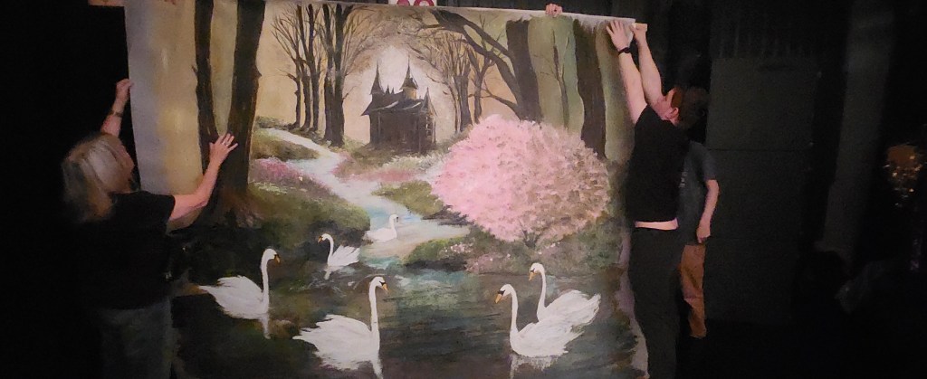
We split the three backdrops between us to work on, Sam and Alicia had into the woods, Caroline and Claire Seven Ravens, and I started on ideas for the Six Swans.
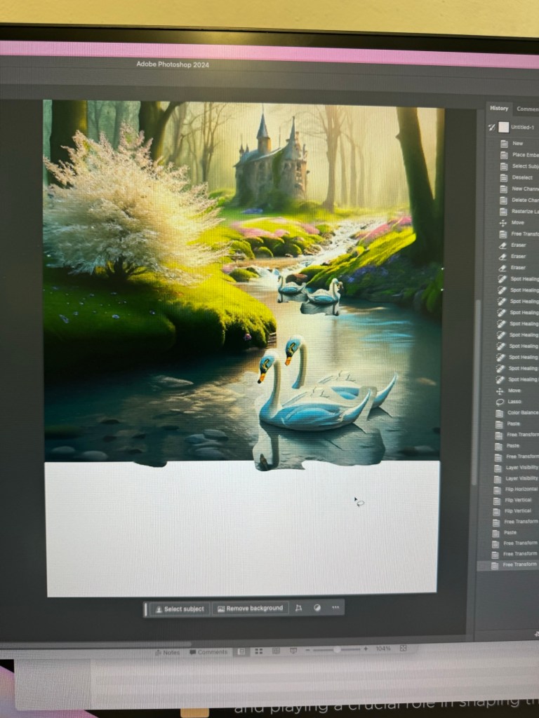
I loved that Ffion wanted light witchy woods, with a stream or pond, with six swans on it and a medieval village/house in the back ground. It was very reminiscent of ballet scenery and backdrops from the theatres when I’ve seen Swan Lake, so I already had ideas bubbling in my head.
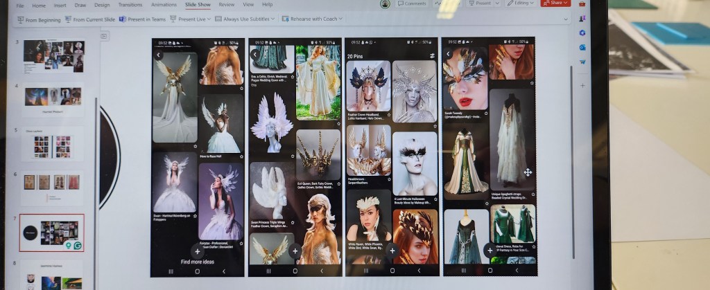
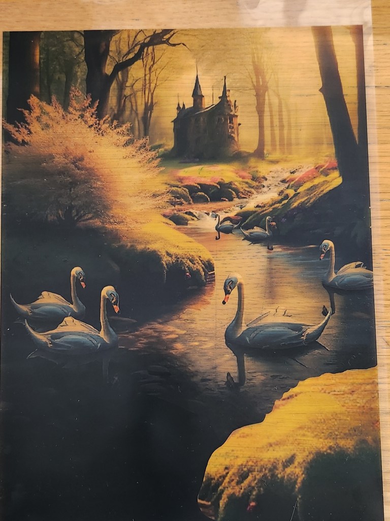
The catch of course is that the mood boards needed to be generated digitally and using Adobe AI products. Not sure if you’ve ever used AI technology but what you get out is only really as good as the word descriptions you put in. I did struggle and couldn’t quite get six adult swans but that was rectified by using photoshop once the design was agreed on with Ffion.
Ffion chose the middle mood board, I then made changes in photoshop that had been requested, like more adult swans, and a bit of land at the front it didn’t look like her model was in the water. For once, I actually felt as though I knew what I was doing and enjoyed using photoshop to get the final look.
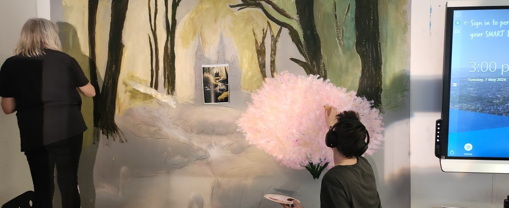
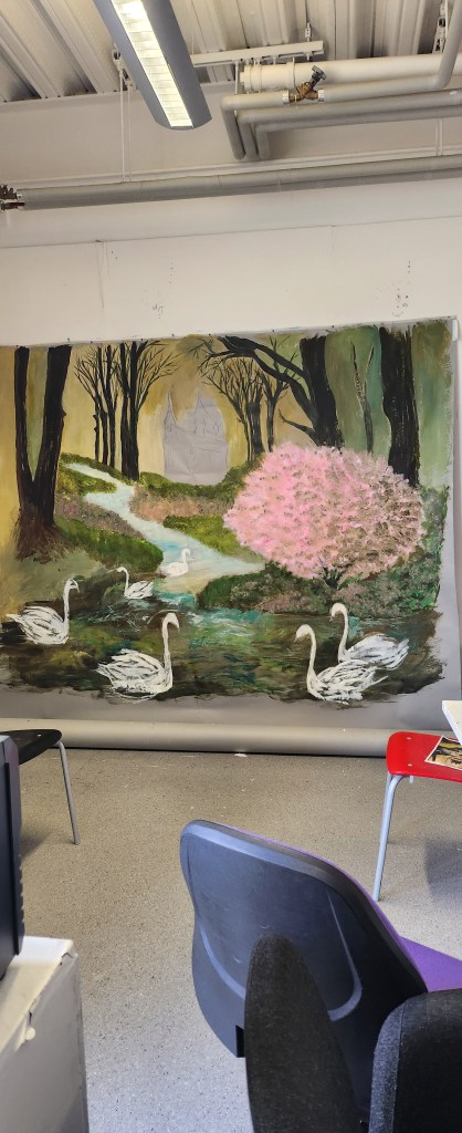
Exam Day…. we installed our frame for the backdrops and our system of having two so that we could photograph one, and have the next ready to go worked really well. Because it was a Monday and not our usual university days I couldn’t stay for all of it, however, I did capture a few photos.
Into The WoodsSeven RavensFfion and her swanSix Swans backdrop being hung in place
My overall conclusion on working on this collaborative piece is that I loved the HMMP students, they were actually pretty easy going, had really clear ideas on what they wanted. The hardest part for us I think is remembering it’s their final exam and our work, even though we are also being marked on it, really shouldn’t overshadow theirs. I think we managed to complement their final costumes and models quite well.
The change in dynamics of our team was a little more difficult as we ended up with two very strong characters, one of whom tended to bulldoze on and not really consider others feelings until after something was done. I was annoyed because we had worked out the lighting direction for the six swans backdrop after it the acetate had been put on the overhead projector with everything on the opposite side. And this person was asked to do the house because that was their skill, and they just got carried away and repainted over areas that had already been done. The affect of this is they changed the direction of light, were pretty messy with the dark colours and areas that had been finished had to be re painted and blended in. However, they didn’t ruin the backdrop and it all came out in the end, it was just really difficult when we were all stressed trying to finish this project of and our final end of year pieces for the Summer Show.
I did get a little fed up of my ideas being spoken over and some good ones from other people being totally disregarded. The final collective outcome was a booklet that was designed by Caroline, which was great but again, some requested changes were ignored and if things weren’t to her deadline, regardless of what else we had going on, you felt like you weren’t being a good member of the team. I have no problems with acknowledging we all had different deadlines with our various bits of work but did feel that the same consideration wasn’t always given back. I am aware that the quieter member of the team has been singled out as not having much input. Whereas, they helped on two backdrops, especially into the woods. Honestly, if I’d been spoken to like she was then maybe I would have stopped voicing opinions and ideas as well.
I think that’s the issue with any project where you are working with various personalities that are sometimes polar opposite. It’s also interesting how we all have a different perspective on who did what and whether all of us were pulling our weight. Personally, I think we all did. I also think that despite the feelings I definitely had about it not being a democracy at times, we actually achieved what we had set out to do. That is to create three backdrops on the themes required.
Am I going to actively look at collaborative work probably not, but if I was asked to work in a collaborative collective on a project – I will definitely meet the key people and consider the personality vibes I pick-up before I commit.
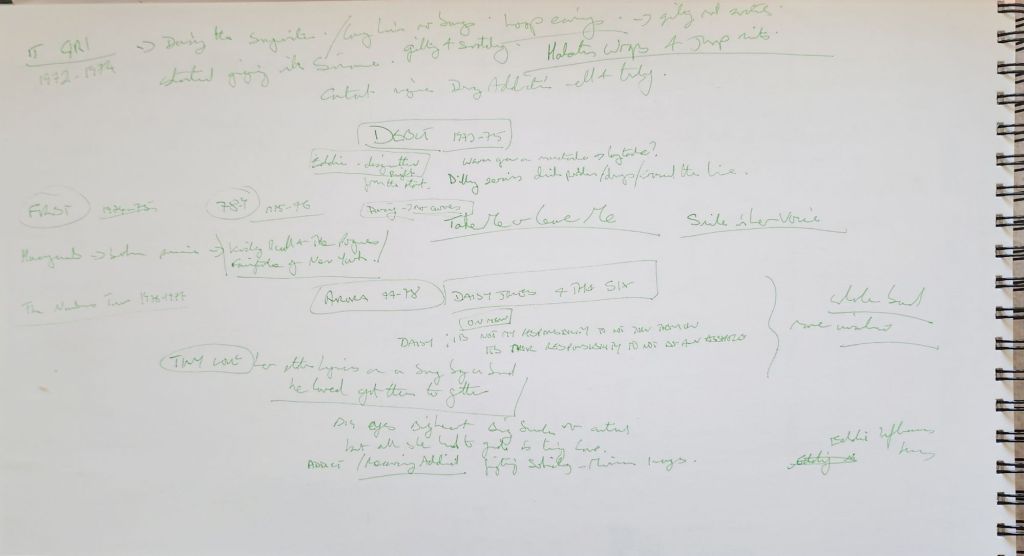
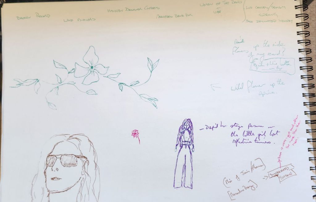
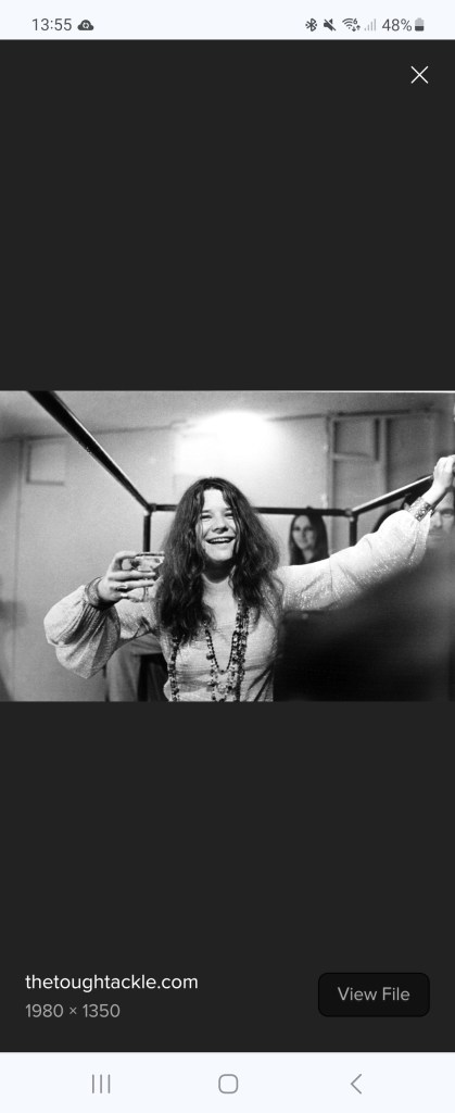
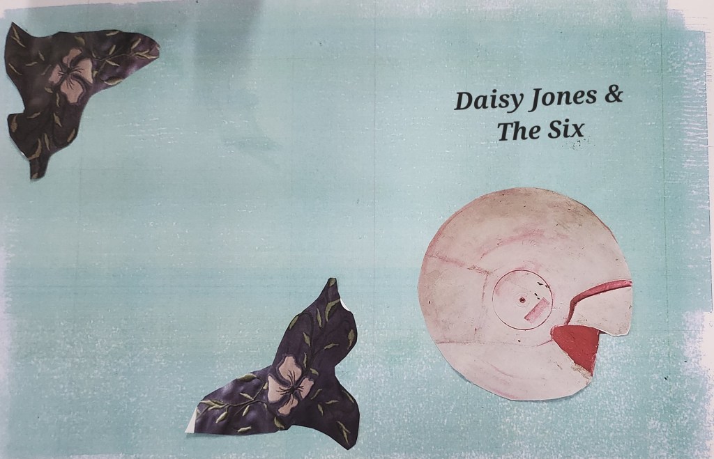
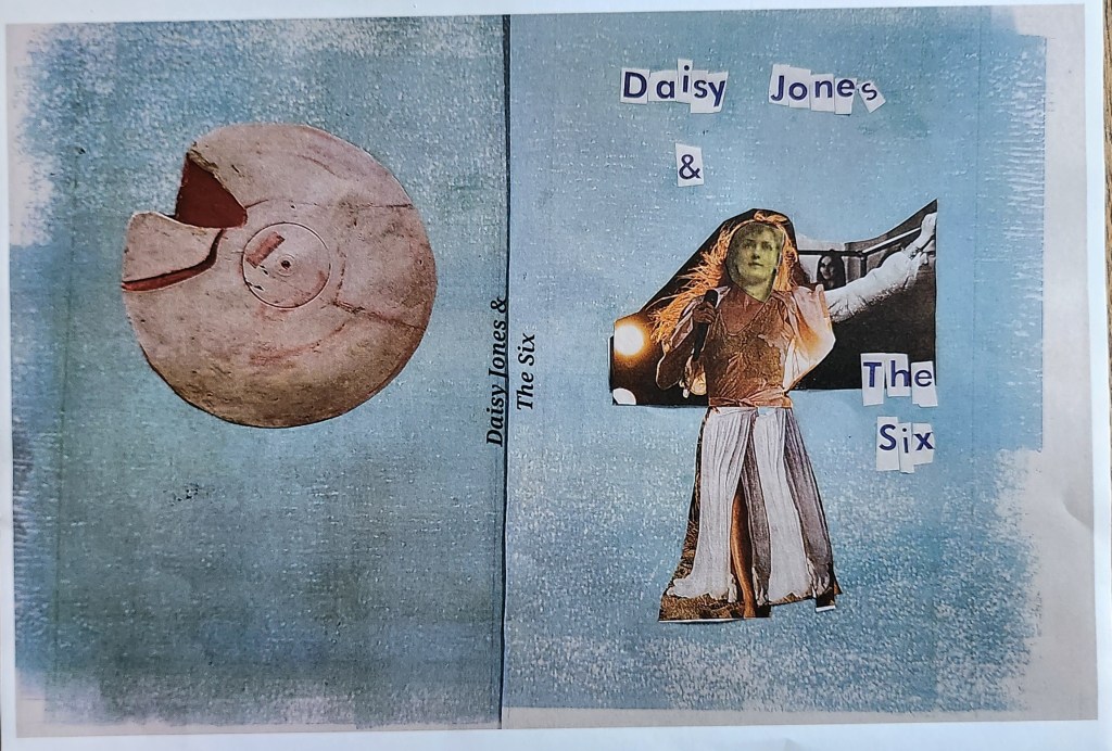
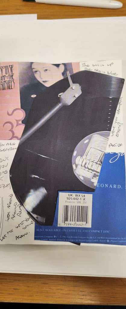
I’ve chosen Daisy Jones and The Six, apparently it’s also a netflix series. I’ve never watched the series but I did buy the book and did a quick synopsis of the main characters and the story line. I didn’t agree that the main character was a “Stevie Nicks” persona. from the first description of her walking down the streets of LA, I got a real Janis Joplin vibe. I also think that the strongest character of the book, and who the story was really about was Camilla Dunne the wife of the lead singer Billy. So straight away, I’m at odds with the book synopsis but I really wanted to tell the cover story as I see it.
My sketchbook notes.
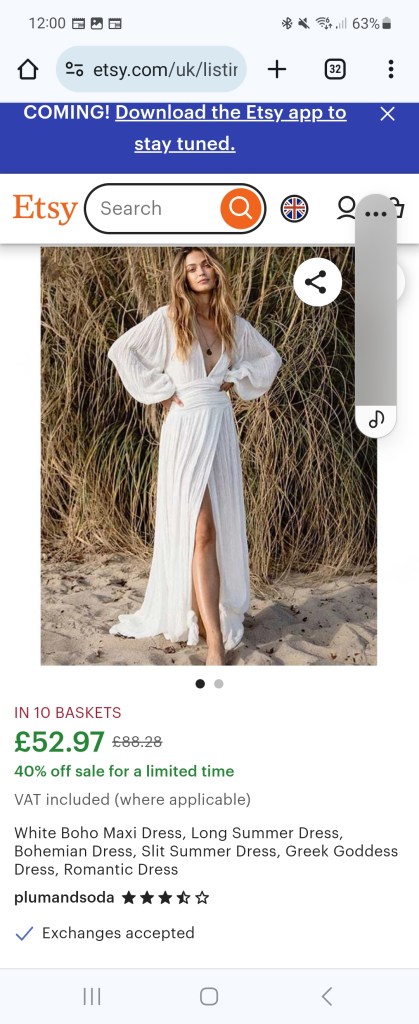
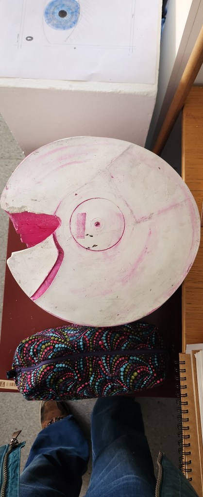
My original idea was to use a 3d plaster sculpture that I had made a couple of years earlier, that looked like a broken record and paint my design on it then photograph it. I started mocking up a collage of “Daisy” using images I found, to me she was mix of Janis Joplin and Florence of Florence and the Machine. I also found patterns of 1970’s style clothing and a Halston robe, to give me an idea of the flower pattern I wanted to use in relation to the Wild Flower Project mentioned.
My nemesis here is that I had to use in-design and whilst I was great at my paper mockup, actually using the computer was not really my forte. I think to say I struggled was an under statement.
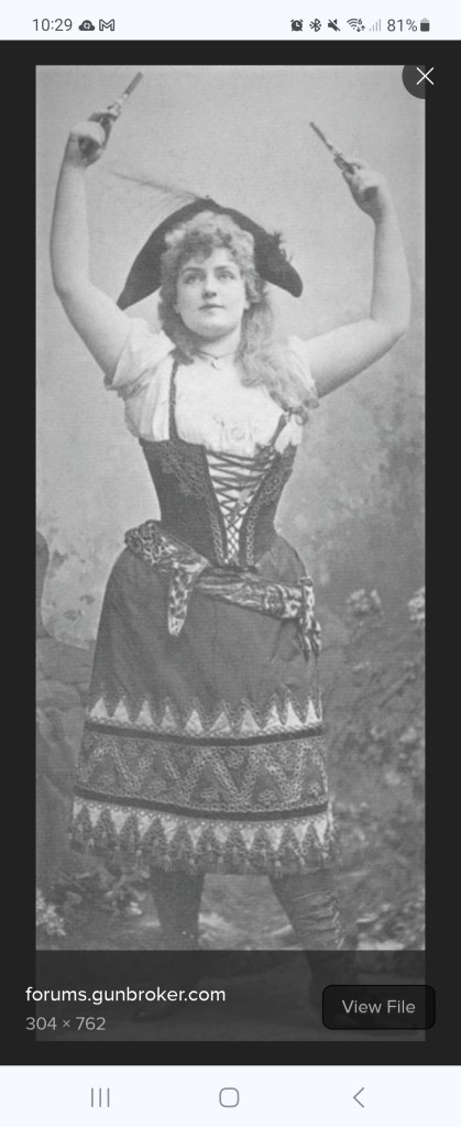
This image to me, is what the book is all about. The strong woman in the background, her story.I needed a not so famous face for my collage, hence this image.I envisage flowers around the side and Daisy with The Dunne’s in the background, on the top of the broken record. My plan is to then overlay the two photographs I take in photoshop.
I haven’t enter the competition, I wanted to but I’ve missed the deadline. Also, this is my mock-up of something I wanted to paint. I’m not happy that this ended up being my final piece of work because I don’t feel like its finished. I don’t feel like I’m done with the idea.
I think it would be great for my work to be considered for a book design cover, not this one, but any future work I do, its one of my quieter ambitions.
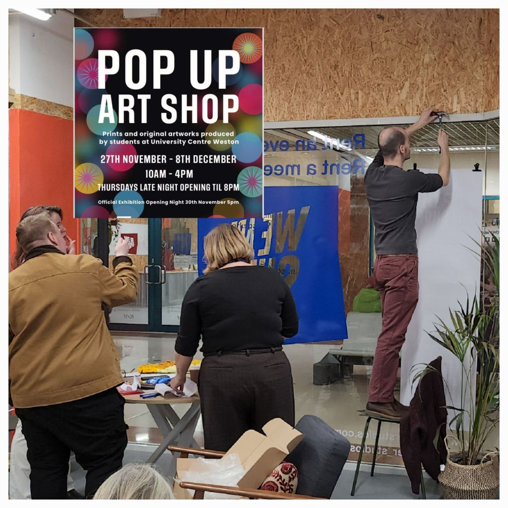
This year as Yr 2 students we were responsible for the marketing, putting up, pulling down and rota for manning the pop up shop. Also making sure any monies from sales were given to the relevant students at the end of the year.
The theme this year is “Light” and we have to create two or three 10″x8″ pieces of that relate to our current practice/materials. Already got a stumbling block because I’m really not sure what mine is at this stage.
The venue this is was “We are Super” in the Sovereign Centre in Weston. As soon as the rota came out I put myself down for the only day I knew I was able to do due to work and family commitments. I also helped set up the display, and checked the monies at the end of the week.
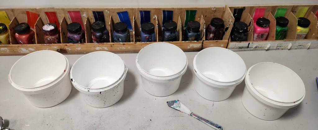
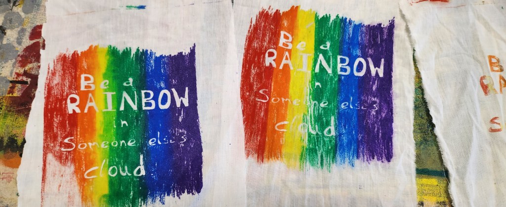
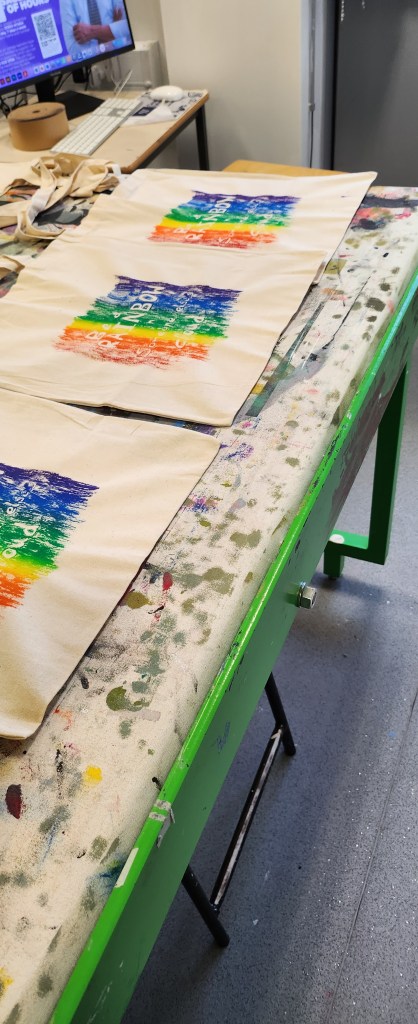
So, I guess me being me I went a little of tangent in that I decided to screen print cotton tote bags. Re-useable bags are always handy and they can be folded down to fit the required measurements. I also had a couple of prints of the slogan on paper. However, I did sell a bag so I consider that a positive result.
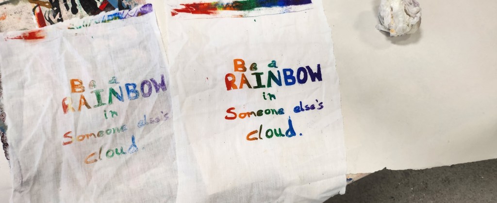
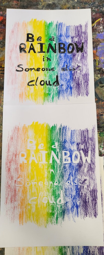
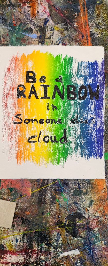
A couple of ideas of how to do the designs for the bags, using a quote by Maya Angelou “Be a rainbow in someoneelse’s cloud” I then chose the colours and learnt how to mix them up with the medium for fabric printing.
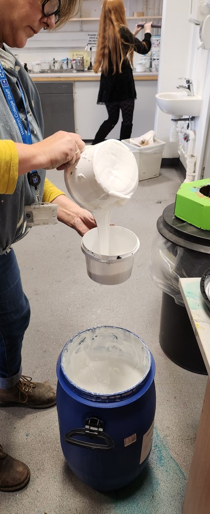
Did some test prints of the designs on cotton fabric scraps. Decided which one I liked best and then set up the production line to print out 10 bags.
I then used the same screen to print out onto paper, the writing didn’t really stand out the same on paper so I decided to line up and go over the words in black.
The problem we had sorting out the money is that we didn’t really set a spreadsheet up to record the sales properly, and some of the students got paid privately for work. Coming from an accountancy background it would have been really easy for me to set some simple tracker up that could have been printed out. Being totally transparent, I didn’t want to do that. Just because I could and I have the financial knowledge. It really didn’t take very long to reconcile the records we had.
I also think, that as there were lots of gaps on the rota because the 1st years wanted to do their spot with their friends, we should have given clearer guidines on it only being one person at the quiet times, and if you insist on it being two of you then you do two shifts. One of the 2nd year students did more than their fair share of covering shifts that people couldn’t.
Over the two reading weeks we had a sketchbook project to complete. It is based on the Brooklyn Art Library idea where people completed sketchbooks every year based on a theme and sent them in to be kept at the Brooklyn Library, a lot of them have been digitised. The project lasted 17 years. https://brooklynartlibrary.org/
This year the idea is to start our own “UCW Art Library” – we had to come up with 5 themes to choose from and we had 2 weeks to complete it. The sketchbooks are A5. After the two weeks we will write our own rules to launch the project to the Level 3 students to complete over Christmas. There are lots of possiblities to grow this idea, engage with the wider University and College community, track and promote it.
My Ideas:
Daily Rituals
Habits of pets
Sunrises and Sunsets – Tails of the day
Nature
Connections
6 degrees of seperation
The Group Ideas:
Portraits
Journey
Random Thoughts
Places
Home
Big Hats
Wind Down
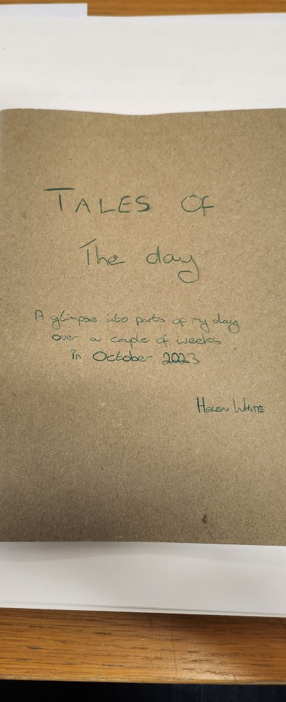
Tales of the Day
In Nature
Bits & Bobs
Ermmmm
Feet
Dinner
Straight Lines
Dreams
Rituals
Collections
Sunset
We put them all in the computer and did spin the wheel to create a random choice.
The lucky 5:
Wind Down
Big Hats
Bits & bobs
Tales of the Day
Sunset
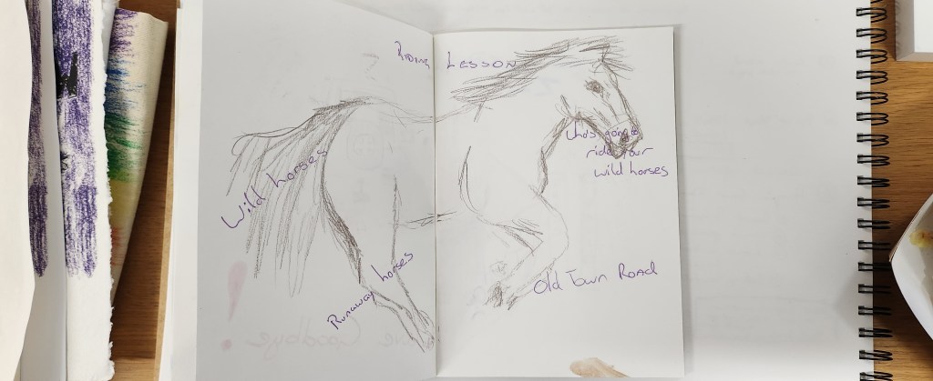
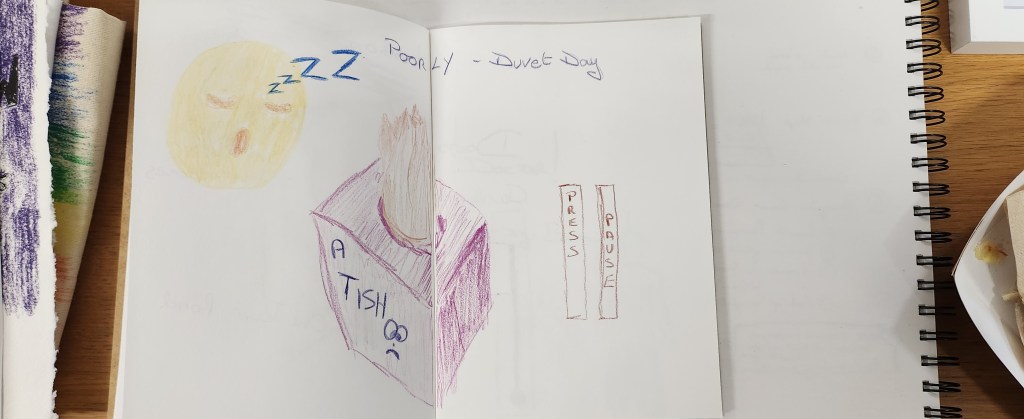
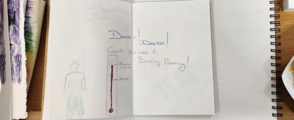
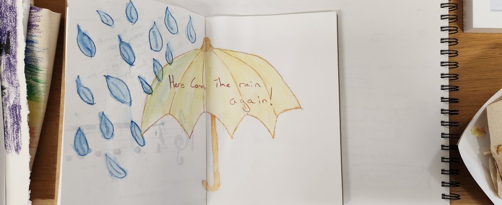
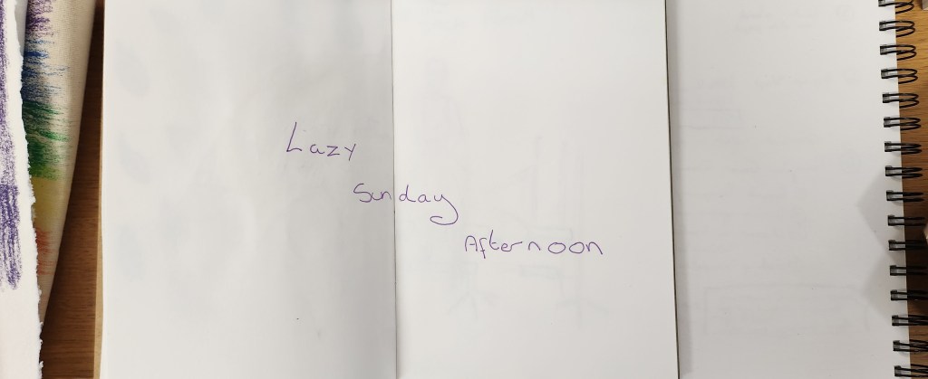
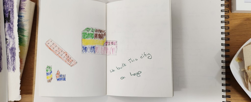
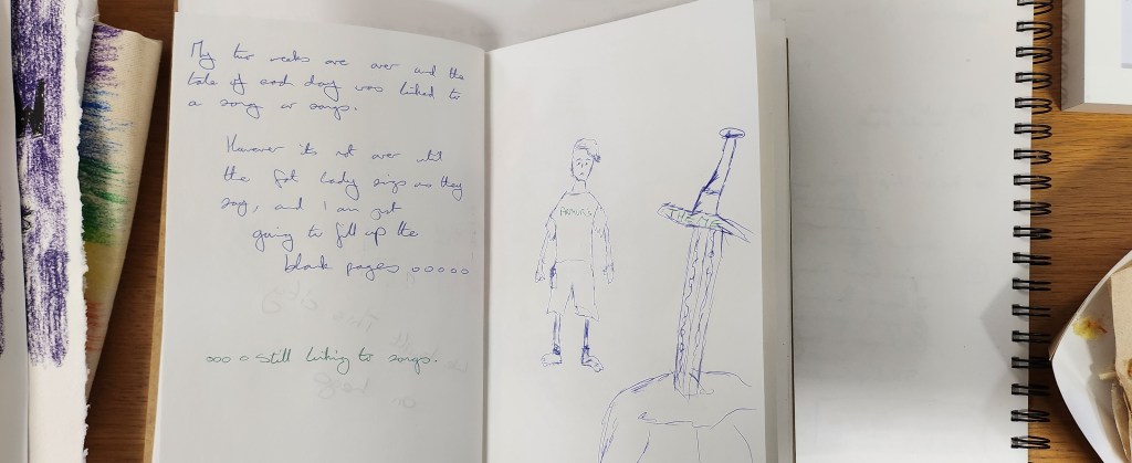
My choice out of the 5 is Tales of the Day. Honestly I started out with good intentions, but I am actually really really rubbish at journalling/sketching on a daily basis. I have on several occasions tried and failed at making a habit out of these things. Like my blogs I seem to have a mental block. It’s like I’ve already written these or live it, and I’ve got memo notes in my main diary or in my main sketchbook, or photos on my phone. Why would I want to repeat stuff I’ve already done! And another part, the insecure part of me actually doesn’t want anyone to have a glimpse into my inner thoughts, feelings and imagination. Due to things that have happened in the past it’s my way of protecting myself.
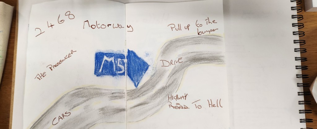
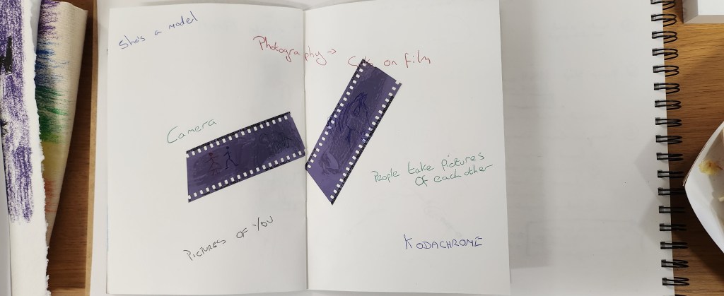
I bought my husband a record deck for his birthday which was at the beginning of the two weeks. It gave me an idea to base my daily theme around songs.
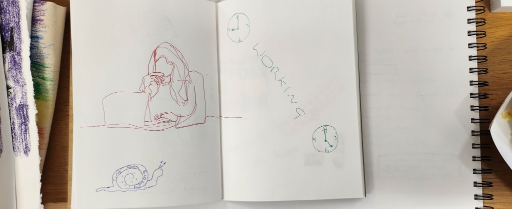
It’s done. Have I got into the habit of sketching every day? No.