Negotiated Project: Week 3

3 November 2022

Artist Research: Frank To

https://www.franktoartist.com/portfolio/gunpowderartwork

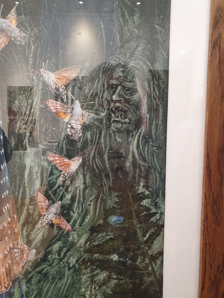
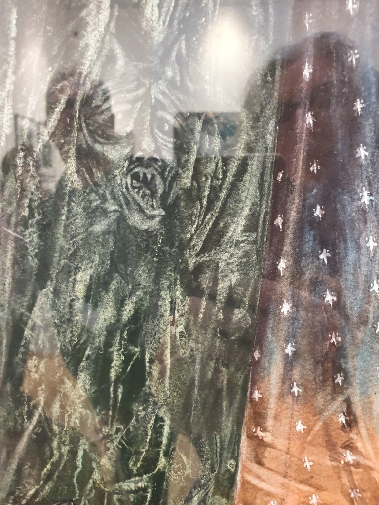
On our visit to the Royal West of England Academy in Bristol one of the exhibits was King of Bees by Frank To. It really grabbed my attention because it was ignited gunpowder and coloured powder on wooden board.

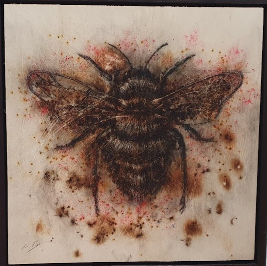
I really liked the detail and the irony of using explosives to depict a species that is in decline wasn’t lost on me. On face value I probably took it as an environment piece, political commentary on the state of climate change. There are a lot of plastics and chemicals involved in the process of making modern gunpowder. However, when I started looking into Frank’s gunpowder art, I think there is a deeper message and mission behind all this.

Frank To want’s his art to inspire people to think twice about the value of life. One of his collaboration projects is the “Humanium Metal Initiative”. Humanium is a metal made from the melting down of illegal firearms that are seized across the world and made into other products. He supports attempts to reduce gun violence.

Frank is also part of instagram #artistssupportpledge. Each time an artist reaches £1,000 of sales, they pledge to buy £200 of work from other artists. This came about during Covid-19 restrictions. I have started following him on insta because I find his work inspirational. I respect that he has this underlying passion that underpins his work and use of the explosive powders with other materials.

Art with a purpose.

Negotiated Project: Project Proposal

3 November 2022

Sustainable Art Practice

I am interested in being as sustainable in my art practices as I can be, and this year have an interest in the impact of pigments and chemicals in manufactured art media and the impact they have on the environment in production and disposal. The pieces of artwork that caught my attention and pigues my interest during the Bristol trip were those that were limited palattes, texture pieces of artwork using either one or mixed media, and those that were created using repurposed materials.

The one that really caught my attention was “King of Bees” by Frank To, which was ignited gunpowder and coloured powder on wooden panel. I need to research him further, but he is a humanitarian and supports various causes with his artwork. This piece of art got me thinking about different ways of using art materials and how to create using more natural pigments.

I am very interested in nature and whatever I create I wish to try and convey the essence of the story I’m narrating with my art or the subject matter. other artists whose work I was taken with because of either their story telling, colour palette, or materials used to create their work were, Claire Sparkes, Andrew Hardwick, Camilla Nock, Rachel Macdonnell and Becky Buchanan.

For my project I plan to research and explore making my own art materials from natural pigments that are available. i will also be experimenting with how these work on repurposed, scrap materials such as wood, metal, linen, canvas etc. I may also look at making my own paper however time restrictions may not allow for this. I like modelling clay so part of this work will be how can I take these theories and practice into ceramics?

I have no idea what the final art piece will be, however I do know that there will be texture, and layers and possibly some form of abstraction, as I tend to shy away from being realistic.

Negotiated Project: Week 2

3 November 2022

This week was all about how the project will run. At the end we need to have a final product. I’ve put some thought into this since the research trip to Bristol and have decided that my project needs to reflect how I enjoy creating pieces of art. Over the past year I have found myself using more found objects and repurposing materials to make my own canvases. My project is all about taking this a step further and creating my own paints using natural pigments where I can and even consider making my own paper.

I need to consider how far do I really want to go in controlling the materials I use? I definitely need to understand more about the history of where pigments come from and how to source my own from the world around me and what kind of paint method would be best to use, and what suits my style? So many questions. I realise that as a busy mum I have so many avenues I could follow in my explorations that the hardest part will be keeping it small to start with. I don’t have to find the answers to everything all at once.

How do I create? What do I enjoy doing?

  • Photography
  • Screen printing
  • Lino Printing
  • Use reclaimed materials for 2D and 3D pieces
  • Ceramics and clay modelling

What’s important to me? That’s easy to answer with my love of horses it’s nature and my surrounding landscape. This is why I want to look at more natural ways of creating pigments and paint, that cut out as many chemicals as possible. How can I be sustainable in my practices? Do I have the time to do things as I would like? And if not, are there other ways of sourcing sustainable materials?

I wish to get across the essence of the landscape or animal I am painting.

I want my work to tell a story.

I would love it if my work draws the observer in.

Negotiated Project: Week 1

13th October 2022

Negotiated Project: This Project provides you with the opportunity for developing a creative practice. Through a Negotiated project proposal, you will independently initiate your working practice where you will adopt a resourceful approach to the practical engagement with materials, ideas, research, design development and production. You have been asked to contemplate possible and potential ideas that could develop a project. Your project needs to target research and investigate relevant art, design and craft contexts through written and visual means to develop creative ideas. Task 1. Use the Bristol Study Trip to gather and focus on appropriate and relevant resource material that could and would be instrumental to that project idea. Effectively record interesting, inspiring and useful information during and after your visit to develop ideas for this project through a physical sketchbook and digital website.  Task 2. Develop further visual and written information in a physical sketchbook and digital website over the half term period. This research will formulate more structured ideas on what your project could be and look like. From this basis write a Negotiated design brief (200-250 words) outlining your aims, theme or concept and the materials and envisioned outcomes, with reference sources.   On return from half term you will receive a Formal Module Launch and briefing. We will seminar on your research and proposals whereby you will enter into a negotiated tutorial that will advise, guide and assist you in the planning of such a project.

Simon Taylor, Lecturer, BA (Hons Art & Design

Armed with the above as a brief for the next 10 weeks we ventured on a field trip to Bristol, visiting the Royal West of England Academy, the Bristol Museum and Spike Island. I had pretty much an open mind about my project as to be honest I didn’t really have any preconceived ideas about where I wanted my project to go or what medium I was more drawn into creating.

I’m going to start with Spike Island because Lawrence Abu Hamden’s film of the 45th Parallel, was very thought provoking. I found it to be very well articulated and well delivered. It made me even more aware of the parallel universes we seem to live in and the ripple effect of simple decisions across the world. The two backdrops that you walk through of Damascus and the border crossing in El Paso-Juarez help highlight the divides in the world, but how one ruling in a court thousands of miles away affect the life’s of others. The other exhibition on at the same time was Rosemary Mayer’s, Ways of Attaching. I loved her use of colour, texture and materials. Her style and way of expressions even as she developed from her original sketch ideas to her material sculptures and paintings, were quite magical and intriguing.

I found most of inspiration at the RWA, there were so many great works of art that touched on many of the things that I’m interested in, repurposing found materials, ceramics, nature, telling a story. I found myself drawn to certain colours and some of the more abstract pieces. I guess the weird and the unusual seemed to stand out for me and as I see my emotions colour whenever I do any form of meditation or visualisation exercise, I take the pieces of art I’m drawn to as a reflection of where I am in that moment. There were a number of artists that inspired me with the unusual media that they used and I will be researching them further like Cathy Pink and Frank To. However, this artist Claire Sparkes watercolour and pencil depictions, had me looking for more to the story she was telling. These are not great photos of her work, but I think you can understand why I wanted to interrogate her paintings further. Plus my control of watercolour as a medium would just look like a runny mess and I would find it very hard to depict the same amount of detail in my paintings. Something to aspire to maybe?

I felt as though I was in a Brothers Grimm Fairy Tale.

There weren’t many things that inspired me in the Bristol Museum, I think maybe because I have seen a number of the paintings and ceramics there over the years and after the RWA and some of the work there that really got me thinking about composition and materials and how I want to tell my stories, it felt a bit like a non event. I was still thinking about the work I had just seen.

Now I have to go away and as per task 2 of the above brief, consider what kind of creative practice I wish to follow and write up a project brief.

Shape, Form, Balance – 3D Maquette

28 September 2022

Taking our image from last week, dissecting and folding to create a 3D form.

What did I picture this as? What was my final piece going to look like? Was it functional? Did it have a purpose or is it just an ornament? A piece of art to look at?

In my mind I pictured this as an abstract sculpture, the shapes I’d chosen in the image resembled elements of a horse and that is what I envisioned. As I folded and tore and stuck the paper together, I was picturing what it could like and the possibilities. It was definitely made out of metal, possibly steel, and the mane would dissect parts of the muzzle and fold back on itself. The you would be able to see through the nostrils and there would be refracted light, the effect of the mane would be through a cascade of water running down the curved metal into the pool below.

On a grand scale it’s a water feature I could see outside a stately home such as Gatcombe House, Burghley or Badminton. Yet I could also see it on a smaller scale in a local park or as a water feature in an inner city courtyard.

The paper maquette is currently hanging with others as part of the wall display at Uni, perhaps one day I will find a way of making the prototype water feature, with the right kind of metal that is shiny yet dull, and able to be textured, and have natural light causing an array of rainbow colours reflecting its surroundings.

So I shall leave you with the sound of water flowing, the warmth of the sun on your face and the sights, sound and smells you would find on a summers day in an English garden whatever it’s size.

Shape, Form, Balance – Traditional Hand Skills

21 September 2022

Creating a still life line drawing using pencil. Sounds easy, yet it isn’t, I found myself struggling to pick an area of the array of still life objects and recreating.

What I have learnt is that instead of letting other people just move pieces I was considering drawing, in fact had even started drawing I should really have said something. However, on the other hand if I was painting a plen air scene on a busy bustling city street, I would have to adapt to changes and focus initially on the more static elements of the scene in front of me first. So maybe it was a good thing, that I chose to hide in my shell and not create a fuss.

This was my first choice and the weird looking shape on the left is what was moved, and I had to draw from memory it’s original state as part of my composition as I’d already started drawing elements of it. Needless to say the perspective is wrong, it doesn’t even represent what it was. However, you wouldn’t have known if I wasn’t honest and told you, but I think all of this is because I am not comfortable drawing still life, I’m not comfortable drawing what I see with other people around me and able to look over my shoulder and immediately comment. After the summer break, I found it hard settling into the whole learning and my art is on display enviroment again. There were some stools, a piece of wood, a fir cone, figurines, a wire fruit tray to name a few of the items in my image. My perspective is off, it usually is when I’m doing these kind of pieces.

I didn’t really add any shadows or highlights, or consider tonal values. The exercise was to recreate the shapes and forms and the result is a flat image.

I created another image, this time I concentrated on the array of ballet shoes propped against a board on tin foil. I felt more at ease drawing these, I used simple lines to create the sense of folding and creases where the shoes had worn and held their shape. Many reasons why this image is less flat, I have more interest in the subject matter, I connected with the shoes as I used to dance. Or maybe, I just let myself tune out the fact that there were other people around, so I was less self-conscious and less distracted.

I think as well as having more of an understanding of art practices I need to do more of, this exercise has also highlighted other things I should work on, on a more self esteem, personal level. There isn’t really a wrong or right interpretation, unless you are being photo realistic, art is just a reflection of what the artist sees and feels, and the story they want to tell. Also, the more I create and do, the more relaxed and confident in my outcomes I’ll be.

Assemble

9th & 10th November 2022

This is small project that ran across two modules Realisation and Creation and Production.

I missed the presentation on this due to being absent, I had to catch up on the second day and finish assembling my piece at home.

Quickly refreshing my knowledge on colour theory, the rule of thirds, the chaos theory and the golden ration. The first task which falls under the Realision Module, was to cut out 3D shapes and arrange them in several compositions, considering how they blend together and the various rules of composition. The different colours of the wood I used certainly helped with my final composition as I used the tones of the wood to help consider what a 3 or 4 colour complimentary palette would look like.

The second task was to paint the pieces of wood and then check the composition again, make any changes that would work with the application of colours if needed and then attach the pieces together in the final piece.

I moved the triangles around quite a lot, for me the piece looked more balanced with the red pieces on the blue square and the other pieces on the red square. I was originally going to put the green triangle in the middle. The benefits of phone cameras is that you can take a snapshot, look at it, change things around, take another photo, compare the two and it certainly helps with decision making in situations like this if undecided. After a few trials I decided that that the yellow triangle in the intersection of the two squares was definitely a better balance and composition.

This was a fun little exercise to do, certainly refreshed my memory on things to be considered when creating pieces of work, whether I wish to follow the rules or not.

Screenprinting & Photoshop

16 November 2022

Started by being shown the process of cleaning the screen off properly, this enables us to then use again for new designs.

The most interesting part for me was learning how to use photoshop to turn an photograph into a bitmap greyscale, so that it can be printed on acetate and then exposed onto the screen.

I used an image I had of my two horses when we first got the youngster, and then traced around part of it to create a line design for a two colour screenprint for the pop up shop. I experimented with different colours but neither the red nor blue were included in my final print.

Screenprinting 2

16 November 2022

Using bits of paper and textured materials which I cut and designed into shapes. I then stuck these on acetate film to make a pattern. This was then used to expose a pattern on a blank screen.

This screen was then used to print from and I really enjoyed experimenting with different colours and paper, I think my favourite was the black paper with the purple and blue ink.

Material, Surface & Form

6th October 2022

Due to illness I missed this session at University and caught up in my own time.

We used our 3D from from the Shape, Form and Balance sessions to inspire a ceramic form. The idea was to adapt the design taking into consideration the difference in materials being used, and how they can be manipulated into shapes.

The process used was rolling out a slab of clay to a size I was happy with, then using a magazine to create stencils I lay them on the clay. I then painted white slip over the clay being careful not to ruck and fold the edges of the paper stencils to prevent the slip seeping underneath.

This layer of slip was then dried with a hot air blower, I knew it was dry because the top of the slip was no longer shiny or tacky to the touch. I then added another layer of paper stencils and covered this layer in black slip. I then repeated the process of drying the slip. Once it was all dry I then removed the paper stencils.

I then cut the clay into two and attached one piece to the edge of the other. This took a little while to decide how I wanted it to look and the best edge to connect it too. I then very carefully attached a thin rolled piece of clay to the join to smooth it out and make it a little more structurally sound.

The piece was then ready to be bisque fired and the next session will be glazing when it is ready.

I really enjoy working with clay, I think the elements I really wanted to try and get across from my original form were the shape of horses muzzle and nostrils, and the wavy tendrils to represent the mane. What I am learning from this process is to let go of what I think it should look like, and go more with the feel of what the materials I am using want to be and are happy to be moulded into.