Shape, Form, Balance – Traditional Hand Skills

21 September 2022

Creating a still life line drawing using pencil. Sounds easy, yet it isn’t, I found myself struggling to pick an area of the array of still life objects and recreating.

What I have learnt is that instead of letting other people just move pieces I was considering drawing, in fact had even started drawing I should really have said something. However, on the other hand if I was painting a plen air scene on a busy bustling city street, I would have to adapt to changes and focus initially on the more static elements of the scene in front of me first. So maybe it was a good thing, that I chose to hide in my shell and not create a fuss.

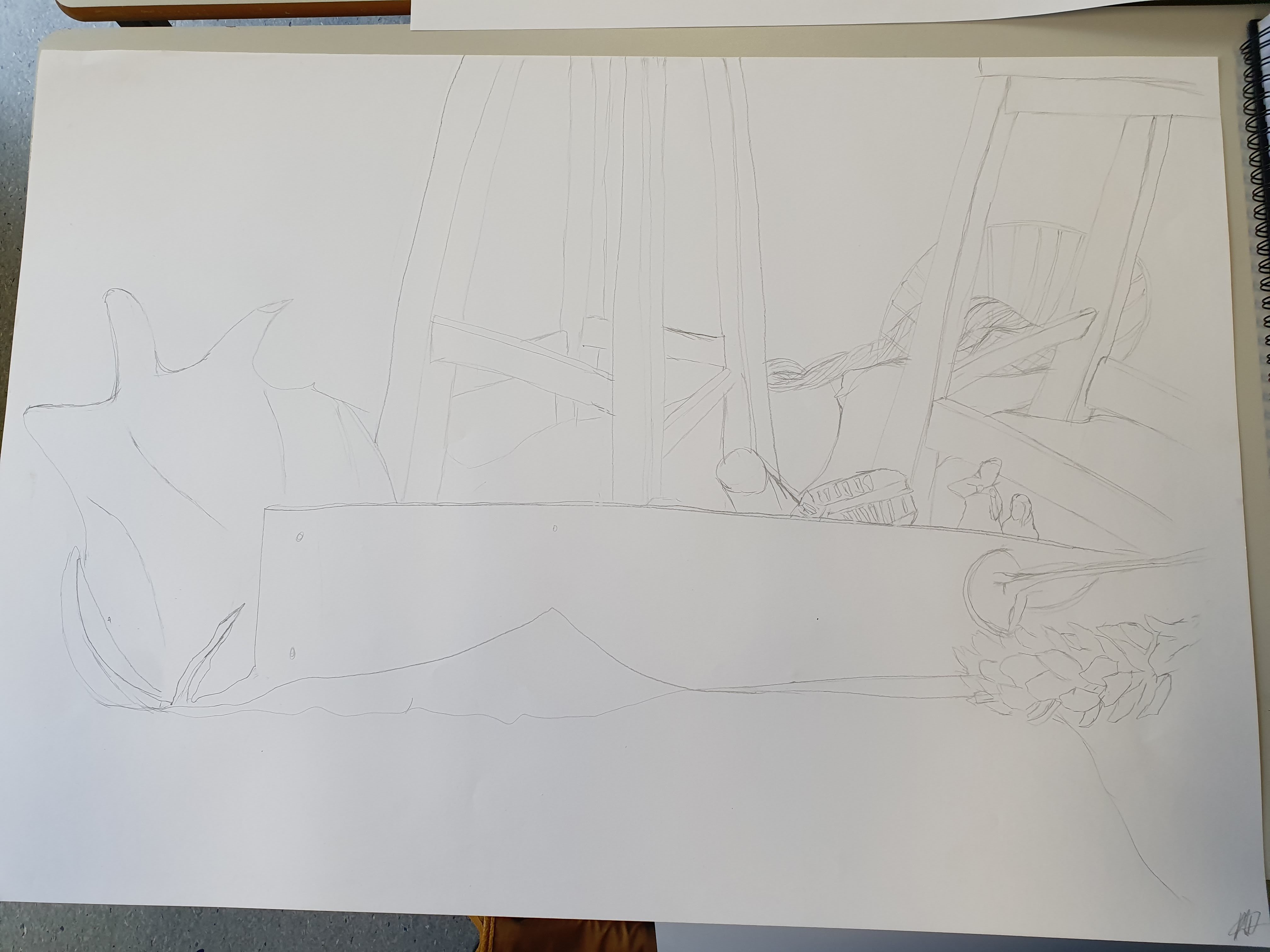
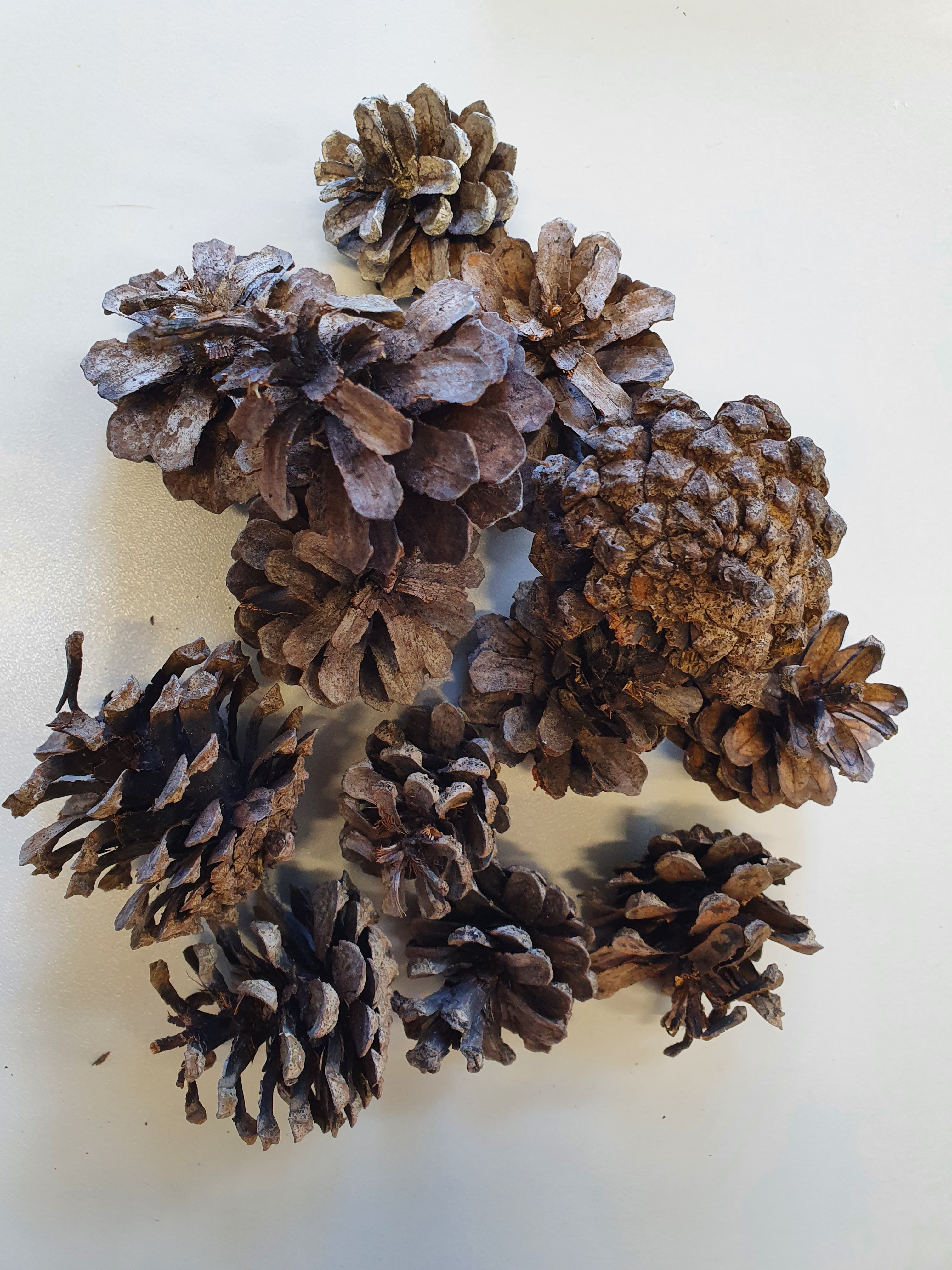
This was my first choice and the weird looking shape on the left is what was moved, and I had to draw from memory it’s original state as part of my composition as I’d already started drawing elements of it. Needless to say the perspective is wrong, it doesn’t even represent what it was. However, you wouldn’t have known if I wasn’t honest and told you, but I think all of this is because I am not comfortable drawing still life, I’m not comfortable drawing what I see with other people around me and able to look over my shoulder and immediately comment. After the summer break, I found it hard settling into the whole learning and my art is on display enviroment again. There were some stools, a piece of wood, a fir cone, figurines, a wire fruit tray to name a few of the items in my image. My perspective is off, it usually is when I’m doing these kind of pieces.

I didn’t really add any shadows or highlights, or consider tonal values. The exercise was to recreate the shapes and forms and the result is a flat image.

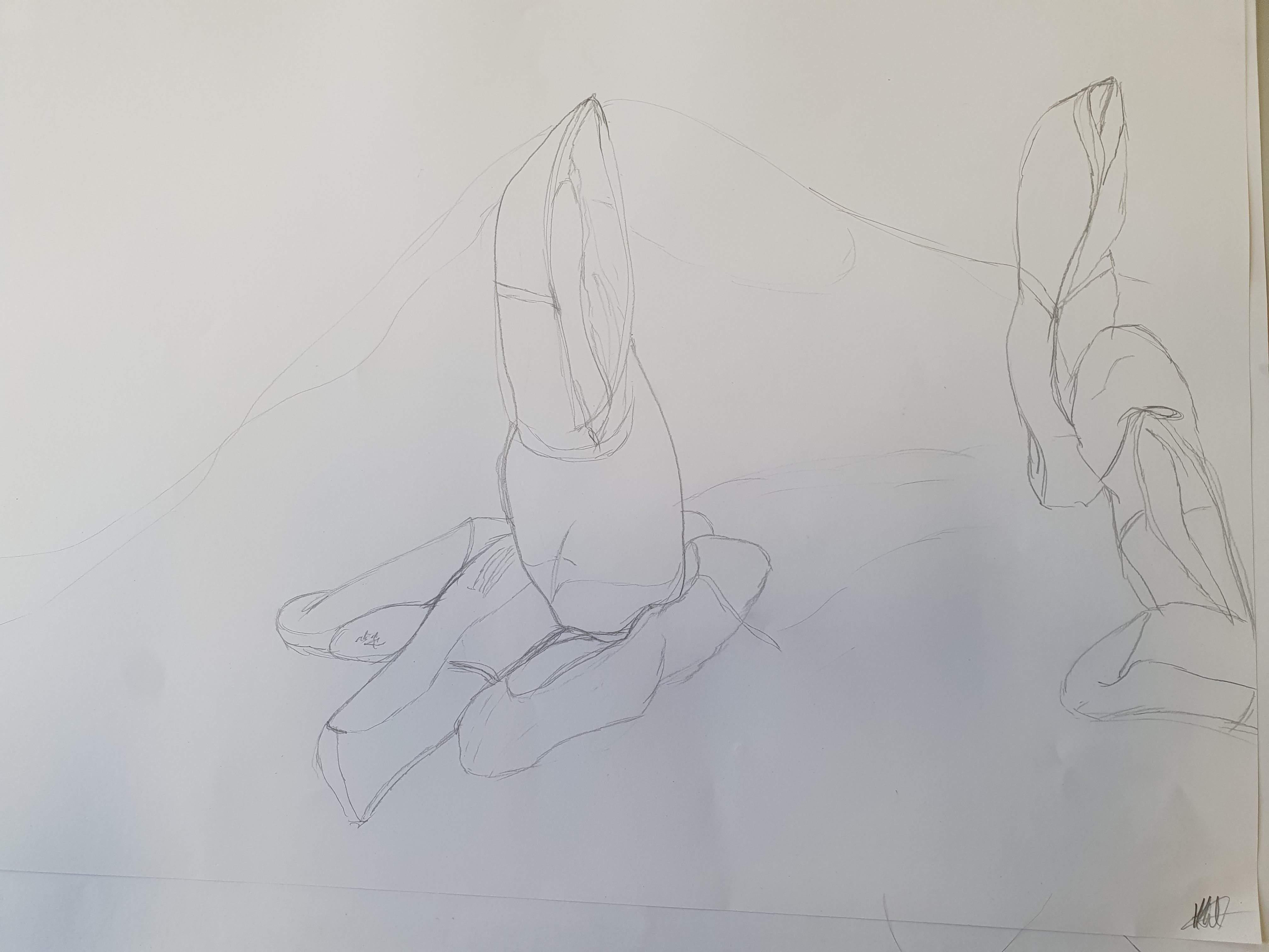
I created another image, this time I concentrated on the array of ballet shoes propped against a board on tin foil. I felt more at ease drawing these, I used simple lines to create the sense of folding and creases where the shoes had worn and held their shape. Many reasons why this image is less flat, I have more interest in the subject matter, I connected with the shoes as I used to dance. Or maybe, I just let myself tune out the fact that there were other people around, so I was less self-conscious and less distracted.

I think as well as having more of an understanding of art practices I need to do more of, this exercise has also highlighted other things I should work on, on a more self esteem, personal level. There isn’t really a wrong or right interpretation, unless you are being photo realistic, art is just a reflection of what the artist sees and feels, and the story they want to tell. Also, the more I create and do, the more relaxed and confident in my outcomes I’ll be.

Assemble

9th & 10th November 2022

This is small project that ran across two modules Realisation and Creation and Production.

I missed the presentation on this due to being absent, I had to catch up on the second day and finish assembling my piece at home.

Quickly refreshing my knowledge on colour theory, the rule of thirds, the chaos theory and the golden ration. The first task which falls under the Realision Module, was to cut out 3D shapes and arrange them in several compositions, considering how they blend together and the various rules of composition. The different colours of the wood I used certainly helped with my final composition as I used the tones of the wood to help consider what a 3 or 4 colour complimentary palette would look like.

The second task was to paint the pieces of wood and then check the composition again, make any changes that would work with the application of colours if needed and then attach the pieces together in the final piece.

I moved the triangles around quite a lot, for me the piece looked more balanced with the red pieces on the blue square and the other pieces on the red square. I was originally going to put the green triangle in the middle. The benefits of phone cameras is that you can take a snapshot, look at it, change things around, take another photo, compare the two and it certainly helps with decision making in situations like this if undecided. After a few trials I decided that that the yellow triangle in the intersection of the two squares was definitely a better balance and composition.

This was a fun little exercise to do, certainly refreshed my memory on things to be considered when creating pieces of work, whether I wish to follow the rules or not.

Screenprinting & Photoshop

16 November 2022

Started by being shown the process of cleaning the screen off properly, this enables us to then use again for new designs.

The most interesting part for me was learning how to use photoshop to turn an photograph into a bitmap greyscale, so that it can be printed on acetate and then exposed onto the screen.

I used an image I had of my two horses when we first got the youngster, and then traced around part of it to create a line design for a two colour screenprint for the pop up shop. I experimented with different colours but neither the red nor blue were included in my final print.

Screenprinting 2

16 November 2022

Using bits of paper and textured materials which I cut and designed into shapes. I then stuck these on acetate film to make a pattern. This was then used to expose a pattern on a blank screen.

This screen was then used to print from and I really enjoyed experimenting with different colours and paper, I think my favourite was the black paper with the purple and blue ink.

Material, Surface & Form

6th October 2022

Due to illness I missed this session at University and caught up in my own time.

We used our 3D from from the Shape, Form and Balance sessions to inspire a ceramic form. The idea was to adapt the design taking into consideration the difference in materials being used, and how they can be manipulated into shapes.

The process used was rolling out a slab of clay to a size I was happy with, then using a magazine to create stencils I lay them on the clay. I then painted white slip over the clay being careful not to ruck and fold the edges of the paper stencils to prevent the slip seeping underneath.

This layer of slip was then dried with a hot air blower, I knew it was dry because the top of the slip was no longer shiny or tacky to the touch. I then added another layer of paper stencils and covered this layer in black slip. I then repeated the process of drying the slip. Once it was all dry I then removed the paper stencils.

I then cut the clay into two and attached one piece to the edge of the other. This took a little while to decide how I wanted it to look and the best edge to connect it too. I then very carefully attached a thin rolled piece of clay to the join to smooth it out and make it a little more structurally sound.

The piece was then ready to be bisque fired and the next session will be glazing when it is ready.

I really enjoy working with clay, I think the elements I really wanted to try and get across from my original form were the shape of horses muzzle and nostrils, and the wavy tendrils to represent the mane. What I am learning from this process is to let go of what I think it should look like, and go more with the feel of what the materials I am using want to be and are happy to be moulded into.

Blue Book Project – Collaboration

Kinetic Art – Shape, Form and Balance

28th September 2022

We were briefed on the project and were split into four groups to work as a collaboration, the outcome to be a form of abstract kinetic art. The idea being that as a group we worked to each others individual strengths. So what did we need to do:

  • research kinetic art
  • use abstract outcomes
  • develop ideas by selection, design, making
  • must be a collaborative practice working to our individual strengths

KINETICS – movement – light and concept of moving, make it real

LIGHT – tonality – alive? – High to low tones, drama

2D art Static 3D use physical movement & light Alexander Rochenko sculpture moves and reacts with light

We looked at a few examples of artists work as part of the briefing lecture on Kinetic Art

  • Bridget Riley – pointilism, dots to blend clolours, lines close together optical illusion of movement
  • Paul Fillier – captive light used to create different shades, iridescent colours, study of light
  • Jean Arp – sculptures – static – you move around it
  • Marcal Duchamp – “Mobile” his sculpture moves
  • Alexander Calder – sculpture, mobile, abstract art – it moves itself
  • Man Ray – known better as a photographer, created first “mobile” he called it ob/struction – ob=objects/struction=putting together

The kinetic sculpture would be displayed in the atrium.

I was in a group with Alan, Alicia, Seb and Lexi. The kinetic artists that seemed to inspire at least two members of our group were Alexander Calder and Rebecca Horn, we then had a discussion about what we liked, didn’t liked and what we were likely to acheive in the timescale we had. Alexander Calder’s pieces were very automotive and although Alan may have had the skills from his engineering background to design and build, it wouldn’t have been possible with the materials we had available to use. Rebecca Horn is interested in sound and musical instruments and uses them in her art installations. Seb wanted to incorporate the music score for “Fur Elise” and whether it’s because of my interest in the art of music and research I did last year on Wassily Kandinsky, I was all up for attempting this. There were comments that music was black and white, so I explained briefly about visual music a book that I had read on Syneasthesia: The Art of Music, and showed them the chart that that every note had a colour, I still feel there was some scepticism but we went ahead with our rainbow notes.

Our initial idea was to use a pedestal and have a pivot in the middle with musical notes hanging of it.

Alicia and Alan started gathering bits together, and working out how to make the pedestal with the pizza boxes, whilst Seb and I went to the photocopier armed with the music sheets to see how we could enlarge them. It was pretty clear that this idea wouldn’t work, so back we went into the studio and I suggested I draw the notes used in the music and we cut them out and paint them. Alicia suggested different weights with cardboard and coloured paper. She also had the hot glue gun to stick a couple of the cardboard notes together to make them heavier. We set up a bit of a production line and got started. At the end of the day Alicia and Seb took the notes home to paint them, and I took the three pizza boxes to home to paint them brown.

The following day Lexi joined us, so we quickly caught her up to speed and she helped with the painting of notes, attaching wires and sticking and attaching them to the pizza box stand. Alan and Alicia worked their magic with glue gun, and we all started attaching the notes and wires to our pedestal. We decorated the pedestal with notes but also with an album cover that Alan had found:

“Things may come and things my go but…… the Art School Dance Goes On For Ever” Pete Brown & Riblokto!

We hit the deadline, we managed to get it all completed if a little tacky in places and displayed in the atrium. As part of the installation and presentation we placed a blue tooth speaker under the pedestal and played “Fur Elise”.

In conclusion I think it was a successful project although, I admit there were points when I really didn’t think we would get everybody on board with a cohesive idea, are there things we could have done differently? Yes as it was quite a fluid construction with lots of problem solving along the way.

Shape, Form, Balance – Tonal Values

22 September 2022

Carrying on from yesterday’s work, we were still using the array of still life objects, only this time looking at tonal values and using charcoal do another still life piece.

I deliberately chose a more industrial object, made of metal, with angles and curves and lots of highlights and shadows. Being objective my perspective is definitely a little skewed, and respecting the different tonal values of the two different metals was hard and did find myself getting a little carried away with some parts and having to hastily rectify them to more accurately reflect the object I was drawing and the angle I was seeing it from. I’m rather pleased I pushed myself out of my comfort zone, there are some elements that I did well, but obviously still have a lot to work on. I seem to keep coming back to perspective. I need to do more of this. I don’t necessarily want to be ultra realistic, but the proportions still need to be more accurate. I have no idea what the original object is, would it have helped if I did? Possibly not, because if I could relate to it there is a chance I would have drawn what my mind thinks it should look like, rather than what it actually does look like from the angle I am viewing. I could have used negative space better to aid with the highlights and shadows, but again this is something I don’t do as a matter of course, so more practice needed.

Another part of the exercise to look at tonal values and high/low contrast, was to take the photographs from yesterday and print them out in black and white. We could reduce, enlarge, cut out elements, replicate as many times as we needed, and create another image. The purpose was really to not overthink it, although trying to remember the design principles and keeping the balance was a little challenging. I enjoyed not really having an idea to start with, yet once I started playing with the images and layering them on the paper I could see a pattern forming and shapes and textures that I wanted to include. There were some repeats that I hadn’t noticed and it was only when Simon, our lecturer, was stood talking through what I was doing and picking up some of the photos himself, that I saw what he did and realised that placing them slightly differently the balance of the tones in the final image looked a lot better.

Breaking this subject down into the simple exercises we’ve done over the past couple of days, has helped me consider my approach to creating ‘Art’. If anything, I’m learning to be brave and not worry about turning things around and looking at them from different angles and perspectives, learning to look at all the angles and stripping away the colour so that you are just left with the tones is really good for understanding composition and seeing things as they really are, not what you think they should be. Who knows, maybe you’ll get to see something in a different light.

Shape, Form, Balance – Digital Still Life

21 September 2022

We were joined by the year two students as we are all working on Shape, Form, and will be working on a collaborative project as part of this tope. Our lecturers had an assortment of interesting objects, shells, pieces of wood, feathers, bone etc. Our first task using the Nikon D90 cameras, was to take interesting shapes, and group items together, or single them out and thing about why we found them interesting. We needed to thing about the formal elements of art and the principles of design and consider how we could use these images. It was a good way to consider lighting, how we can change it, how we use the negative spaces, take photos from different angles by not only moving objects, but moving around them ourselves.

I found that I was very interested in textures and the more natural patterns, I was also attracted to curves rather than purely linear patterns. Which I find quite interesting, as most of the time I draw freehand I will start with a slightly wavy line or a circular motion rather than straight and angular. I was also drawn to the more natural materials on the table, rather than the manmade structures, or metal. Maybe that’s where I find my inspiration? I love being outdoors and like the more earthy colours. Yet sometimes, like the strands of wool fibre hanging in front of the spot light, I love the clash and harshness of the lights behind the softness of the wool. I also like the tones acheived by the harsh shadows. The delicacy of the feather and the dried leaves, and the contrast of the bright green with the autumn browns, it made me think of a woodpecker that visits my garden. The well worn ballet shoes, I could almost hear the music and the “one, two, three” count of the teacher as the dancer practiced the movements over and over. That’s what these images evoke in me, and remind me about, as I was taking the photographs and considering the best way to reflect them, I was imagining the stories behind how they got to be there.

The final individual outcome is to be monochrome, but we took the original images in colour. The whole idea of this exercise is to get us back into the habit of recording everything and developing good practice.

The Visual Verb

21 September 2022

We looked at the work of Richard Serra and his idea of creating artwork from verbs. TO DRAW is a verb.

As a group we had a class exercise to find examples of the twelve verbs we had chosen from Richard Serra’s list of verbs and photograph them. The limitation on the task was that they needed to be from somewhere in the college building and grounds. My choices are below:

To Twist

To Simplify

To Splash

To Suspend

To Gather

To Surround

To Weave

To Match

To Light

Of Nature

Of Reflection

Of Symmetry

As an exercise it was quite interesting as even though we were to work individually, as a class we used similar images, if not the same for some of the verbs. Our lecturer asked us to upload them all so that she could display them as a postcard wall.

The next task was to create an art response to one of the verbs, the stipulation was that it had to be 4″x6″ postcard size. I did one response but wasn’t too sure about it, so on the reverse did another response. I used felt tip pens to create the image, can you guess which verb I chose?

A career in modelling?

Clay that is! I have been spending my time since my college course finished wisely and am learning how to model/sculpt with clay. It’s very relaxing and therapeutic.

The Golden Diva

This little piece is based on our little Welsh Section A. Unfortunately there a little crack happened in the final firing process, but it can easily be fixed. I will then mount her in a box frame and place on my wall.

I am lucky to have three horses in my life so have decided it isn’t fair to just sculpt one, and the next project is going larger…

I will keep you updated on the progress throughout the summer.